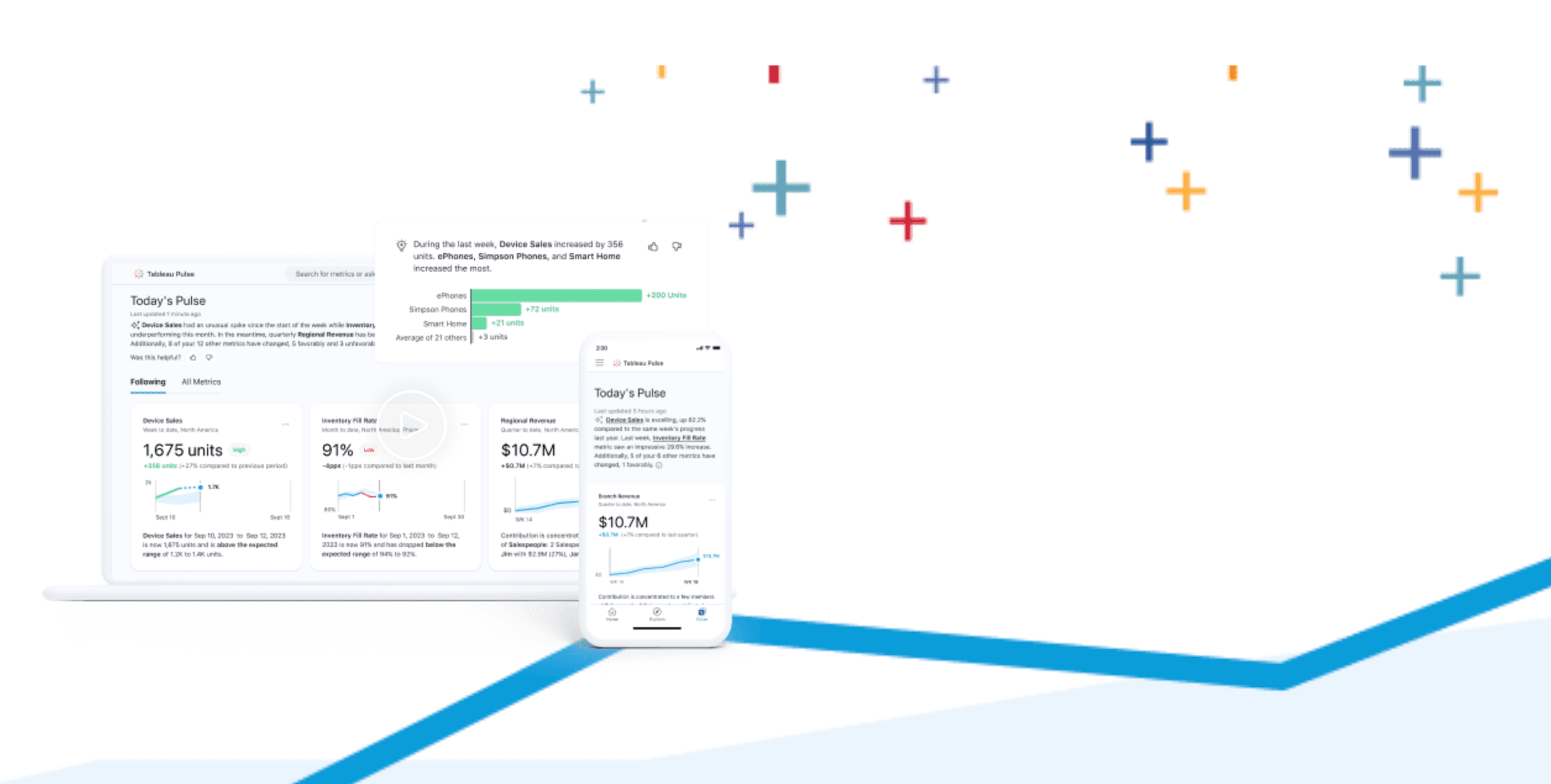
As of Thursday 22nd February Tableau Pulse gained GA (general availability) status with every Tableau Cloud account now having access to it. Pro tip, if you are looking down the left hand menu and can’t see it listed then your site administrator probably hasn’t enabled it yet. If you’re a site administrator you need to go to your site settings and tick at least the first checkbox but ideally both of them:
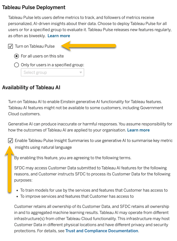
So what does this mean for you and your use of Tableau Cloud? Has it suddenly become a whole lot more valuable as a service? As with many things in life it depends and I believe it specifically depends on how you already work with data. It breaks down as follows:

Pulse has been created to put as many people as possible in touch with data, to inform as many people as possible and to enable as many as possible to understand what’s going on in their organisation. In early development I had it described to me as a trusted source of data-driven news, a place you quickly browse every day to keep in touch with the information that interests you just as you do each day with your news app and a morning coffee.
With that in mind its sweet-spot is with c-level executives and management teams (1% of an organisation). They want feel on top of what’s happening in their organisation with snippets of up to date, easily digestible information delivered to them on a regular basis. That same simple presentation also appeals to the majority (let’s say 90%) of the organisation who would either have no need for the classic dashboard, they may see it as out of the scope of their job, or would receive a regular generic report which more often than not just gets filed away without reading.
But what about the remaining 9%? Well now we’re talking about the classic data engineers, analysts and enthusiasts and on the face of it you’ll probably dismiss it as too simple. It’s the same analysis you’ve been presenting for years only yours has much more context and the ability to drill into the data. Why should you spend your time recreating your work in this tool?
So there are two really important reasons why I think you should engage.
Embrace the hype and help steer the ship
First of all people will want to use it. Whether they know exactly how AI can help their organisation, it doesn’t matter. Somebody somewhere (probably the CEO) will be telling people to make use of AI where possible so that they can say they are an AI and data-driven organisation (it’s new and that’s hype for you). If that 91% goes at it on their own with little guidance and knowledge of the data sources they’re utilising mayhem will develop. Hundreds of metrics definitions produced, data sources unsuitable for this kind of analysis presented as fact and you’ll spend most of your time trying to validate Pulse metrics created by others.
Instead you could get ahead and embrace the hype. The keen eyed among you will have noticed that Pulse can be restricted to a specific user group:
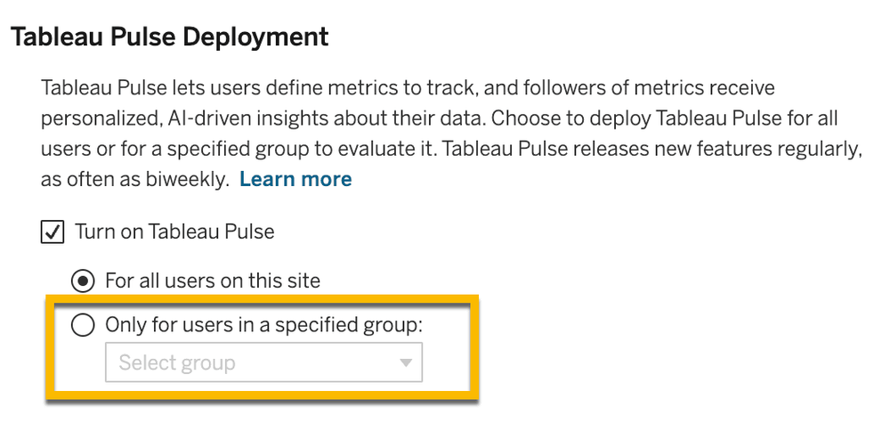
Make this first group your 9%. Have them analyse the most popular workbooks and data sources on your Tableau cloud site. That’s going to be the first metric definitions you create. You should also pepper in a couple of definitions that point to data you think is really important to the organisation but few seem to pay attention to. Pulse is going to have a lot of attention paid to it, you may as well take advantage of it.
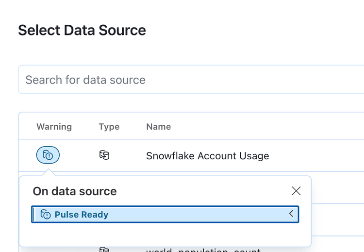
If you have the data management add-on you can make use of the quality warning labels to highlight which data sources shouldn’t be used by Pulse as you open up to a wider audience. When creating a metric definition the quality warnings are surfaced in the data source selector which provides a great opportunity to stop mistakes being made:
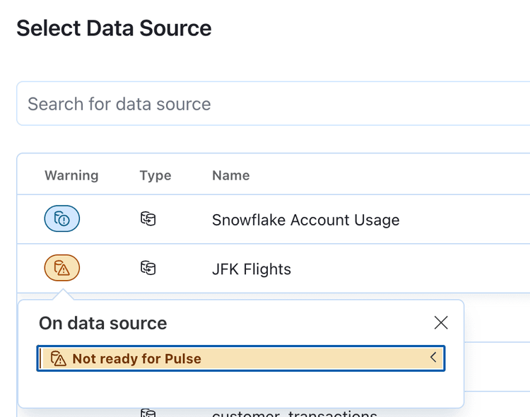
Unfortunately it’s currently not possible to have any other label categories appear in this selector meaning you’ll need a work around for marking data sources as “Ready for Pulse” or “Pulse approved”. The standard vs high visibility option could be one way to distinguish between the positive and negative flag:
It might just be the future of Tableau
Now this is a little more speculative but the second reason I think you should engage with Pulse is in my opinion Tableau is building Pulse on what it sees is its future platform. I’ve been using Tableau Server for over a decade and have a pretty good working knowledge of how VizPortal has developed and evolved over those years. At risk of being very wrong I feel confident enough to say that VizPortal has matured and has very few if any new development jumps on its horizon.
The platform on which Pulse is built on the other hand feels very new. The API powering the Pulse interface is brand new, UI elements follow a different design guide more aligned with other Salesforce products and the search function isn’t a classic filtering search but a suggestion engine promising more of an AI-driven guided analytics experience. Probably one of the biggest giveaways of the mindset behind this being a brand new independent platform is that no navigation link was added allowing a user to go from Pulse back into the classic VizPortal, as if it was always expected this would be a one way journey.
Final thoughts
So in conclusion it is easy for your Tableau Desktop and Prep enthusiast to dismiss Pulse as something too simple and not for them at the moment. I would however encourage even the most avid data analyst to embrace Pulse and help your organisation make the best start with this new tool. If done right you may even find your own personal stock increase as data insights spread to areas you’ve been trying to reach for years.
