

What is Tableau Pulse?
Tableau Pulse allows business users to follow the metrics that matter to them and receive personalised, contextual, and smart content delivered directly into their flow of work. Tableau Pulse surfaces automated analytics in plain language, proactively anticipating questions the user might ask next, and even suggesting questions they might not have thought of.
Who can use Tableau Pulse?
Everyone! Tableau Pulse is currently free to all users of Tableau Cloud. Creators & Explorers will be able to build and edit Metrics. Viewers can view metrics and insights, adjust filters, and follow and share metrics.
What do you need to use Tableau Pulse?
A Tableau Cloud account
A Published Data Source - Live/Extract/Virtual Connections/Bridge data sources are all supported
For a Metric Definition
One measure
One time dimension
At least one metric filter
How do you use Tableau Pulse?
Log into your Tableau Cloud Site
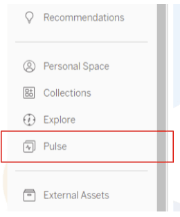
Once you have requested access to Tableau Pulse you will see it in your menu on the left hand side of your view.
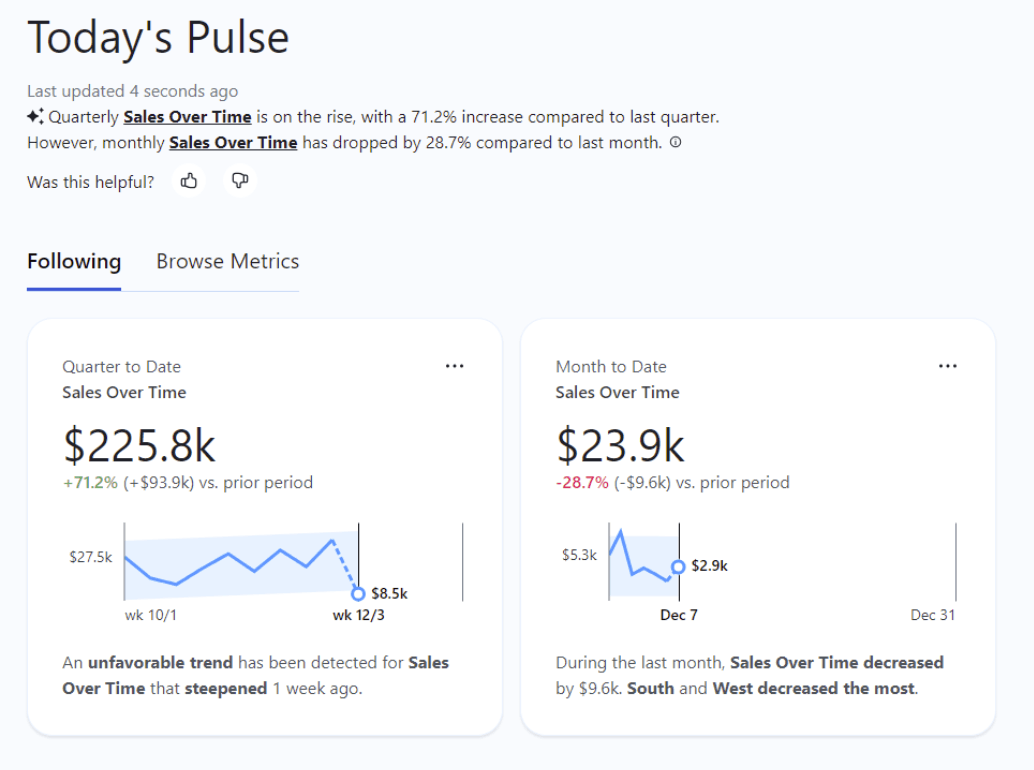
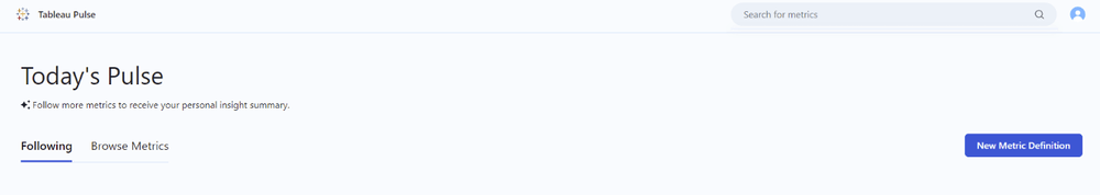
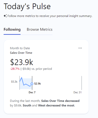
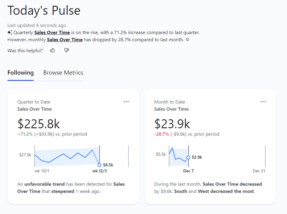
On the Pulse home page you will see what you are already “Following” and you can “Browse Metrics” to see what other metrics are available for you to follow. There is also a search bar in the top right corner to help find exactly what you are looking for.
Your Pulse is made up of numerous metrics.
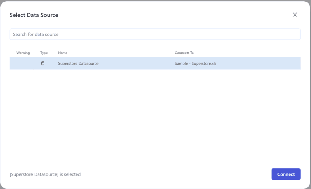
To create a new metric click on “New Metric Definition” and select a data source from the pop up.
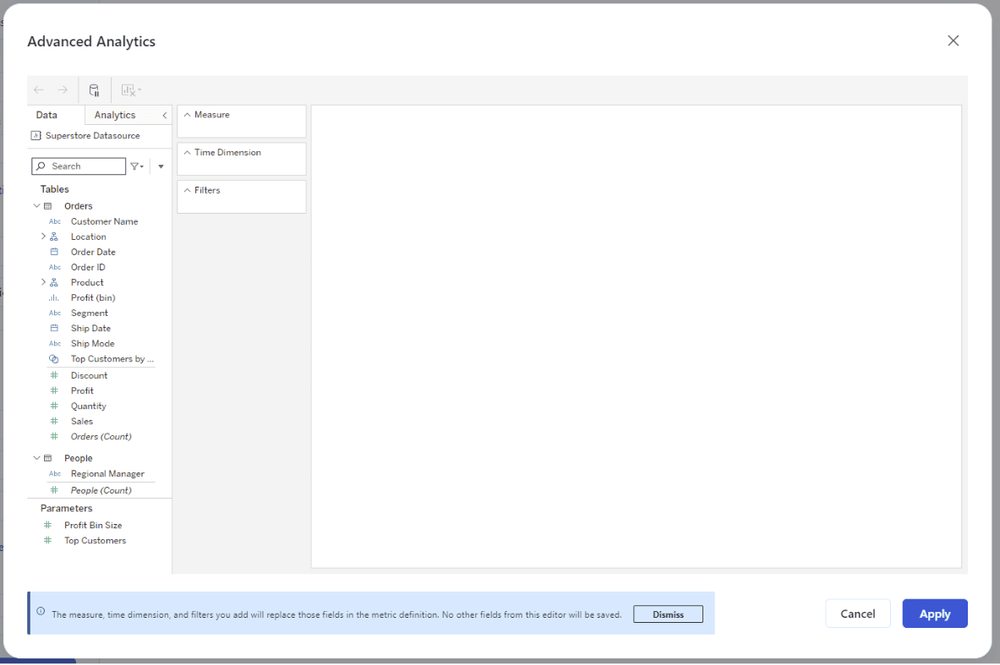
This will then open up the main editor where you can create your metric.
Definition Tab
This is where you define what makes up the metric
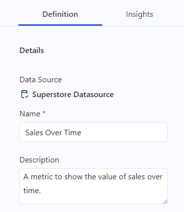
Details
Name & Description
Give the metric a relevant name and description. Remember this is the first thing others will see so try to make it obvious what your metric is showing.
Value
In order to define a metric you need to have one aggregated measure, one date/time dimension and at least one filter.
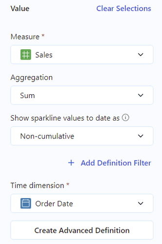
Select a measure
You can select any field in your datasource, this will then be treated as a measure. You then need to select an aggregation and if you want the line to be running total or non cumulative. (this may be pre-selected depending on the aggregation you choose)
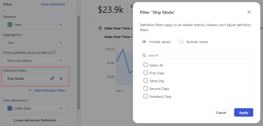
Definition Filter
This allows you to limit the scope of data for the metric definition by either including or excluding values. Viewers cannot adjust definition filters.
When you click Add Definition Filter you will be given a list of all dimensions in your data source, select one and a pop up will appear containing all the values in that field. You can then choose to include or exclude any of those values. Click apply to add the definition filter. This will then apply to all data related to this metric.
Time Dimension
Select a date/time field from your data. When you do this, the metric will populate the view on the right
Create Advanced Definition
This allows you to have much more control over the metric you create. For example, you can create a new calculation to use as your value. When you click Create Advanced Definition you will see a pop up that looks exactly like Tableau Desktop
Adding a filter in the advanced definition will apply to the view but will not be adjustable by the viewer. Once you have created your metric via the advanced definition option, this will be the only way to edit it going forward.
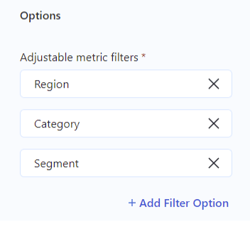
Options
Adjustable Metric Filters
This is where you can add whatever dimension filters you require the viewer to have access to. You must add at least one.
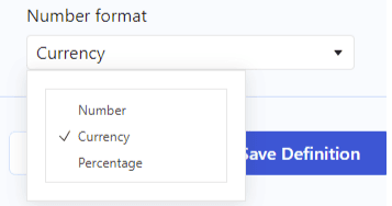
Number format
You can set the format of the number to either number, currency (currently only dollar) or percentage
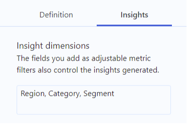
Insights Tab
Here you can define the parameters for the insights available into your created metric
Insight Dimensions
The Insights will be generated based on the filters you have added for the metric. On the right you will see what insights may be available to your viewers
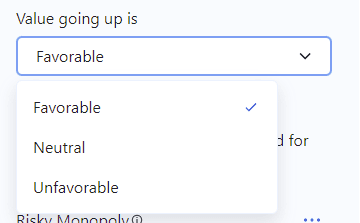
Value going up is
Here you can define how you want the change in value to be represented in your metric. This can be Neutral, Favourable or Unfavourable. This will change how the Insights represent the change.
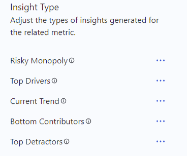
Insight Type
This will define what insights are available to users. There are currently 5 options to choose from. By default these are all on but you can turn them off individually.
Risky Monopoly - Shows dimensions with a concentration of very high values
Top Drivers - Shows which values for a metric that increased the most across a specified time offset
Current Trend - Shows current trends to communicate the rate of change direction and fluctuations for the metric value
Bottom Contributors - Shows the lowest values in a dimension for a metric within a given time range
Top Detractors - Shows the values for a metric that decreased the most across a specified time offset
Once completed select “Save Definition” to publish the metric.
The metric is now available to you and others with the relevant permissions to view, adjust and follow.
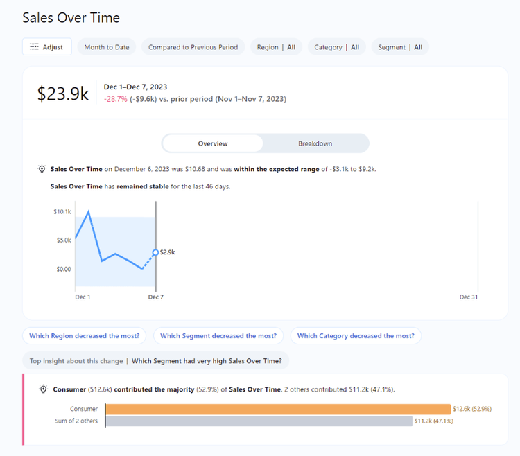
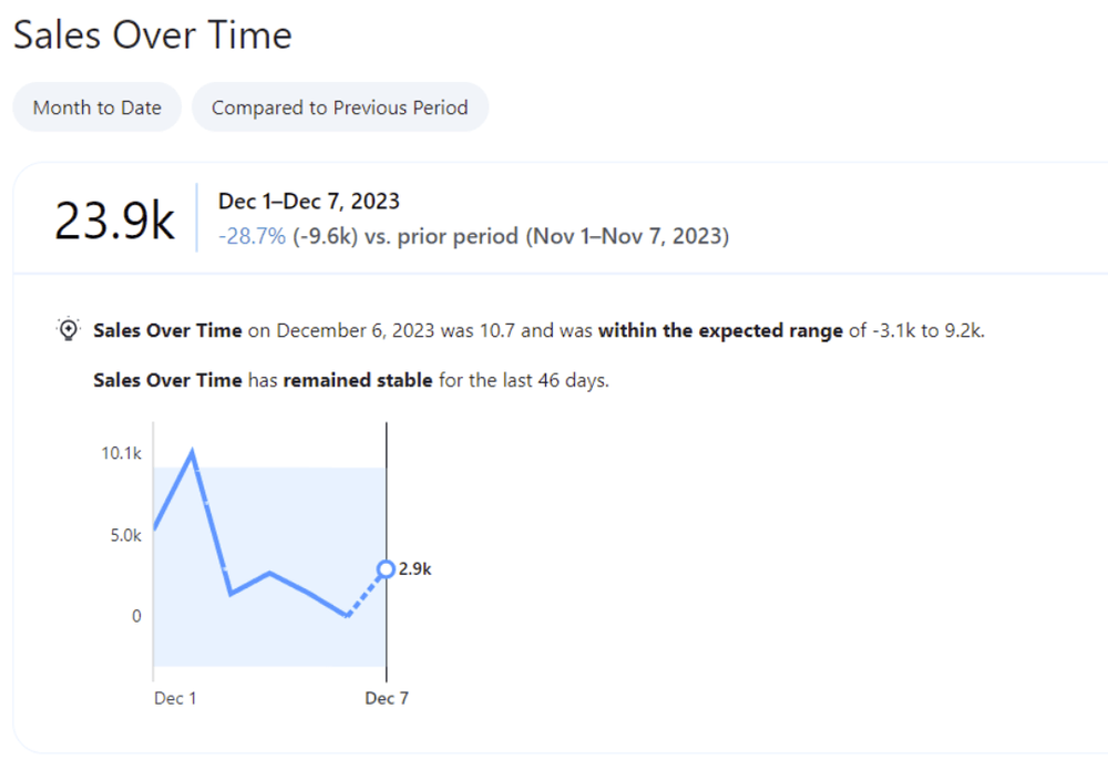
In the metric you can now choose to see an overview or a breakdown. The overview shows the metric you created. The breakdown allows you to view a breakdown of the value by the dimension filters.
Adjust
By clicking Adjust you can change the time dimension, the comparison, from previous period to previous year and any filters that are available. Click the tick to apply your changes. This then creates a “custom” view of the pulse which you can then choose to follow. This becomes your personal view of the metric.
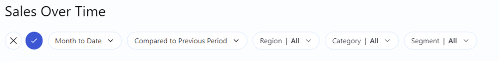
This allows an analyst to create one generic metric which everyone else can then create their own custom versions of to follow.
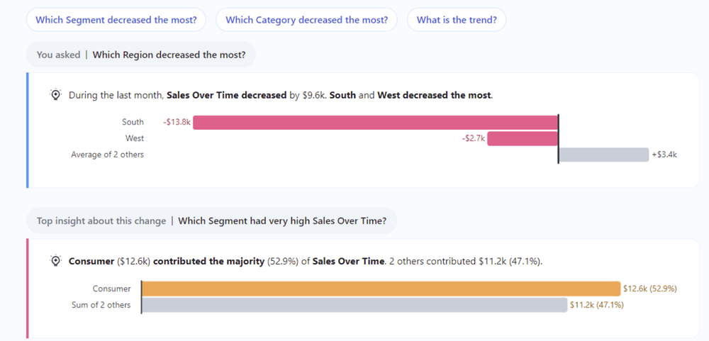
Underneath the overview/breakdown section you will see some questions you can click on and also the “Top insight” If you click on any of the questions this will then bring you the Insights that were customised when creating the Metric.
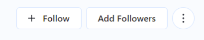
How to Follow a metric
In the top right hand corner you have some options. These options will depend on your permissions.
“+ Follow” - this will add the metric in the current view to your pulse.
Add Followers or Manage Followers - this allows you to add or remove followers to the metric.
Ellipses menu - this will allow you to edit the definition
When you add more than one metric to your Pulse you will then get a personal insight summary. This utilises Generative AI to communicate and summarise important insights detected by Tableau Pulse. This can be turned off, although this means some features will not be available.
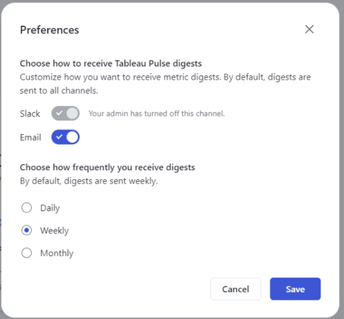
How do I get a “Pulse” ?
From the main page, if you select your account button in the top right you can change your preferences.
You can decide to receive your pulse via slack or email and how frequently you receive them: daily, weekly or monthly.
Things to note
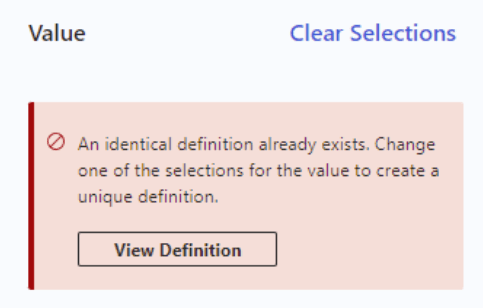
You can only have one metric based on a combination of measure + aggregation + time dimension. If there is one already created you receive an error message telling you an identical definition already exists, with a link to view that definition. This stops the accumulation of hundreds of the same metrics.
Remember, this is the initial release of Tableau Pulse so there are plenty of features to come!
If you need any help with Tableau Pulse, or anything to do with Tableau please let us know.