If you would like to follow along with this exersice or view an example please follow this link
Often when using Alteryx, or in any form of reporting, we can find ourselves wanting to output different data sections or different findings into multiple places. Now anyone who is experienced with Alteryx may know that you can use the default output tool to output identical sheets, by using the 'Take File/Table Name From Field' and 'Changing the File/Table Name'.
However, this has its limitations, only allowing us to output the same sheet, but grouping it by a different field. So in this example, it is outputting all the sales for our store across Europe, but splitting each page by country so they can go to the relevant regional managers. However, what if we wanted to send multiple different reports?
So imagine you are that regional manager and you want it broken down into the overall sales, like you are receiving above, an aggregation by client (Customer), and also a breakdown by product category. Using the above method would work, but you would now receive 3 separate files instead, and would hence require 3 output tools.
To do the output via 1 tool we will need to bring in and use 3 tools from the reporting tool set:
- Table - this will allow Alteryx to turn the data into a table object (This should only be carried out after any data preparation has occurred as it will now be treated by Alteryx in the same vein any reporting object would be (only viewable via a browse tool))
- Layout tool - this lets Alteryx move and reorder the configuration of multiple tables (which is exactly what we have)
- Render tool - this allows Alteryx to output the objects in many different forms, either temporarily or permanently.
The workflow we will end up with will contain 12 tools, within 8 different parts, looking like this:

After inputting our data, we will need to split this off into the 3 streams we spoke about earlier:
- By Customer
- By Category
- Overall
All being split by country, the summarize tools being setup like below:
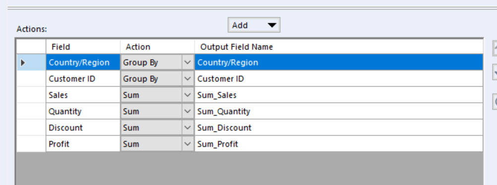
After creating both of these we are going to bring our first reporting tool onto the canvas, and this is to bring a Basic Table tool into all 3 data streams we are going to create/have created.
These should be set up as the following:
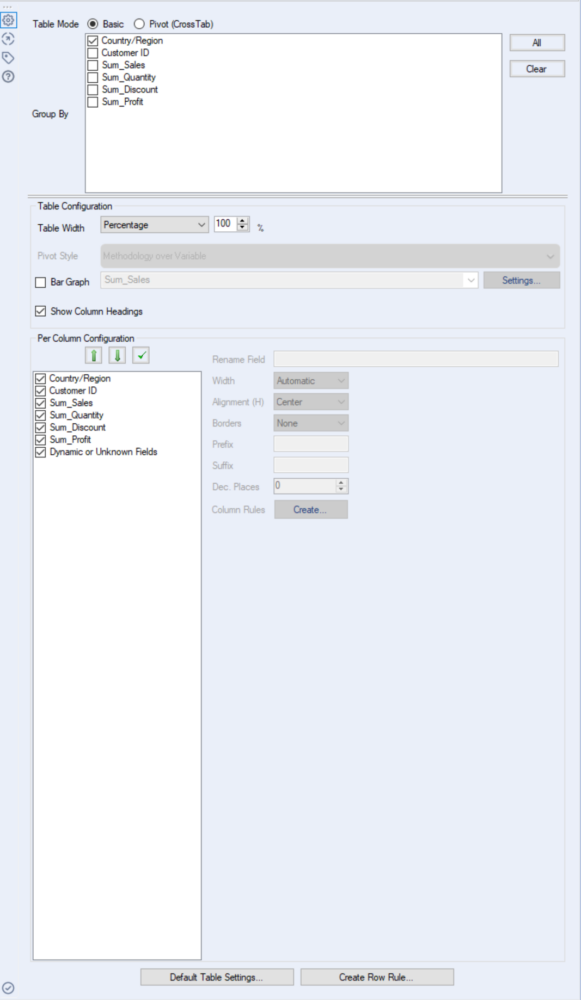
Feel free to change how the width is configured, as this will not affect the outcome, but we do need to keep the group by Country/Region ticked as this will give us multiple tables, one for each country, otherwise this will all be configured into one. The bottom section allows us to reorder our columns, rename fields, and remove fields (in many ways it is similar to a select tool).
Our workflow should now look like the following:
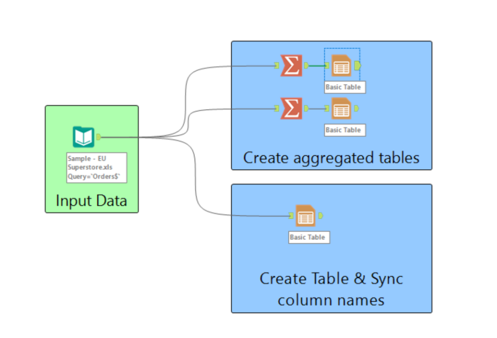
After this, we will need to union the top 2 tables to create 30 separate tables, as the data I've used here is for 15 distinct European countries, and there is now 2 of each country; 1 containing the customer information, and the other the category. By unioning the 2 sides here we are moving them into the same data stream, this will allow us to bring in another reporting tool; the Layout tool.
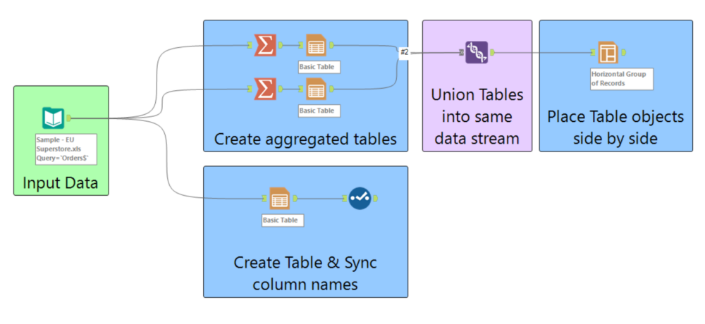
The Layout tool here will be configured in the following way:
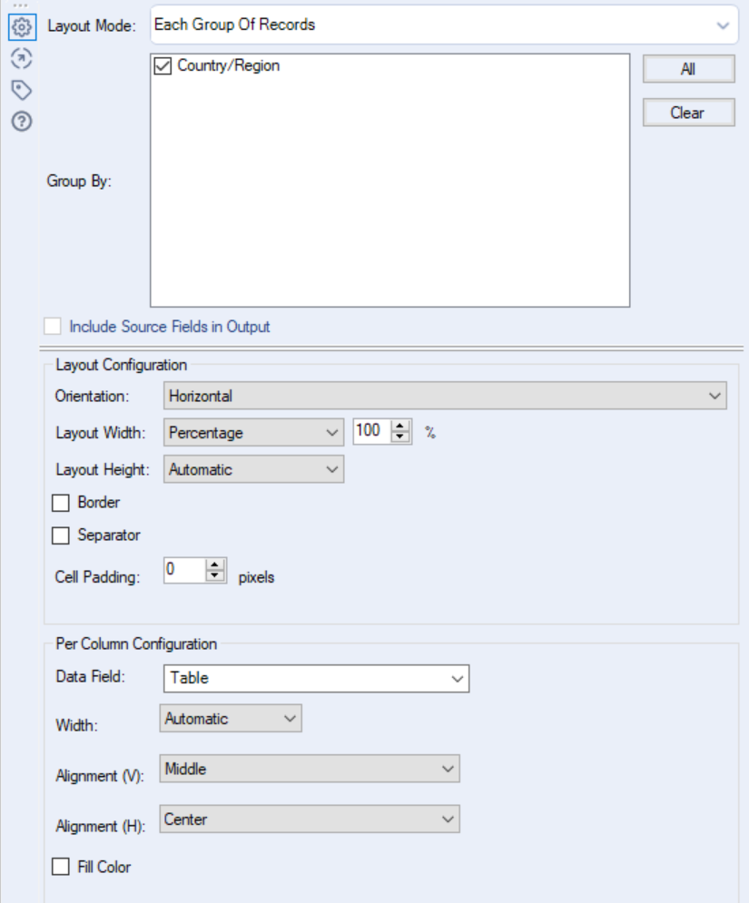
A couple of items to note here -
- Firstly, we have selected the layout mode as Each Group of Records, this is to keep it as a horizontal line for each country, if Each Individual Record was selected Alteryx would bring through all the records, So 1 of each for Customer and Category, and hence place nothing side by side. Using All Records Combined would bring all 30 records together side by side, which is not what we want here.
- Secondly, make sure Group By is selected for Country/Region, otherwise, it won't be grouping by anything, and you will create the same result as Each Individual Record.
- Lastly, as previously the rest of the options are only aesthetic options, so these won't change our output going forward, but just how it looks; feel free to edit these to your own desires.
After updating this we are going to Union the third stream so that we now only have one stream of data. So bringing the 2 side by side tables together with the all information table that we were using earlier. This will be carried out through an Auto Config by Name; please note here that the bottom table will require a select tool (Explained earlier) to change the name from Table to Layout, otherwise they will not line up in the same columns using Auto Config by name.
Nearing the end of the workflow we now have the following:
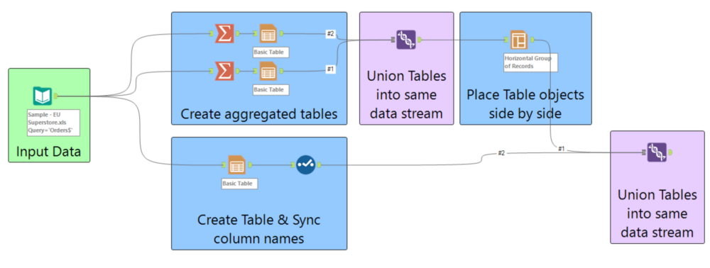
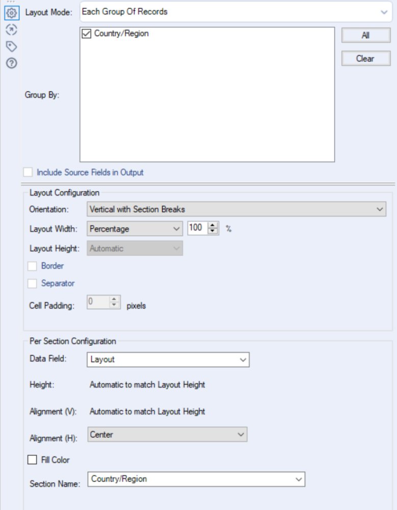
There are two small steps that we now need to take to get Alteryx to output multiple tables into one Excel sheet. To start this we are going to reintroduce another Layout tool, though this time it will be set up in a vertical layout; this is as we want our tables (in this case objects as the 2 tables that have been aggregated are now 1 object) on top of each other. The key to what we are doing here, however, is it will be Vertical with section breaks, not just normal vertical orientation. This creates the following 'Breaks' in our layout:
- For .xls and .xlsx, a section break is equivalent to a new sheet within a workbook.
- For .pdf, .doc, .docx, and .rft, a section break is equivalent to a new page.
- For .html and .pcxml, a section break is not created.
As we are using a .xlsx this will create a separate page for each object, leaving us with 30 pages (sheet 1 is our 2 aggregated tables for Austria, sheet 2 is our individual table for Austria etc.) if selected on Each Individual Record. If we instead select group by country/region this will make each country/region its own, storing all 3 of our tables together. Finally, we should make sure that the section name is the same as our grouping, as this defines the sheet names; otherwise, they will just be sheet 1, sheet 2 etc.
Note: as previously the rest of the options are only aesthetic options, so these won't change our output going forward, but just how it looks, feel free to edit these to your own desires.
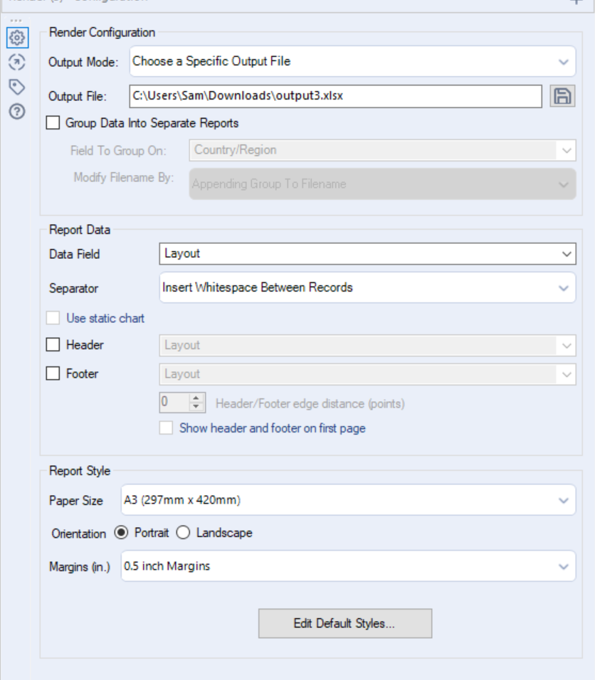
The last tool for us to worry about is our Render tool, essentially acting as our output. This will output all of the objects created so far (we now only have 15 objects, all containing 3 tables each), there isn't too much to do within this tool other than set up what we are outputting. The reason we are using the render tool, and not the output tool, is that the output tool is unable to process the objects; these objects are in a specific kind of image related coding which requires rendering, not just an output.
We first need to select our output mode. The Render tool will allow us to create temporary objects (these are useful for analytical apps), however in our case, we want to create a permanent file, so we should select a Specific Output File. Under here we need to choose a path for our file, saving it to a specific location. This is where we also select our file type, we want to make sure ours is .xlsx. The final important item that we need to change is the Data Field which we need to define as our data, contained within our Layout field, the separator here makes little difference as our records are already being split by section, so if we hadn't carried out this action earlier we could have defined it here.
Our Workflow should now look the same as the finished workflow presented at the start:
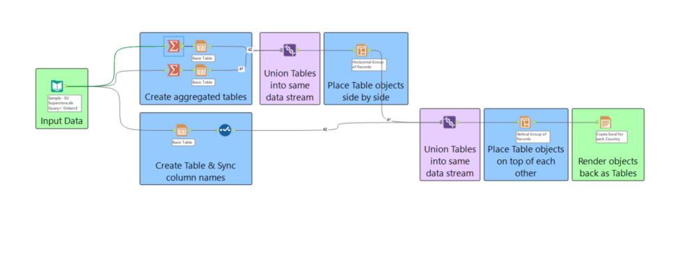
And just like that, you are able to output multiple tables into multiple sheets within an excel workbook. This technique will also work for PDF's, putting each set of charts on a page, however a little more care needs to go into the aesthetics of PDF's than Excel workbooks. If you want to change the look and feel of the tables we've created here you may want to use Ben Moss's technique to bring in VBA Macros to you're Alteryx workflow here.
Thanks for reading, and If you'd like to reach out for any questions feel free to reach out in the comments below.
