

29 July 2013
Waterfall charts are simple to construct in Tableau, and I'm not going to go over the whole process in this post. If you want to know how to make one (Running Total Sum Gantt with negative Sum on Size), then watch this video from Tableau.However, there are two things from the video that I want to pick up on and go into a little bit further. Colours and Labels.
Colours
When adding colours to a waterfall chart, you have a few options. The first one is whether the colour is a continuous scheme based on the value of the bars, or whether it is one colour for a positive value and another for a negative value. Generally colouring based on the value of the bars is not used, as you can't then add a Grand Total, so we will look at a couple of ways of adding a 2-tone colour scheme to the chart.Calculated Field
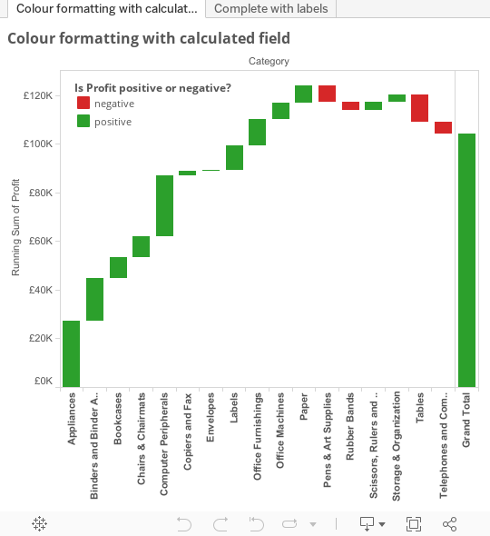
The question here is simple - is the sum of the value greater or less than zero? Using the same field as the Tableau video (Profit) gives us something like:IIF(SUM([Profit])>=0, 'positive', 'negative')This is added to the colour shelf and gives us a 2-tone effect
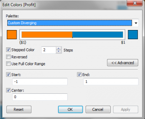
2-step colour legend
The principle here is to limit the colours from the SUM([Profit]) field to 2 colours, 1 for positive and the other for negative. This works very well, and gives just the 2 colours required. However, if you had this chart and had no negative numbers (for instance), then the chart changes to have 2-tone colours for the positive numbers. This occurs even if you press 'Advanced' and fix the centre at 0. The solution is to additionally fix the high and low values, with my personal best options being +1 and -1.
Labels
The next step is to take a look at the labels on the Waterfall chart. 2 options I'll mention here are to either have the labels at the above or in the middle of the bars. However, if the bars are small, having the labels in the middle can make them unreadable, and having labels above all the bars can be confusing when you have a couple of similar length bars, one positive and one negative. Which is up and which is down - it's not so clear.One answer I've seen to address the clarity issue is to add an icon for up and one for down. This works fine, but can suffer from the same issue as labels in the middle or the bars - when the bar gets small, they don't work so well.My suggestion for labelling bars is to have a label above, if the bar is positive, but one below if the bar is negative. This can be done by using 2 calculated fields.Field 1IF SUM([Profit]) >= 0 THEN SUM([Profit]) END (note that the missing ELSE part is the same as saying 'ELSE null')Field 2IF SUM([Profit]) < 0 THEN SUM([Profit]) ENDAdding these to the view gives a much clearer idea of the flow of the data.To add you will need to use a dual axis chart of the same basic view with synchronised axis. Add field 1 to the label of the primary axis, with an Alignment of 'Top' and field 2 to the label of the secondary axis with an Alignment of 'Bottom'.Personally, this adds an extra level of clarity to a Waterfall chart.I've put the completed file up on Tableau Public so see what you think for yourself