31 August 2018

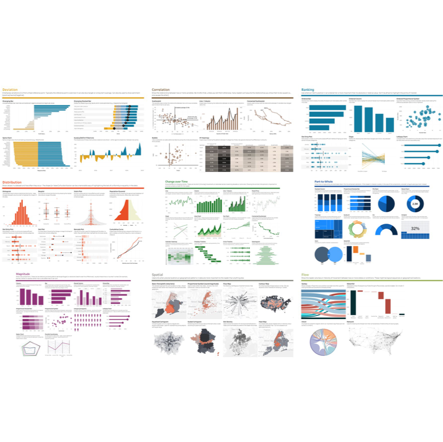
As the Head Coach of The Data School, I need to be on top of all things Tableau so that I can pass that knowledge onto our trainees. What I really hope they pick up is my method for learning and my constant to desire to get better at my craft. When they graduate from The Data School, they're clearly some of the best Alteryx and Tableau users in the World. While that's fantastic, unless they have an approach to problem solving, a thirst for learning, and a passion for sharing, I have failed as their coach, teacher, and mentor. Tableau version of the FT Visual Vocabulary[/caption]
WHAT IS THE VISUAL VOCABULARY?
From the Financial Times Github page, the Visual Vocabulary is:A poster and web site to assist designers and journalists to select the optimal symbology for data visualisations, by the Financial Times Visual Journalism Team.The FT Visual Vocabulary is at the core of a newsroom-wide training session aimed at improving chart literacy. This learning resource is inspired by the Graphic Continuum by Jon Schwabish and Severino Ribecca. This is not an attempt to teach everyone how to make charts, but how to recognise the opportunities to use them effectively alongside words.I had the honour of giving a talk to them right after I released my Tableau version and it was interesting to hear WHY they created it. They needed a way for their journalism and graphics teams to quickly pick a chart that works, plug in the data, and off they go. I even got a live demo, which was fascinating to watch. Thank you to Alan Smith and his team for inviting me over and for making me feel so welcome. Honestly, I never thought I'd get to meet Alan; he's like a god in the data viz space.
WHY DID I CREATE A TABLEAU VERSION?
As I previously mentioned, I am constantly looking for learning opportunities. I hadn't built many of the charts in the Visual Vocabulary before, so I knew that I'd learn a lot. For example, I had never built these charts:- Violin plot
- Circle timeline
- Seismogram
- Sunburst chart
- Arc chart
- Venn diagram
- Scaled cartogram
- Sankey chart
- Chord diagram
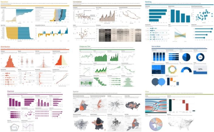
 Tableau version of the FT Visual Vocabulary[/caption]
THE VALUE OF SHARING
As a Tableau Zen Master, I take my responsibility to share with the community very seriously. Ever since I started blogging, I did it with three purposes in mind:- To document what I was learning
- To have a repository that I can refer to later
- To allow other to learn from what I've learned
