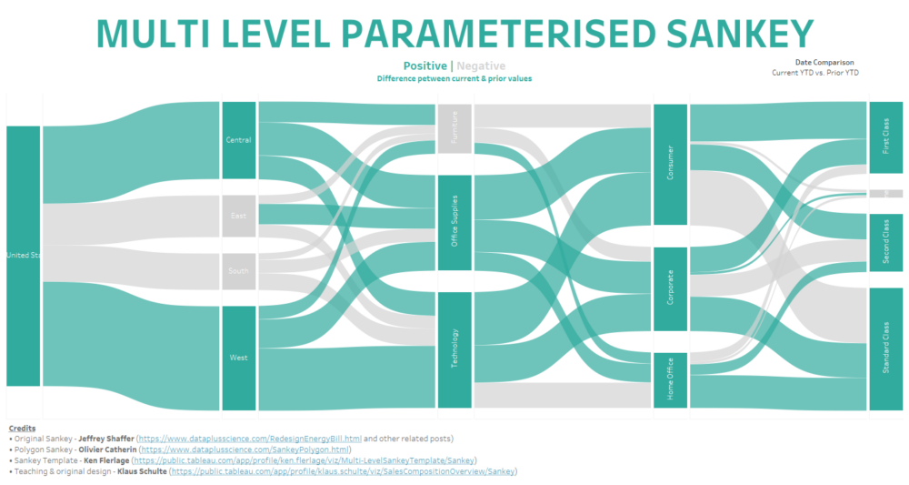
All credit for the following content should be directed towards Robert Rouse & Ken Flerlage, who created and made available the templates we are going to use, as well as Jeffrey Shaffer & Olivier Catherin who’s work provided the foundation for much of what has come since, and to Klaus Schulte who created this original content and who’s inspirational teaching made all this possible.
N.B. when using any templates please make sure to give attribution to the original creator of the template – it is soon going to become apparent just how much work and thought goes into creating these resources and it is only fair to give the credit that is so clearly due.
-----------------------------------------------------------------------------------
In my opinion two things are almost universally true of Sankey diagrams:
- They look really, really cool.
- They are intimidatingly complex to build from scratch.
As such there comes a point in every Tableau user’s journey at which they see their first Sankey chart and they think ‘Wow, I would love to make one of those’. However, this is often followed by the realization of just how complicated such a chart would be to build, and so for many (myself included) the Sankey dream is over almost as soon as it has begun.
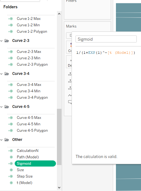
But it doesn’t have to be this way. This blog will serve as a guide to quickly and easily produce a Sankey diagram, as well as providing an introduction to using templates in Tableau more generally.
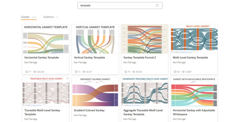
First of all we are going to need to open a fresh Tableau workbook, and for the purposes of this exercise we will connect to Sample Superstore. Then open an internet browser and navigate to Tableau Public (https://public.tableau.com/) and search for ‘templates’, the result should look something like this:
For now we are going to scroll down the page until we find a template called ‘Date Logic Template’ by Robert Rouse, and click on it (we will return for our Sankey Template later). This is an incredibly useful template that contains pre-written logic for many common date comparisons, and in our case is going to make our Sankey interactive by letting us choose which type of date comparison we wish to see using a parameter. Download the workbook and open it in Tableau.
We are going to copy 2 sheets from this template workbook into our blank superstore workbook. First, navigate to the second dashboard in the workbook (‘Date Range Options’), then navigate to and unhide the date label sheet (below).
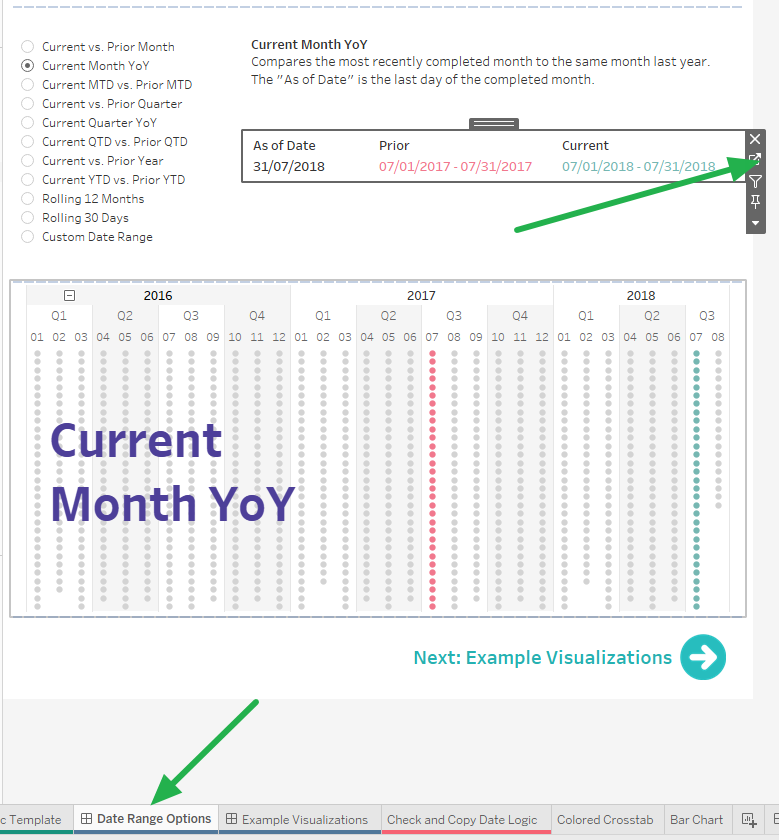
The second sheet we are interested in is called Bar Chart and is already visible. Ctrl + Click/ Cmd + Click to select both sheets at once, then copy and paste them into our blank workbook. In the process the data source from Robert’s template will also be copied across and should look something like this:
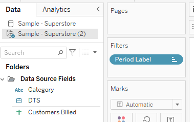
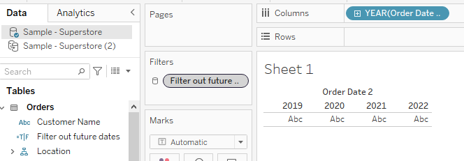
At this point we need to perform a somewhat variable step, in order for our date comparisons to work correctly we need to ensure that our data source contains order dates up to & including the current year. At the time of writing this it is 2022, however the superstore dataset only contains values up to 2021 so the following bullet points are designed to create some 2022 dates. If you are reading this in the distant future then you may need to adjust these steps accordingly, or even skip them entirely, but you need to ensure you have order dates up to the year that you are currently in.
- Take a blank sheet and make sure you are connected to our original data source.
- Create a calculated field ‘Order Date 2’ which should contain the following calculation:
- DATE(DATEADD(‘year’,1,[Order Date]))
- Create a second calculation called ‘Filter out future values’:
- [Order Date 2]<TODAY()
- Drop this calculation onto filters & select true. Then ensure that this filter applies to all worksheets & add it to context in anticipation of using some LODs.
With that out of the way we will now replace our data source. Navigate to the data menu in the top left of the screen and select ‘Replace Data Source’. In this case our ‘Current’ should be Sample - Superstore (2) whilst our ‘Replacement’ should be Sample - Superstore, then press OK. This will immediately produce a lot of broken fields, but we will fix them so don’t worry. You can now right click on & close the unused data source (Sample - Superstore (2)) as we no longer need it.
In order to fix all the broken fields we are going to identify the fields that are coming from the data source (not calculated fields!) as if we fix them all the subsequent calculations will be fixed in turn.
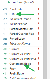
Right click first on ‘DTS’, then select replace references & replace it with Order Date 2 – this will fix all of our date fields. Then do the same process replacing the broken ‘Customers Billed’ field with ‘Sales’, and you should find that all of our broken fields are now fixed.
Navigate to the Date Range Labels sheet and show the Date Comparison parameter. You should see that the different parameter selections are working correctly.
The final adjustments we need to make before bringing in our Sankey Template involve altering the aggregation of some of our calculations. These steps are necessary due to the fact that Robert’s template builds in aggregations that will not be suitable for the unaggregated row-level data that the Sankey Template we are about to use reads in – so we need to make some adjustments in order for it to work. The necessary adjustments are as follows:
- Open ‘Current’ and remove the Sum aggregation.
- Open ‘Prior’ and remove the Sum aggregation.
- Open ‘Current vs Prior’ and add a Sum aggregation for ‘Current’ and another for ‘Prior’ within this calculation.
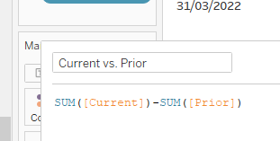
- Finally, adjust ‘Current vs Prior (%)’ to be [Current vs. Prior]/ABS(SUM([Prior]))

And with that we are ready to bring in our Sankey Template!
Return to Tableau Public and once again search for ‘template’. This time we are interested in Ken Flerlage’s ‘Multi-Level Sankey Template’. Download it and open it in Tableau.
Next open file explorer/finder and navigate to downloads (or wherever you saved the Sankey template). The file name is Multi-Level Sankey Template.twbx with the .twbx extension indicating that this is a packaged workbook – a zip file in which we will be able to find the data source as well as the .twb workbook file that creates the workbook. If you are on a Mac then rename the .twbx extension to .zip and unpack it, if you are on a PC then simply right click on the .twbx file and unzip it. You should now be able to navigate into the resultant folders to the location Multi-Level Sankey
Template/Data/Datasources where you should find a .hyper file.

Return to Ken’s Sankey diagram workbook, right click on the dashboard’s tab at the bottom of the screen and then copy & paste it into our workbook in the same way we did earlier. Once again, by doing this we copy Ken’s data source across as well. Within this source you can see an intimidating number of complicated calculations that build out the Sankey – a visual reminder of just how much work we are saving ourselves and just how much we owe to the creators of these templates.
With our sample superstore source selected, navigate to the data pane. Then add a connection to the hyper file we unearthed from the zip file earlier. Drag this into our relationship model (connecting to Orders) using a relationship calculation of 1=1. And just like that our data is connected to the Sankey template.
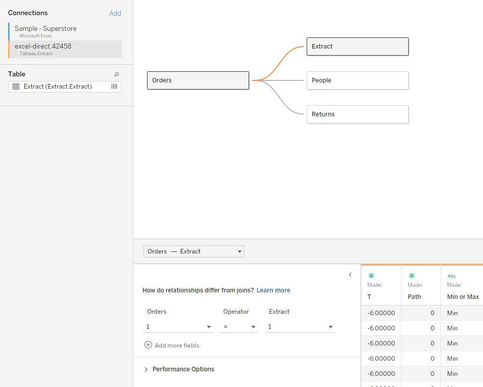
Once again we now want to replace our data sources. So navigate to Data>Replace Data Source. This time our ‘Current’ is Sankey whilst our ‘Replacement’ is Sample Superstore. This will break many fields but by now we know not to worry, it is all under control.
Once again search for fields coming from the data source and replace the references as follows:
- Path (Model) > Path
- t (Model) > T
Then close the connection to the Sankey source as we no longer need it.
We can now customize our Sankey diagram by replacing references to fields that are currently in the Sankey diagram with whichever fields we want to be there instead. For the sake of this exercise I will specify some replacements to make – but depending on what you wanted to show in your Sankey this is the point at which you could make your own selections.
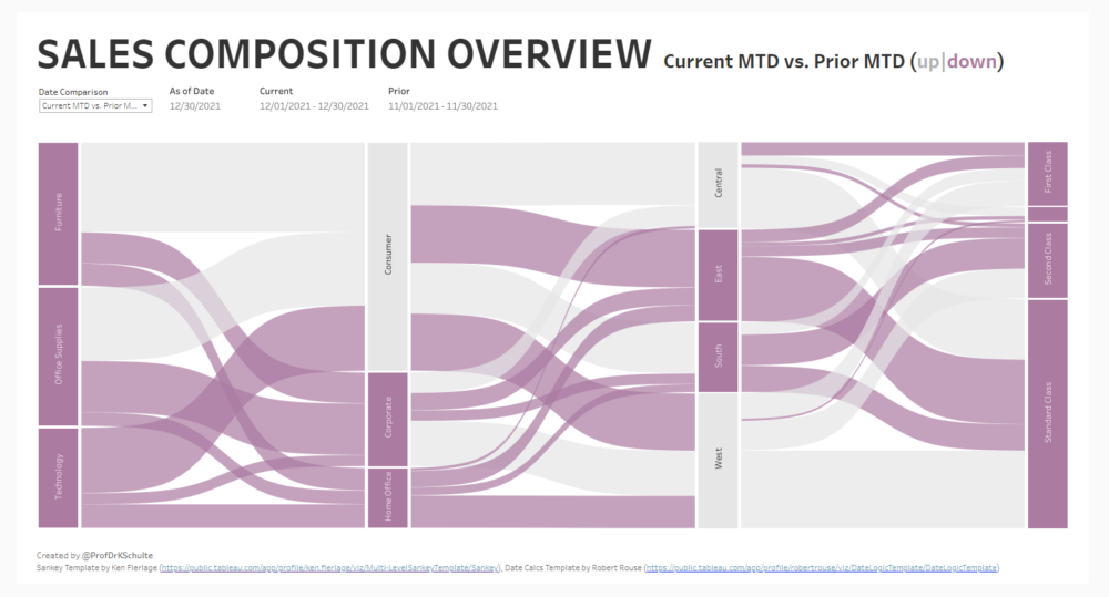
In order to replicate Klaus’ workbook replace the fields as follows:
- Step 1 -> Country/Region
- Step 2 -> Region
- Step 3 -> Category
- Step 4 -> Segment
- Step 5 -> Ship Mode
- Size -> Current
Now return to the dashboard and you should see your Sankey diagram come together before your eyes! Bring in the date comparison parameter and you should find that changing the parameter value will update your Sankey!
Finally, we will use a Boolean colour calculation to highlight positive or negative differences between our current & prior values. The calculation should be as follows: [Current vs. Prior]>0. Add this to the colour marks card of any sheet that you would like to colour accordingly, and all that remains is to choose a colour scheme.
