31 March 2016
This is part 4 of a joint series with Chris Toomey. In case you missed it you should catch up by reading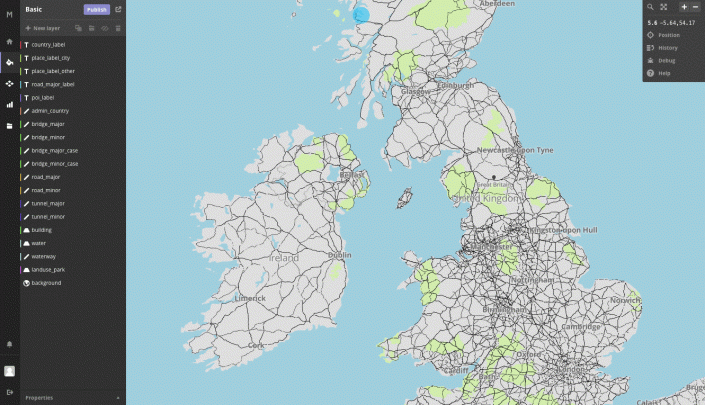
 or by going here https://www.mapbox.com/studio/styles/fonts/If however you don't find what you're looking for ask your marketing team to send you the corporate font in either TrueType (TTF) or OpenType (OTF) format. Then simply upload it using the same page. You can also do this via the font selector in the style editor.Once your font's in place, simply select it from the text properties of the layer in question. In this example let's change the font of the city labels to something a bit more fun:
 As you were changing the font you may have noticed there's more than one listed. Why and which should you change?
 The reason for multiple fonts is most fonts don't include all the characters needed to cover all languages. So Mapbox will try and use the first font, in this case 'Brokenscript OT Bold' as much as possible. For characters though that aren't covered it'll fallback to 'Arial Unicode MS Bold'.To see which languages your fonts cover click the 'Language Coverage' tab. If your corporate font doesn't cover a lot other than say English you might want to point this out to the marketing team.
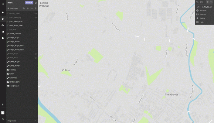
 As an example of using one of these let's take a look at our map again and add mark the location of hospitals with a classic '+' sign. We'll create a symbol layer from scratch containing points of interest, filter the data down to points with type = Hospital, assign the icon and then adjust the label so there's no overlap.
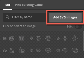
 What about your own icons I hear you ask? Once again, ask marketing to send them over, this time in SVG format. When you come to select the icon, instead of choosing from the Maki set simply click 'Add SVG Images'. Your custom icon will be added to the list.
 Note there's also an edit switch you can use to remove icons from the set (including the Maki) if you'd like something more manageable.
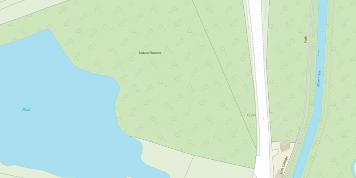 You can see the repeating pattern of trees as well as the colour green. This is a key requirement for the map as it needs to adhere to a consistent key which spans both online and printed content. An Ordnance Survey must always look like an OS map (if you know what I mean).As far as Mapbox is concerned it's all in the SVG. You need to create a small square which will nicely repeat and save it as an SVG.I'm going to make a 'version' of the OS trees with this image:
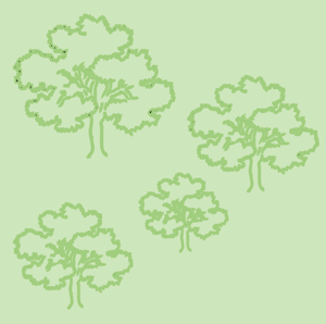 Here we go:
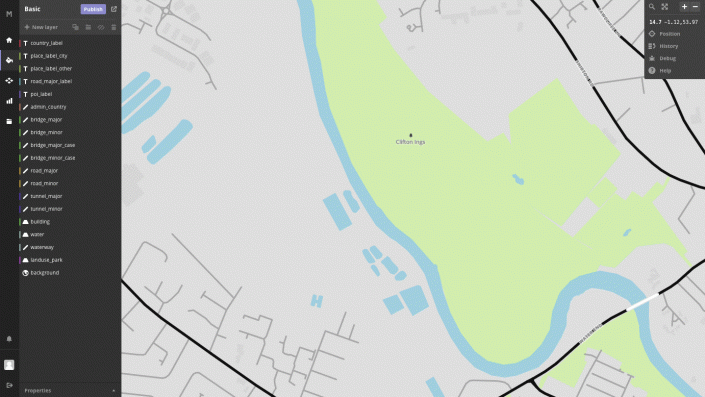
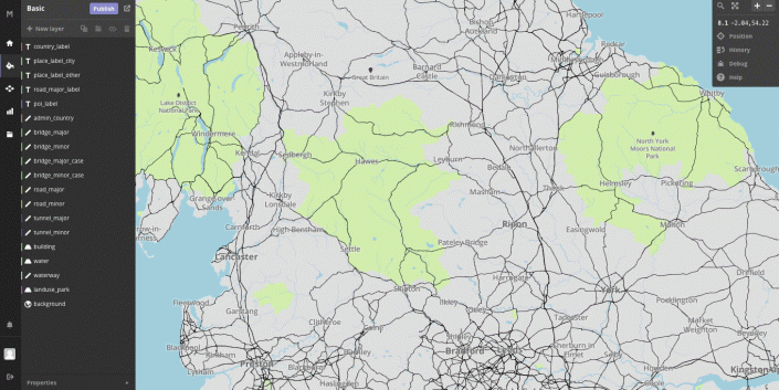 So that's it for now. Next up from Chris Toomey is the final part bringing it all together in Tableau.Have fun!
- Part 1 – How Tableau and Mapbox Work Together
- Part 2 – Styling Mapbox Maps
- Part 3 - Bring Your Own Data
'erm, that's not the corporate font is it?''Sorry I can't let you publish it to prod, those aren't the approved colours''We've just paid a lot of money for some new iconography, could you make use of it please!'Sound familiar?Well here's the info you need so you don't have to sweat it when the inevitable happens.
Thinking like an artist
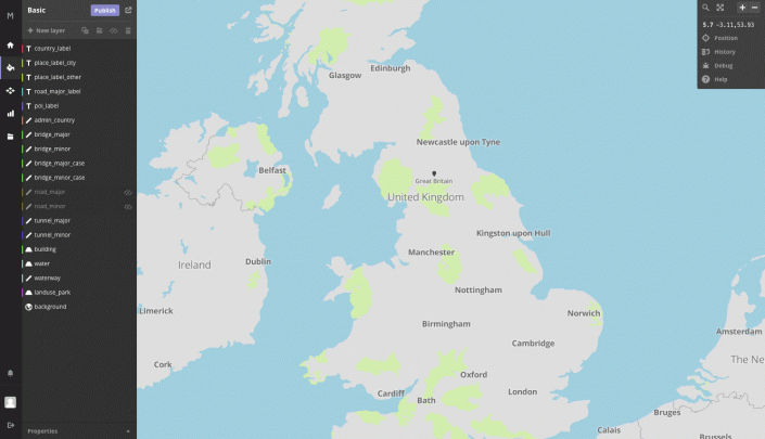
Ever heard of the Painter's Algorithm? No neither had I until Chris Toomey point me to it. Essentially it's all about thinking ahead when it comes to drawing scenes that have depth (3D) on a flat canvas (2D). You start with the thing that's furthest away, then layer on top of it with something closer, then on top again and again until you have your finished scene.Why does this apply to Tableau? Well it's exactly how Tableau layers the map up when it renders those default, out-of-the-box maps we love so much. First comes the base layer (for Tableau that means land and ocean), then country borders followed by country names, state borders, state names, roads & highways, and so on. Each one is layered on top of each other with the author able to enable or disable each, making the map as simple or complex as they require.So why should you care about this? Can't you do it all in Mapbox? Well yes you can, although be aware that Mapbox has layering too...you've seen that in action when looking at their default maps as well as adding custom data in part 3. However! IF you're going to take the time to create a custom 'corporate approved' map you should make it as flexible as possible. Then others can reuse it and disable elements they don't want, or you can easily drop in an extra element you do want.Sounds great! How do I go about layering my map? Well at first don't worry about it (we'll address layering in Tableau in part 5 of this series), you can just go with a Mapbox template and edit it as is. If you do decide to add a layer though take care when positioning it within the layer stack. Layers at the top of the list will be in the foreground of the map, layers at the bottom will be in the background.Here we add a new admin boundary layer, then move it below the water layer making it vanish, then move it back above.
Adhering to Marketing's Rulebook
The corporate look & feel probably includes a little more than just colours (which we've discussed changing in parts 2 and 3). It can include more complex things such as fonts, icons and patterns. Can we really change those? Sure we can!Fonts
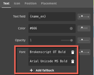
There's a whole bunch of font families (versions of each font) included with Mapbox Studio, you can find them all by clicking the 'Fonts' tab on the Styles page, or by going here https://www.mapbox.com/studio/styles/fonts/If however you don't find what you're looking for ask your marketing team to send you the corporate font in either TrueType (TTF) or OpenType (OTF) format. Then simply upload it using the same page. You can also do this via the font selector in the style editor.Once your font's in place, simply select it from the text properties of the layer in question. In this example let's change the font of the city labels to something a bit more fun:
 As you were changing the font you may have noticed there's more than one listed. Why and which should you change?
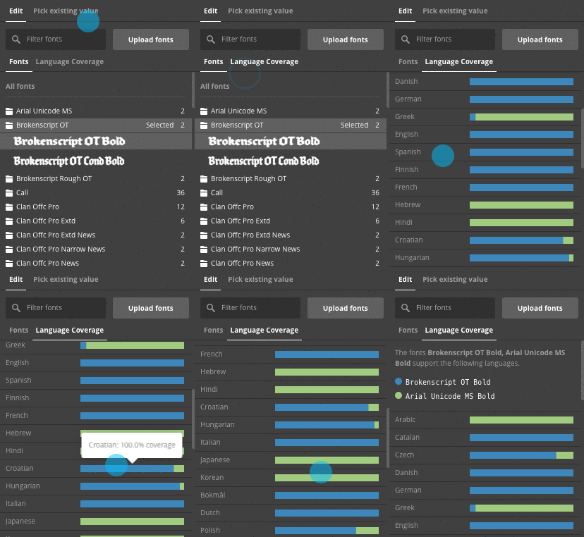
 The reason for multiple fonts is most fonts don't include all the characters needed to cover all languages. So Mapbox will try and use the first font, in this case 'Brokenscript OT Bold' as much as possible. For characters though that aren't covered it'll fallback to 'Arial Unicode MS Bold'.To see which languages your fonts cover click the 'Language Coverage' tab. If your corporate font doesn't cover a lot other than say English you might want to point this out to the marketing team.
Icons
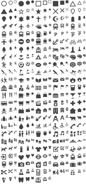
If you want to show the position of a place you'll probably want a nice icon to mark the spot. Again out of the box Mapbox have a bunch of icons they've created specifically for their maps which are free to use, known as Maki.At the time of writing this post Maki v2.o are about to be released, here's what's available with Maki today: What about your own icons I hear you ask? Once again, ask marketing to send them over, this time in SVG format. When you come to select the icon, instead of choosing from the Maki set simply click 'Add SVG Images'. Your custom icon will be added to the list.
Patterns
The requirement for patterns is less likely, although if it is needed it's usually a key requirement. For instance if you're reading this from the World Health Organisation, Ordnance Survey or the UN you've probably got some strict requirements on how areas are filled, and sometimes a flat colour just doesn't cut it.For the rest of us what are we talking about here? Well its all about a repeating pattern to show an area of land or water. For example here's a nature reserve from Ordnance Survey: You can see the repeating pattern of trees as well as the colour green. This is a key requirement for the map as it needs to adhere to a consistent key which spans both online and printed content. An Ordnance Survey must always look like an OS map (if you know what I mean).As far as Mapbox is concerned it's all in the SVG. You need to create a small square which will nicely repeat and save it as an SVG.I'm going to make a 'version' of the OS trees with this image:
 Here we go:
Go Global
Now as you become a master of your map you may feel a little frustrated having to bounce between loads of different layers to change each area of green to be a little darker. Don't forget about the properties box in the bottom right of the screen.The properties box gives you quick access to all formatting options across your entire map and where a colour is shared you can change all versions of it in one single click! This applies to colours, numbers, images (icons), fonts and text fields! So that's it for now. Next up from Chris Toomey is the final part bringing it all together in Tableau.Have fun!