16 February 2016
This is part 2 of a joint series with Chris Toomey. In case you missed it you should definitely read Ultimate Mapping Guide Part 1 - How Tableau and Mapbox Work Together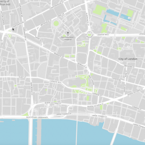
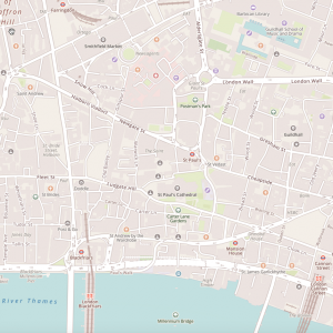 Each of these styles show off the amount and detail of data Mapbox maps have. If you want to add as much detail as possible to your maps you can't go wrong with these. In a recent project 'Rain, Destruction and a Modern Mapping Stack' I made use of the Emerald template as a starting point primarily due to its emphasis on the road network and inclusion of topological shading, both clearly important for providing context to flooding data.
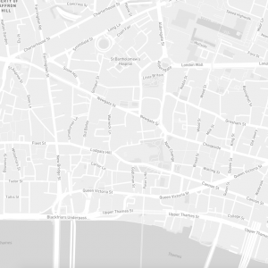 Subtlety is everything...but you still want all the detail to be there. That's what Mapbox's light style manages to achieve. It's perfect for data viz as the map vanishes when you want it to but has all the context your audience may crave. Essentially if you want to Tableau's grey background map but just a bit better...see the light.
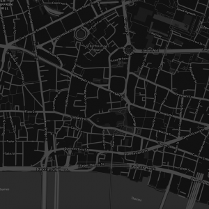 Another one that's great for data viz is the dark template. Whether you love white data points on a black background, or want to convey a dark subject (for instance Andy Kriebel's mass shootings dashboard [link to]) dark is the right one for you.
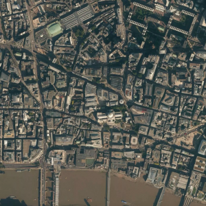 Sometimes the best context you can provide your viewers is a picture of the actual place you're mapping. Mapbox has you covered with worldwide satellite mapping right out of the box. Mapbox gets its satellite mapping (depending on the zoom level) from NASA/USGS Landsat and Digital Globe as well as some other public sources. While the coverage is good you may find that some areas have lower resolution imagery due to low demand or adverse weather (clouds) the last time a survey was attempted. Rule of thumb as always is if you're mapping a population centre you'll be fine, if your area of interest has a lot of green space you probably won't be able to see the boundary of your garden gate.
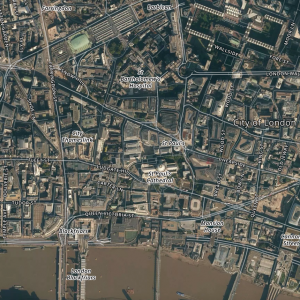 And finally for those of you who just want it all, data mashed together with photography you can have it with Satellite Streets.
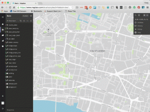 Make the change. Repeat.If you want to do a replacement of a colour, regardless of what's using it, take a look a the properties menu.
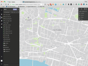 Unlimited undo, if you make a change you're not happy with just go back...each step is recorded.
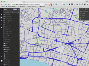 You'll notice that some styles have multiple colours associated with them with a zoom value against each. This is known as 'ramping' and is the feature that allows you to modify how things look (or even if they're shown) based on the zoom level of the map.
 Once you've got everything just how you want it publish the style and admire your work!
Why Mapbox?
I love both how easy Tableau make what was once a specialist skill, mapping data, and how much people love to engage with maps. I've encouraged people to include maps where possible on their dashboards (yes Matt Francis I can hear you shouting already) because instinctively the end-user, no matter what language they speak or understanding of BI they have, will want to interact with the map. More often than not they'll click where they live...just because.About 2.5 years ago I was getting a lot of questions about mapping in Tableau. Mapping one level of data was great, mapping two with a dual axis was awesome, but people wanted more. Users wanted to map more data, wanted to add regional boundary lines, wanted to highlight areas of the map that was important to them, ultimately wanted to add more context to the story they were trying to tell. The trouble is dual axis mapping can only take you so far and as it's rendering everything on the fly has a detrimental effect on performance.In steps Mapbox. It wasn't my first solution, I tried my own custom WMS server, I tried creating my own map tiles with MapProxy, but it was so difficult! Not Tableau at all (if you're still not sure what Mapbox is all about know this, Mapbox does to mapping what Tableau does to data). What was so difficult? Well to map the world you need to process about 500GB of data. To do it on the fly takes a powerful machine. Then you need to style everything, and I mean EVERYTHING. Every geographic feature, road type, label. And even worse each style has to work with no zoom (whole world), or full zoom (street level). Mapbox makes all this super easy.Out of the mapBox
The first way Mapbox make it easy is to give you some beautiful 'standard' or template maps. Think of these and Tableau's Show Me! as in they're a great starting point to your mapping journey. Let's take a closer look at each of these:Basic/Bright/Streets/Emerald


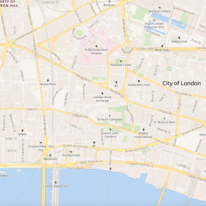
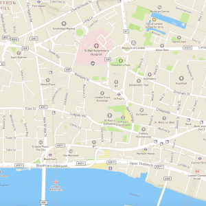
 Each of these styles show off the amount and detail of data Mapbox maps have. If you want to add as much detail as possible to your maps you can't go wrong with these. In a recent project 'Rain, Destruction and a Modern Mapping Stack' I made use of the Emerald template as a starting point primarily due to its emphasis on the road network and inclusion of topological shading, both clearly important for providing context to flooding data.
Light
 Subtlety is everything...but you still want all the detail to be there. That's what Mapbox's light style manages to achieve. It's perfect for data viz as the map vanishes when you want it to but has all the context your audience may crave. Essentially if you want to Tableau's grey background map but just a bit better...see the light.
Dark
 Another one that's great for data viz is the dark template. Whether you love white data points on a black background, or want to convey a dark subject (for instance Andy Kriebel's mass shootings dashboard [link to]) dark is the right one for you.
Satellite
 Sometimes the best context you can provide your viewers is a picture of the actual place you're mapping. Mapbox has you covered with worldwide satellite mapping right out of the box. Mapbox gets its satellite mapping (depending on the zoom level) from NASA/USGS Landsat and Digital Globe as well as some other public sources. While the coverage is good you may find that some areas have lower resolution imagery due to low demand or adverse weather (clouds) the last time a survey was attempted. Rule of thumb as always is if you're mapping a population centre you'll be fine, if your area of interest has a lot of green space you probably won't be able to see the boundary of your garden gate.
Satellite Streets
 And finally for those of you who just want it all, data mashed together with photography you can have it with Satellite Streets.
Making it your own
Don't forget that while these styles could be exactly what you're looking for, they're also just templates. Starting points on your journey to the perfect map. You could even, if you're brave, start with a blank slate and just make use of Mapbox's streets data to style your own map from scratch. Just like in Tableau the choice is yours.Streets of data
So what is this 'streets' data I keep referencing? Well remember that 500GB if data I referred to at the beginning of the post? It's that, the data of the world. Only super fast, bang up to date thanks to openstreetmap contributions, and ready for styling just the way you want it.But what exactly is it? Well if you're not familiar with GIS data here's a little GIS 101 to bring you up to speed.Circles (aka Points)
These are areas of interest which can be represented by a single latitude, longitude coordinate. For instance your house could be a point, the centre of your nearby city, and so on. What's interesting if you think about points is there are very few real-life point locations. Your house has a footprint & a boundary area, it's not a single lat-lon. Your nearby city has a huge footprint and you can debate where the central point actually is. Really it's all a question of resolution which decides what area of land should be simplified to a single point location.Let's think about some of the ways we might style a point. First of all a point is usually represented as a small, round, filled circle, it doesn't have to be. It can be a square or a star or maybe an icon shaped like an office block. The shape or icon can of course be any colour and size. It can also have a label attached to it. Usually one point would only have one label, seems obvious but it's not the case with lines, so it's worth pointing out.Finally you can have a point which has no shape or icon at all and is instead just represented by a label. You've come across this before, although you've maybe never realised it, when you've turned on the 'Place Names' layer in Tableau's standard maps.Lines
The representation of multiple points which have a relationship with each other usually defined by the movement or flow of one to the next is done by a line. Therefore a line will be made up of many lat-lons, with an integer indicating of the join order. A key distinction between lines and polygons are lines don't often form a closed shape. Common examples of lines are roads, paths, motorways (highways), and so on.Lines are styled much as you'd expect in that they have colour, thickness, opacity and can be dashed.Polygons
Polygons are similar to lines in that they're made up of multiple lat-lon data points with an ordered value describing how to join the points. The key difference is polygons form a closed shape and represent not only the locations in the dataset (a boundary of lat-lons), but also the entire area enclosed by the boundary.In terms of styling therefore, polygons have fill colour, pattern and opacity.Styling
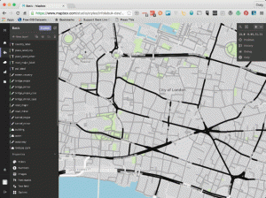
Let's take a look at styling these in Mapbox Studio. First thing, pick your template and have an explore. You're going to want to understand how the template has been setup and how the colours and features go together.Decide on what you'd like to change and give it a go, the map will update instantly. If you can see something you'd like to change but you're not sure what it is in the template. then just click on it. The tooltip will tell you the items close to where you've clicked, you can select what you'd like to change from there. Make the change. Repeat.If you want to do a replacement of a colour, regardless of what's using it, take a look a the properties menu.
 Unlimited undo, if you make a change you're not happy with just go back...each step is recorded.
 You'll notice that some styles have multiple colours associated with them with a zoom value against each. This is known as 'ramping' and is the feature that allows you to modify how things look (or even if they're shown) based on the zoom level of the map.
 Once you've got everything just how you want it publish the style and admire your work!