

16 December 2014
Introduction to treemapsBar charts are surely well know but let’s spend a few words on treemaps now. A treemap is a chart type that displays hierarchical or part-to-whole relationships via rectangles. In case of hierarchical (tree-structured) data these rectangles are nested. The space in the view is divided into rectangles that are sized and ordered by a measure. Nested rectangles mean that hierarchy levels in the data are expressed by larger rectangles (above in the hierarchy) containing smaller ones (below in the hierarchy).The rectangles in the treemap range in size from the top left corner of the chart to the bottom right corner, with the largest rectangle positioned in the top left corner and the smallest rectangle in the bottom right corner. In case of hierarchical data - when the rectangles are nested -, the same ordering of the lower level rectangles is repeated within each higher level rectangle in the treemap. So the size, and thus the position of a rectangle that contains other rectangles is determined by the sum of the areas of the contained rectangles.Let’s see now an example of a treemap showing part-to-whole relationships and a nested treemap from hierarchical data.(All the charts will be built on the 'Superstore data' provided with Tableau Desktop and will be using consistently the Sales measure for the sake of simpicity.)A) Simple, 'part-to-whole' treemap (1 dimension only, now Region) 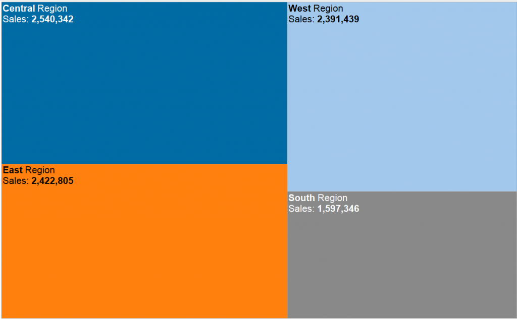 B) Nested treemap (more dimensions, now Region & Product Category)
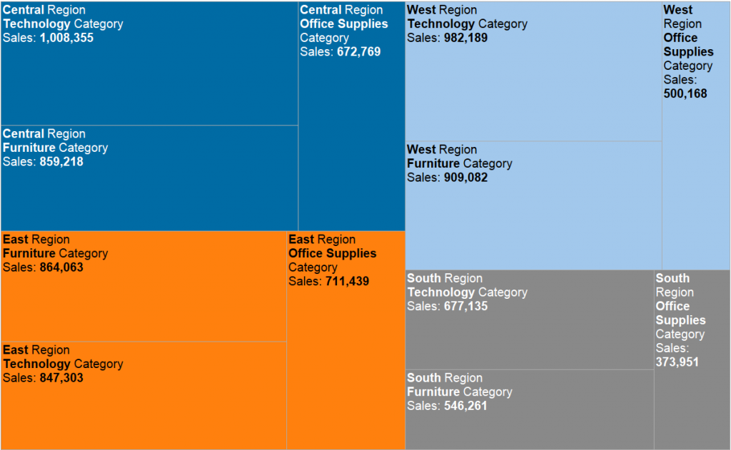 So much for now about the theory of treemaps, let’s see if they stand a chance compared to bar charts...Treemaps vs bar charts - what are the differences?
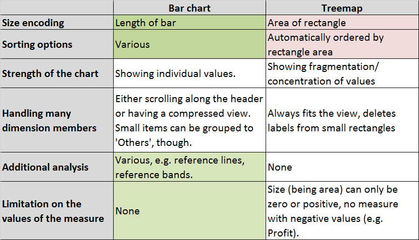 My green/red coloring stands for having an advantage/disadvantage. Although I did not color anything in terms of the ‘strength’ of the chart, bar charts can be further flavoured with a running total line on dual axis (moving towards a Pareto chart) that results in a slight edge over a treemap even in this case.Concluding the advantages of the bar chart, the next logical question is: can we always replace a treemap with an equivalent bar chart? Let’s try…A treemap is created from 1 or more dimensions, 1 or 2 measures.
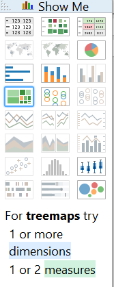 Let's see the basic variant, 1 dimension and 1 measure: Product Sub-Category and Sales.Treemap
  Bar chart
 The order of Product Sub-Categories is clearer in the bar chart and the differences between the individual values are also better displayed.I quit the case of 1 dimension and 2 measures as the second measure is used only for coloring the treemap. Also, later on the variants with an additional measure on color button are not discussed as the number of dimensions will be more important for us.Let's move on to including 2 dimensions and 1 measure in the view. We may also use the higher level dimension on color to visually group the marks.Treemap (hierarchy of dimensions)
 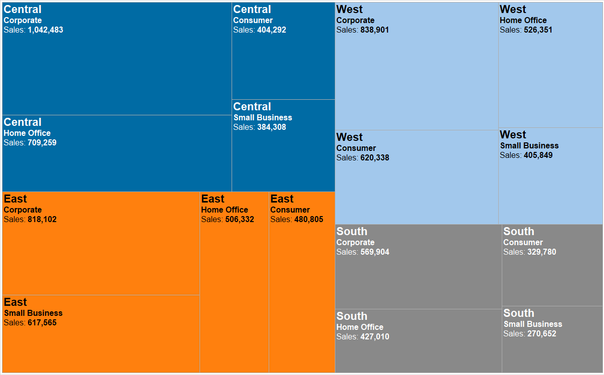 Bar chart (hierarchy of dimensions)
 Individual region-product category combinations are still more accurately shown on the bar chart. What the treemap does well is organizing the cells (region-product category combinations) by regions in a descending order. Still, can you tell if East or West is bigger in total if you do not know the second biggest region should appear below the first one and the third one on the right?There is another bar chart solution with 2 dimensions and 1 measure, namely a stacked bar.
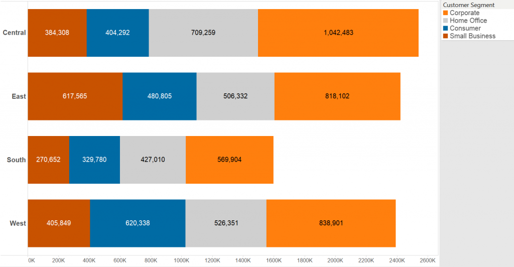 A similar view is produced by combining treemaps and bar chart to create a bar chart where each bar is a treemap itself.
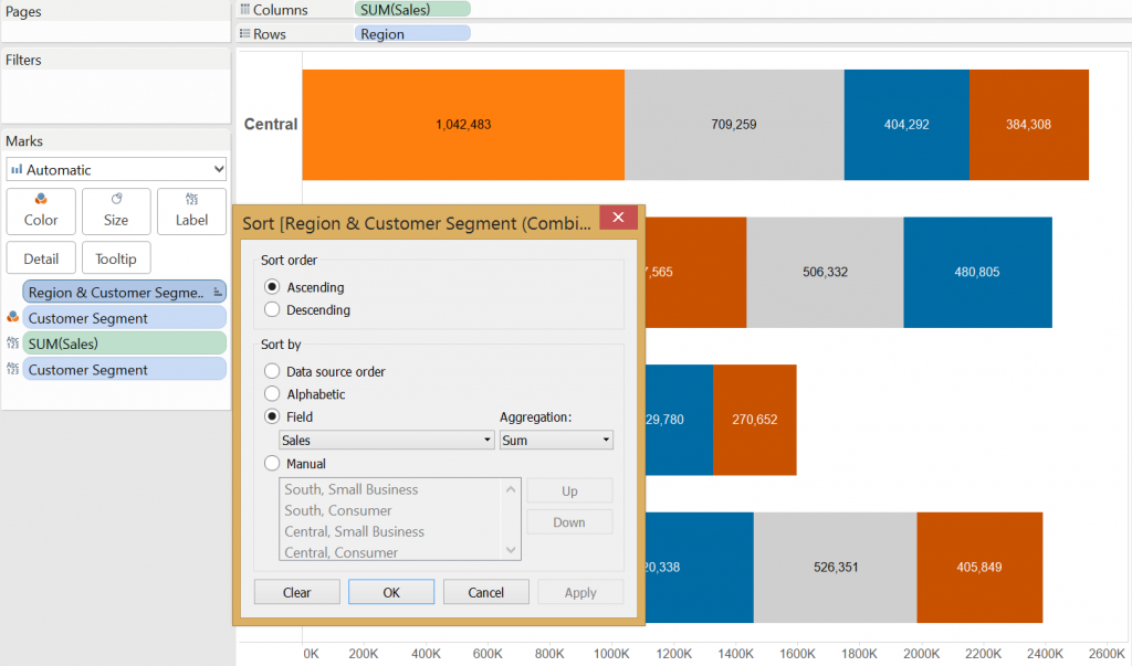
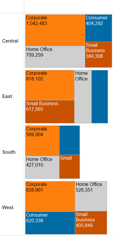 Notice that the length of the bars corresponds with the total value of Sales in the region, just like in the stacked bar chart.Does the treemap outperform the stacked bars? No. Bar sizes still translate the differences in sales clearer. Another aspect you may mention is that dimension members are automatically ordered on treemaps, while it is not straightforward to solve this on a stacked bar chart but can be simply reached.Just create a combined field of the dimensions (in our case Region & Customer Segment), then drag the new, combined field to Level of Detail, above the dimension (now Customer segment) of color and finally sort that combined field by SUM(Sales).
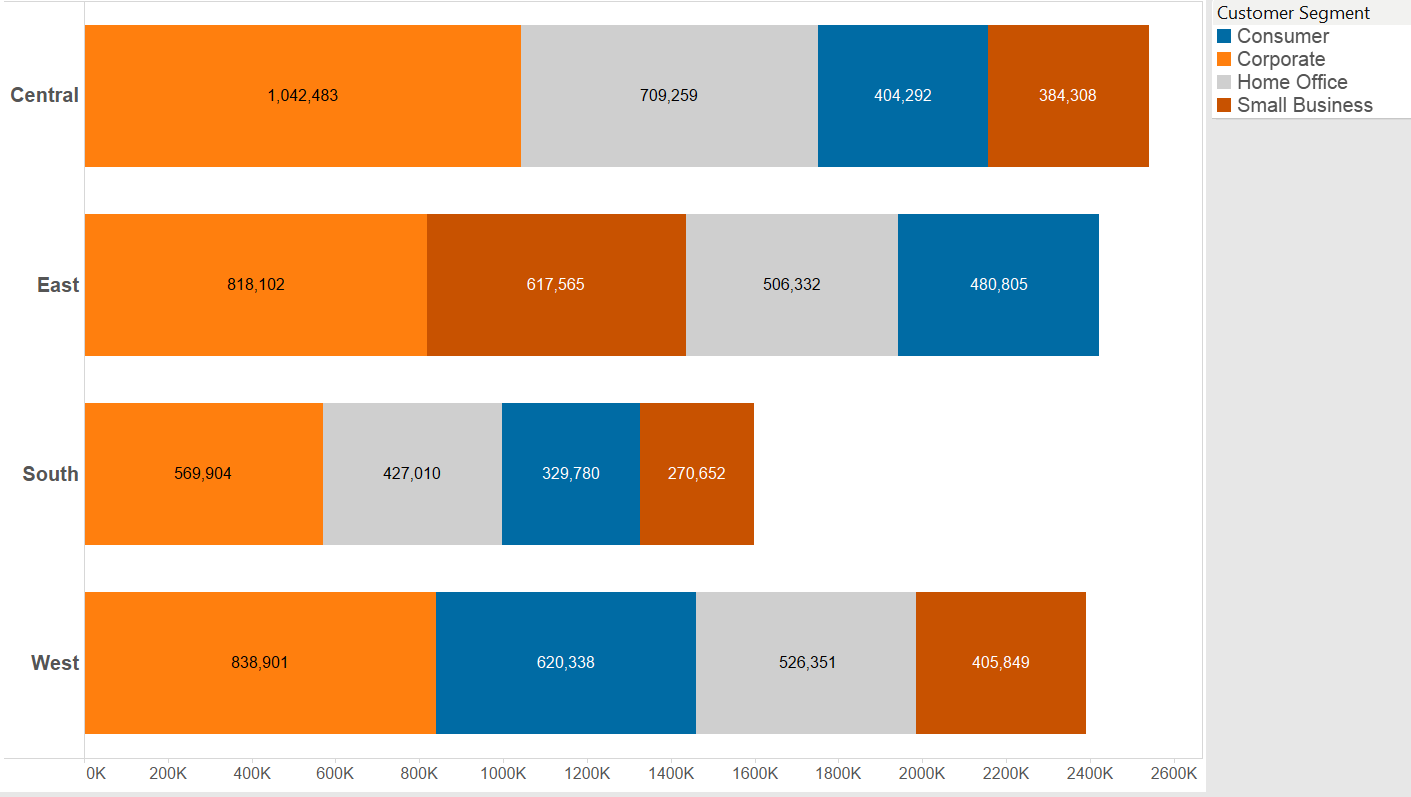
 So far all cases of a treemap could be reproduced with a bar chart that proved to be more effective. When is a treemap superior to a bar chart?What if we are dealing with a very large number of dimension members?Treemap (large number of items)
  Bar chart (large number of items)
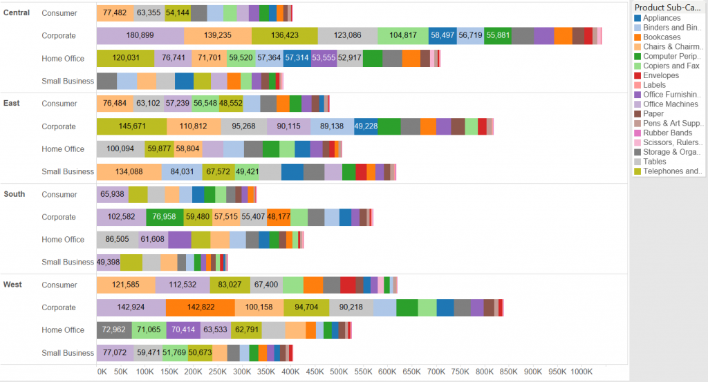 To be honest none of these look appropriate, although the tree map groups the items well using color and labels are visible in larger rectangles. This many data points are rather visualized in a text table if looking up the individual values is important.The last resort for the treemap is that due to the rectangular shapes it may be more user friendly on mobile. Yet if a reasonable number of marks are involved, there is no reason why a bar chart would not do the job.All in all the treemap may be the new pie chart. It looks fancy and the software capabilites are luring us to go for it - it is so simple to create. Please consider the good old bar chart first.
 B) Nested treemap (more dimensions, now Region & Product Category)
 So much for now about the theory of treemaps, let’s see if they stand a chance compared to bar charts...Treemaps vs bar charts - what are the differences?My green/red coloring stands for having an advantage/disadvantage. Although I did not color anything in terms of the ‘strength’ of the chart, bar charts can be further flavoured with a running total line on dual axis (moving towards a Pareto chart) that results in a slight edge over a treemap even in this case.Concluding the advantages of the bar chart, the next logical question is: can we always replace a treemap with an equivalent bar chart? Let’s try…A treemap is created from 1 or more dimensions, 1 or 2 measures.Let's see the basic variant, 1 dimension and 1 measure: Product Sub-Category and Sales.Treemap
 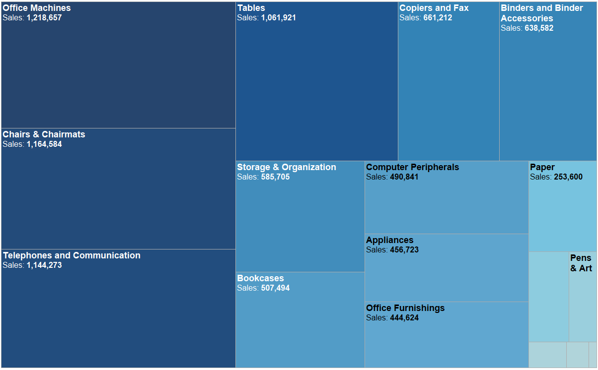 Bar chart
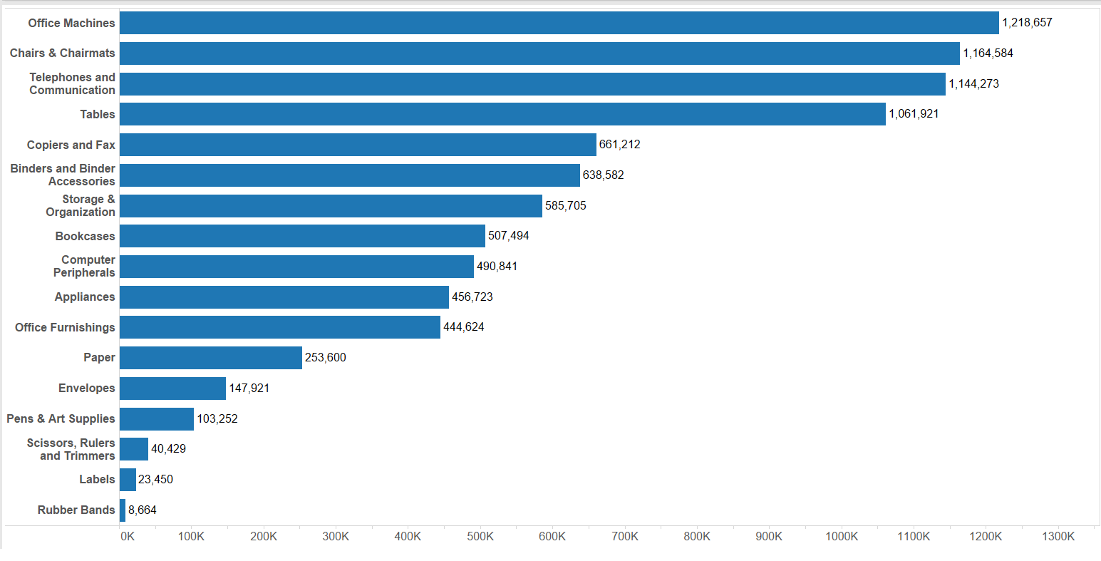 The order of Product Sub-Categories is clearer in the bar chart and the differences between the individual values are also better displayed.I quit the case of 1 dimension and 2 measures as the second measure is used only for coloring the treemap. Also, later on the variants with an additional measure on color button are not discussed as the number of dimensions will be more important for us.Let's move on to including 2 dimensions and 1 measure in the view. We may also use the higher level dimension on color to visually group the marks.Treemap (hierarchy of dimensions) Bar chart (hierarchy of dimensions)
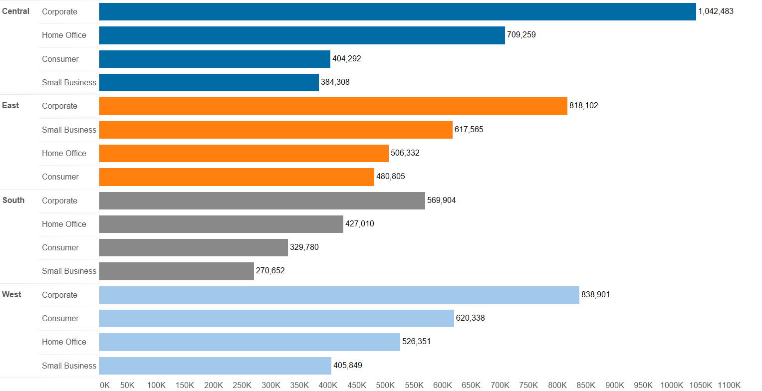 Individual region-product category combinations are still more accurately shown on the bar chart. What the treemap does well is organizing the cells (region-product category combinations) by regions in a descending order. Still, can you tell if East or West is bigger in total if you do not know the second biggest region should appear below the first one and the third one on the right?There is another bar chart solution with 2 dimensions and 1 measure, namely a stacked bar.
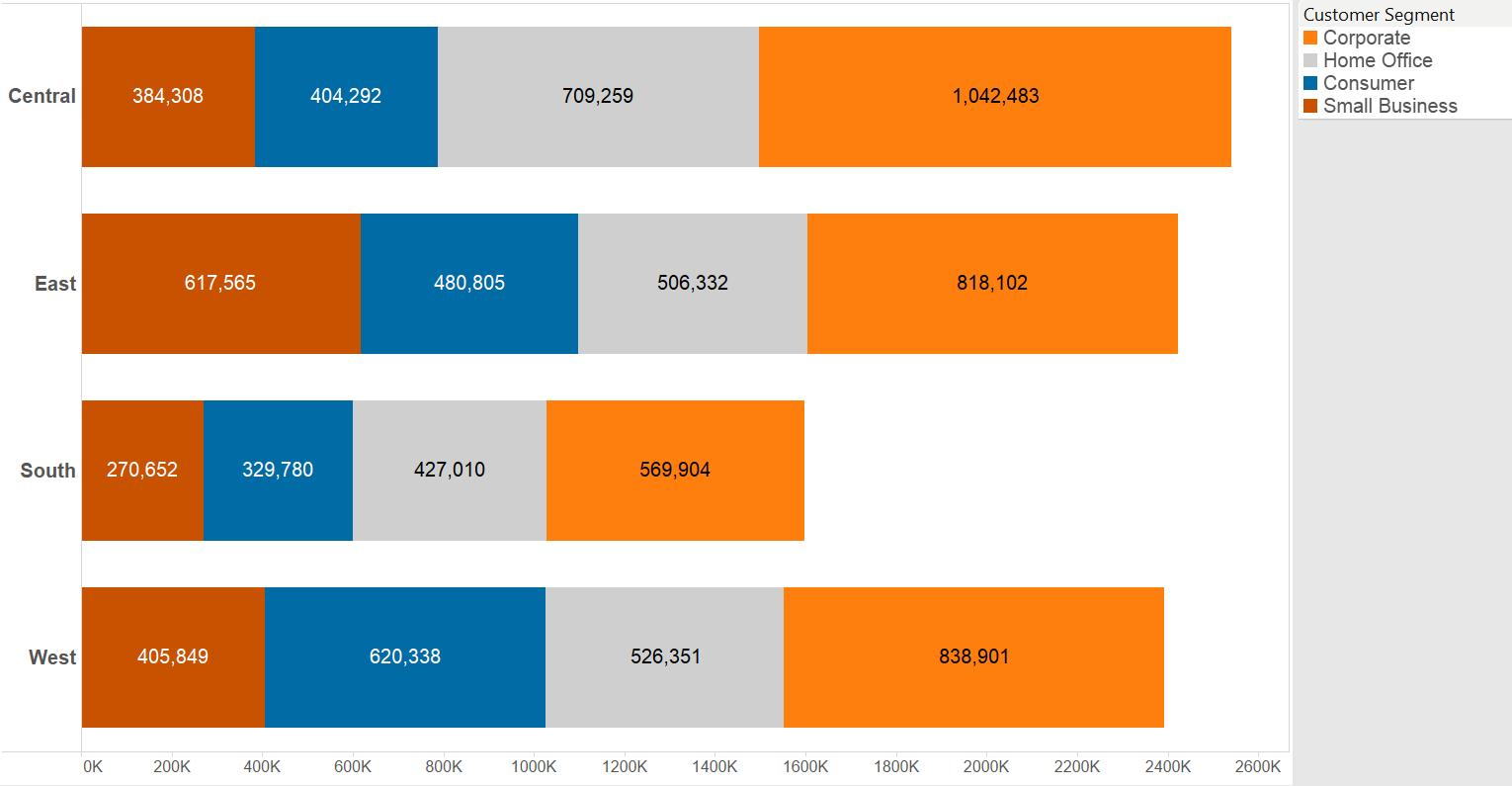 A similar view is produced by combining treemaps and bar chart to create a bar chart where each bar is a treemap itself.Notice that the length of the bars corresponds with the total value of Sales in the region, just like in the stacked bar chart.Does the treemap outperform the stacked bars? No. Bar sizes still translate the differences in sales clearer. Another aspect you may mention is that dimension members are automatically ordered on treemaps, while it is not straightforward to solve this on a stacked bar chart but can be simply reached.Just create a combined field of the dimensions (in our case Region & Customer Segment), then drag the new, combined field to Level of Detail, above the dimension (now Customer segment) of color and finally sort that combined field by SUM(Sales).
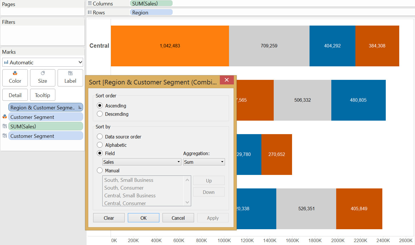 So far all cases of a treemap could be reproduced with a bar chart that proved to be more effective. When is a treemap superior to a bar chart?What if we are dealing with a very large number of dimension members?Treemap (large number of items)
 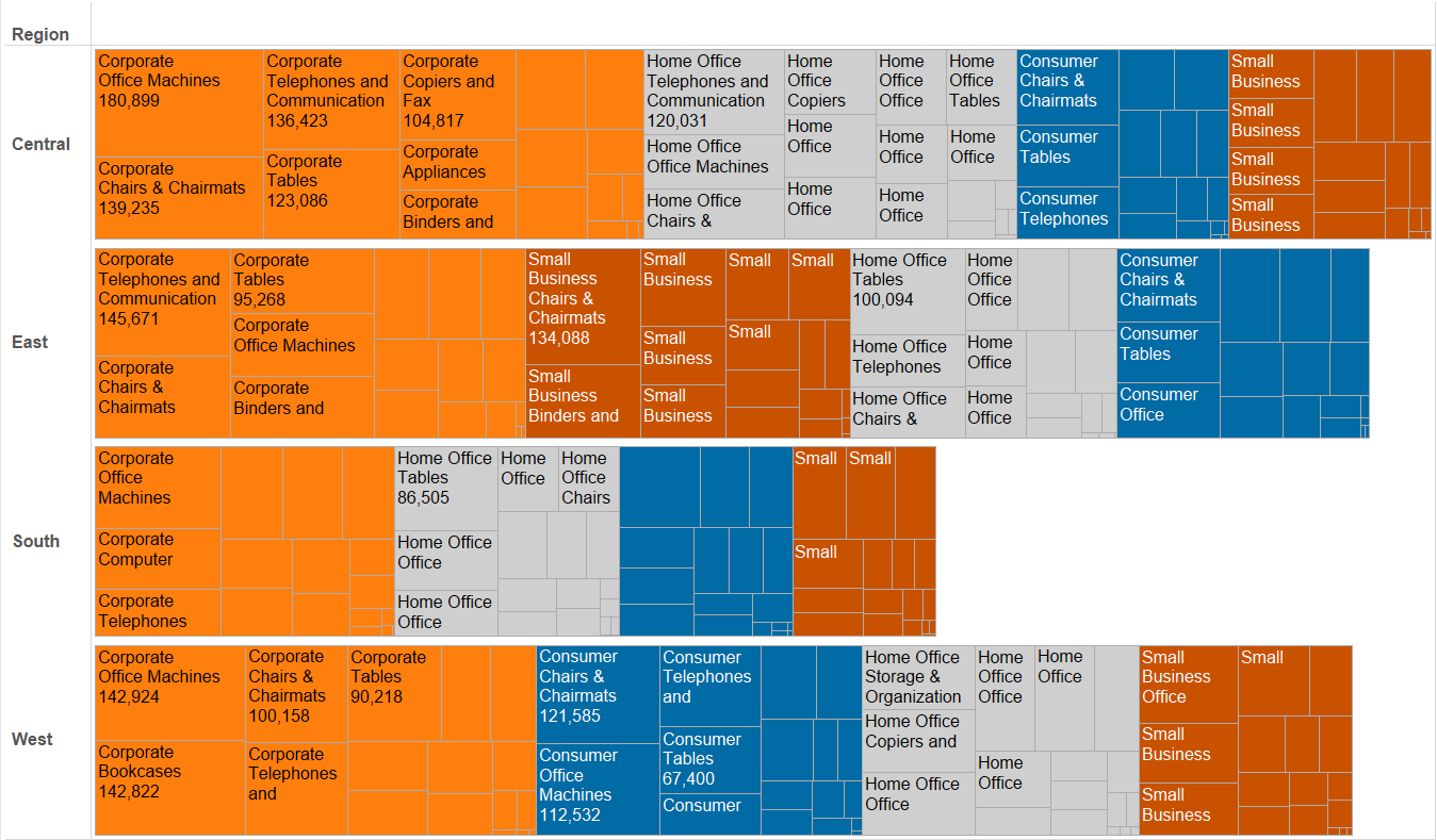 Bar chart (large number of items)
 To be honest none of these look appropriate, although the tree map groups the items well using color and labels are visible in larger rectangles. This many data points are rather visualized in a text table if looking up the individual values is important.The last resort for the treemap is that due to the rectangular shapes it may be more user friendly on mobile. Yet if a reasonable number of marks are involved, there is no reason why a bar chart would not do the job.All in all the treemap may be the new pie chart. It looks fancy and the software capabilites are luring us to go for it - it is so simple to create. Please consider the good old bar chart first.