

So, you want to explore Tableau Pulse. Hopefully, you've started by setting up a small group of trusted testers initially, that will help you find your feet without worrying about people your users starting to interact with things you're testing.
If you're getting hung up on whether to turn on Pulse due to Information Governance issues and AI then remember that the setting for Tableau AI is independent of the setting to deploy Tableau Pulse, meaning that turning on Tableau Pulse won't turn on insights summaries for Tableau Pulse. That's a good place to start if you've any concerns with AI and IG.
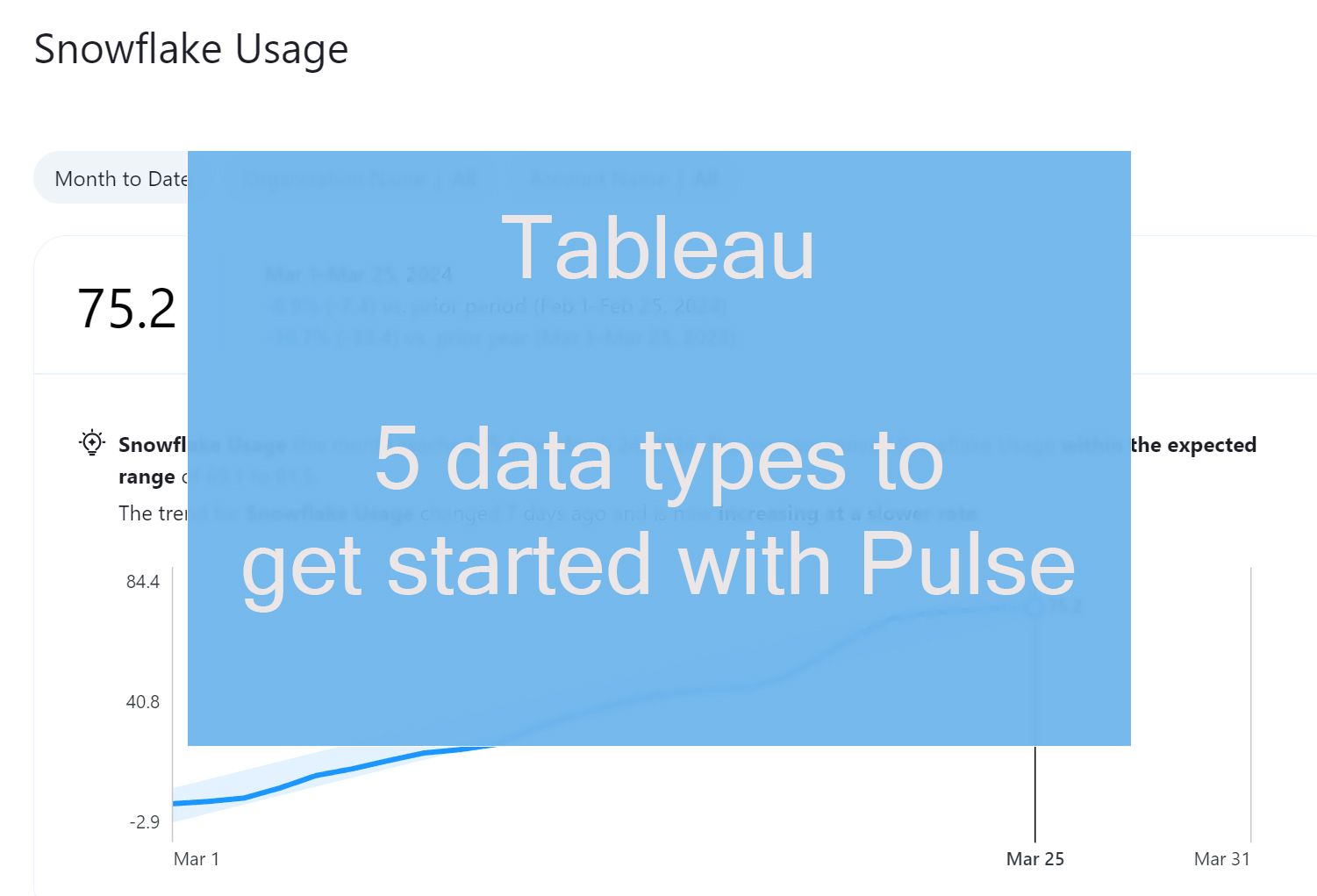
Your first concern with Pulse is going to be what data to add to the site, in this post I'm going to lay out 5 data types that work well in Pulse, and a few that don't. First thought we should spend some time understanding the general requirements to ensure data is going to be fit for purpose in Pulse.
In general your data.....
must include a time dimension
must come with a good history of data going back over a year
should have a set of related dimensions it can be broken down by
should have new data added regularly and frequently
should have metrics that are understandable and meaningful
should have actionable activities linked to the metrics so we can drive change (i.e. have a "so what")
With that in mind lets look what type of data works well in Pulse:
Usage Data
Whether it's your Admin Insights data or some Snowflake credits usage data, many people are getting started with usage data to kick off their exploration of Tableau Pulse. This is a great starting point as it's low-risk data, that isn't too sensitive while you get used to Tableau Pulse permissions.
Usage data is also perfectly suited to Pulse as we can investigate trends in our data environment as platform owners, without needing to rely on external expertise or knowledge outside our domain.
By understanding your usage data of external compute-based systems like Snowflake in Tableau Pulse, then you can aim to optimise spend and avoid unexpected bills.
Spend Analysis
Spend data can be an excellent resource to drop into Tableau Pulse, whether it's expense data or supply chain understanding spend is a key part of cost reduction and supplier performance.
Dimensions such as product, category, department, geography, cost centre, contract type and supplier are all important. By analysing data on supplier performance metrics such as on-time delivery, quality, and pricing with Tableau Pulse, a supply chain department can identify underperforming suppliers. By renegotiating contracts with these suppliers or seeking alternative suppliers, we've seen organisations achieve cost savings without compromising quality.
"One of the things I've enjoyed most about Pulse is getting the data on my mobile in the Tableau App and being able to review metrics in real time - it's super easy and has become the default way I use Pulse"

Applications (HE)
In Higher Education, data can play a crucial role in helping universities control lost applications, which are applications that are started but not completed by prospective students. By analyzing relevant data and metrics, universities can identify bottlenecks in the application process, understand reasons for abandonment, and implement strategies to improve completion rates.
Using Pulse to build metrics around lost applications broken down by department or program, as well as understanding other base metrics like the number of Enrolled Students can help university program leaders monitor their application process and get ahead of issues.
Contact Center Analysis
There are several metrics we can expose to Pulse for Contact Centres; Average Handle Time (AHT), First Call Resolution (FCR) Rate, Customer Satisfaction (CSAT) Score, Abandonment Rate and Occupancy Rate are all measures that can be broken down by handler, team and time of day, as well as call category and priority.
By opening up these metrics in Pulse, a contact centre can gain insights into its performance, identify areas for improvement, and make data-driven decisions to enhance customer service, optimise resource allocation, and drive operational efficiency.
One thing to think carefully about here is how an aggregate metric is calculated, the example I like to explain this with is share prices: when viewing a weekly share price this is not the sum of the previous days, so a 'weekly metric' would need to be calculated. Similar, may need to happen with your contact centre metrics rates to create weekly and daily averages.
As we've started to expose our support desk data to this we've started to expose hidden metrics to the business about the open tickets we have, and the average resolution time, helping us prioritise resources and keep on top of customer queries.
Performance Data
Performance data plays a central role in driving continuous improvement, enhancing safety and reliability, and meeting customer needs in the transportation industry. By collecting, analyzing, and acting upon performance data, transportation providers can optimize operations, reduce costs, and deliver high-quality services to customers.
Data around average delay, number of accidents, fuel consumption (or even sand usage for our rail customers) and distance travelled can help you minimise disruption, and improve customer experience, as well as minimising CO2 emissions and other environmental aspects.
In logistics it might be the number of on-time deliveries, in Manufacturing Overall Equipment Effectiveness (OEE), Healthcare: Patient Wait Times, Financial Services: Return on Investment (ROI) - whatever your industry adding your performance data to Pulse can be the first step to getting a better understanding of it.
The key thing to spot is whether the data is an accurate measure as it gets created, data that will change as time goes by is difficult to track in Pulse and doesn't make a good use case. This leads us nicely on to...
What data types have proved harder than we expected?
Profit
Profit data is likely one example of data that will be changing over time. As invoices are sent and paid, and delivery costs change then, at least at The Information Lab, we find out profit isn't easy to establish. Tracking this data in Pulse is something we started but due to its variability, it often caused more questions than answers. Therefore, for now, we've settled for simpler measures and coincident indicators of profit, such as total sales.
Systems / IoT Data
Data from The Internet of Things is great for building Tableau dashboards, we've worked with everything from sensor data for train loading to door pass activations in offices. Energy and environmental meters too in industrial processes can be monitored, usually via APIs.
However, this data only works well if the results are interesting and actionable though, for example, while a dashboard on door activations in an office can reveal overall trends on exploration, it can be harder to tease out via metrics. This data is highly seasonal and events that move each year like Easter and school holidays are likely to impact annual reporting and give trends that are of little value.
Similarly, our work in transport systems looks for localised outliers and trends, for example, an increase in the average time it takes for a door to open / close on a train can indicate an issue with the door that could fail; we can fix, avoiding the train being out of service. This would be hard to spot in Pulse - building metrics for every door is impractical.
So while we can leverage IoT and Systems by pulling data from APIs into data warehouses and analysing in Tableau Dashboards can help spot issues and save maintenance costs, you may struggle to make metrics in Pulse work with this data for most use cases.
Security Logs and Audit Trails
Some data is simply better suited for specialist systems, while it's natural to want to put data like security logs and audit data into Pulse, and it may be useful for exposing trends to the wider business, it's not the place to spot issues or attacks as they happen.
Tableau Pulse is an incredibly useful tool that can help you make the most of your data by sharing it with users who may have trouble engaging with data in dashboards. With Tableau Mobile, you can easily keep up to date with the metrics as a viewer and monitor what's important to you. As a Creator remember that when creating metrics, it's important to think about how your viewers will go beyond just viewing the number and use them to drive change. By doing so, you can use Tableau Pulse to make your data accessible to everyone and democratize your data effectively.