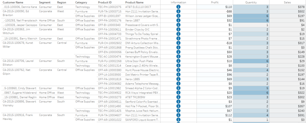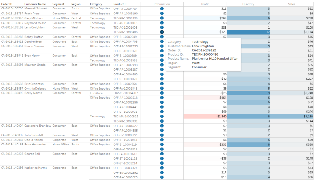
Let's say you want to give your audience detailed data in form of a table. At the same time, you want to add colour but also and information button, which makes it obvious that you can hover over it for more details. In short, you want something like this:

To have the names of the fields present in the table, you'll need to do a bit of trick, but I'll walk you through it step-by-step. In this example, I'm using Sample Superstore available with Tableau Desktop.
1. Build the table
First, we just want to have the table ready. Go ahead an put the following fields onto Rows shelf:

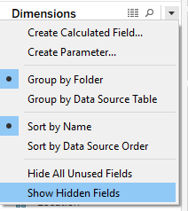
Product ID is by default hidden. To show all hidden fields, click on the small arrow next to Dimensions -> Show Hidden Fields:
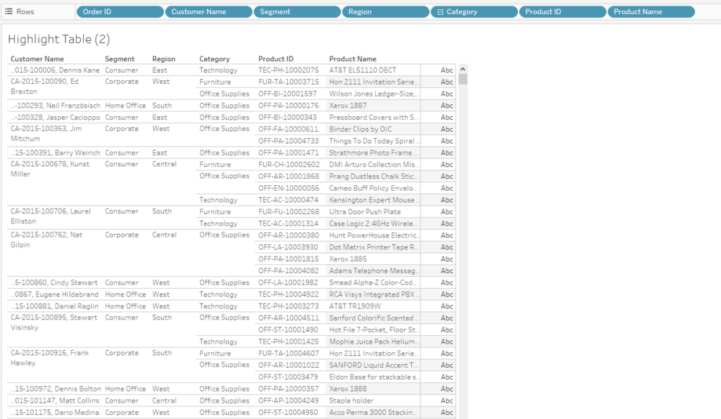
You should end up with something similar:
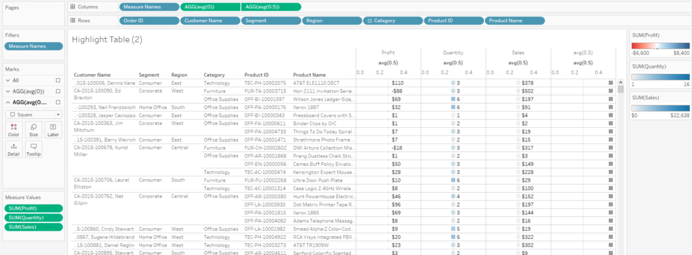
Now, double-click on Profit, Quantity and Sales. This should do a few things. Instead of just the measures on the columns, there is Measure Names, Measure Values are on text and three measures that were clicked on are on the Measure Values tab:
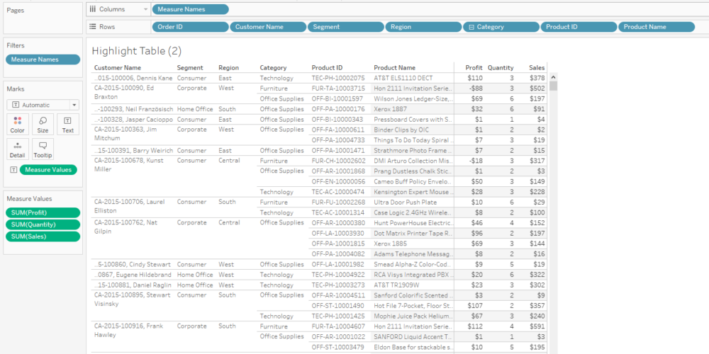
We have our table.
2. Change it to a highlight table
Now that we have the values in the table, we want to help the audience get the message easier. To do that, hit ctrl and drag Measure Values onto colour. This will change the colour of the text which is not exactly what we want.
To change it into a highlight table, change the mark type to square. Now, we do have a background for each cell, but there's only a single colour legend. The problem with this is that Profit will range between negative and positive values, Sales will have only positive but might have very high positive values while quantity will have values of tens, maybe. To separate the colours, right-click on Measure Values assigned to colour -> Use Separate Legends:
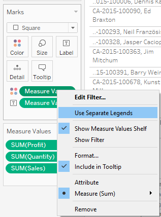
This will separate the legends by Measure Names and you can adjust them by right-clicking on the legends -> Edit colours.
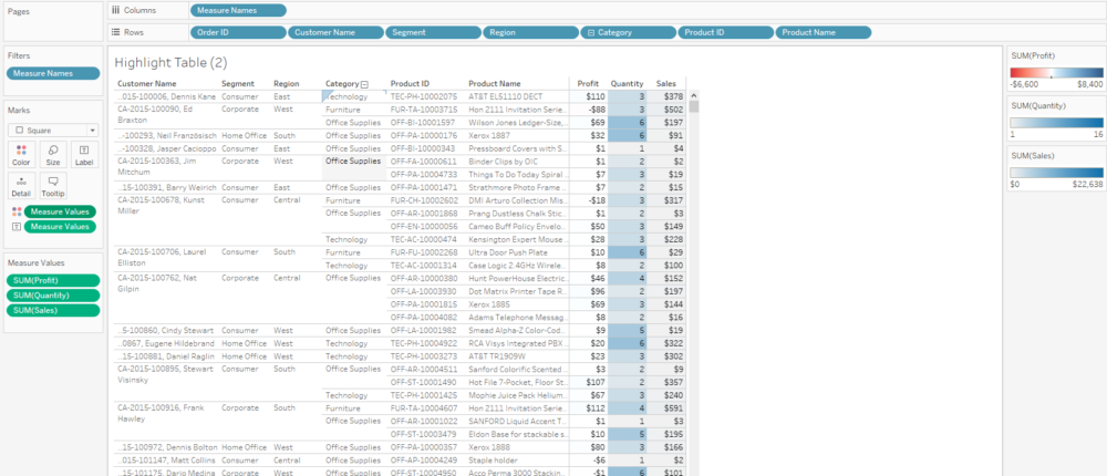
You should have something like this:
3. The trick
Ok, here we go. Double-click on the white space next to Measure Names on Columns shelf and type in avg(0). Double-click on the white space next to the new green pill and type in avg(0.5). Then right-click on either of the new green pills -> Dual Axis. You might be thinking we're breaking our beautiful highlight table, but bear with me. This is the view for now:
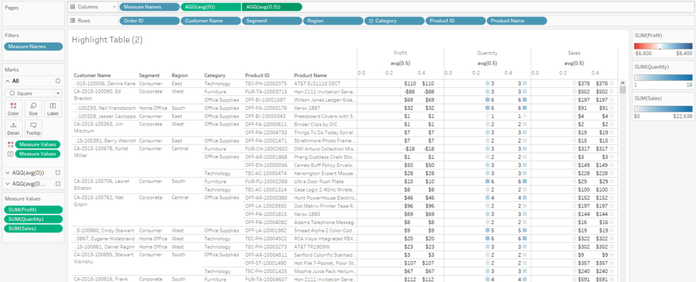
On avg(0.5) tab on Marks card, get rid of any Measure Values, as nothing else was there, it should be empty now:
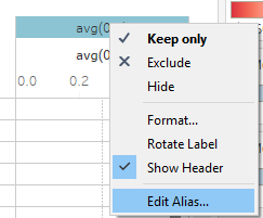
Compared to the previous photo, you can see that now there are four measure-related columns, despite having only three measures on the Measure Values card. The name of the new column is not exactly elegant, so right-click on it and hit Edit Alias and change avg(0.5) to Information:
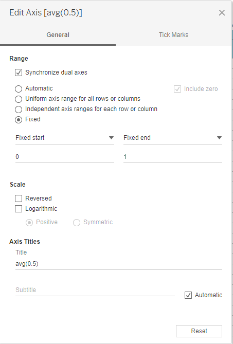
Right-click on any of the axes -> Synchronise Axis. Right-click again -> Edit Axis then change range to fixed from 0 to 1:
Now right-click on the axes and unselect Show Header.
Ok, we're almost there.
On avg(0.5) tab on Marks card, change the marks type to shape. Create a new calculated field called Dummy (or whatever you'd like) and type in
''This is only an empty string as we need an actual field to have more control over the shape and its colour. Drag new Dummy field onto colour and shape and adjust it to your preferences. Depending on your available shapes and selected colour, your view will be probably slightly different to mine:
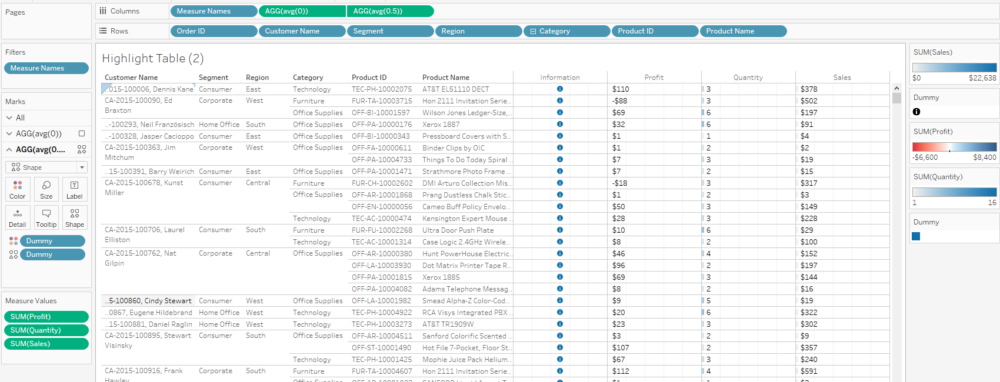
Now let's rebuild our highlight table.
On the avg(0) tab on the Marks card, change the mark type to Gantt Bar. Double-click on the white space on the tab and type in avg(1), then move it to size. This will create a colour coded background, almost like in the highlight table we've had previously. Click on the size on this tab and move the slider to the right, it will fill the cell vertically:
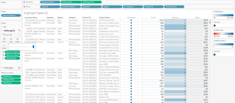
The last thing is to get rid of the grid lines. Go to Format -> Lines. Grid Lines says None but don't believe it and re-set it to None, and the grid lines should disappear!
Now you can add whatever information you'd like to have in the tooltip on the information icon. You can either have the same tooltips for the other measures or disable the tooltips for highlight table by deleting text from tooltip for Gantt Bar mark.
There you go! Thanks for reading :)