23 July 2018
We continue with the PostgreSQL Repository blog series after the first one about visualising all groups, users and last logins. Today we are going to talk about the Traffic to Views dashboard and how to improve it to keep a better track of how many views is our Tableau Server receiving, when, and what content is the most popular. If you are familiar with the Admin Views available by default on Tableau Server, the first one - Traffic to Views - looks like this: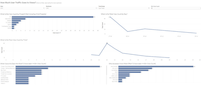 It's a quite basic but informative dahsboard about views per day, hour, project, etc. in a certain period of time. What I will show in the next lines is the connections you need to build to the PostgreSQL Repository to improve this view and get additional insights.
 Why is this important? First because it will be much easier to create the different views we are interested in. It's always better to analyse different events using different data sources, as each type of event might require a different approach, different tables to join with, different join clauses, etc. But also because the amount of information we will query from the Repository will be significantly lower. In my example, we will move from 315,000 rows of data to 14,000. That's just a 4% of the total records of the historical_events table so the performance and impact on the Server will be obviously much lower.
 We will hide around 32 columns. So we are reducing the data pulled from the Repository to a 50% of what we had initially.


 And you can click here if you want to download the .twb and point it to your PostgreSQL Repository and publish it in your Server. As I always recommend with the PostgreSQL Repository, my suggestion will be to avoid using live connections and create an extract that is refreshed every morning to avoid querying the Repository all the time.
 It's a quite basic but informative dahsboard about views per day, hour, project, etc. in a certain period of time. What I will show in the next lines is the connections you need to build to the PostgreSQL Repository to improve this view and get additional insights.
Step 1: Historical Events and Historical Event Types tables
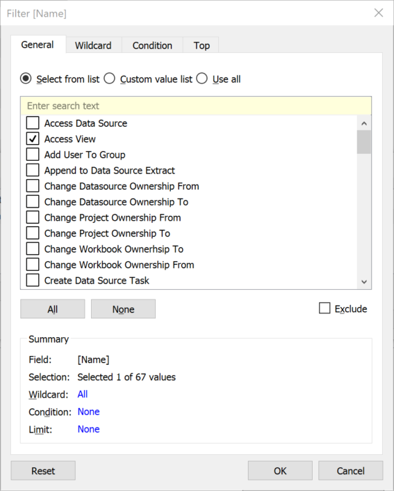
This is probably the key point in order to get the correct data to build a dashboard that answers the question: what are users accessing on the Server? The historical_events tables tracks everything that happens on the Server. From changes in a project ownership to groups created, data sources deleted workbooks downloaded, logins, views published, schedule updates and obviously access to concrete views. And the most important thing, not only tracks what is happening but also when is happening and by who.As you can imagine the amount of information this table stores is significant, so the first thing that we need to do is to be able to identify correctly the concrete event we want to analyse (Access Views) from the 67 different events this table tracks. In order to do that, we are going to join this table to the historical_event_types table based on historical_events.historical_event_type_id = historical_event_types.type_id.Once we have the join ready we will add a data source filter to reduce the amount of data pulling from the Repository, and we will use the Name field from the historical_event_types table to keep just records about Access Views like you can see in the image below. Why is this important? First because it will be much easier to create the different views we are interested in. It's always better to analyse different events using different data sources, as each type of event might require a different approach, different tables to join with, different join clauses, etc. But also because the amount of information we will query from the Repository will be significantly lower. In my example, we will move from 315,000 rows of data to 14,000. That's just a 4% of the total records of the historical_events table so the performance and impact on the Server will be obviously much lower.
Step 2: Join the different tables to get Site, Project, Workbook and Views names
We have already have our data source with all the views accessed during the last months. But the historical_events table doesn't have useful fields to identify the different sites, projects, users, workbooks and views by itself. We have the Ids, but not the actual name of each of those elements so we will need to join the table to the different hist_ tables to get the name of the actual sites, projects, workbooks and views accessed, as well as the name of who accessed them if we want to analyse that too.The tables we will use are hist_sites, hist_projects, hist_workbooks, hist_views and hist_users. And the joins are as follows:- historical_events.hist_target_site_id = hist_sites.id. In this particular case probably we could use the hist_actor_site_id from the historical_events table, but we will use the target_site_id as the target represents a record to the site that was the target of the event (the site where the views is located).
- historical_events.hist_project_id = hist_projects.id. To join each project ID from the historical_events table to the hist_projects table and get the name of the projects where the views are stored.
- historical_events.hist_workbook_id = hist_workbooks.id. To get the workbook names.
- historical_events.hist_view_id = hist_views.id. To get the views names.
- historical_events.hist_actor_user_id = hist_users.id. To get the user names and details. Why we use in this case the actor_user_id and not the target_user_id? Because there was no user that was the target of the concrete event (access a view) so you could check that the target_user_id for all rows is null. While the Actor is a reference to the user id who initiated the event. This means, the user who accessed the view.

Step 3: Hide fields we will not use
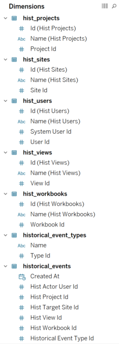
We mentioned in step 1 that we reduce significantly the amount of rows querying when we filter to just 'Access View' rows. We can improve now even more the data queried by hiding fields we will probably not use. Probably we can even hide more fields that the ones I did, but for now I'll keep the next 25 fields and hide the rest. In fact we don't need any measure at all, so we could keep a data pane that looks like this: We will hide around 32 columns. So we are reducing the data pulled from the Repository to a 50% of what we had initially.
Step 4: Analyse the data
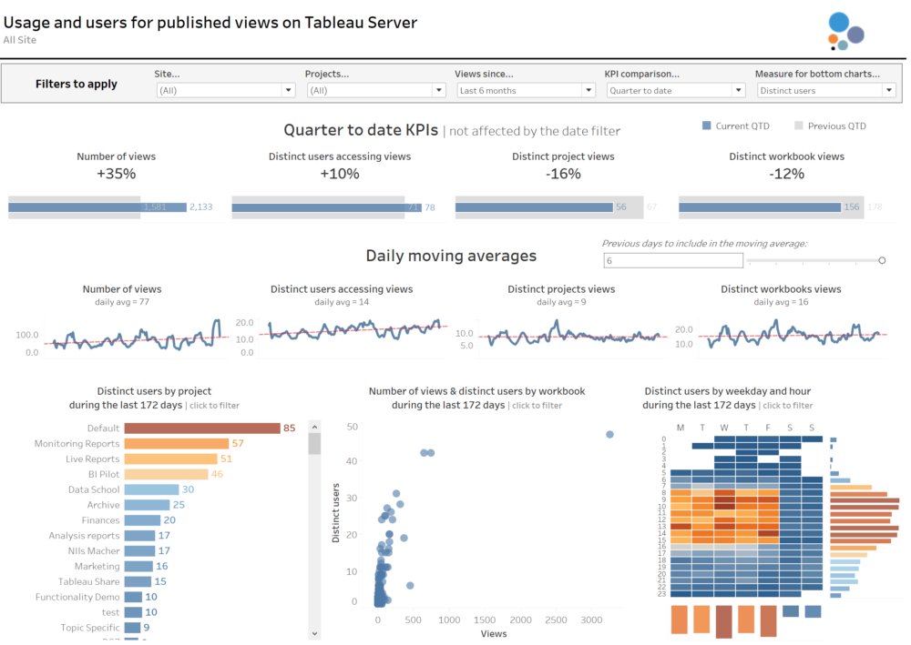
We have the data, so now it's a matter of analysing and visualising the data in the way we want. My recommendation here will be to add some filters to all sheets, like a Site filter, a Project filter and a Created At (date field that records when the view was accessed) so we can focus the analysis on concrete Sites and Project names and in a concrete period of time when the view was accessed.I have also divided my analysis in 3 sections.- My top section analysis four KPIs: Number of views, Distinct users accessing views, distinct projects accessed and distinct workbooks. And I added a parameter so the user can decide if they want to see the KPIs based on the current quarter, current month or current week compared to the previous period. Also, this section is the only one not affected by the Created At (date) filter.

- The middle section analyses the trend over the time period selected in a daily basis of those same four KPIs. Because the trend can have significant changes from one day to another I decided to show the moving average instead, and add a parameter that allows the user to select if they want a moving average between 1 previous day and 6 previous days (1 week moving average in total). You will notice how the moving average smooths the lines significantly, but also makes it easier to see the overall trend.

- I left the bottom section for a more detailed analysis. So users or server admins can check the projects more frequently accessed, the concrete views and also the days of the week and hours of the day when more views are being accessed. I also added a parameter so the users can switch between the number of views and the distinct number of users accessing views.

Step 5: Create a dashboard
Finally, I combined everything in a dashboard so users can analyse the high level KPIs, overall trends and the bottom and more granular views all together. This is how the dashboard looks like at the end. And you can click here if you want to download the .twb and point it to your PostgreSQL Repository and publish it in your Server. As I always recommend with the PostgreSQL Repository, my suggestion will be to avoid using live connections and create an extract that is refreshed every morning to avoid querying the Repository all the time.