

22 August 2018
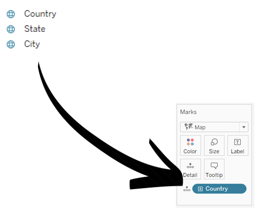
Tableau evolves rapidly with new features. Plotting data on a map is one of those coolest features. This blog will show you a short history of how Tableau’s data mapping has developed over the last few years.Geographic roles and polygons, version 9.0Mapping requires location data – a position on a map is determined by a set of coordinates which can originate in your data. Alternatively, Tableau can geocode geographies into latitude and longitude. For a complete list of geographic role types that Tableau can geocode visit hereThis is a simple method until you have locations that Tableau cannot localise on map. This was the case for UK local authorities until 2015, a key geography boundary affecting many types of analysis including the distribution of public funding. An alternative method then was to blend pre-made extracts of map polygons, which were readily available thanks to the Tableau community.[caption id='attachment_12032' align='alignnone' width='705']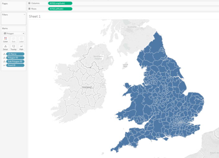 Figure 1. Polygon data extract of Local Authorities in England and Wales.[/caption]Mapbox integration, version 9.2Adding flair to your geographic data became possible with Mapbox integration. It gave users the ability to fully customise their background map style. Either by building the entire map to branding guidelines or even better, to answer landscape-dependent questions which need markers such as streetlights or mountains on a map. These can be imported into Tableau using Mapbox bringing a new layer to your organisation’s data.Custom territories, version 10.0Tableau brought in custom territories to visualise new areas that exist outside of your data. This may be necessary in planning a business where geographic areas are constantly changing. By clicking, you can create regions on the fly by selecting marks on a map and group them to quantify your data to another level.[caption id='attachment_12035' align='alignnone' width='1000']
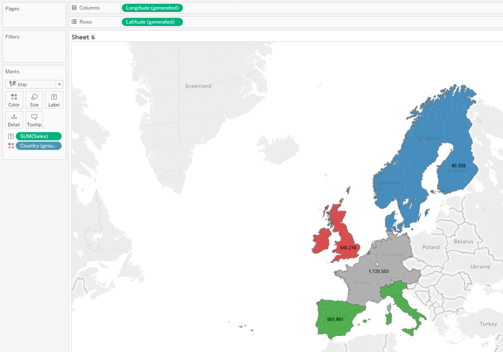 Figure 2 Custom territory of sub-regions in Europe.[/caption]Shapefiles, version 10.2The next big thing of mapping in Tableau is to be able to connect directly to geospatial files, replacing the need to transform data for polygon maps. Yes, that’s right, reading your own custom Shapefiles from ESRI and GIS. Shapefiles contain data of polygons, lines or points for example for sales areas, delivery routes or stores and you can use directly them in Tableau.[caption id='attachment_12034' align='alignnone' width='1000']
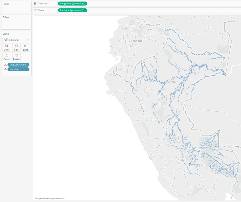 Figure 3. Geometry field for point geometries of navigable rivers in Peru[/caption]After 10.2 release, Craig (CTO) transformed the repository of tablemapping.bi into a web data connector. What does this mean? You can directly connect to (online) geographic data in your workbook. Preview mapping layers at https://www.tableaumapping.bi.Live and dual-axis, version 2018.1 The ability to connect directly to spatial data in SQL is fairly new. There is no need to download data or lose the live feed that drives real-time decision-making such as those coming from the smart grid or emergency services.To provide flexibility, also in this version, Tableau released dual-axis mapping allowing users to visualise multiple mapping layers.Spatial joins, version 2018.2 The latest new feature in Tableau is to combine topologically-related data using a spatial join. In essence if you have two spatial files comprising of polygon or points, you can combine them.[caption id='attachment_12033' align='alignnone' width='1000']
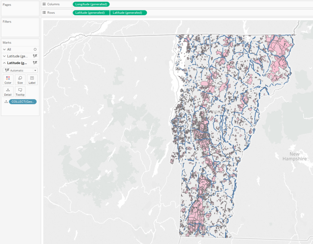 Figure 4. Spatial join of wild-life crossings and conservation land in Vermont.[/caption]Three years ago, what first attracted me to Tableau was the ability of mapping data. I was able to see the distributing of agricultural land across the UK. However, there were limits to geocoding, and it was tricky to blend geographic data. Since then Tableau has made big strides introducing new features in a very short time. The Tableau community continually contributes with ideas, such as of hexbin mapping for density plots or using viz in tooltips as a loupe. It would not have been possible without you, Tableau users, so thank you. Collectively you have made mapping even more user-friendly, flexible and seamless.
Figure 1. Polygon data extract of Local Authorities in England and Wales.[/caption]Mapbox integration, version 9.2Adding flair to your geographic data became possible with Mapbox integration. It gave users the ability to fully customise their background map style. Either by building the entire map to branding guidelines or even better, to answer landscape-dependent questions which need markers such as streetlights or mountains on a map. These can be imported into Tableau using Mapbox bringing a new layer to your organisation’s data.Custom territories, version 10.0Tableau brought in custom territories to visualise new areas that exist outside of your data. This may be necessary in planning a business where geographic areas are constantly changing. By clicking, you can create regions on the fly by selecting marks on a map and group them to quantify your data to another level.[caption id='attachment_12035' align='alignnone' width='1000'] Figure 2 Custom territory of sub-regions in Europe.[/caption]Shapefiles, version 10.2The next big thing of mapping in Tableau is to be able to connect directly to geospatial files, replacing the need to transform data for polygon maps. Yes, that’s right, reading your own custom Shapefiles from ESRI and GIS. Shapefiles contain data of polygons, lines or points for example for sales areas, delivery routes or stores and you can use directly them in Tableau.[caption id='attachment_12034' align='alignnone' width='1000'] Figure 3. Geometry field for point geometries of navigable rivers in Peru[/caption]After 10.2 release, Craig (CTO) transformed the repository of tablemapping.bi into a web data connector. What does this mean? You can directly connect to (online) geographic data in your workbook. Preview mapping layers at https://www.tableaumapping.bi.Live and dual-axis, version 2018.1 The ability to connect directly to spatial data in SQL is fairly new. There is no need to download data or lose the live feed that drives real-time decision-making such as those coming from the smart grid or emergency services.To provide flexibility, also in this version, Tableau released dual-axis mapping allowing users to visualise multiple mapping layers.Spatial joins, version 2018.2 The latest new feature in Tableau is to combine topologically-related data using a spatial join. In essence if you have two spatial files comprising of polygon or points, you can combine them.[caption id='attachment_12033' align='alignnone' width='1000'] Figure 4. Spatial join of wild-life crossings and conservation land in Vermont.[/caption]Three years ago, what first attracted me to Tableau was the ability of mapping data. I was able to see the distributing of agricultural land across the UK. However, there were limits to geocoding, and it was tricky to blend geographic data. Since then Tableau has made big strides introducing new features in a very short time. The Tableau community continually contributes with ideas, such as of hexbin mapping for density plots or using viz in tooltips as a loupe. It would not have been possible without you, Tableau users, so thank you. Collectively you have made mapping even more user-friendly, flexible and seamless.