

In the first part of this series we covered the basics, in the second part we went a little deeper and put some of those basics to use and built the skeleton framework for a responsive menu interface. Today we'll bring it all together and put the finishing touches and build something like this (see below image) from where we left off in part2.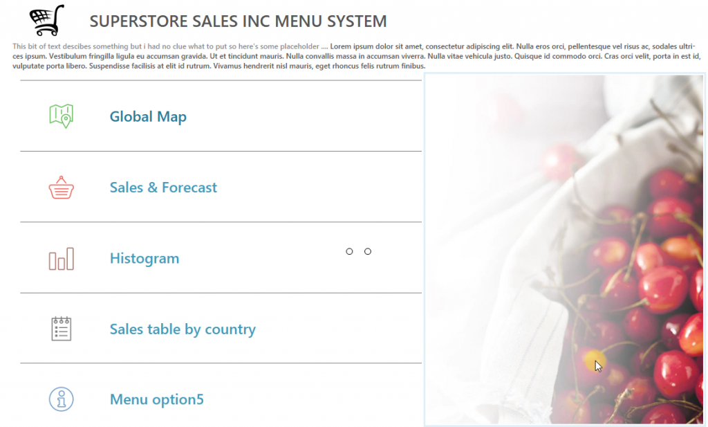 If you have the workbook from the end of part 2 then follow along if you'd like to, otherwise just watch. I should also add that this is relevant for version 9 of Tableau too except you might notice some slight user experience upgrades. You can check these out over here in this great post by Jonathan ( 10 new features in Tableau v9 you may not know about ). Lets get stuck in.In the video I mentioned Andy had produced a great post on dashboard sizes, its worth considering. As the range of devices that people use increases and Tableau continues to develop desktop and mobile applications, screen size becomes a pivotal discussion as it has done in related industries such as design and digital print.As ever the more time you spend on layout containers, the more familiar you'll get with the quirks. The issue I had during the video where a container had disappeared and changed to horizontal is very common and can happen easily if you've got a lot of containers on a dashboard so always be on the look out and of course resort to the dashboard hierarchy on the bottom right, it has the full blueprint of what's in front of you and why.
Over to you ... & Piet Mondrian
You might not know much about Piet Mondrian but you're about to because his art work will become a great practise ground for putting what you've learnt to use. It's simple, pick some Mondrian style art like the image below title 'Tableau 1' and using nothing but layout containers, recreate it. Be sure to tweet me below with your designs (post them in tableau public or take screenshots).Tweet to @timngwena
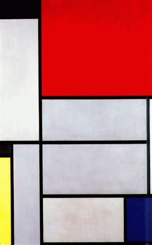 Art Titled 'Tableau 1' Completion Date: 1921 or check out Tableau 2 here