So last week I started to look at the analytics tools within Tableau desktop by looking at using box plots to explore the variation within data. This week I am continuing with the analytics features by discussing reference lines and reference bands.
Setting targets is common practice within elite sport, from lap times in Formula One through to distance jumped in the Triple Jump. I am going to be exploring how we can use a quick and simple feature of Tableau to visualise performance against a base score or a target score.
What Am I Dealing With?
Ok,so first of all, lets take a look at what we want to do and what our data looks like…
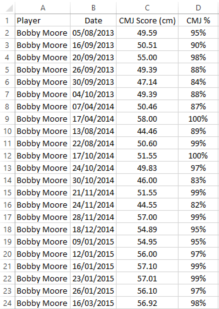
I have a small sample database of counter-movement jump (CMJ) scores, used as an indicator of muscle fatigue / recovery. In basic terms, an athlete’s CMJ height will be measured prior to performance (for instance on a Friday before a match on a Saturday) and then the CMJ height will be measure again post performance (ie. on the Monday morning following a Saturday match) with the difference in these heights being the CMJ Score - smaller score means better recovery.
My athlete, Bobby Moore, has a base level he must reach of 85% of his pre match jump, that is to say, if his CMJ height on the Friday was 60cm, on the Monday morning we want him to be attaining a CMJ height of at least 51cm on the Monday morning. Anything below this could be an indicator of muscle fatigue and an intervention may be required.
For this example, I also wish to be able to view my athlete’s average CMJ (%) score to view how he varies from this average and whether he has attained at least his personal average with his latest jump.
I Have My Data, What Next?
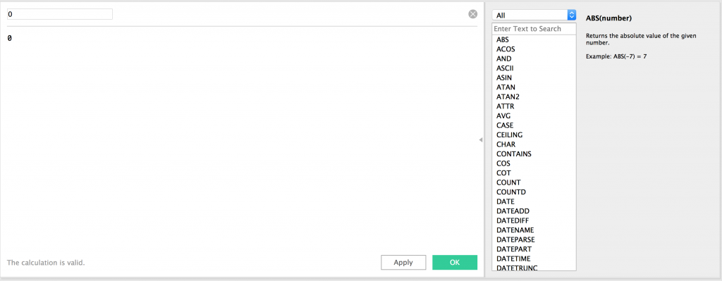
After connecting to my data in Tableau, I need to introduce my base score and a minimum score (all will become clear shortly). I am going to create a new calculated field, by right clicking in the data pane and selecting “Create Calculated Field…”, and give this field the name “0” and a static value of 0.
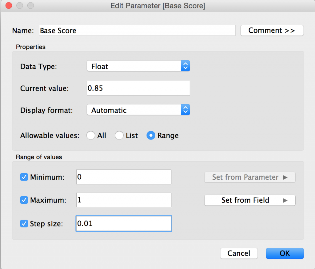
For the base score, I am going to create a parameter. I am creating a parameter for this instead of a calculated field as parameters are dynamic values that can be changed using the parameter control, thus enabling you to easily change the base line score if required.
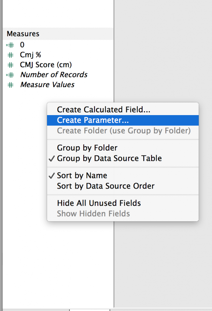
We create a new parameter by right-clicking in the data pane and selecting “Create Parameter…” and we are then presented with a variety of options to create our parameter…
You will see above that I have given the parameter a name, defined the data type as a ‘float’, set the current value to 0.85 (85%) a minimum value (0 or 0%) and a maximum value (1 or 100%), as well as a step size of 0.01 (1%). When working with number values in parameters you have the option of allowing ‘All’ numbers, a ‘List’ of specified numbers or a ‘Range’ or numbers. In this instance I have chosen a range (0-1 or 0%-100%).
Now we have all the fields we need, let’s create our viz…
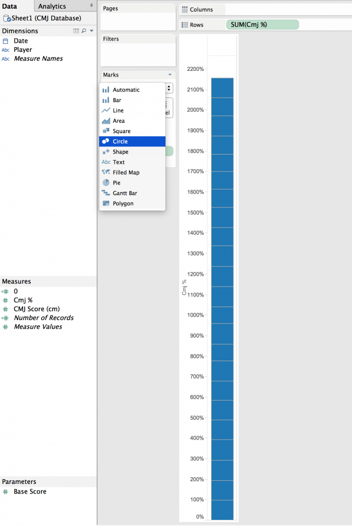
By dropping our ‘Cmj %’ field on to the rows shelf it gives us the SUM(Cmj %) for all dates in a bar chart. So first of all I am going to drag my ‘Date’ field on to the ‘Detail’ card and select ‘Exact Date’ from the right click menu.
This breaks down the bar by date and creates a stacked bar of the Cmj % for each individual date. From here I just need to change the chart type to a circle chart and then I have the basis of my viz. Also note that I have edited the axis to make it more relevant to the range of Cmj % scores.
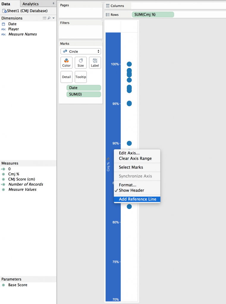
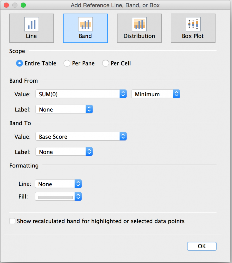
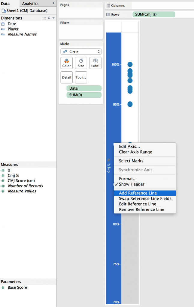
Now it’s time to create our reference band. This reference band is going to shade the area from the lowest possible score (0%) up to our base level, which is set by our parameter (currently 85%). To do this we need our “0” field to be in the view, so I’m simply going to drop this on to the ‘Detail’ card. Now, when I right-click on my ‘Cmj %’ axis and ‘Add Reference Line’, I am able to use my “0” field (SUM(0)) within the options box that we are presented with.
You will see that I have a selected ‘Band’ (as opposed to Line, Distribution or Box Plot), and my band has a ‘From’ value of SUM(0) – Minimum (which will be 0) – and a ‘To’ value that is my ‘Base Score’ parameter.
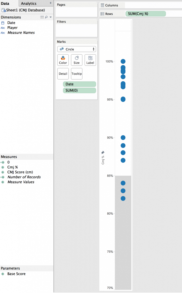
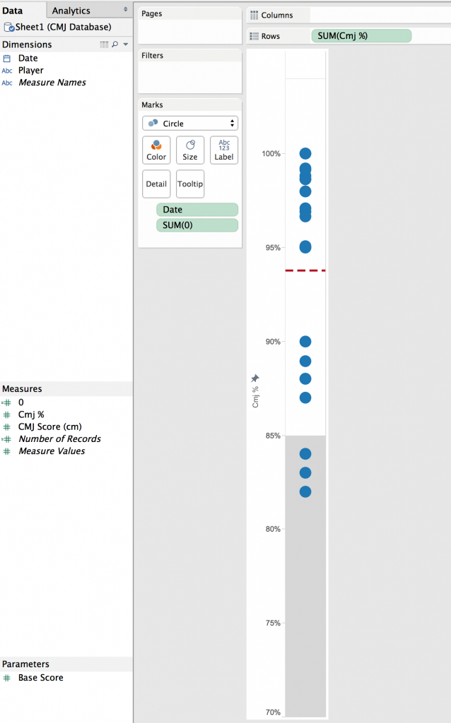
The screenshot below shows the resulting reference band. We can see how this can act as a visual cue to emphasise the scores that are below the base level we want our athlete to achieve.
Let’s just add one more little detail so that we are able to see the athlete’s average and therefor providing us with a value to relate Cmj % scores to. I am going to do this by adding a reference line…
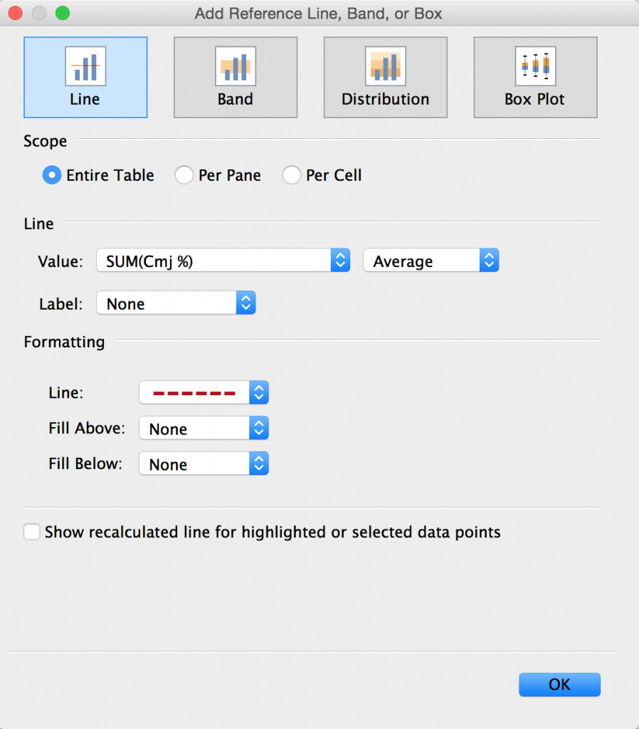
Again, I am going to right-click on my ‘Cmj %’ axis and select ‘Add Reference Line’, but this time I have selected ‘Line’ (not Band). This line is going to be positioned at the average value of all Cmj % scores.
And there we have it, a simple and very visual way to look at CMj % scores, these scores compared to the individual’s average and also place an emphasis on those scores that are below the desired base level.
What About My Parameter?
Ah yes, I mentioned about my ‘Base Score’ parameter earlier and how they are good for providing control of a dynamic value, in this instance to change the base level whenever required. So let’s take a look at how this works…
In the above screenshot we have 5 duplicated charts, each with it’s own parameter control above. You can see that as the value in the parameter control is changed the base level reference band also changes. Parameters are a great way of providing the end user with control over certain values, in this instance our base level score.

