Over the next few weeks I am going to be exploring the various analytics tools that are native within Tableau. These tools provide quick and easy access to some common analytics features, from trend lines to distribution bands.
These are without a doubt my favourite features within Tableau. “Why?” I hear you ask, well, the answer is simple. In my eyes Tableau isn’t a ‘dashboarding’ tool - yes it has this capability - but it is much more than that. Tableau’s true strength lies in its ability to provide users with the power to visually query data, a process that not only feels more like play than work, but is also far more pleasing to the human brain when it comes to identifying insights.
The first analytics tool I am going to look at is box plots, also known as box-and-whisker plots…
What Are Box Plots?
Box plots show the distribution of values and can be used to show the range, median and quartiles of these values. They provide a visual way of comparing data across numerous groups, such as the variation in 100m sprint times of different athletes.
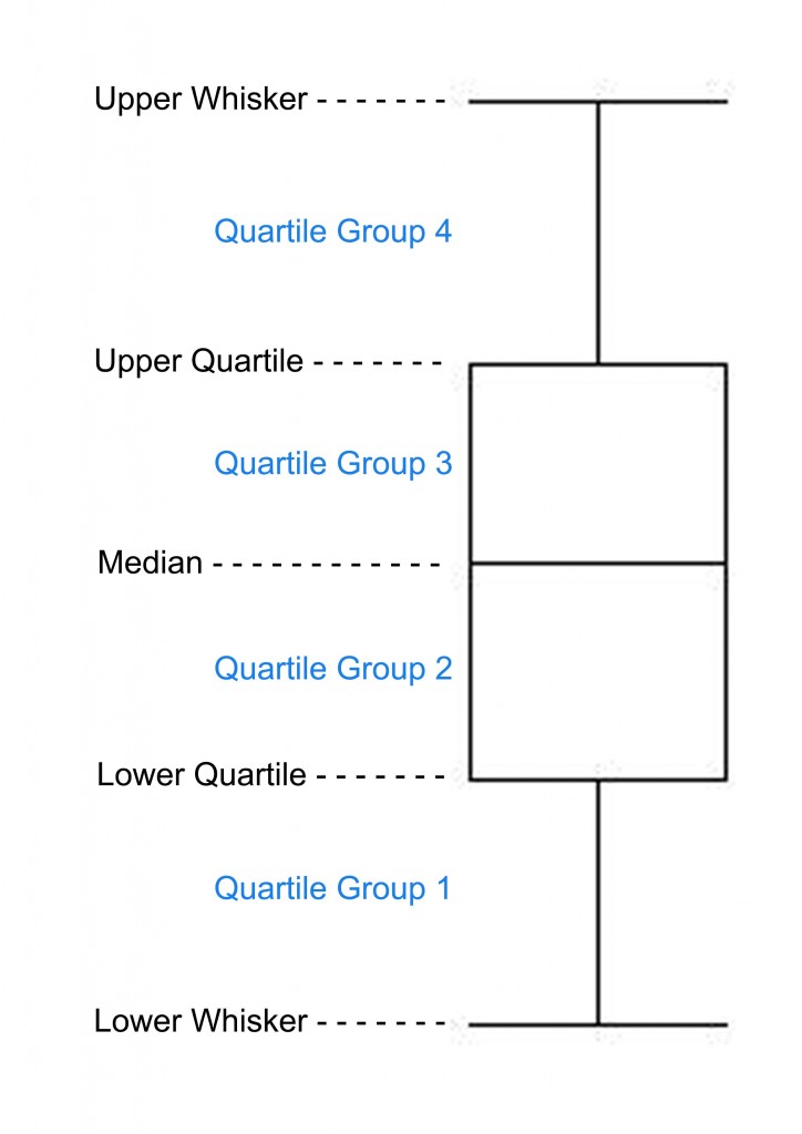
With box plots, the values are sorted and then split in to 4 equal groups (as shown in the image below) so that 25% of all the values fall in to each group.
There are 5 key things to know regarding box plots:
The median - Marks the mid-point of the data, where half the values are greater or equal to this value and half are less or equal to this value
The upper quartile - 75% of scores fall below the upper quartile
The lower quartile - 75% of scores fall above the lower quartile
The inter-quartile range - 50% of the values fall between the upper and lower quartile (the interquartile range)
The whiskers – Generally represents the full extent of the data (this can be changed to 1.5 x the inter-quartile range if desired)
Why Use A Box Plot?
So for this example I am going to use Opta data and a very simple measure of total passes per team for each individual match.
The first question I am going to address is “why would I want to do this?” well let me explain…
Box plots are great for exploring variations between groups, in this case, teams. So let’s take our pre-match planning as an example. We want to establish our opposition’s passing ability in terms of the number of passes they attempted in order to provide us with a base knowledge around whether they are a team who dominate possession and like to pass the ball or whether they spend a large portion of the game without the ball. We also want to see how our opponent’s number of passes has varied across the season to identify whether there is the potential that the team’s number of passes differs depending on the type of opposition they play, their own formation or any number of other factors.
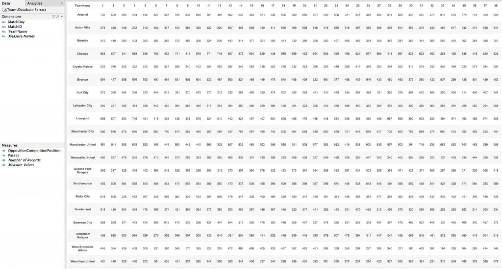
First of all I am going to connect to my data. This is a database created by parsing the Opta F24 XML files for the 2014/15 English Premier League season using Alteryx. The database is aggregated on a per match per team level, that is to say, for example, that it contains the total number passes for each team in each match they played.
For ease of understanding I have removed all the fields except the ones in which I am going to be using.
Let’s Get Vizzing
Box plots can be created very quickly in Tableau, even quicker since the addition of the analytics pane in Tableau 9.
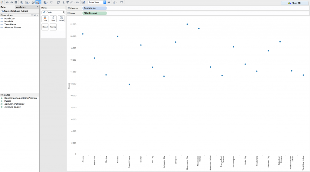
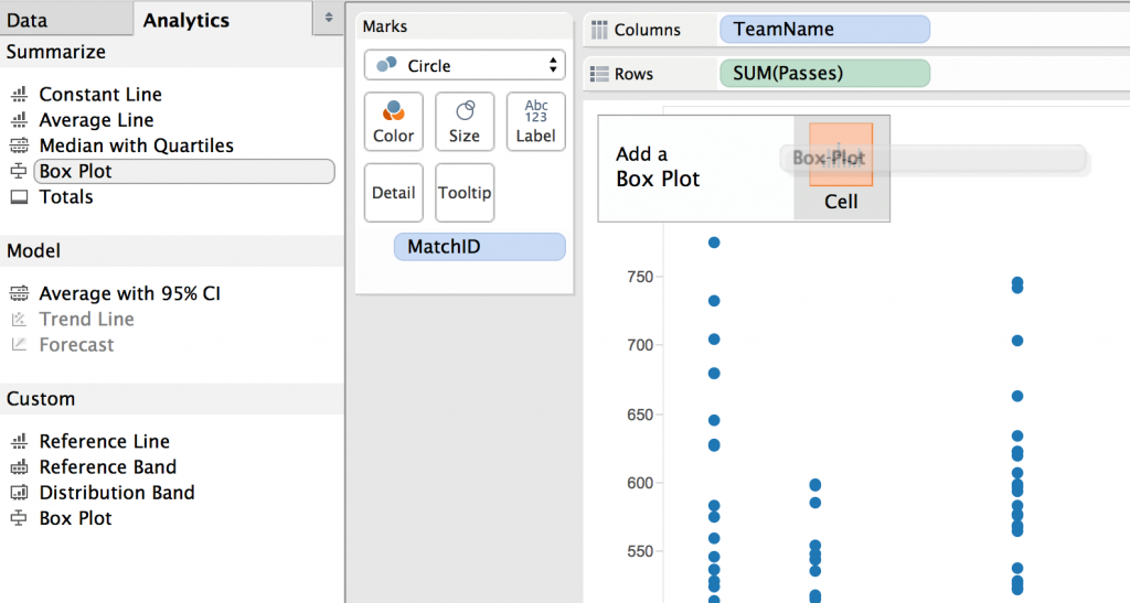
I started by dragging the ‘TeamName’ dimension on to the columns shelf and the ‘Passes’ measure on to the rows shelf (‘Passes’ default aggregates to ‘SUM(Passes)’). I also then changed the chart type (on the marks card) to ‘circle’.
This provides us with a simple chart where the circle indicates the total number of passes made by each team.
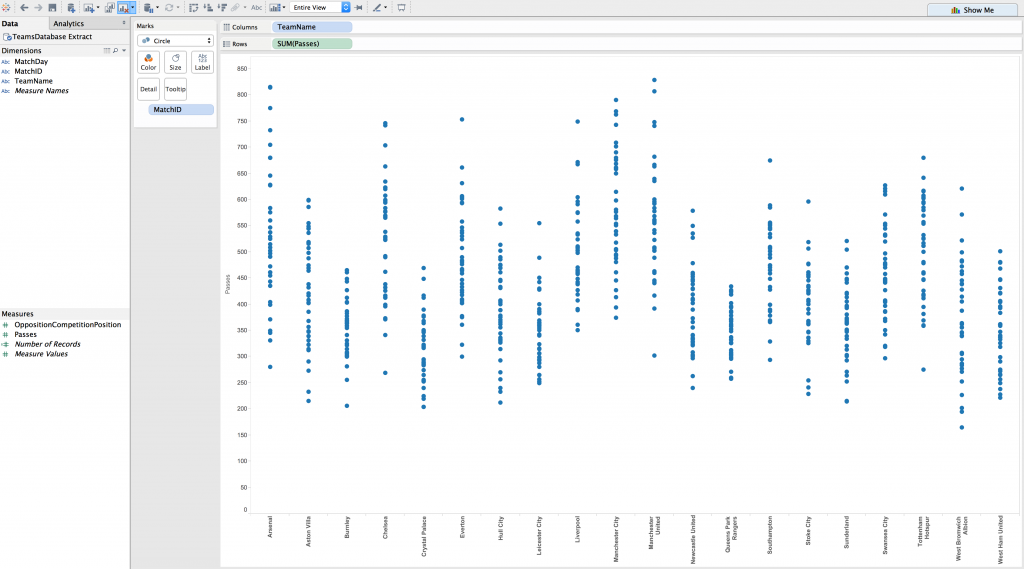
What we want to do though is to look at the variation of each individual team’s number of passes on a per match basis. To do this we just drag the MatchID dimension on to ‘detail’ on the marks card. MatchID is a unique ID for each individual match and will therefore split our circle marks to number of passes per match for each team (see below).
The next step is not only the most important in creating a box plot in Tableau, but it is also remarkably simple.
Select the analytics pane from the sidebar and drag the ‘Box Plot’ object on to the view. You will see a box appear in the top left of your view, just drop the ‘Box Plot’ object on to ‘Cell’ and voila…
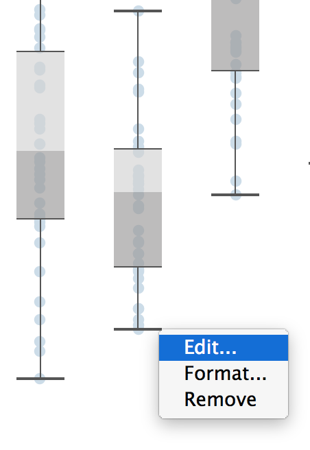
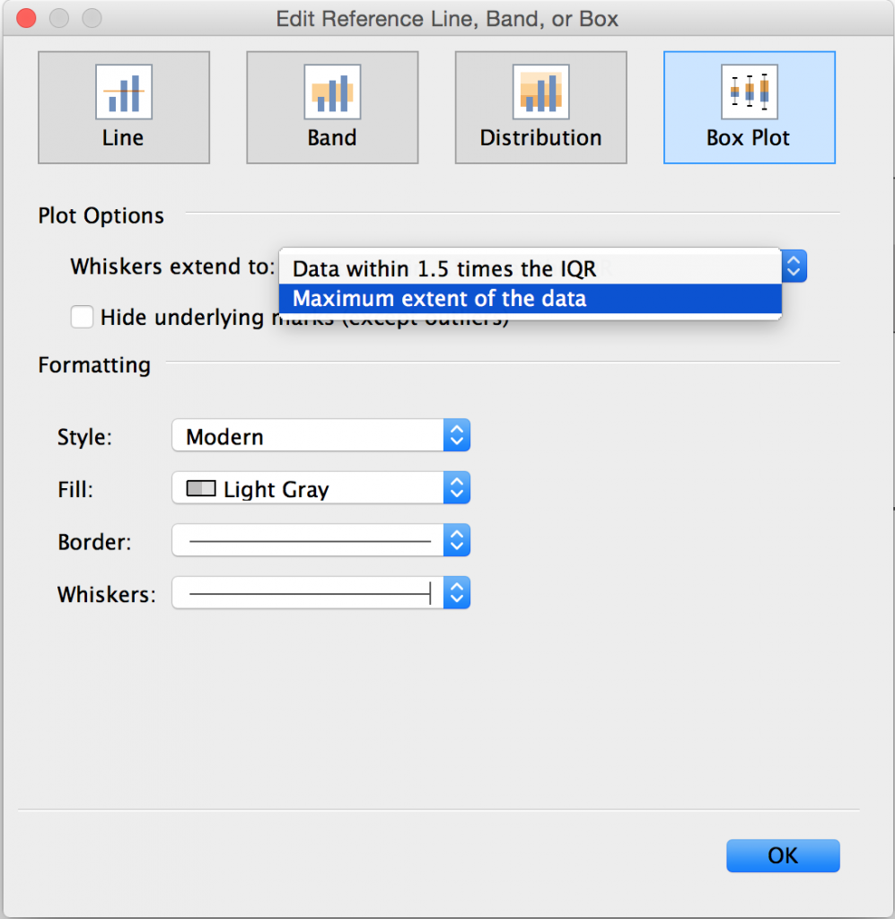
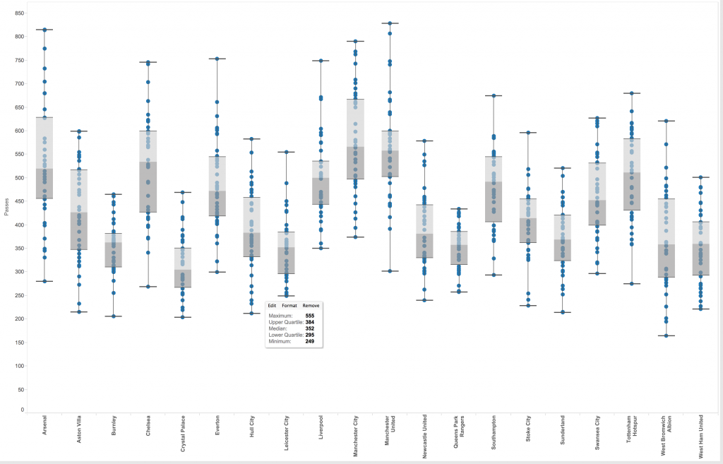
First thing to note is Tableau’s default preference to extend the whiskers to 1.5 x the inter-quartile range. I believe box plots are designed to show the full range of all the data and therefore always change the whiskers to extend to the maximum extent of the data. To do this simply right click on any part of any box plot and click edit. In the box that will pop up you have the option to change the magnitude to which the whiskers extend to along with other formatting options.
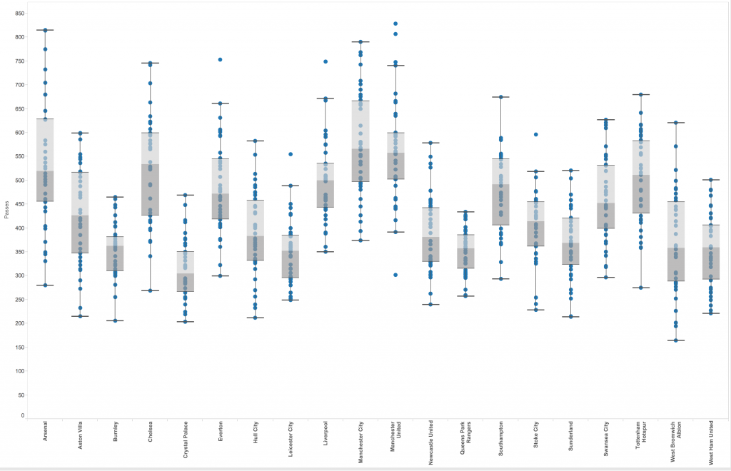
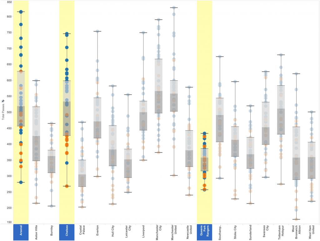
We can now see from the screenshot below that the whiskers extend to the maximum extent of the data. We can also describe the box plot by hovering over one of the box plots and a tooltip will appear with the maximum and minimum value, the median and the upper and lower quartile values.
What Am I Looking For?
Now you have your box plot, it is important to know what you are looking for. Put simply, any difference in box plots between groups (teams) could be something to look in to further. But let’s be a little bit more specific than that with these 4 key observations:
- A short box plot shows there is little variation in values for that team.
- A tall box plot shows there is large variation in values for that team.
- If one box plot is higher or lower than another, this suggests there is a difference between the two group's values
- If the four quartiles of the box plot are uneven in size it shows that there is little variation in scores between the smallest quartile and a larger variation in the bigger quartile.
Let’s Add Context
As always, context is king, so let’s add a little more detail to our box plots that will perhaps help us understand our opponents a little bit more.
It is common place for a team’s playing style to change when they are playing tougher opponents (sometimes out of choice and sometimes down to the quality of the opposition). So let’s take this in to account and group each team’s number of passes in to games versus the top 6 teams and games versus the other 13 teams.
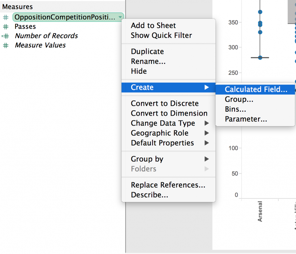
Our first port of call for this is to create a calculated field that will provide a true or false value as to whether the opponents are a top 6 team or not. To do this I will right click on my ‘OppositionCompetitionPosition’ field (which is a field that has a team’s final position for the season) and select Create > Calculated Field…
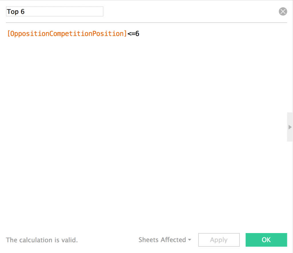
I have given this calculated field a name of ‘Top 6’ and it is going to be a true/false field as to whether the opposition’s final league position was less than or equal to 6.
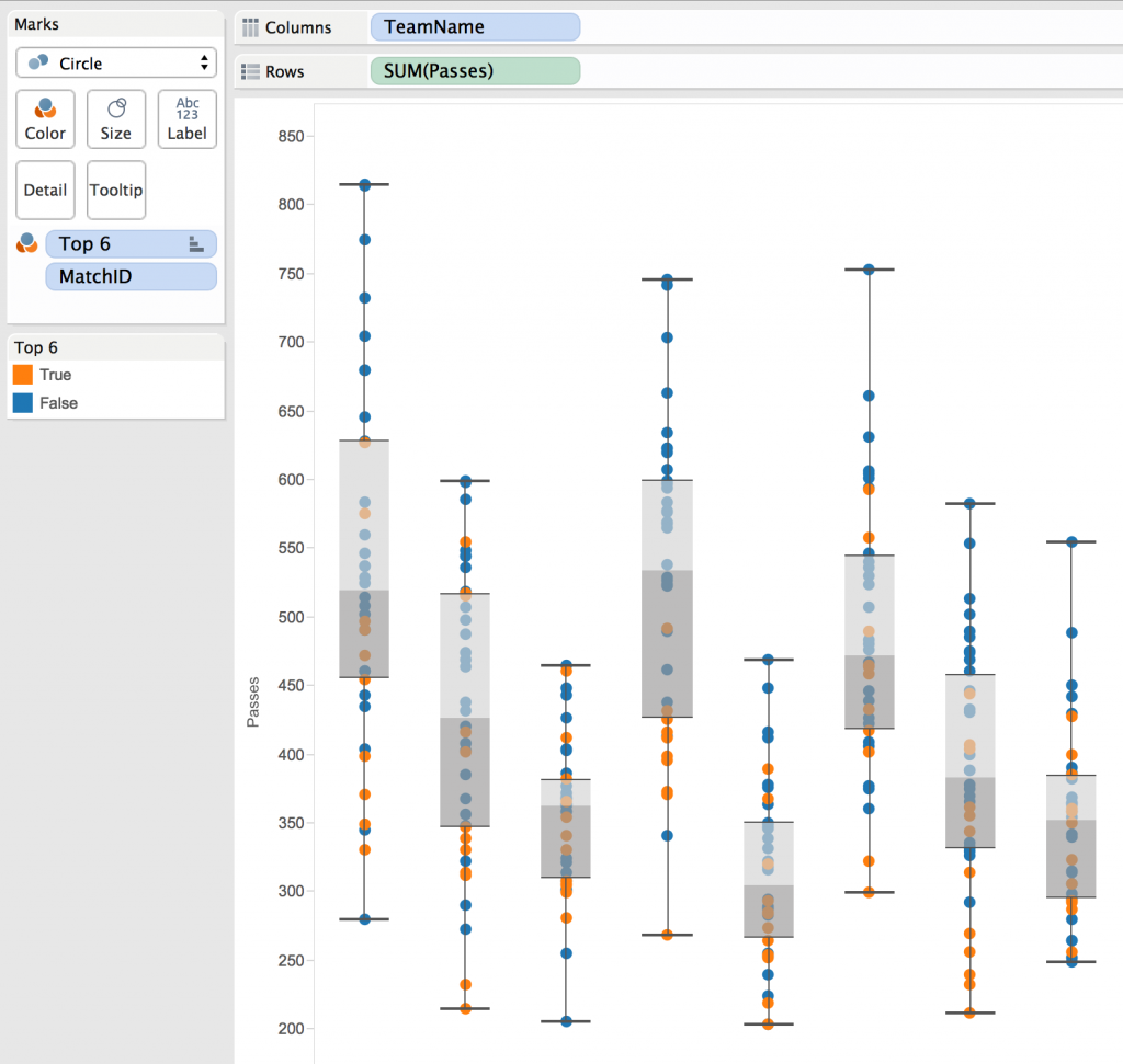
I then need to drop this ‘Top 6’ calculated field on to the color mark and the top 6 teams are now orange.
Exploring My Data
I’m now going to have a little visual exploration of my data and let’s see what we can establish from this very basic metric…
I am going to look at three teams in particular, Arsenal, Chelsea and Queens Park Rangers and have observed the following…
- In general, Queens Park Rangers attempt fewer passes than Arsenal and Chelsea (obvious right?)
- Arsenal have the largest range of values suggesting that the number of passes they make does vary match by match and needs further exploration. Ie. What was different in their match against West Ham United where they only attempted 280 passes compared to their match against Aston Villa where they attempted 815 passes? And does this affect the way your team is going to set-up against them?
- Chelsea, in general, attempt fewer passes against higher quality teams. Is this down to the way they set-up or the quality of the opposition?
Box plots provide a quick visual means of understanding a metric better and can instigate further, more insightful data exploration.

