

Pirlo, Scholes, Xavi, Zico, Platini….
Everyone’s list of football’s best passers will be different, but just like this list, what makes each individual player a world-class passer is also different. Whether it is beautiful tika-taka, cutting through balls or exquisite diagonals, there is variety in the world’s best performers and to understand them (and why they are the best), where better to start then looking at their pass maps.
What Data Do I Need?
So let’s be blunt about this, the data is the most important topic in pass maps, you cannot create pass maps without the correct data, so let’s set some prerequisites:
- You need to have a unique ID for each pass (in most cases the timestamp will do, but not all, so for best practice ensure you have a ‘UniqueID’ for each pass.
- You need the X/Y co-ordinates of pass location
- You need the X/Y co-ordinates of pass end
- You need to have the dimension you wish to break the passes down by in the same row of data as the UniqueID & X/Y co-ordinates.
- You need a ‘Path Order’ more on this later, but in short, this identifies the start of the pass and the end of the pass
We can obtain the first 4 of these prerequisites from our parsed Opta F24 XML files (for more details on this see my previous blog on Parsing Opta XMLs).
The only thing we have missing is our ‘Path Order’ – So let's have a look at one possible solution to get this field…
Connecting To My Data
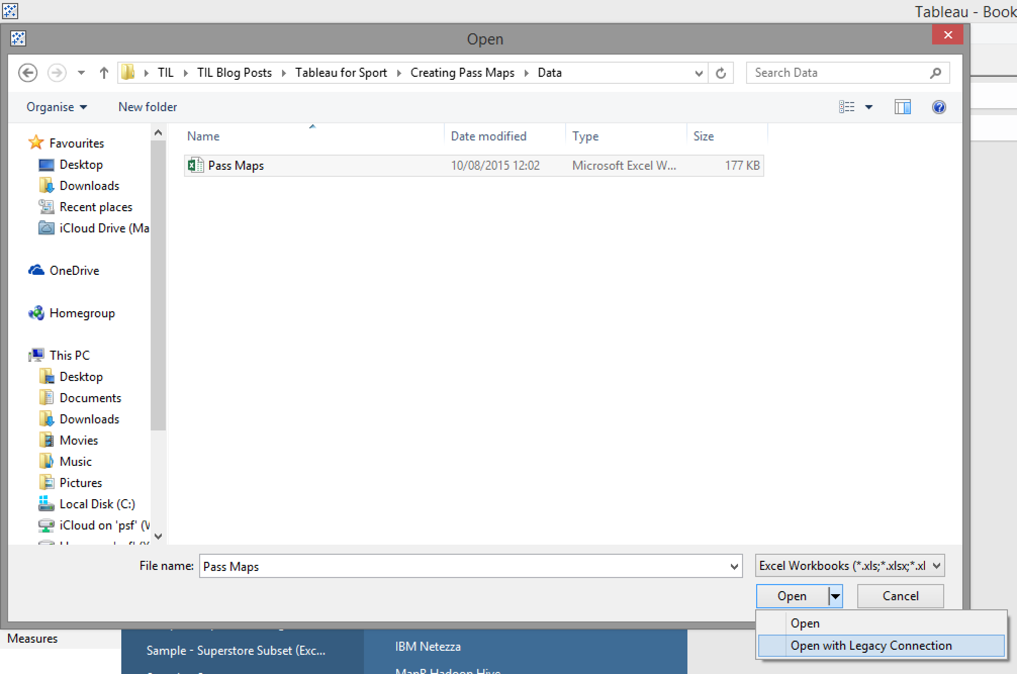
There are many ways in which we can do this but I am going to use an Excel database of Opta data.
First lets connect to our data source. Because we are going to carry out some simple custom SQL in the next step then we need to connect to our Excel database with a legacy connection (click here for more information on legacy connections).
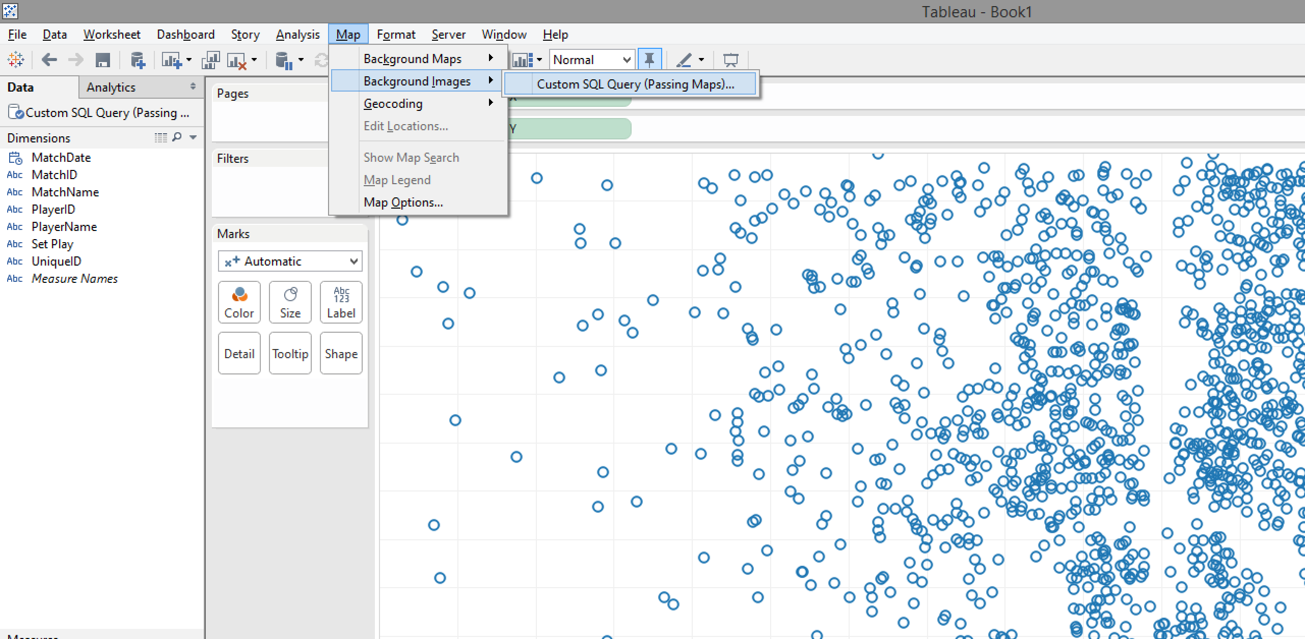
Next it is time for our custom SQL – Drag the custom SQL option from the left hand list of data sources in to the window that says “Drag sheets here”. A window will appear where we need to right some SQL as per the screenshot below.
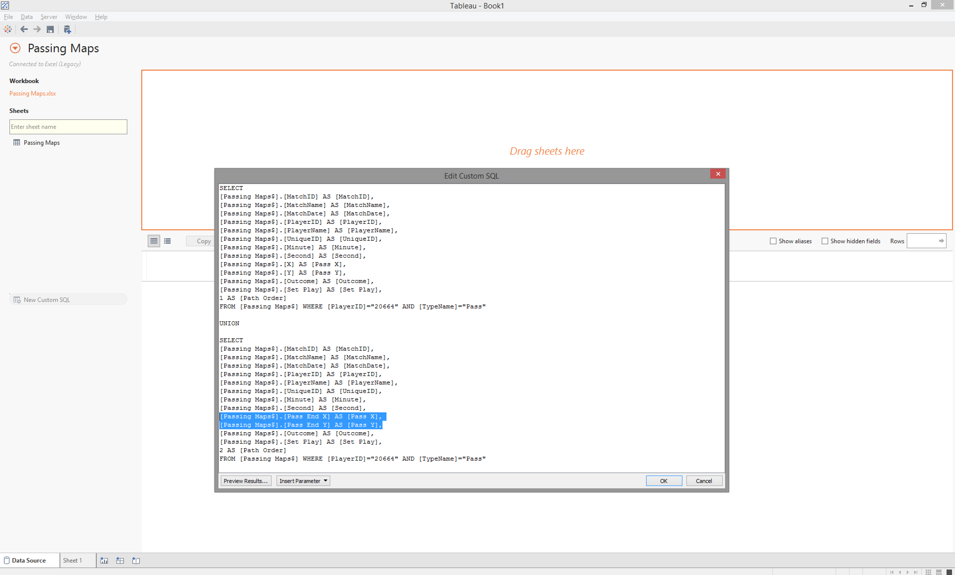
This top half of the SQL (everything prior to the word ‘UNION’) brings through the relevant fields for the dashboard I am going to create, as well as renaming the X & Y fields to Pass X & Pass Y respectively.
Along with this I am also creating a new field called ‘Path Order’ and giving all rows (all passes) the value ‘1’. I have also created a WHERE filter to only include PlayerID = “20664” and TypeName = “Pass”, but you can adjust this as suits your needs.
We then need to Union this to the same data again with a couple of important changes…
The same fields are called in the bottom half of the union as the top, but this time we want ‘Pass End X’ & ‘Pass End Y’ as opposed to ‘X’ & ‘Y’, but we will still rename ‘Pass End X’ & ‘Pass End Y’ to ‘Pass X’ & ‘Pass Y’ (as we did with ‘X’ & ‘Y’ in the top half of the union).
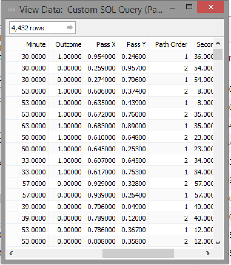
If we preview the results we can see we now have two lines per UniqueID (per pass), one with Path Order of ‘1’ and the X/Y co-ordinates of the start location of the pass and the second row with a Path Order of ‘2’ and the X/Y co-ordinates of the end location of the pass.
Creating My Viz
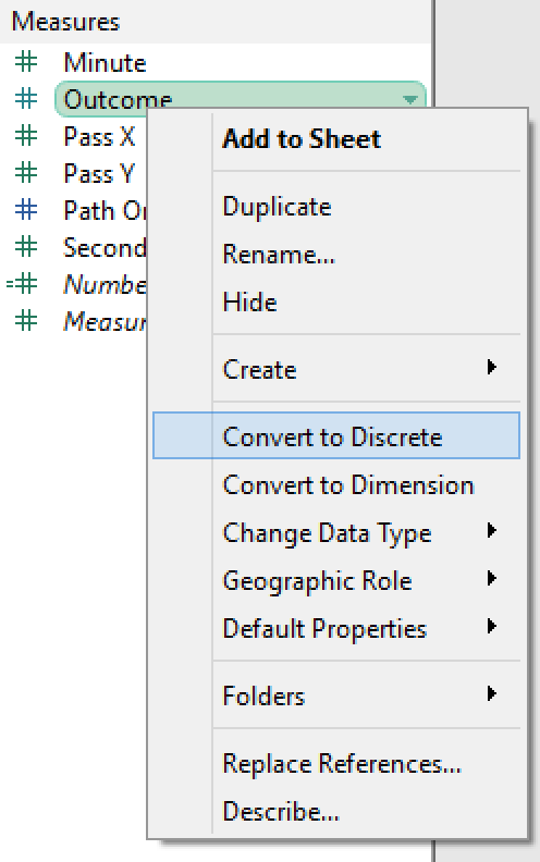
First port of call is to convert our ‘Outcome’ and ‘Path Order’ measure fields to discrete by right-clicking on the measures and choosing this option from the menu.
Next we drop ‘Pass X’ on to the columns shelf and ‘Pass Y’ on to the rows shelf and then convert both of these fields to dimensions from the right-click menu.
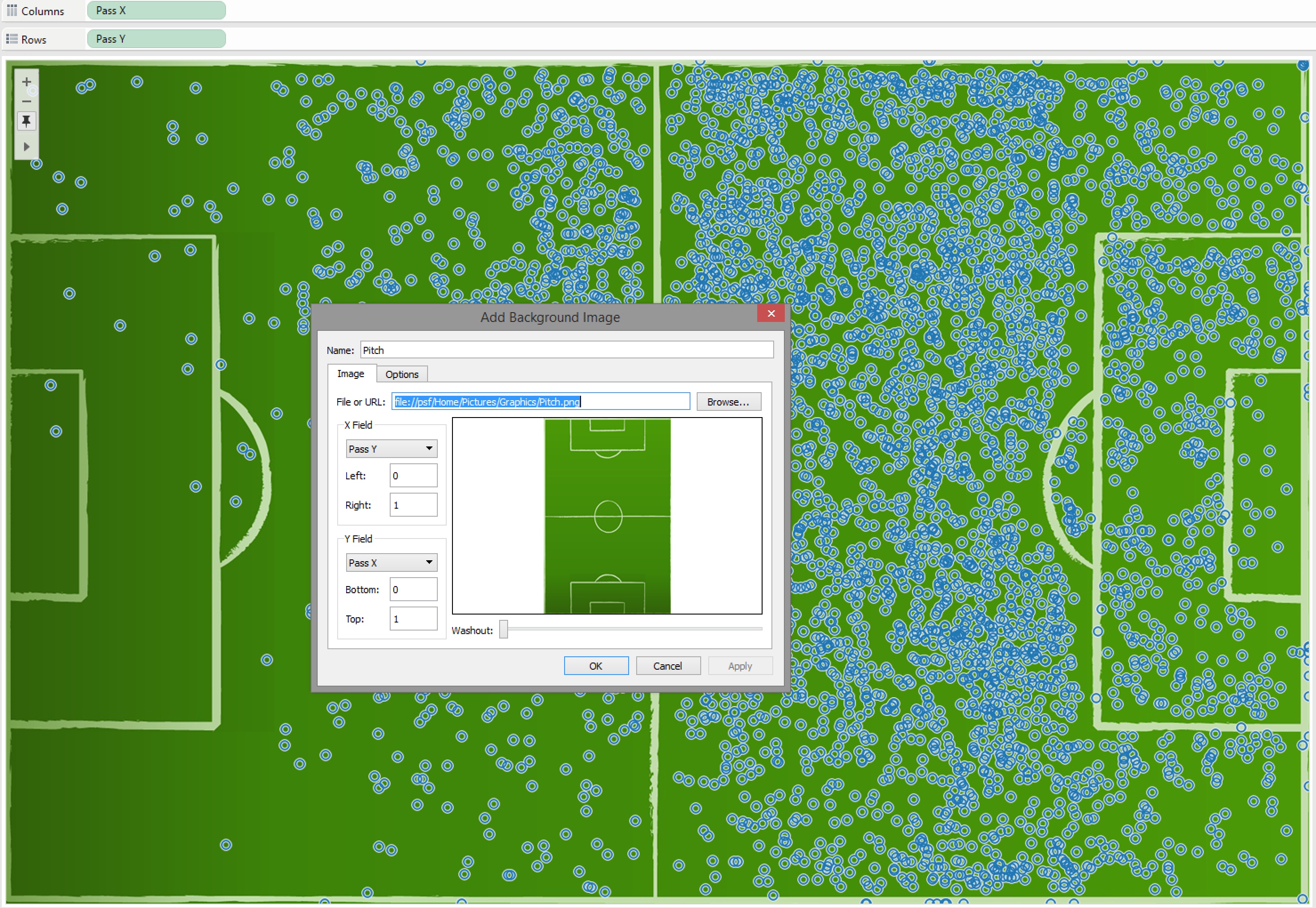
Now we can see the X & Y co-ordinates of all passes start and end locations, let’s add a background image of a pitch to add a bit more context.
From the toolbar select ‘Map’, ‘Background Images’ and then your current data source. From the configuration window that appears, choose the location of the image you wish to use as well as the fields (in this instance Pass X & Pass Y) that are defining our axis. I have also set the min and max for each field to 0 and 1 consistent with the Opta data.
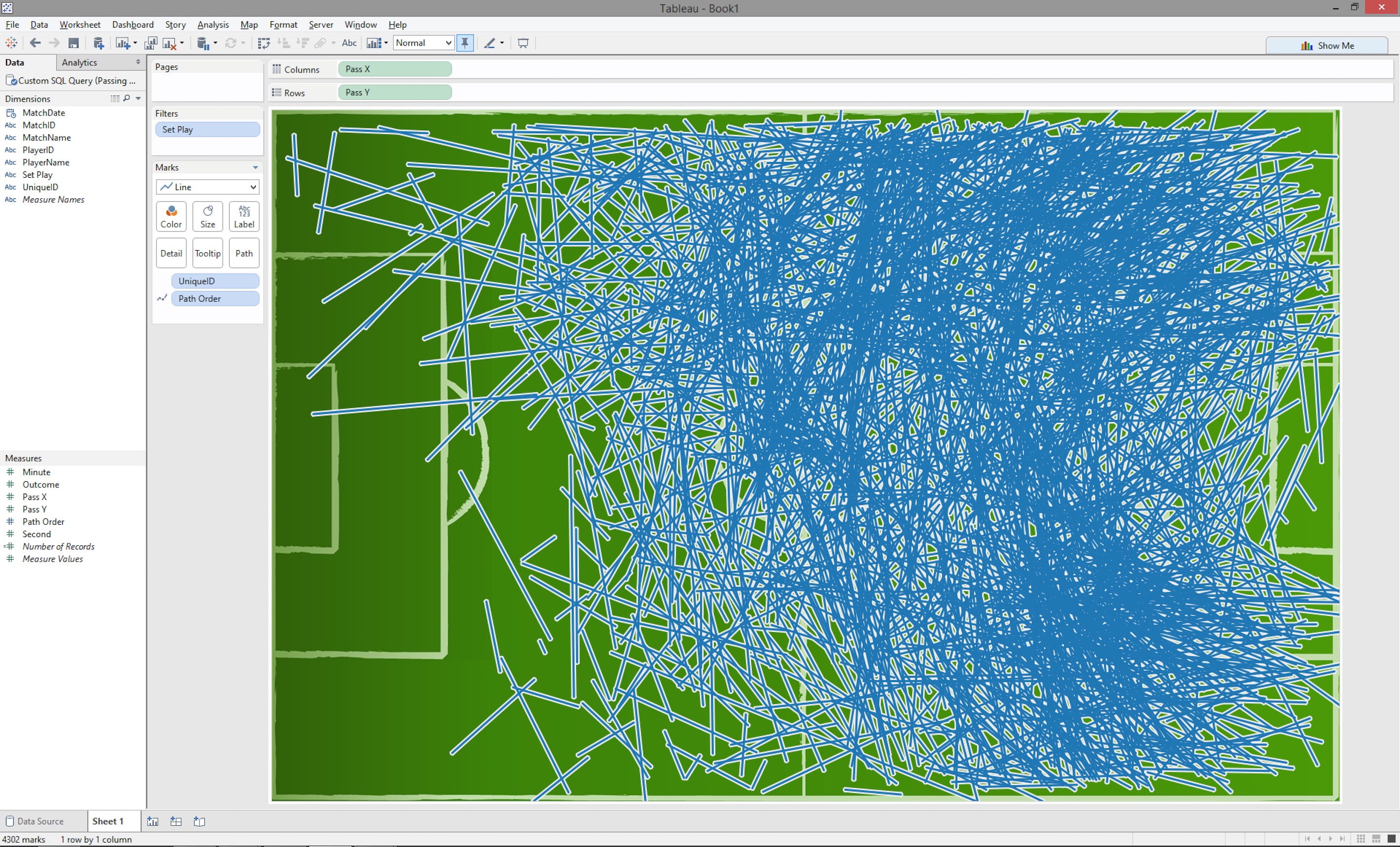
We then need to change the viz to a line chart from the marks shelf and drop ‘Path Order’ on to path and ‘UniqueID’ on to details – Now we can see the viz really taking shape.
All that’s left to do is tidy and smarten up our viz for it to be a clearer and insightful...
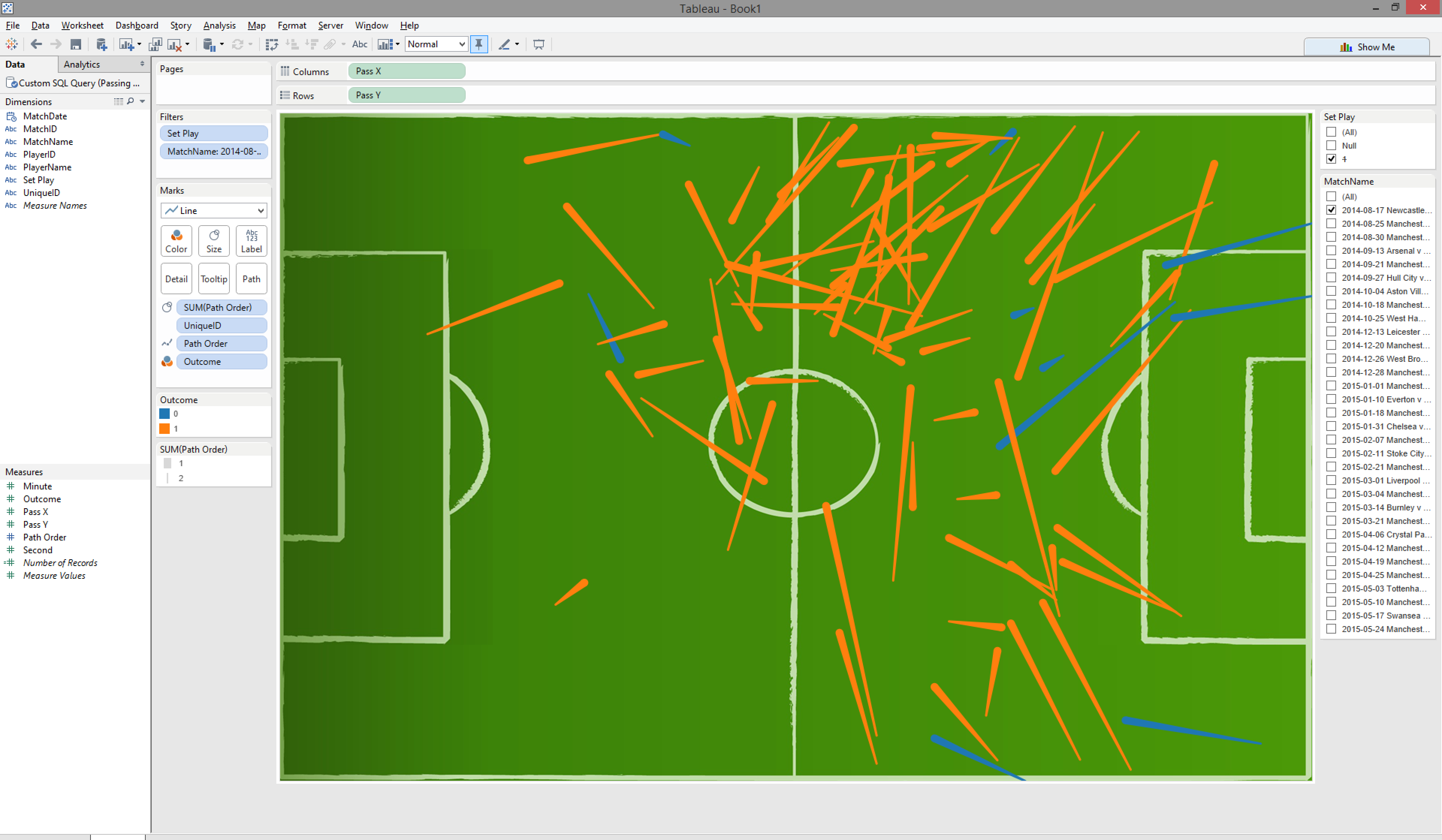
In the example above I have; dropped ‘Outcome’ field on to the colour card to distinguish between successful and unsuccessful passes; dropped ‘Path Order’ on to the size card (and reversed the sizes) to distinguish the flow of the pass (pass start to pass end); hiding the axis; removing set play passes and creating a match filter by dropping the ‘Set Play’ and ‘MatchName’ fields on to the filters shelf.
Voila – There we have it, an interactive pass map that we can tweak until our heart’s content. Enjoy!