16 April 2015
Tableau is a very flexible tool, it allows us to display the same data content in various ways. One of the countless examples of this flexibility is that we can show measures in separate views or we can include many of them in the same view, enabling the user to switch between the measures. While parameters make this switch easy, if those measures have different units, moreover, we want to colour the values based on varying rules, involving them in the same view gets a bit more complicated. We do not discuss now the basics of how to create this 'measure switch' with a parameter or the reasons of placing the measures in the same view instead of their own worksheets. As always, let's walk through a simple example to demonstrate the solution.The exampleLet's say that we have a small data file summarizing the performance of a brand's corporate websites across multiple countries. We have to visualise four KPIs (key performance indicators) in the same view in line with below brief: For the sake of simplicity we work with a miniature data file:
 The objective is to have a map where the viewer can switch between these KPIs, all of them are displayed with correct unit of measure, meaningful colour codes reflect the KPIs value and the tooltip gives guidance about the colour codes.We will go along the journey from the brief to the end result through a set of challenges and the solutions to them. We can already suspect some of them due to having different units of measure and absolute sizes, some having categories to base coloring on, some not and while most improving as the values increase there is one (Maintenance cost) that is the contrary.Challenge #1: create a calculated field which shows these measures with a uniform number format.Solution: 'Page views per visit' has to be displayed with one decimal. 'Returning visitors %' can also be shown in one decimal as that is very practical for a percentage. We keep in mind that 'Maintenance cost' has to be represented in K EUR. The task is then to bring all these measures to a one decimal figure format.What is then the formula of the calculated field we apply to create the view?
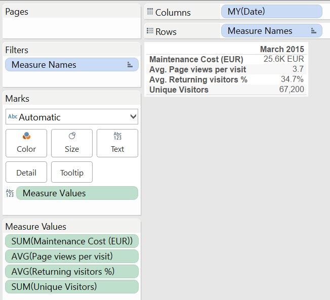
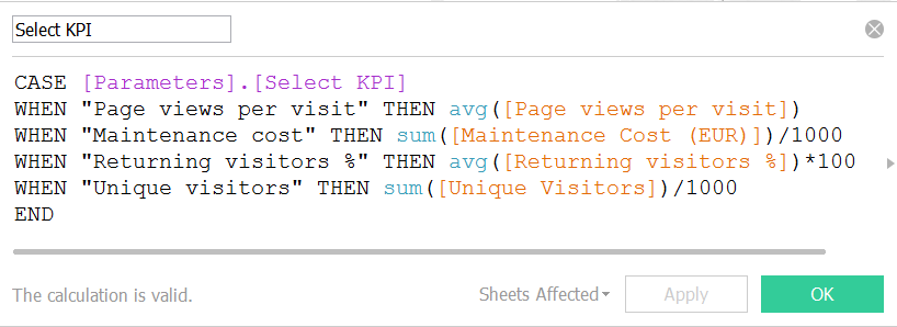 You may notice that this is already the brand new calculated field editor panel of Tableau Desktop version 9. One of our earlier posts introduces a selection of new features.Now, let's compare the default properties of these measures in Tableau with the 'Select KPI' calculated field that we will use for the switch. (The value of this calculated field is tied to a parameter that allows users to select a KPI for the view.)Individual KPIs Select KPI field
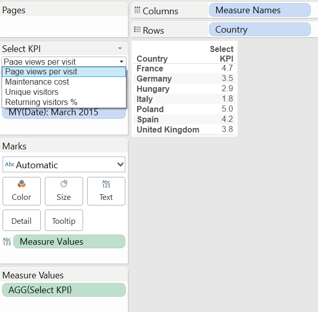 Note that it does not matter which parameter value we select via the 'Select KPI' parameter control (on the right hand side), the format is always a one decimal figure as we set that for the 'Select KPI' calculated field.In line with this, what does our initial map look like?
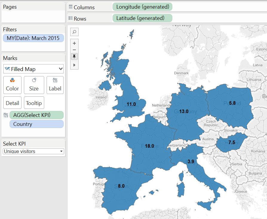 No colours yet, no units of measure but everything appears with one decimal, a small step towards our objective!Challenge #2: display the correct units of measuresSolution: this is simple. We just write a calculated field that's value depends on our parameter and use that on the Label button on the Marks card together with the 'Select KPI' field.
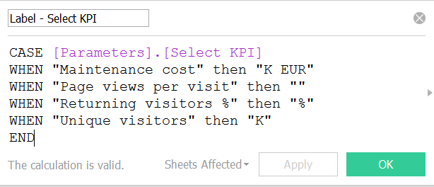 The map is evolving:
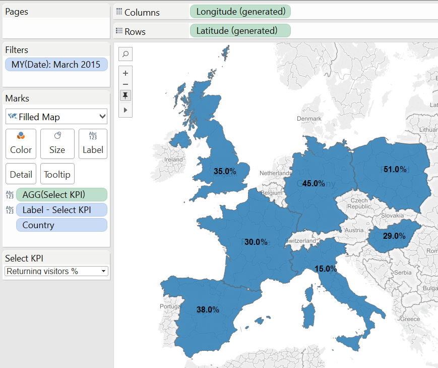 Challenge #3: Colour the map based on the given ranges of valuesSolution: I have to admit that this is the part why I wanted to write this post. In our theoretical project the colour code categories of 'Page views per visit' and 'Returning visitors %' will create three discrete colour codes: Red, Amber and Green. They can be easily returned with logical statements:
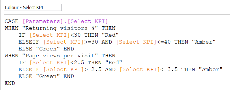 The real challenge is that we want to colour also the other two measures (Maintenance cost and Unique visitors) that are continuous, no categorization of their values is available yet (e.g. our client hasn't given one). We can either use discrete colours or continuous colour in our visualisation but not both at the same time. So how do we approach the quadrature of the circle? The statistical term 'range' is the hint. 'Range' is practically the difference between the maximum and minimum value of a measure. What if we split the range of 'Maintenance cost' or 'Unique visitors' into three same sized intervals (tertiles)? Before Tableau v9 we had to turn to a duplicate data source to complete the calculation, now it is made simple by the LOD (level of detail) calculations. The formula for 'Maintenance cost' is:
 Let's walk through the key points without going into the details of LOD calculations. In case of 'Maintenance cost' the lower the value, the better so the (MIN + Range/3) will be green. Any value in between (MIN + Range/3) AND (MIN + Range/3*2) becomes amber and the rest (above MIN + Range/3*2) turns red. Why do we first INCLUDE Country and then EXCLUDE Country? The data file in its current format contains one record per country. We have to prepare for the chance that in the future this file would contain several records per country. (Maybe the website Maintenance cost is added up from different items like content creation, administration, etc. and these are entered in separate records within the Maintenance cost field.) What we are initially looking for is the MIN and MAX of 'Maintenance cost' values aggregated to Country level (the country totals). After we have these values (e.g. Poland's country level aggregated value is the maximum, Hungary's country level aggregated value is the minimum), we want to subtract the MIN from the MAX (to get the range) but at this stage we are doing the calculation across countries so the 'Country level of detail' has to be excluded. (Otherwise with this data we received zero as within each country the difference between the maximum and minimum of values is zero as there is only one data value by country.)After writing the correct logical statements for all four measures within one field, we drag that field onto the Color button on the Marks card.It is time to take a look at our map again.
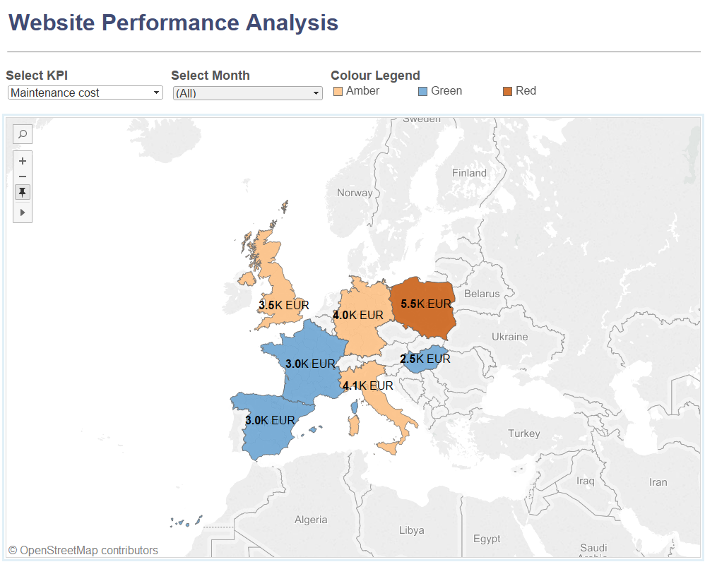
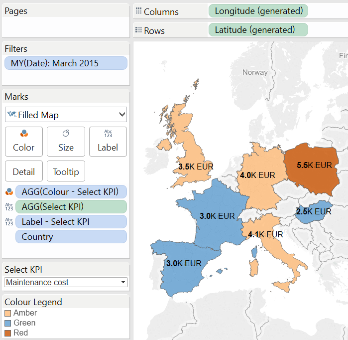 We are also working with color blind friendly color codes instead of the 'traditional' red-amber-green.Challenge #4: Informative tooltips that tell the relevant KPI performance categories.Solution: after solving the issue of color codes, tooltips are relatively simple. We again need a calculated field:
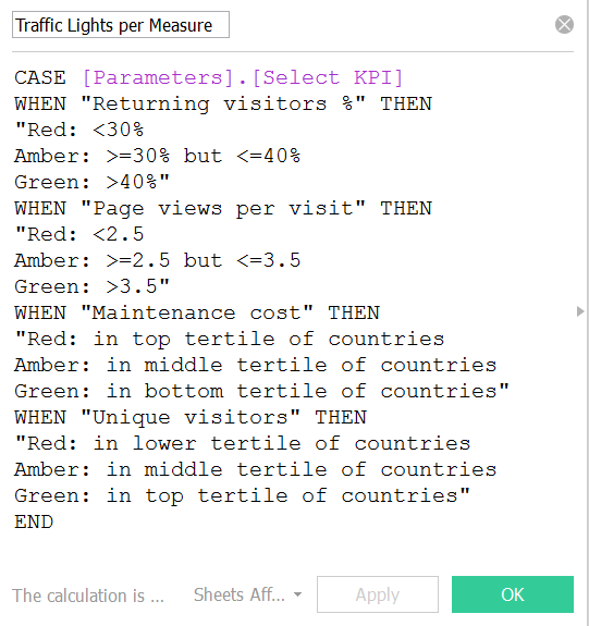 Combining this field with other vital pieces of information the tooltips become real aids.
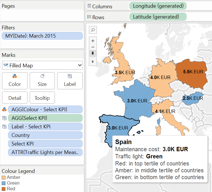 I hope these solutions will be useful in your daily Tableau tasks. By clicking on the image below you can view the complete dashboard on Tableau Public.
 For the sake of simplicity we work with a miniature data file:
 The objective is to have a map where the viewer can switch between these KPIs, all of them are displayed with correct unit of measure, meaningful colour codes reflect the KPIs value and the tooltip gives guidance about the colour codes.We will go along the journey from the brief to the end result through a set of challenges and the solutions to them. We can already suspect some of them due to having different units of measure and absolute sizes, some having categories to base coloring on, some not and while most improving as the values increase there is one (Maintenance cost) that is the contrary.Challenge #1: create a calculated field which shows these measures with a uniform number format.Solution: 'Page views per visit' has to be displayed with one decimal. 'Returning visitors %' can also be shown in one decimal as that is very practical for a percentage. We keep in mind that 'Maintenance cost' has to be represented in K EUR. The task is then to bring all these measures to a one decimal figure format.What is then the formula of the calculated field we apply to create the view?
 You may notice that this is already the brand new calculated field editor panel of Tableau Desktop version 9. One of our earlier posts introduces a selection of new features.Now, let's compare the default properties of these measures in Tableau with the 'Select KPI' calculated field that we will use for the switch. (The value of this calculated field is tied to a parameter that allows users to select a KPI for the view.)Individual KPIs Select KPI field
 Note that it does not matter which parameter value we select via the 'Select KPI' parameter control (on the right hand side), the format is always a one decimal figure as we set that for the 'Select KPI' calculated field.In line with this, what does our initial map look like?
 No colours yet, no units of measure but everything appears with one decimal, a small step towards our objective!Challenge #2: display the correct units of measuresSolution: this is simple. We just write a calculated field that's value depends on our parameter and use that on the Label button on the Marks card together with the 'Select KPI' field.
 The map is evolving:
 Challenge #3: Colour the map based on the given ranges of valuesSolution: I have to admit that this is the part why I wanted to write this post. In our theoretical project the colour code categories of 'Page views per visit' and 'Returning visitors %' will create three discrete colour codes: Red, Amber and Green. They can be easily returned with logical statements:
 The real challenge is that we want to colour also the other two measures (Maintenance cost and Unique visitors) that are continuous, no categorization of their values is available yet (e.g. our client hasn't given one). We can either use discrete colours or continuous colour in our visualisation but not both at the same time. So how do we approach the quadrature of the circle? The statistical term 'range' is the hint. 'Range' is practically the difference between the maximum and minimum value of a measure. What if we split the range of 'Maintenance cost' or 'Unique visitors' into three same sized intervals (tertiles)? Before Tableau v9 we had to turn to a duplicate data source to complete the calculation, now it is made simple by the LOD (level of detail) calculations. The formula for 'Maintenance cost' is:
 Let's walk through the key points without going into the details of LOD calculations. In case of 'Maintenance cost' the lower the value, the better so the (MIN + Range/3) will be green. Any value in between (MIN + Range/3) AND (MIN + Range/3*2) becomes amber and the rest (above MIN + Range/3*2) turns red. Why do we first INCLUDE Country and then EXCLUDE Country? The data file in its current format contains one record per country. We have to prepare for the chance that in the future this file would contain several records per country. (Maybe the website Maintenance cost is added up from different items like content creation, administration, etc. and these are entered in separate records within the Maintenance cost field.) What we are initially looking for is the MIN and MAX of 'Maintenance cost' values aggregated to Country level (the country totals). After we have these values (e.g. Poland's country level aggregated value is the maximum, Hungary's country level aggregated value is the minimum), we want to subtract the MIN from the MAX (to get the range) but at this stage we are doing the calculation across countries so the 'Country level of detail' has to be excluded. (Otherwise with this data we received zero as within each country the difference between the maximum and minimum of values is zero as there is only one data value by country.)After writing the correct logical statements for all four measures within one field, we drag that field onto the Color button on the Marks card.It is time to take a look at our map again.
 We are also working with color blind friendly color codes instead of the 'traditional' red-amber-green.Challenge #4: Informative tooltips that tell the relevant KPI performance categories.Solution: after solving the issue of color codes, tooltips are relatively simple. We again need a calculated field:
 Combining this field with other vital pieces of information the tooltips become real aids.
 I hope these solutions will be useful in your daily Tableau tasks. By clicking on the image below you can view the complete dashboard on Tableau Public.