

tl;dr version
Here's how to make bar graphs with standard errors and confidence intervals in Tableau. It involves making some calculations yourself, which may or may not differ from Tableau's built in versions. You can download the workbook showing you how to make the graphs here:
https://public.tableau.com/profile/gwilym#!/vizhome/Standarderrorsandconfidenceintervals/Standarderrorbarsoptions
Why show variance in your graphs?
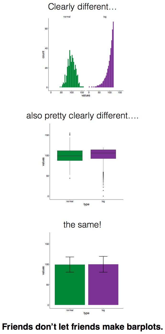
Sometimes when you plot values on a graph, you want to show not only the aggregated value, but also the variance or uncertainty around it. Now, before I get into this blog properly, I want to say that I don't actually recommend plotting bar graphs with error bars or confidence intervals, as it can be misleading. The Bar Bar Plots campaign has far more information on it, but ultimately it's more honest, and really straightforward, to show the actual data points in Tableau, so why wouldn't you just do that?
But in the event that you do need to show simple bars and an indication of uncertainty, you've got two main options:
- Standard errors
- Confidence intervals
Introduction to the data
I'm going to use some data I collected during an experiment I ran in 2015. In this experiment, Dutch people learned some Japanese ideophones (vividly descriptive words). But there was a catch - half the words they learned were with the real meanings (e.g. fuwafuwa, which means 'fluffy', and they learned that it meant 'pluizig'), and half the words they learned were with the opposite meanings (e.g. debudebu, which means 'fat', but they learned that it meant 'dun', or 'thin'). Then they did a quick test to see if they remembered the word associations correctly. You can read more about that here, if you like.
All the following graphs in this blog have been created in this workbook on Tableau Public. Please feel free to download and explore how it's all made!
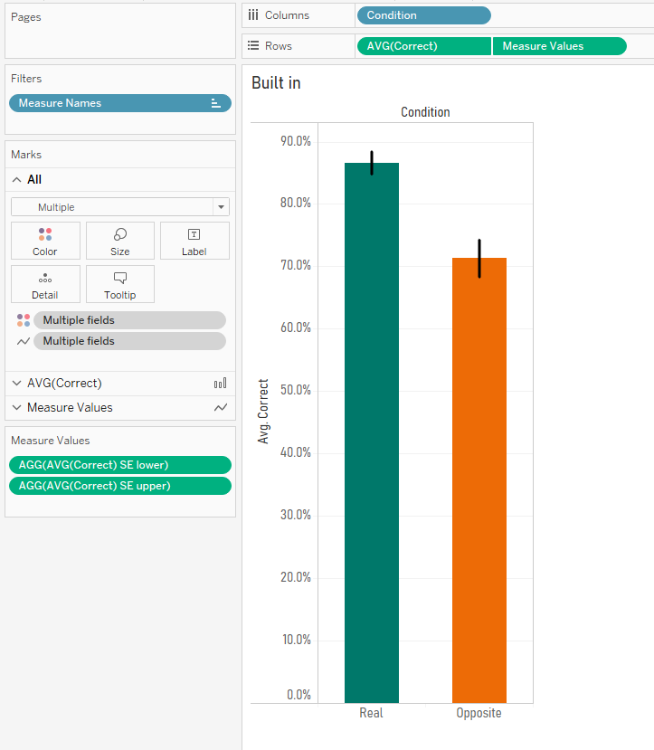
Here's a simple bar graph of the results. For the words they learned with their real meanings, people answered correctly in the test round 86.7% of the time. But when tested on the words they learned with their opposite meanings, people answered correctly only 71.3% of the time.
But this hides the variation in the data. Sure, the average in each condition (and the difference between them) is what I care about, but with simple bar graphs, it's easy to forget that lots of individual people are below and above the average in each condition. You can see that variation here:
Also, these are averages taken from a sample. I can't go to a conference and say, 'hey everybody, I've done the research and Dutch undergrads get 86.7% correct in the real condition and only 71.3% in the opposite condition'… well, I could, but it would be misleading. I can't guarantee that these results are definitely in line with what the entire population of Dutch undergrads would get if I somehow managed to test all of them, so I need to make some kind of statement about the uncertainty of that result. I can do this with standard errors or confidence intervals.
Standard errors
Let's start with standard errors. The standard error of the mean is essentially a way of saying how uncertain you are about the mean based on the size of your sample by estimating the standard deviation of the whole population. The wikipedia article on standard errors is pretty good.
The first step is to create a field for the standard error. This is the standard deviation of the scores per condition, divided by the square root of the number of participants:
STDEV([Correct])
/
SQRT(COUNTD([Participant]))
You'll notice I've also got fields for the sample standard deviation and the not sample standard deviation. This is from when I was playing around with different calculations for the standard deviation of the sample vs. the standard deviation of the population. I'm not going to go into it in this blog, but here's a really nice explainer here, and you can download the workbook to investigate further. In summary, it looks like Tableau's native STDEV() function uses the formula for the corrected sample standard deviation by default, rather than the population standard deviation. This is pretty nice, it feels like a safer assumption to make. Cheers, Tableau.
Now that we've got the standard error, we can create new fields for our upper and lower standard error limits like this:
AVG([Correct]) - [SE]
and
AVG([Correct]) + [SE]
So, now we can create some nice standard error bars. This uses a combination of measure names/values and dual axes, so it's a little bit complicated. Firstly, create your simple bars for the correct % per condition:
Now, drag the lower standard error field onto rows to create a separate graph. Drag the upper standard error field onto the same axis of that new graph to set up a measure names/measure values situation:

Now, switch the measure values mark type to line, and drag measure values from columns and drop it on the path card:

All you have to do now is create a dual axis graph, synchronise the axes, and remove condition from colour on the standard error lines:

Great! We've now got bar graphs with standard error bars. I mean, I still don't recommend doing this, but it's a common request.
Confidence intervals
Now, let's have a look at confidence intervals. They are a range around your sample mean which tell you that, if you repeated the same study over and over, X% (usually 95%) of confidence intervals from future studies will contain the true population mean. They're hard to explain (there's a good blog here), but easy to see.
In Tableau, confidence intervals are really straightforward. You can plot your data points, go to the analytics pane, and bring in an 'average with 95% CI' reference line, which creates a reference band around the average:
Nice. This is exactly how I'd like to visualise my experimental data! You can see the average per condition, the confidence intervals, and the underlying participant data.
Quick disclaimer: because I'm looking at percentages here, this is a proportion rather than a hard and fast value, so I shouldn't actually be using confidence intervals at all... but if we pretend that the 86.7% value is actually an average 0.867 value of something like my participants taking 0.867 seconds taken to respond, or young children being 0.867 metres tall at a certain age, or 0.867 kg lost for each week under a new diet plan, then it's okay. I'm just going to keep going with my percentages, but please bear this in mind.
However, if your journal insists on old school bar graphs, Tableau's built in average with 95% CI reference band won't work. Well, technically it will, it's just that it'll show you this:
Because we've had to take Participant off detail in order to show an aggregation across participants, the reference band doesn't know how to compute it, and it assumes that there's just one data point.
One way around this would to built a dual axis graph. Keep the bars with just condition on colour, and create another axis. Add participant to detail, and set the mark type to circle. Make the circles as small as possible and completely transparent, hit dual axis, synchronise axes, and voila. Now you can have an average with 95% CI reference band again.
The downside is that this is pretty ugly. The reference line/band is way outside the edges of the bars, and it just doesn't have that standard look that you're used to. What we actually want is something like our standard error lines from earlier, but with confidence intervals.
The good news is that we can do it! But we'll have to move away from Tableau's built in confidence intervals, and create our own calculation, just like we did with standard errors.
The first step is to use the standard error field we made earlier to calculate the confidence intervals. When you look up how to calculate confidence intervals, you'll probably find something saying that 95% confidence intervals are calculated by taking the mean, and adding/subtracting 1.96 multiplied by the standard error. This 1.96 figure is from the Z distribution, which tells you that 95% of normally distributed data is within 1.96 standard deviations of the mean. And because this is a sample of a population, we multiply that 1.96 by the standard error to get our confidence intervals. Here's another great blog which breaks it all down.
So, we can create separate fields for our upper and lower confidence interval limits like this:
AVG([Correct]) - (1.96 * [SE])
and
AVG([Correct]) + (1.96 * [SE])
Once we've done that, we can build our graphs. This is the same technique as the standard error bars earlier. Create the measure names/values and dual axis graph with measure names on the line path, and you'll get the same kind of graph, but now showing confidence intervals instead of standard errors:
Excellent! We've now got our 95% confidence intervals... or do we?
Confidence intervals, pt.2 - what's going on?
Some of the more statistically minded of you may have been yelling at the screen when I used the 1.96 value from the Z distribution to calculate my confidence intervals. You see, confidence intervals shouldn't always simply use the Z distribution, even though that's the standard formula you'll find when looking up the definition of confidence intervals. Rather, when you've got a small sample, which is generally defined as under 30, you should use the T distribution because the size of the sample may skew the normality of the sample. Again, there's a lot of good information here.
I started investigating this when I noticed that Tableau's average with 95% confidence interval calculations were different from my manually calculated ones. Have a look at this comparison - you'll notice that the confidence interval values are slightly different:
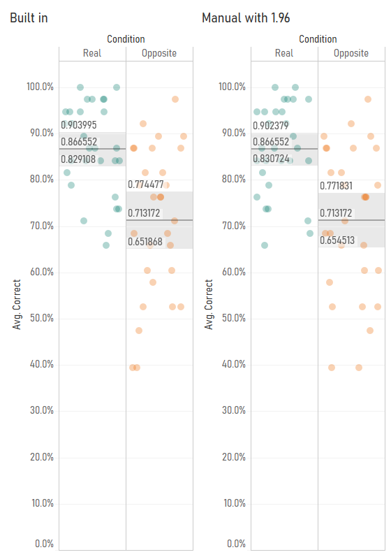
I started playing around with the Z/T value in the confidence interval calculation by making it parameter-driven, and I found that Tableau's confidence interval calculation seemed to use a number like 2.048 rather than 1.96:
This is because Tableau's confidence interval calculation is using the T distribution rather than the Z distribution. You can find the appropriate T values to use based on your degrees of freedom (which is your sample size minus one) in Appendix B.2 of this very useful pdf (there's also a table set to 4dp instead of 3dp here). In my case, I've got 29 participants, so the degrees of freedom is 28, and the lookup table shows that the relevant T value for a 95% confidence interval is 2.048, so I can put that in my confidence interval calculations. It also looks like Tableau's confidence intervals are calculated on a more precise number than 2.048, which suggests that the back end is calculating it directly from the T distribution rather than using the fairly common approach of looking it up in a table where everything is rounded to three decimal places. That's pretty nice too.
My next step was to check whether Tableau switches between the T and Z distributions based on sample size. So, I duplicated my data and fudged the [correct] field by a random number to create a sample of 58 participants. With 58 participants, it's fine to use the Z distribution to calculate 95% confidence intervals. But even then, it looks like Tableau is using the T distribution - when I set my parameter to 2.0025 using the slightly-more-precise values in the T table here, you can see that the confidence intervals using T values, not Z values, match Tableau's calculations:
This is pretty good as well, I think. As your sample size increases, the T distribution starts to match the Z distribution more and more closely anyway. Notice how, with 29 participants, the T value was 2.0484, and with 58 participants, it was 2.0025. This is getting closer and closer to 1.96. At 200 participants, the T value would be 1.9719. Overstating the confidence intervals by using the T distribution is safer default behaviour than accidentally understating them by using the Z distribution.
So, to conclude, I've found out the following about confidence intervals in Tableau:
- They're based on standard errors which use the corrected sample standard deviation (and Tableau's STDEV() function returns the corrected sample standard deviation as well).
- They're based on the T distribution regardless of your sample size.
Again, I've published the workbook containing my demo graphs and my standard deviation and T vs. Z explorations here: https://public.tableau.com/profile/gwilym#!/vizhome/Standarderrorsandconfidenceintervals/Standarderrorbarsoptions
One final word of thanks to my colleague David for helping me out with some of the troubleshooting!