10 February 2015
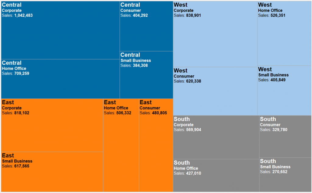
Treemap essentialsThe 'treemap' is a chart type that displays hierarchical or part-to-whole relationships via rectangles. In case of hierarchical (tree-structured) data these rectangles are nested. The space in the view is divided into rectangles that are sized and ordered by a measure. Nested rectangles mean that hierarchy levels in the data are expressed by larger rectangles (above in the hierarchy) containing smaller ones (below in the hierarchy).The rectangles in the treemap range in size from the top left corner of the chart to the bottom right corner, with the largest rectangle positioned in the top left corner and the smallest rectangle in the bottom right corner. In case of hierarchical data - when the rectangles are nested -, the same ordering of the lower level rectangles is repeated within each higher level rectangle in the treemap. So the size, and thus the position of a rectangle that contains other rectangles is determined by the sum of the areas of the contained rectangles.Treemaps can be created via different tiling algorithms to calculate the sizes and determine the positions of rectangles but this post will not go into the details of these tiling methods.Let’s see now an example of a treemap showing part-to-whole relationships and then a nested treemap from hierarchical data.Simple 'part-to-whole' treemap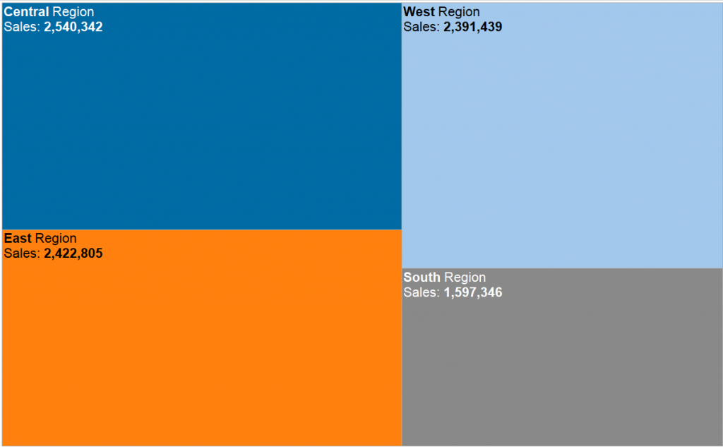 Nested treemap
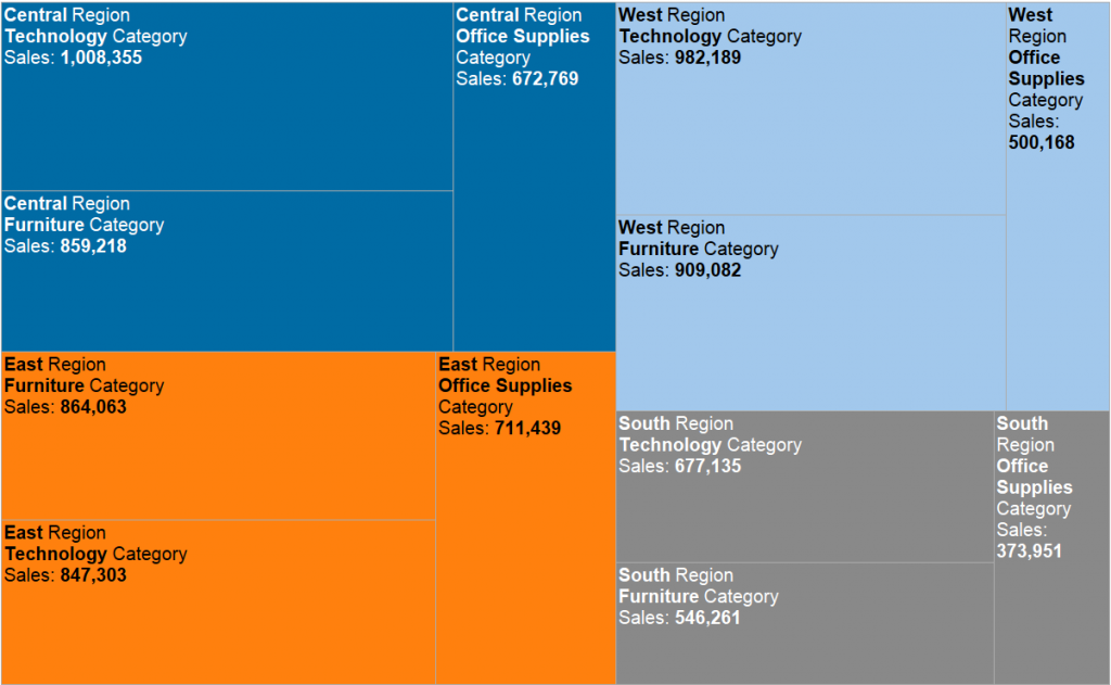 Before we move onto 'Show ME' - the advantages / disadvantages of treemapsAs treemaps always fit into the view, they are ideal to provide further drill-down navigation options without having to scroll the chart. They tell the big picture well (what is big, what is small, what is the order among the main items). One disadvantage vs a bar chart is that the human eyes translates length easier then area so a bar chart may be preferred when the users will be looking for exact gaps / differences in sizes. In an earlier blog post we compared treemaps with bar charts and it can be concluded that in the vast majority of cases bar charts are the preferred option.Show Me How: TreemapsTreemaps are one of those complex chart types where the user-friendliness of Tableau really shines. We can create a simple, non-hierarchical treemap with just dropping a dimension to color and a measure to size. Still, we want to get there even faster, here comes the ’Show ME’ panel to play.
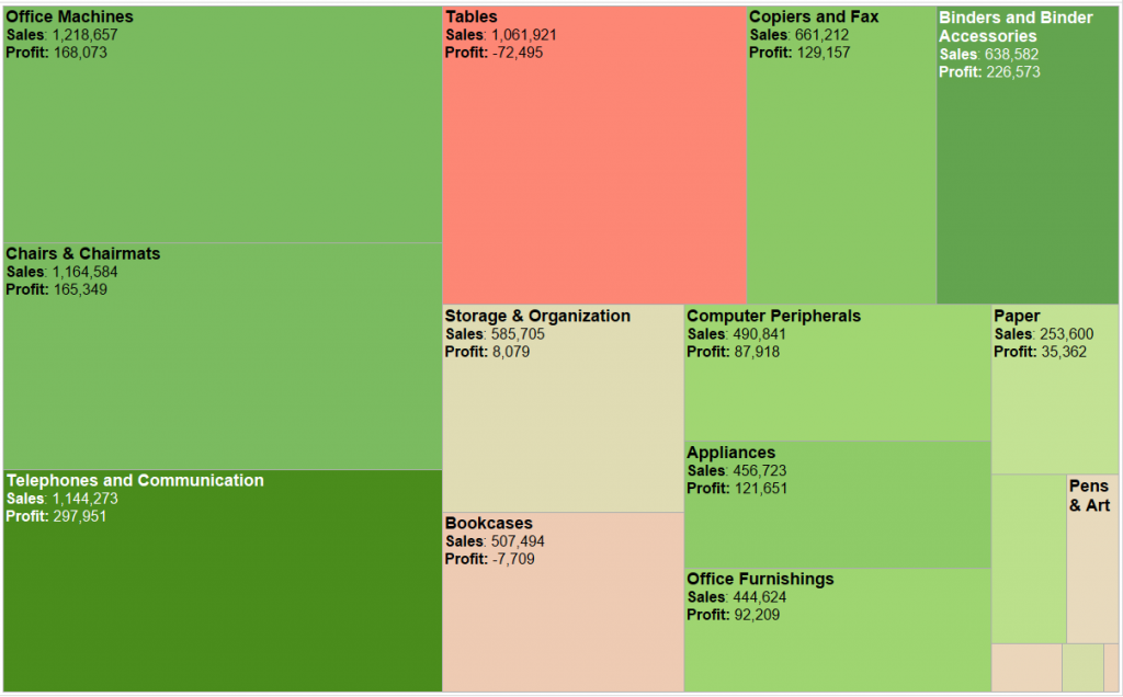
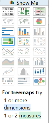 We are instantly notified by Tableau about the options: for treemaps we should select 1 or more dimensions and 1 or 2 measures.The second measure is always used for coloring the rectangles. The second (and further) dimensions are adding hierarchy to the heatmap and lead to nesting within the primary dimension. If having only one measure in the view the rectangles may be colored by a dimension to visually 'group' them.Treemap sized by Sales colored by a secondary measure, Profit.
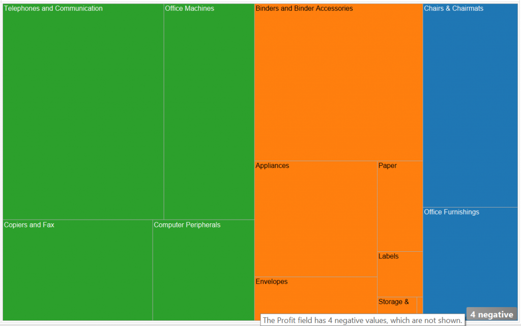
 Treemap colored by a dimension.
 What to keep in mind when we create a treemapSize: size of the rectangles is determined by a quantitative measure the values of which should sum up along the hierarchical structure of the data. This measure must always be more or equal to zero as you cannot express a negative number with size. This is why the measure of ‘Profit’ can not be used to express size on the treemap.
 Color: the best suited measure to color a treemap is a performance measure (a few examples are 'Profit', 'Growth rate' or 'Customer Satisfaction'). Use a single color scale when the measure starts at zero, two color scale when it is ranging from negative to positive (e.g. Profit).Labels: these should not clutter the treemap. Also, all the labels should be fully visible, not truncated. Tableau helps us achieve this by writing out only those labels that fit in the rectangles. I recommend to indicate the measure name(s) besides the measure value(s) in the label. Just type in the measure names using the Label button on the Marks card.Treemap without measure name labels
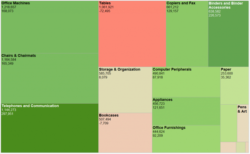 Treemap with measure name labels
 We addressed the argument of using bar chart over treemap in an earlier post. There I was struggling to find a really good use case for treemaps but received a very valid comment. Treemaps are indeed helpful when there are a large number of items to display with high concentration of values - so a few items account for majority of the total. Then a treemap draws attention to the big ticket items on the top left while also indicating the total number of items (the dense area on the bottom right of the chart). A typical visualisation like this is displaying files on a computer, ordered by size.Even though it is easy to create a treemap in Tableau, in the vast majority of the cases - outside of the one mentioned above - it is worth not giving in to the temptation but just visualise your data with a good old bar chart.Please visit this index to see what has already been posted in our Show Me series and what is coming up next.
 Nested treemap
 Before we move onto 'Show ME' - the advantages / disadvantages of treemapsAs treemaps always fit into the view, they are ideal to provide further drill-down navigation options without having to scroll the chart. They tell the big picture well (what is big, what is small, what is the order among the main items). One disadvantage vs a bar chart is that the human eyes translates length easier then area so a bar chart may be preferred when the users will be looking for exact gaps / differences in sizes. In an earlier blog post we compared treemaps with bar charts and it can be concluded that in the vast majority of cases bar charts are the preferred option.Show Me How: TreemapsTreemaps are one of those complex chart types where the user-friendliness of Tableau really shines. We can create a simple, non-hierarchical treemap with just dropping a dimension to color and a measure to size. Still, we want to get there even faster, here comes the ’Show ME’ panel to play.
 We are instantly notified by Tableau about the options: for treemaps we should select 1 or more dimensions and 1 or 2 measures.The second measure is always used for coloring the rectangles. The second (and further) dimensions are adding hierarchy to the heatmap and lead to nesting within the primary dimension. If having only one measure in the view the rectangles may be colored by a dimension to visually 'group' them.Treemap sized by Sales colored by a secondary measure, Profit.
 Treemap colored by a dimension.
 What to keep in mind when we create a treemapSize: size of the rectangles is determined by a quantitative measure the values of which should sum up along the hierarchical structure of the data. This measure must always be more or equal to zero as you cannot express a negative number with size. This is why the measure of ‘Profit’ can not be used to express size on the treemap.
 Color: the best suited measure to color a treemap is a performance measure (a few examples are 'Profit', 'Growth rate' or 'Customer Satisfaction'). Use a single color scale when the measure starts at zero, two color scale when it is ranging from negative to positive (e.g. Profit).Labels: these should not clutter the treemap. Also, all the labels should be fully visible, not truncated. Tableau helps us achieve this by writing out only those labels that fit in the rectangles. I recommend to indicate the measure name(s) besides the measure value(s) in the label. Just type in the measure names using the Label button on the Marks card.Treemap without measure name labels
 Treemap with measure name labels
 We addressed the argument of using bar chart over treemap in an earlier post. There I was struggling to find a really good use case for treemaps but received a very valid comment. Treemaps are indeed helpful when there are a large number of items to display with high concentration of values - so a few items account for majority of the total. Then a treemap draws attention to the big ticket items on the top left while also indicating the total number of items (the dense area on the bottom right of the chart). A typical visualisation like this is displaying files on a computer, ordered by size.Even though it is easy to create a treemap in Tableau, in the vast majority of the cases - outside of the one mentioned above - it is worth not giving in to the temptation but just visualise your data with a good old bar chart.Please visit this index to see what has already been posted in our Show Me series and what is coming up next.