11 December 2014
Show Me How: Symbol Maps
Using maps in Tableau is a very powerful tool that can quickly show the user geographical data at a glance. In this post I will show you how you can build a Symbol Map quickly using the 'Show Me' feature in Tableau Desktop.
What is a Symbol Map?
Symbol Maps are simply maps that have a mark displayed over a given Longitude and Latitude. Using the 'Marks' card in Tableau you can quickly build up a powerful visual that informs users about their data in relation to its location. These maps can be as simple or as complex as you need them to be and I will show you some examples to get you started.
What is a Symbol Map?
Symbol Maps are simply maps that have a mark displayed over a given Longitude and Latitude. Using the 'Marks' card in Tableau you can quickly build up a powerful visual that informs users about their data in relation to its location. You can also use data to drive the shape of the mark that is on the map either by using the Pie chart example or shapes to better show another level of detail.These maps can be as simple or as complex as you need them to be and I will show you some examples to get you started.Where to start
The first thing you are going to need is geographical data, this means that you either have to have the Longitude and Latitude for the data points you want to show or you have fields of data that you can match up to the geographical roles in Tableau for example Country, City, Postcode etc.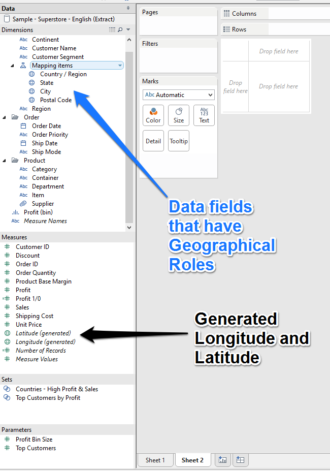
Example one
For the first example I will use the Super Store data set available with Tableau desktop.As you can see we already have the Country, State, City and Postal Codes matched to the roles so any one or all of these can be used.Double click on the Country field and Tableau will move this onto the level of detail and also move the generated Longitude and Latitude onto the rows and column shelfs. This is the most basic of a symbol maps as it is showing your data in relation to its location.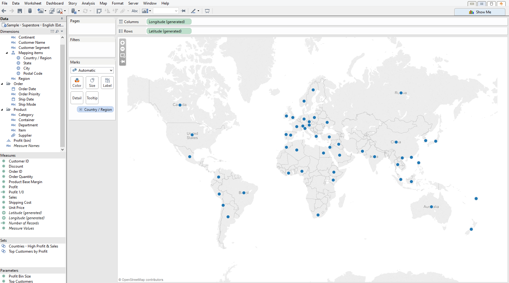 From here we can do any number of things to improve the visualisation to help inform our audience.For example we may want to have a look at how our Profit is doing per country?All we need to do is drop the Profit field from our measures section onto the Size shelf on the Marks card.
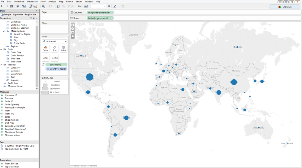 Now that we know which countries make us the most profit we may want to know what it is that makes us all this profit?We can change the Marks type from Automatic into a Pie and then drop Department onto the Color shelf on the Marks card. This will now split up each mark with the Departments profit contributions per country.
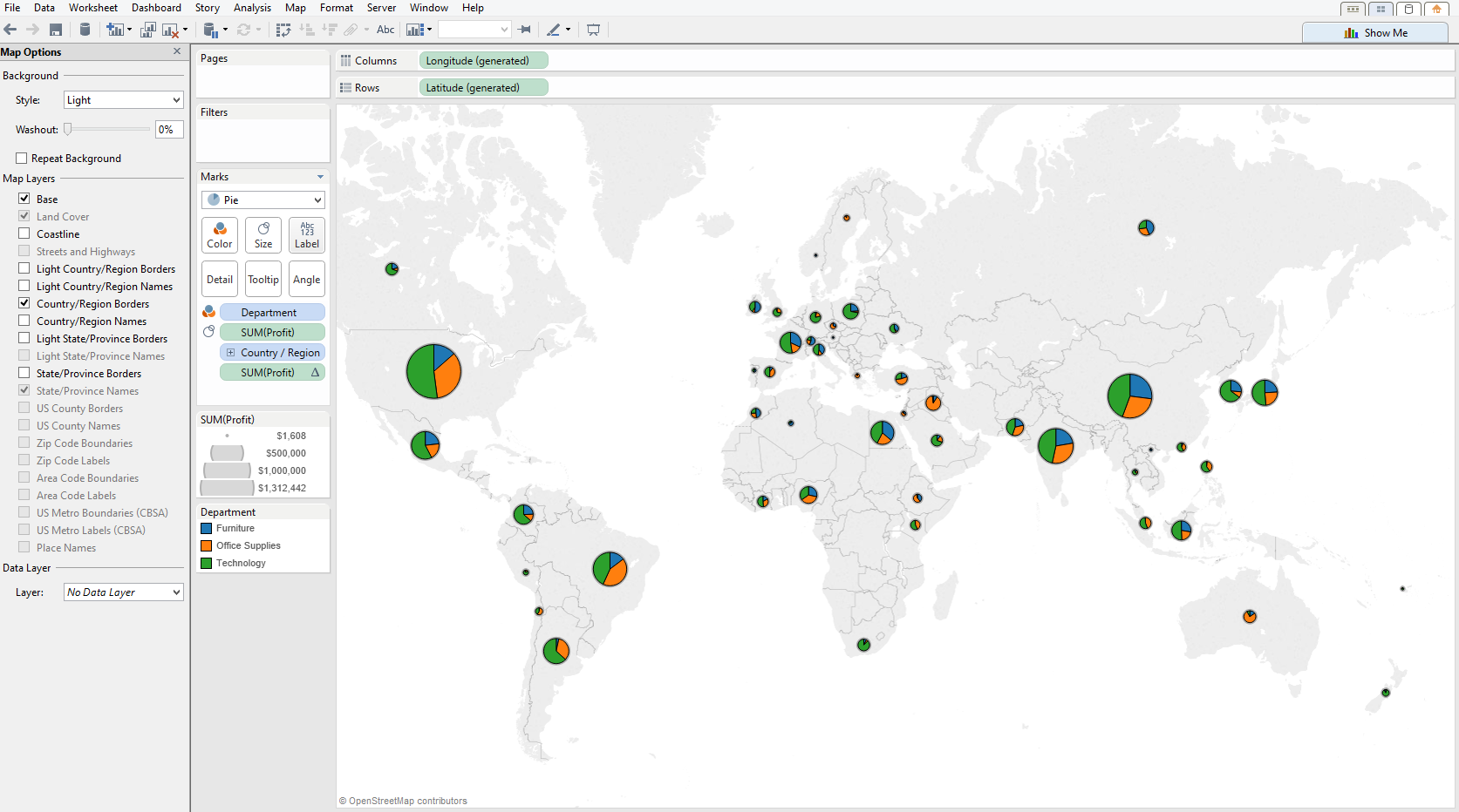
Example two
The next example is using GPS data gathered from a mobile phone appThe following is an example from some GPS data I had and this only provided Lat/Longs so there is no field with city or postcode to match against the inbuilt geographical roles.Each mark is a placed on its Lat/Long point as a visit and the size of the mark is the amount of time spent at each location.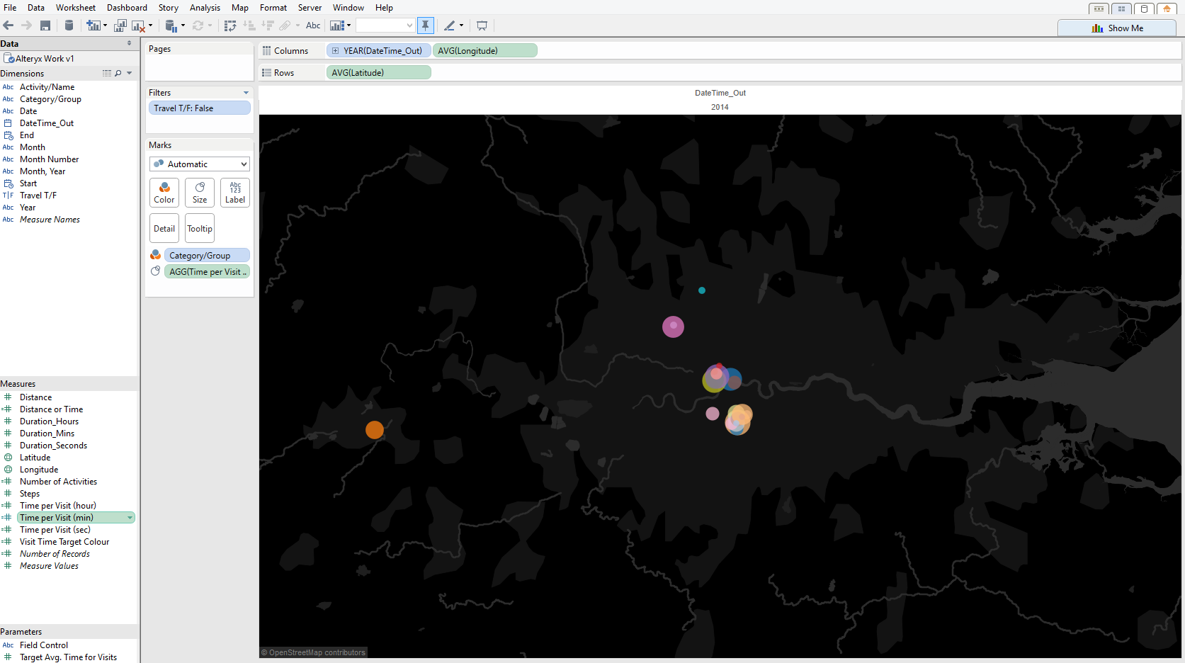
Example Three
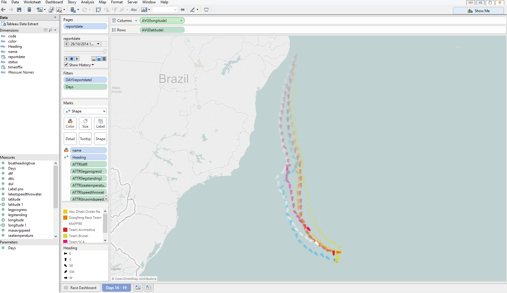
Last Example is just to show that you do not need to be on land to use the the Lat / Long methodAs you do not need to have a country or city level of detail you can actually chart data points in the middle of the sea or even against a image of your own that is not a map at all.The following is a screenshot from Chris Loves' entry into The Volvo Ocean Race Alteryx and Tableau Challenge we posted earlier. You can see all of our attempts here The Volvo Ocean Race Tableau Challenge and have a go with the data provided if you wish.