20 January 2015
In this instalment of our Show me How series we cover creating stacked bars in Tableau and when is best to use them.
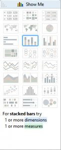 Show Me How: Stacked Bars
Stacked bar charts can be used to indicate relationships in your data. They have the benefit of being easy to understand, but are able to display an extra level of detail than a simple bar chart.Stacked bars allow you to see both the aggregation of the members in the group, and the total. Their main downfall is it can become difficult to compare the size of the individual members (in which case a side-by-side bar may be more useful). One thing to note is that a stacked bar implies a part to whole relationship - so as with pie charts make sure your groupings make sense! As with pie charts you should also be careful not to try and represent too many categories per bar, or you may find it harder to spot patterns in your data.Where to start
To make a stacked bar chart you will need two dimensions and one measure, preferably ones that imply a grouping. In this example I have data from the 2012 Olympics. In the chart I'm showing per sport, per gender, the number of gold medals won. Here's how it's made.Firstly I click and drag the Sport field from the dimensions pane to the rows shelf. Then I take the Gold field from measures and place it on the columns shelf. This creates a bar chart. All that's left is to take Gender from dimensions and drag that on to colour on the marks card. There's also a handy video at the end of the post so you can follow along step by step if needed.
Labelling stacked bars
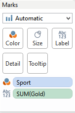 Stacked bar charts can be a little tricky to label. Let's take our Gold field again from our Measures (or if you're feeling clever, hold ctrl and click Gold on the columns shelf - this will create a copy that you can then use elsewhere on the view) and place it on text on the marks card.
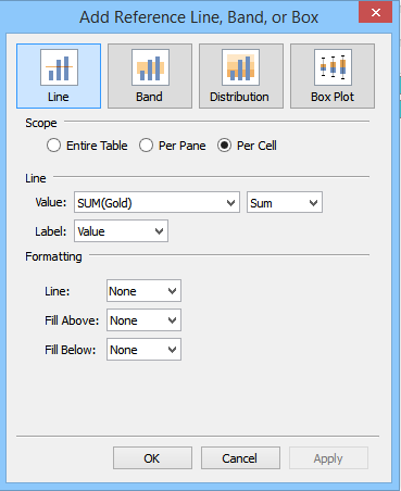
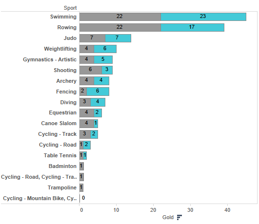 This works if we want to label the individual 'stacks'. But what about if we want to label the end of the bar with the total for all the parts? Here's where we have to get a bit clever with reference lines.Right-click the Gold axis and select 'Add reference line, band or box'. In the dialogue window that opens apply the following settings:
 Here's the result:
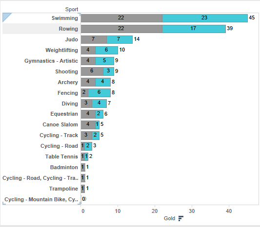 The axis lines have been added per cell to sum the number of Golds for each stack of our bars. As we chose to only display the label and not the line the reference line appears to only label our bars with the total number of Golds for each. Clever stuff.You can now format the reference lines by right-clicking on them. I like to change the alignment of the font to make them more central to the bars.My final tip is when you're placing your lovely stacked bar charts on a dashboard is to remember to include the colour legend. This lets your end user see what the different colour segments are!Here's the step-by-step video and workbook for you to download and work through.[embed]https://www.youtube.com/embed/-U4yvGx1sc0[/embed]Download the workbook