

17 March 2015
We continue the ’Show Me How’ series of The Information Lab with side-by-side circles that are conventionally called dot plots (just like the circle view). This chart type is another type of the circle view, enabling us to add more dimensions or more measures compared to a circle view. Similarly to either a circle view or a scatter plot, side-by-side circles are effectively pointing out outliers. This means that we benefit the most from this view when we work with granular data at a relatively low level of detail, though that is not a prerequisite for a side-by-side circle chart.Let’s see how we arrive to a side-by-side circle view from a simple circle view through a simple example. For this we will be using the Superstore dataset, shipped with Tableau. In an earlier post we learned how to create circle views: the essential ingredients are a measure to have an axis and a dimension on level of detail to split the view. Now our initial circle view contains more than the essentials by displaying the Profit by Region, split by Customer Name (on level of detail), coloured by Product Category. Some outliers already stand out but it is hard to distinguish Customers who produced ’average’ Profit for our company within each Region in terms of the Product Category they have ordered.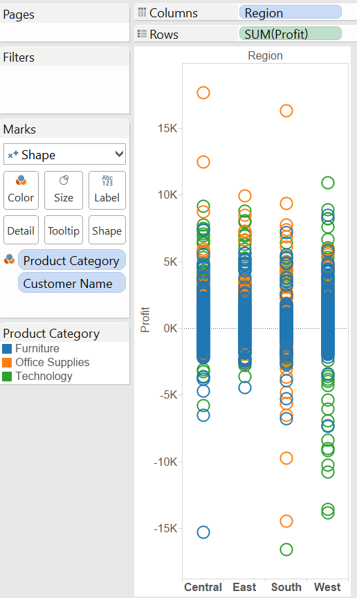 This is the typical situation when the dimension we use to colour the marks (the circles) should also be applied to split the view by creating an additional header. This results in nested dimensions in our view (that just means more than one dimension on the columns shelf now).What is required exactly to create side-by-side circles?
 Depending on how we want to display data, in the side-by-side circles we may have Product Category is the outer dimension:
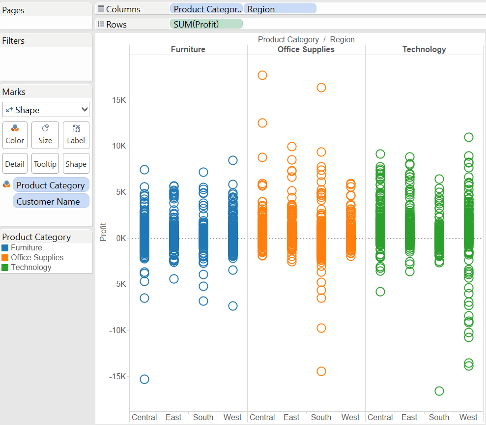 or have Product Category as the inner dimension:
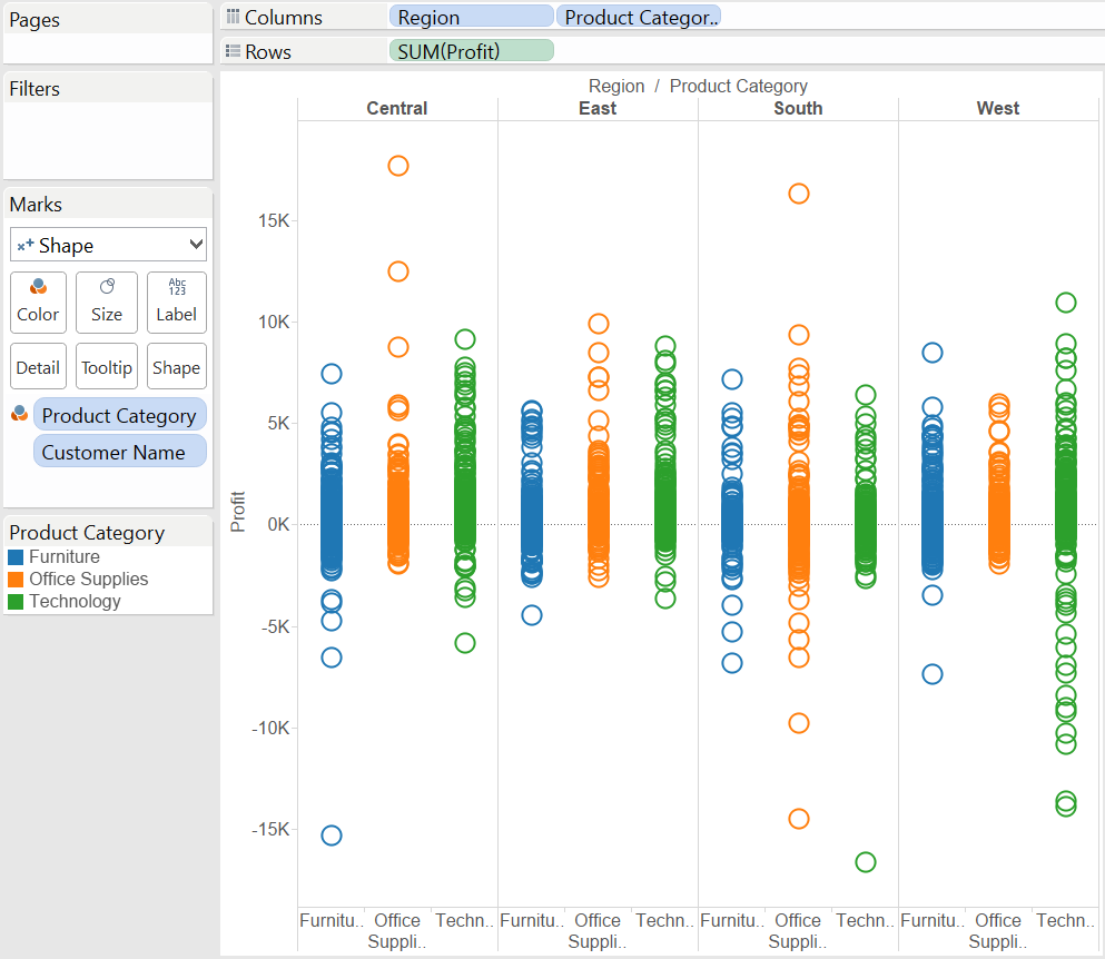 In the first version of the view you rather want to compare Regions within Product Categories, in the second version it is vice versa, you want to compare the Product Categories within a Region.In both versions the circles appear in 'blocks', side-by-side as we brought the second dimension in the view.The mark type of these charts is 'Shape' to show the most of the overlapping marks and give the best sense of how 'dense' the chart is. (Notice that even if not having any dimension on 'Shape' to further encode data values, the Shape mark is working very well with the default circles.) If we set the mark type to 'Circle' the resulting graph would appear more cluttered, less suitable to give a feel of the number of marks where their density is very high. An example of the side-by-side circles with the circle mark type:
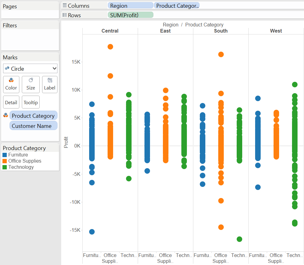 This is the side-by-side circle chart to its core, of course the view may be enriched by applying another (positive) measure on the Size button or a dimension on Shape. Beware though not to complicate your visualisation, more is sometimes less.Finally, let's recap what we have done to produce the side-by-side circle view in the blog post:
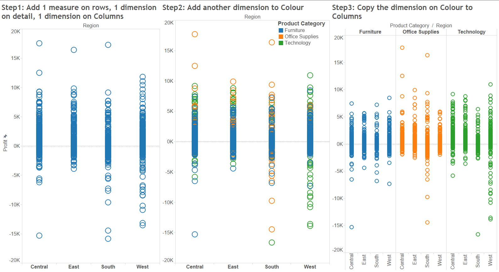
This is the typical situation when the dimension we use to colour the marks (the circles) should also be applied to split the view by creating an additional header. This results in nested dimensions in our view (that just means more than one dimension on the columns shelf now).What is required exactly to create side-by-side circles?Depending on how we want to display data, in the side-by-side circles we may have Product Category is the outer dimension:or have Product Category as the inner dimension:In the first version of the view you rather want to compare Regions within Product Categories, in the second version it is vice versa, you want to compare the Product Categories within a Region.In both versions the circles appear in 'blocks', side-by-side as we brought the second dimension in the view.The mark type of these charts is 'Shape' to show the most of the overlapping marks and give the best sense of how 'dense' the chart is. (Notice that even if not having any dimension on 'Shape' to further encode data values, the Shape mark is working very well with the default circles.) If we set the mark type to 'Circle' the resulting graph would appear more cluttered, less suitable to give a feel of the number of marks where their density is very high. An example of the side-by-side circles with the circle mark type:This is the side-by-side circle chart to its core, of course the view may be enriched by applying another (positive) measure on the Size button or a dimension on Shape. Beware though not to complicate your visualisation, more is sometimes less.Finally, let's recap what we have done to produce the side-by-side circle view in the blog post: