19 May 2015
We have arrived to scatter plots within the Show Me How series. We will see how this chart type is created and used as well as some tips, tricks and pitfalls along the way. This graph type is commonly used to visualise correlation between two paired sets of numeric values, for example the sales value and profit content of sales instances.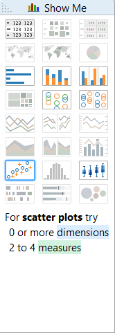 The starter scatter plot with two measures and no dimension practically draws a Cartesian coordinate system with an X and Y axis. As the values are aggregates, the result is only one dot. Notice that the automatic mark type of the scatter plot is 'shape', though they work fine also with circles or squares, too. For the examples we rely on the Superstore Sales data set that is shipped with Tableau Desktop.
 Our first scatter plot is not yet a scatter of plots. It shows the sum of all sales in the data set paired to the sum of all the profit. As the next step it needs to be split by a relevant dimension. Let's say that we want to follow sales vs profit by Product Name. One way to split the total sums of sales and profit is to bring in Product Name to the level of detail. The dimension on level of detail just splits your data - shows it at that level of detail, now Product Name level - but does not alter the colour, label or size of the marks.
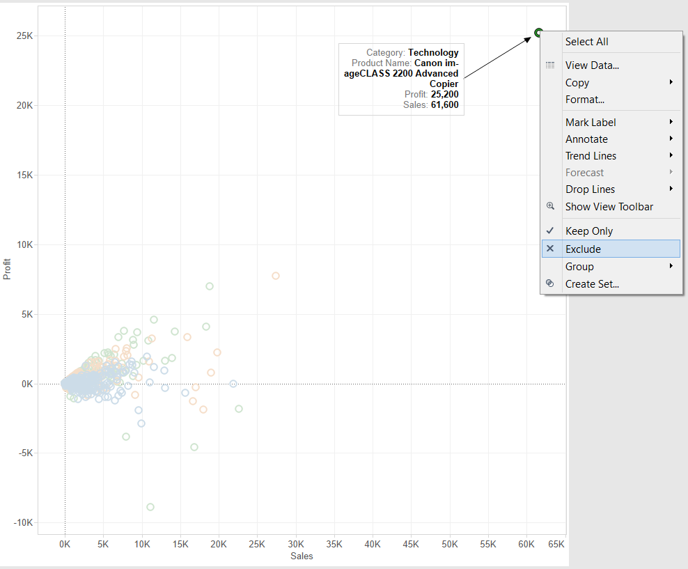
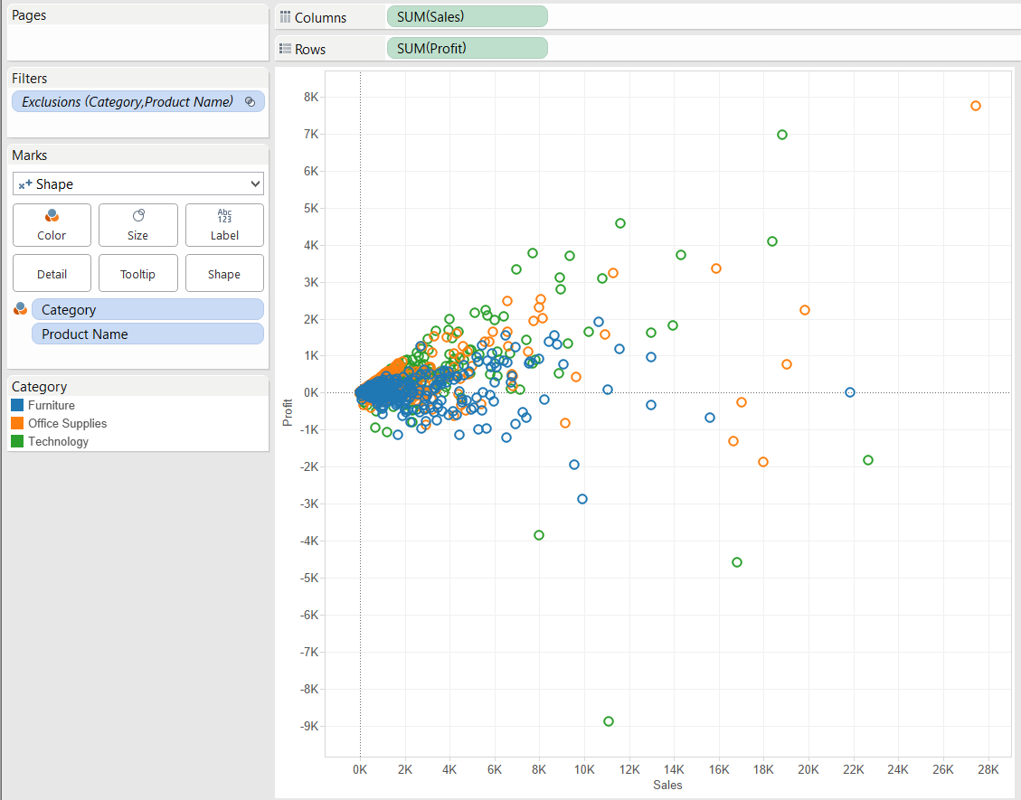
 The number of marks (shapes now) on the chart equals the number of different Product Names in the data set. (I did not include it on the image, this one contains 1841 marks.)This looks right, we can observe the allocation of products in the sales-profit space, for all the time periods cumulated in the data set (as we do not filter for date or use a date field on Columns). The view can be enriched by bringing in another dimension (Category) onto the Color button on the Marks card. Let's do this and also exclude the outlier product that sits in the top right corner of the chart and its presence compresses the differences between the other marks as the axes have to span too wide to incorporate it. Scatter plots are excellent to identify outliers in the data.
 The resulting chart is more insightful:
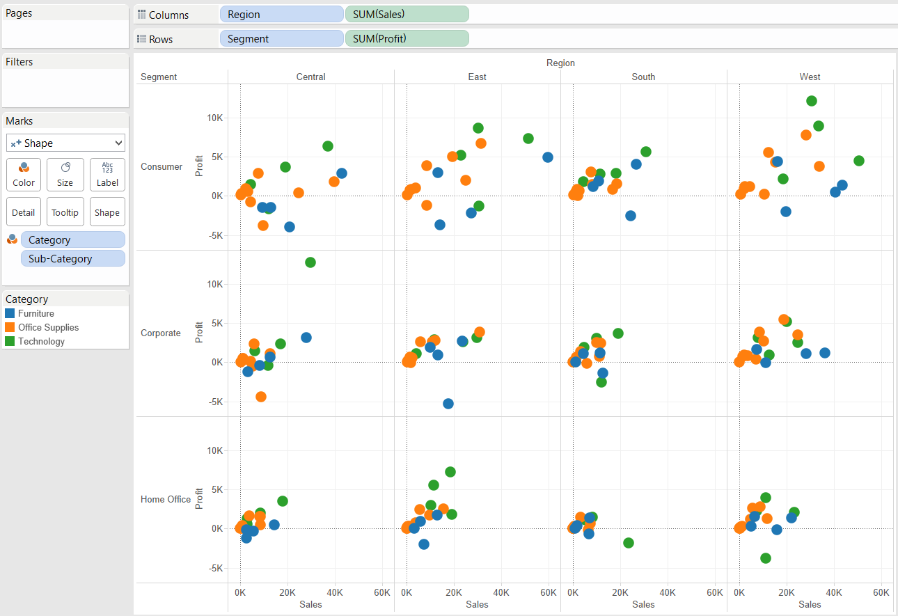
 Important: every dimension placed on level of Detail, Color, Size, Label or Shape splits the data. Tableau calculates the combination of these dimensions. The relationship between the dimensions determine the number of marks you arrive to. If e.g. you apply Product Category (N members) and Product Sub-Category (n members) in the view and each Sub-Category belongs to only one of the Categories (it is a hierarchy), the scatter plot will display n marks. If Product Category is replaced by Region so it is not a 1-many relationship any more but many-to-many (a Sub-Category can be sold in many Regions), the number of marks increase to represent the existing combinations.We do not have to stop at having 2 measures and 2 dimensions in the view, by adding 2 more dimensions (one on the Columns and Row shelves each), a small multiple chart is produced. As dimensions create headers, Tableau automatically arranges them on Columns and Rows 'inside', in front of the measures. This post does not go into the detail of small multiples, we may talk more about this in an advanced intermission of the Show Me series later. Other advanced variations of the scatter plot are the connected scatter plot and the movement plot, both may be addressed in following posts.
 Reverting back to the point when we split the view by a dimension - an alternative route besides applying the dimension on level of Detail is to disaggregate the measures. That paints your charts at the record level. Just uncheck the 'Aggregate Measures' option under the Analysis menu item.
Show Me Scatter Plots
As always, Tableau's Show Me panel is again a helpful guide for the building blocks of scatter plots. The starter scatter plot with two measures and no dimension practically draws a Cartesian coordinate system with an X and Y axis. As the values are aggregates, the result is only one dot. Notice that the automatic mark type of the scatter plot is 'shape', though they work fine also with circles or squares, too. For the examples we rely on the Superstore Sales data set that is shipped with Tableau Desktop.
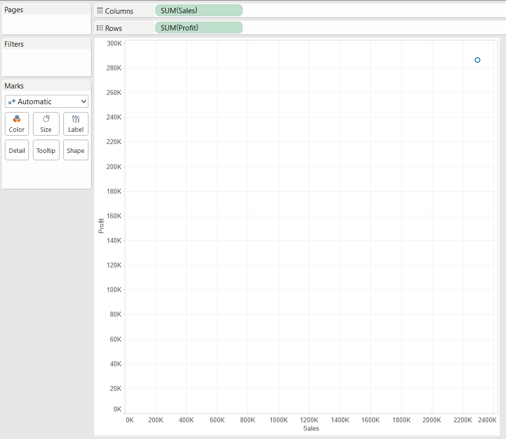
 Our first scatter plot is not yet a scatter of plots. It shows the sum of all sales in the data set paired to the sum of all the profit. As the next step it needs to be split by a relevant dimension. Let's say that we want to follow sales vs profit by Product Name. One way to split the total sums of sales and profit is to bring in Product Name to the level of detail. The dimension on level of detail just splits your data - shows it at that level of detail, now Product Name level - but does not alter the colour, label or size of the marks.
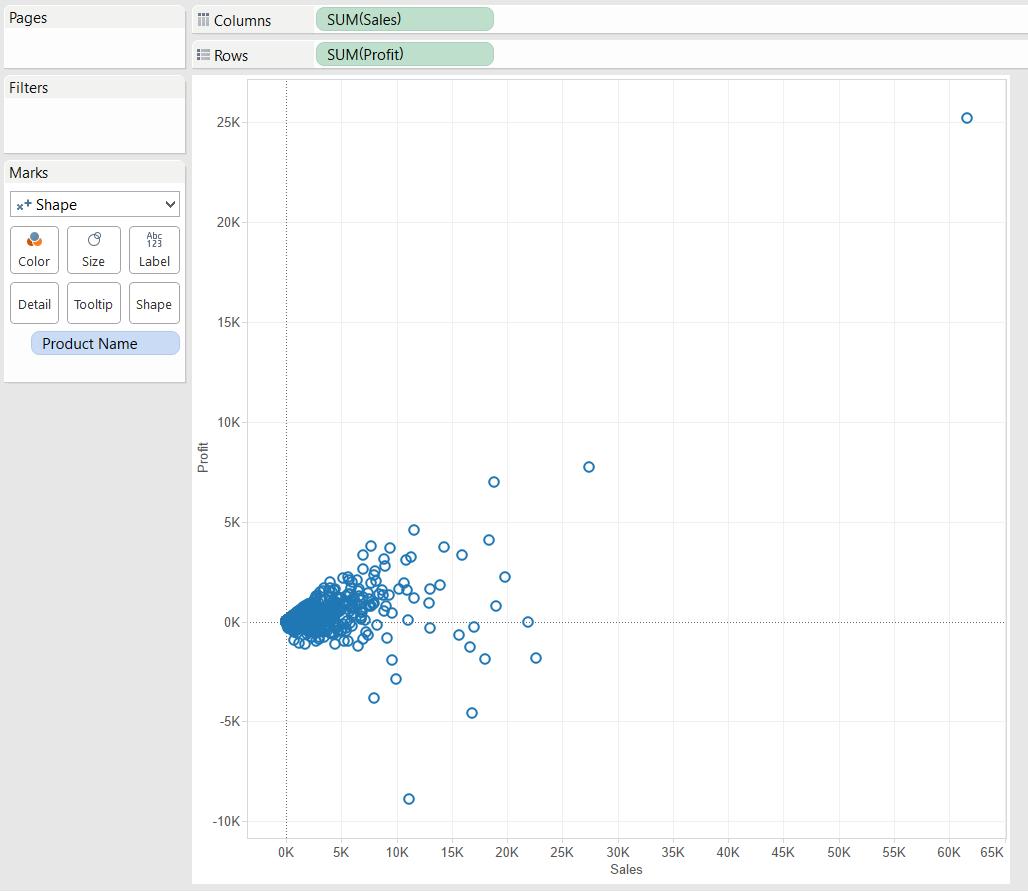
 The number of marks (shapes now) on the chart equals the number of different Product Names in the data set. (I did not include it on the image, this one contains 1841 marks.)This looks right, we can observe the allocation of products in the sales-profit space, for all the time periods cumulated in the data set (as we do not filter for date or use a date field on Columns). The view can be enriched by bringing in another dimension (Category) onto the Color button on the Marks card. Let's do this and also exclude the outlier product that sits in the top right corner of the chart and its presence compresses the differences between the other marks as the axes have to span too wide to incorporate it. Scatter plots are excellent to identify outliers in the data.
 The resulting chart is more insightful:
 Important: every dimension placed on level of Detail, Color, Size, Label or Shape splits the data. Tableau calculates the combination of these dimensions. The relationship between the dimensions determine the number of marks you arrive to. If e.g. you apply Product Category (N members) and Product Sub-Category (n members) in the view and each Sub-Category belongs to only one of the Categories (it is a hierarchy), the scatter plot will display n marks. If Product Category is replaced by Region so it is not a 1-many relationship any more but many-to-many (a Sub-Category can be sold in many Regions), the number of marks increase to represent the existing combinations.We do not have to stop at having 2 measures and 2 dimensions in the view, by adding 2 more dimensions (one on the Columns and Row shelves each), a small multiple chart is produced. As dimensions create headers, Tableau automatically arranges them on Columns and Rows 'inside', in front of the measures. This post does not go into the detail of small multiples, we may talk more about this in an advanced intermission of the Show Me series later. Other advanced variations of the scatter plot are the connected scatter plot and the movement plot, both may be addressed in following posts.
 Reverting back to the point when we split the view by a dimension - an alternative route besides applying the dimension on level of Detail is to disaggregate the measures. That paints your charts at the record level. Just uncheck the 'Aggregate Measures' option under the Analysis menu item.
Visual design best practices
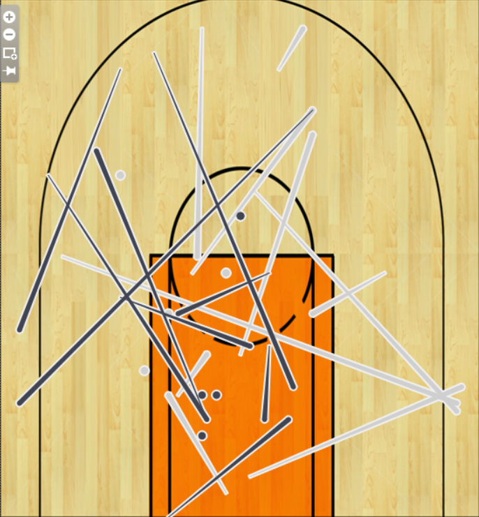
Dimensions split the view so apply the lowest level, most detailed dimension on the level of Detail (button) and higher level dimensions on Color (or Size, Shape). You do not want 20-30 or 2000 different colours on the chart.Scatter plots are great tools to identify outliers. You may annotate those marks or if necessary (and possible), exclude them from the analysis to better reveal the differences among the other marks. Annotate other interesting areas, too - maybe issues, opportunities, etc.Tableau can perform some rapid fire analytics, part of that is trend lines - adding this to your scatter plot quickly shines the light on over- or underperformance compared to the trend. The trend line itself visualises the general relationship between the two measures. Reference lines can also significantly add to the story behind the data.A common challenge with scatter plots is the over-plotting in the graph, meaning that a large number of marks share the same view, overlapping, being on top of one another. This hampers deriving conclusions from the data as some of the information is hidden. Stephen Few recommends the following actions: reduce the size of data objects, remove fill colour from data objects, change the shape of data objects, jitter data objects, make data objects transparent, reduce the amount of data. We do not discuss these options in detail, the complete description of these solutions can be read here.The world would be a worse place without scatter plots. It would be lacking maps and the Gartner Magic Quadrant, as well as some crazy (and amazing) scatter plot visualisations on Tableau Public. One of them is from our colleague Carl Allchin who knows everything about basketball and is not afraid to viz it. (To view his great work, please click on the image below.)