10 March 2015
We take a look at the Circle View in Tableau, great for viewing a distribution of data points along an axis.
Continuing our “Show Me How” series, this blog post is looking at the Circle View. These are interesting charts and are often lead on to other report.[caption id='attachment_5488' align='aligncenter' width='575']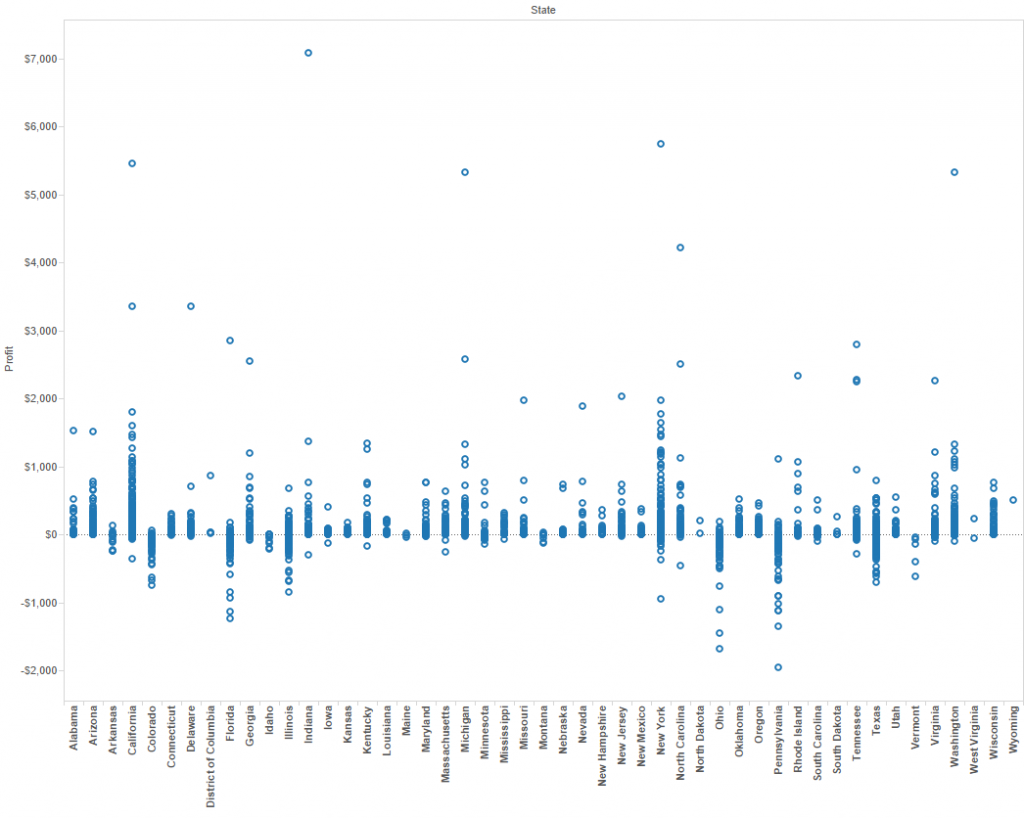 A simple Circle View[/caption]What we have is a representation of all of our data points plotted against one axis, which allows us to see the spread. In the image above, I’m able to compare my Profit by customer, and I have added an additional dimension on Columns so that I can see this for each State.The critical components to this chart are one measure, giving you an axis
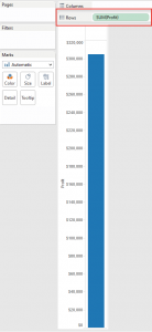
![]() One dimension, on detail.
One dimension, on detail.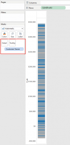
![]() The chart type “automatic” tries to give you a stacked bar chart if you do this, so you also need to switch the Mark Type to Shape, and perhaps also change the size.
The chart type “automatic” tries to give you a stacked bar chart if you do this, so you also need to switch the Mark Type to Shape, and perhaps also change the size.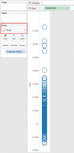
![]() There are two things you have to consider with this type of chart. Firstly, like a bar chart, you have an axis on Rows or Columns, and either nothing or dimensions on the other. When listing a dimension, you should try to have it on Rows, so that the text can be read without having to turn your head. My example above demonstrates how difficult it can be to read each state name.The second consideration is a danger of making your chart too busy. We still have size, colour, and shape all available for other dimensions or measures. That can add extra value, but often you only have a couple of seconds to make your point. You need to deliver a quick message, and encourage people to interact with your report.[caption id='attachment_5494' align='aligncenter' width='574']
There are two things you have to consider with this type of chart. Firstly, like a bar chart, you have an axis on Rows or Columns, and either nothing or dimensions on the other. When listing a dimension, you should try to have it on Rows, so that the text can be read without having to turn your head. My example above demonstrates how difficult it can be to read each state name.The second consideration is a danger of making your chart too busy. We still have size, colour, and shape all available for other dimensions or measures. That can add extra value, but often you only have a couple of seconds to make your point. You need to deliver a quick message, and encourage people to interact with your report.[caption id='attachment_5494' align='aligncenter' width='574']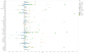 A (possibly over-) detailed Circle View[/caption]As I said at the start, a Circle View can be the starting point to other report types. Later in the series we’ll cover a Scatter Plot, which allows you to compare two measures, or a Box and Whisker Plot which allows you to enhance a Circle View by highlighting the inner quartile and whiskers to the outliers.
 A simple Circle View[/caption]What we have is a representation of all of our data points plotted against one axis, which allows us to see the spread. In the image above, I’m able to compare my Profit by customer, and I have added an additional dimension on Columns so that I can see this for each State.The critical components to this chart are one measure, giving you an axis


 A (possibly over-) detailed Circle View[/caption]As I said at the start, a Circle View can be the starting point to other report types. Later in the series we’ll cover a Scatter Plot, which allows you to compare two measures, or a Box and Whisker Plot which allows you to enhance a Circle View by highlighting the inner quartile and whiskers to the outliers.