4 December 2014
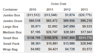
We often get asked about how to start influencing people who just want the numbers, to start moving them towards more visualised dashboards. For me, that answer includes Highlight Tables.Let’s remember that data visualisation is focused on letting users of a dashboard analyse their data to find the meaning and story in the data quickly and easily. Highlight Tables do exactly as their name suggests – it adds highlights for the user to read the table more quickly.Find the highest value in the table below:
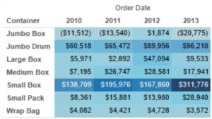
 Both tables are the same, just one is using colour to give visual clues as to where to look.
 But there are limitations with this. If there are negative figures, they don’t stand out to the consumer of your visualisation as they lack a presence on the screen due to the absence of colour. That leads us nicely to our second option.
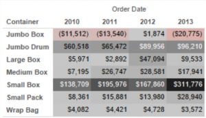 Tim from The Information Lab notes this is a great technique for financial highlight tables as it lends itself to the leading the user to see whether something is in the “red” or “black”.This table lets me see the negative figures pop out in the same way that I see profitable figures. Therefore, if I am trying to understand both the highest and the lowest, a diverging set works nicely.
 Hopefully that is a useful guide how you can start your audience on their journey to visual analysis if they are currently reluctant.

 Both tables are the same, just one is using colour to give visual clues as to where to look.
Colour in Highlight Tables
Colour is really where the magic is added within a Highlight Table. However, with the ability to add the ‘magic’ means that you have to think carefully about your colour choices. So what are those choices?Single shading
Andy Cotgreave (Tableau and gravyanecdote.com) advocates showing your visualisation in grey first of all to allow you to see what is going to fundamentally stand out. I like this technique in Highlight Tables to work out what your table is showing before you apply the storytelling power of colour.
Show Me
Single Colour
Colour adds a greater intensity than the greyscale as we can see by adding blue to the same table. But there are limitations with this. If there are negative figures, they don’t stand out to the consumer of your visualisation as they lack a presence on the screen due to the absence of colour. That leads us nicely to our second option.
Diverging Colour
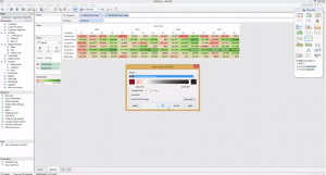
Adding a second colour gives the reader more visual clues about what the table is showing. In the version below, I have used red to show negative values and black for positive values. Tim from The Information Lab notes this is a great technique for financial highlight tables as it lends itself to the leading the user to see whether something is in the “red” or “black”.This table lets me see the negative figures pop out in the same way that I see profitable figures. Therefore, if I am trying to understand both the highest and the lowest, a diverging set works nicely.
Adapting Highlight Tables
There is a lot more that you can do with Highlight Tables by adding additional Dimensions in Tableau to the visualisation. Just like anything in visualisation, adding more often does not mean better. Be careful with the level of granularity you give your consumer as if they are having to wade through hundreds of rows of data – it’s going to be harder to visually analyse the data.How
We have also pulled together this video guide to help you see more about the techniques mentioned in this post. Hopefully that is a useful guide how you can start your audience on their journey to visual analysis if they are currently reluctant.