27 November 2014
Continuing our 'Show Me How' series in this post we look at Heat Maps in Tableau.
Heat Maps are a very quick way to get a high level look at a couple of measures or KPIs at a glance across a range of dimensions. They do so by encoding measure values in two ways:
1. The SIZE of a square i.e. it's area.
2. The COLOUR of a square
By doing this they allow a viewer to quickly see the relative performance of those two measures across a group.
 Show Me How: Heat Maps
Continuing our 'Show Me How' series in this post we look at Heat Maps in Tableau.Heat Maps are a very quick way to get a high level look at a couple of measures or KPIs at a glance across a range of dimensions. They do so by encoding measure values in two ways:1. The SIZE of a square i.e. it's area.
2. The COLOUR of a squareBy doing this they allow a viewer to quickly see the relative performance of those two measures across a group.Having said this I have a problem with Heat Maps in Tableau, and that is because using the size of an area as a way of encoding information is a relatively poor choice when it comes to us being able to precisely compare the relative values of two measures. With this in mind I tend to use a Bar rather than a Square in Tableau - as we are better at comparing lengths of bars. However having asked my colleagues how they use Heat Maps the general answer came back that they are good to use as a very quick overview, perhaps with just a few dimension values, allowing a quick comparison before allowing drill-down (via action filters) to more precise visualisations.Show Me
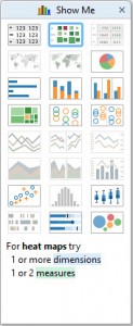
Heat Maps can produced via Show Me when there are one or two measures on the view.Single Measure
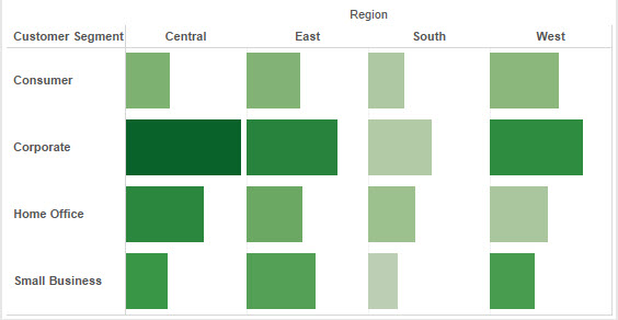
When there is one measure then the default encoding applied by Show Me will be on SIZE, as below (typically Show Me will shrink the size of the cells so I've enlarged them for the image below).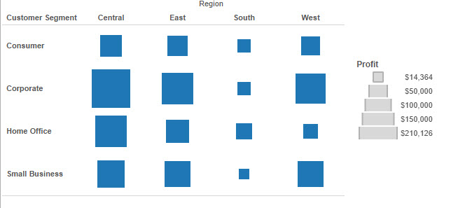 You can quickly see that the South is doing poorly related to the other areas, and the Corporate Segment is doing very well in the Central Region; these kind of comparisons are easy. However as you can see from the legend comparing precisely how much is difficult. How much better is West than South in the Corporate Segment? Approximately five times is the answer, could you judge that from this chart? So as mentioned previously avoid leaving the user to make those comparisons by using this chart as a brief overview - supported by drilldown, etc.
Two Measures
In the below image I've used Show Me with two measures, here Sales are shown SIZE and Profit on COLOUR. The result means I can see both measures at once with ease, e.g. Sales and Profit are both High in the Central Region in Corporate.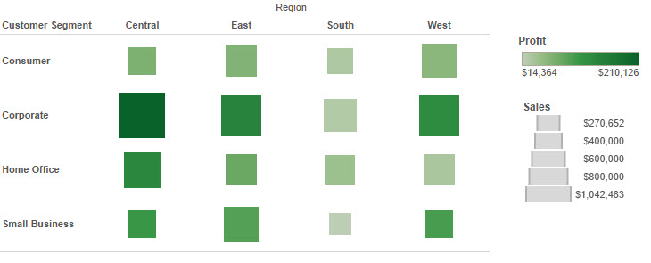
How
Setting up these Heat Maps is easy without Show Me simply by dragging measures to the Size and Colour buttons. See the video below where I walk through how to create these visualisations quickly and easily.Alternatives
I've said a couple of times that I prefer to use a bar chart in this instance, but how might you do that? Simply changing the mark type to bar. Consider the below, it's a very small change but makes comparisons slightly easier in my opinion: