

19 December 2014
Show Me How: Filled Maps
Using maps in Tableau is a very powerful tool that can quickly show the user geographical data at a glance. In this post I will show you how you can build a Filled Map.
What is a Filled Map?
Filled Maps are maps that have polygon shapes defined and then they can be filled with colours dependant on the data.
Using maps in Tableau is a very powerful tool that can quickly show the user geographical data at a glance. In this post I will show you how you can build a Filled Map.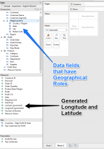 This is not the only way to make a filled map as you can also use polygons to create your own areas and then colour them with your data and I will show an example of this method in the second example.
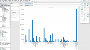 You could of course do this without the Show Me by dragging the fields into their final position Tableau will automatically try and build the best visualization it can for you. Drag out Country Dimension onto the level of Detail Mark and then Drag the Profit Measure onto the Color Mark and you should instantly see and Filled Map of the world where there is profit data in the source.
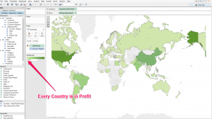 We can tell from the first map that there are no countries that have a negative profit value. What you could do is further develop your view by drilling down to the State level of detail by clicking on the + sign on the Country pill in the Marks Card. This will now draw a polygon shape over each state it has data for.
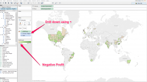 Now we can see that there are states that have a negative profit but it is hard to see the difference between them as they are spread apart. First off we can add a filter to the Profit measure and include only negative values. This clears up the view a bit but it is still hard to tell what the difference is between them.
 What we can do is take these polygons and make a Scatter plot against the amount of sales vs profit.NOTE - If you used the automatic second option to build your filled map you will need to change the Marks Card from 'Automatic' into 'Filled Map' to keep the polygons.To do this you will need to replace the Latitude-Longitude fields on the Rows and Columns shelf with Sales and Profit fields. As we know these are all Negative profit values we can change the colour to be by country, increase the size of the Polygons as they are not over a map and we can add in the State field on the Labels mark.
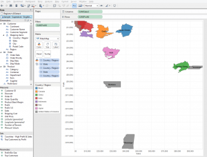
 To start with I just need to add my Latitude-Longitude to the sheet by double clicking or dragging them out. This gives us a single point in the middle of the map.
 Now to add in the fields that I need to make Tableau draw the shapes, first by changing the Marks type to Polygon and then drag out a fields to build up the shapes.
 I did not go into too much detail as this is just an overview of the function in Tableau but you should find more detailed posts on our site.Off the top of my head there is this one from Craig BloodworthUK Area Polygon Mapping in Tableau.and this one from Chris LoveGeospatial Heat Maps in Tableau via Alteryx.If you would like us to help you build something custom please Contact us and we will try and help you further.
What is a Filled Map?
Filled Maps are maps that have polygon shapes defined and then they can be filled with colours dependant on the data.Where to start
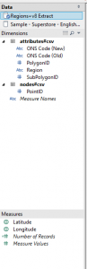
The first thing you are going to need is geographical dimensions that match up with the built in roles within Tableau. If we take Tableau's Superstore Sales data this is in the form of Country, State, City and Postcode. You can tell these have been matchup to a role by the icon next to the name, and you will also see the Generated Latitude-Longitude fields in the Measures section.This is not the only way to make a filled map as you can also use polygons to create your own areas and then colour them with your data and I will show an example of this method in the second example.For the first example I will use the Super Store data set available with Tableau desktop.
As you can see we already have the Country, State, City and Postal Codes matched to the roles so any one or all of these can be used.Drag out the Country Dimension onto the rows shelf and then drag the Profit Measure onto column shelf and you will get a Bar chart like the one below. From here you just need to pick the Filled Map option from the Show Me card. You could of course do this without the Show Me by dragging the fields into their final position Tableau will automatically try and build the best visualization it can for you. Drag out Country Dimension onto the level of Detail Mark and then Drag the Profit Measure onto the Color Mark and you should instantly see and Filled Map of the world where there is profit data in the source.
 We can tell from the first map that there are no countries that have a negative profit value. What you could do is further develop your view by drilling down to the State level of detail by clicking on the + sign on the Country pill in the Marks Card. This will now draw a polygon shape over each state it has data for.
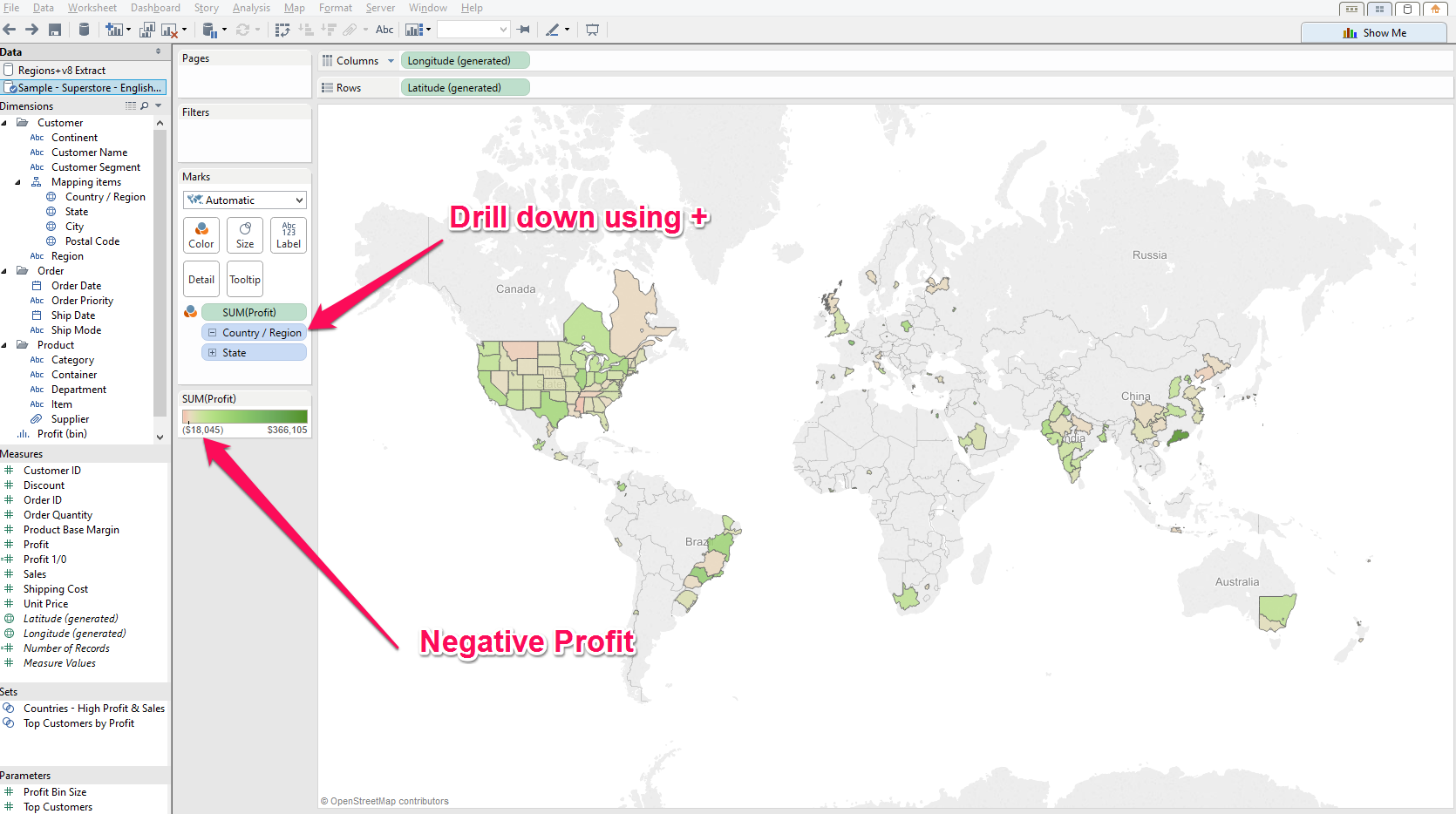 Now we can see that there are states that have a negative profit but it is hard to see the difference between them as they are spread apart. First off we can add a filter to the Profit measure and include only negative values. This clears up the view a bit but it is still hard to tell what the difference is between them.
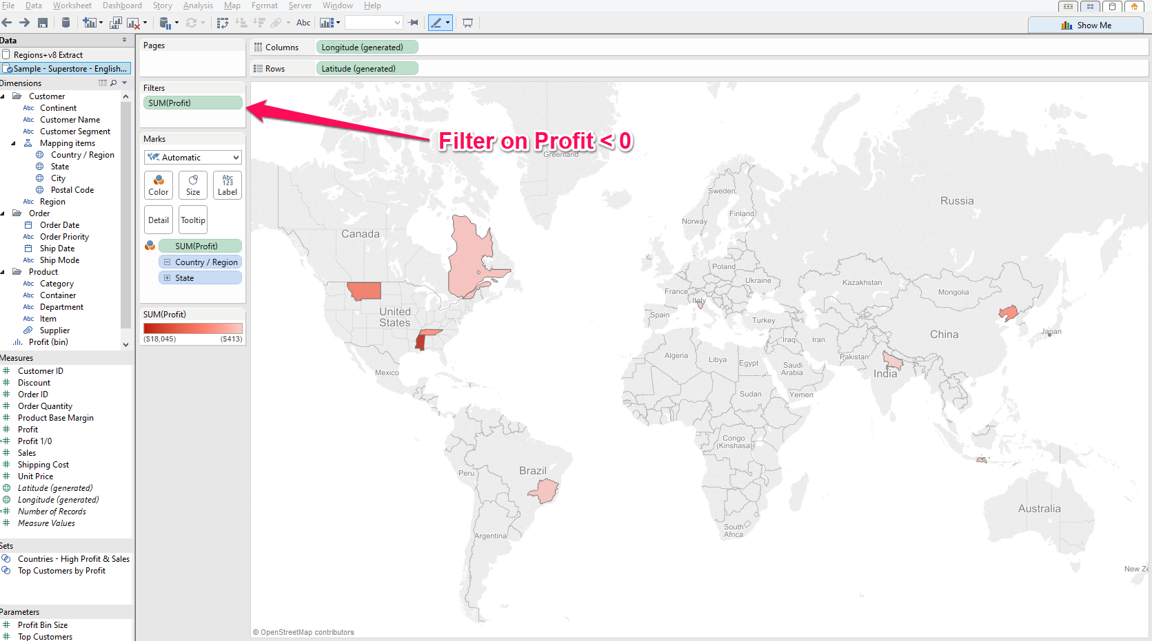 What we can do is take these polygons and make a Scatter plot against the amount of sales vs profit.NOTE - If you used the automatic second option to build your filled map you will need to change the Marks Card from 'Automatic' into 'Filled Map' to keep the polygons.To do this you will need to replace the Latitude-Longitude fields on the Rows and Columns shelf with Sales and Profit fields. As we know these are all Negative profit values we can change the colour to be by country, increase the size of the Polygons as they are not over a map and we can add in the State field on the Labels mark.
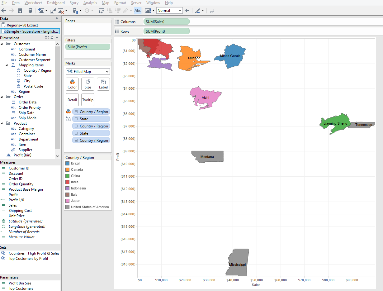
The second example is using non-geographical dimensions
This method relies on the Latitude-Longitude being available in the data and not generated by Tableau. It also requires the data to have the structure for the shapes (polygons) to be defined in the data by using a polygon mark and a 'Path' field.I have connected to a datasource that has the 'non-generated' Latitude-Longitude in the data and no dimensions are linked to geographical roles. To start with I just need to add my Latitude-Longitude to the sheet by double clicking or dragging them out. This gives us a single point in the middle of the map.
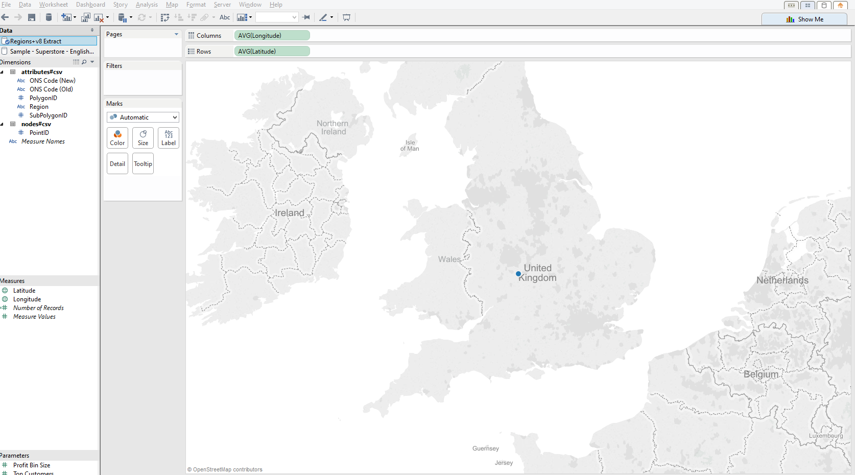 Now to add in the fields that I need to make Tableau draw the shapes, first by changing the Marks type to Polygon and then drag out a fields to build up the shapes.
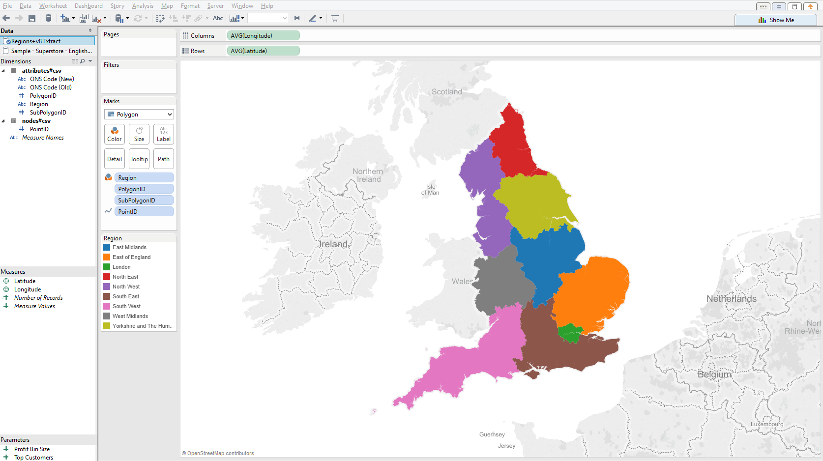 I did not go into too much detail as this is just an overview of the function in Tableau but you should find more detailed posts on our site.Off the top of my head there is this one from Craig BloodworthUK Area Polygon Mapping in Tableau.and this one from Chris LoveGeospatial Heat Maps in Tableau via Alteryx.If you would like us to help you build something custom please Contact us and we will try and help you further.