

13 May 2015
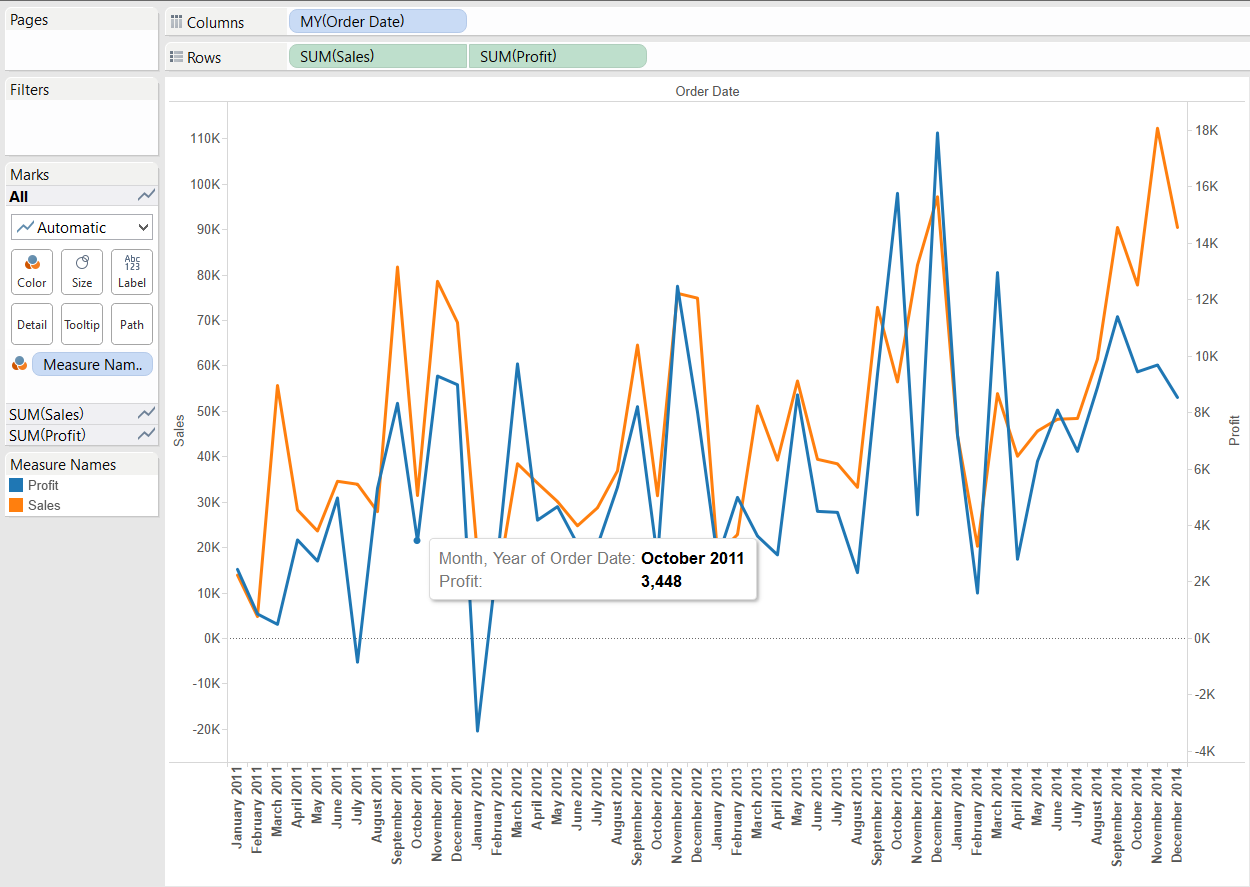
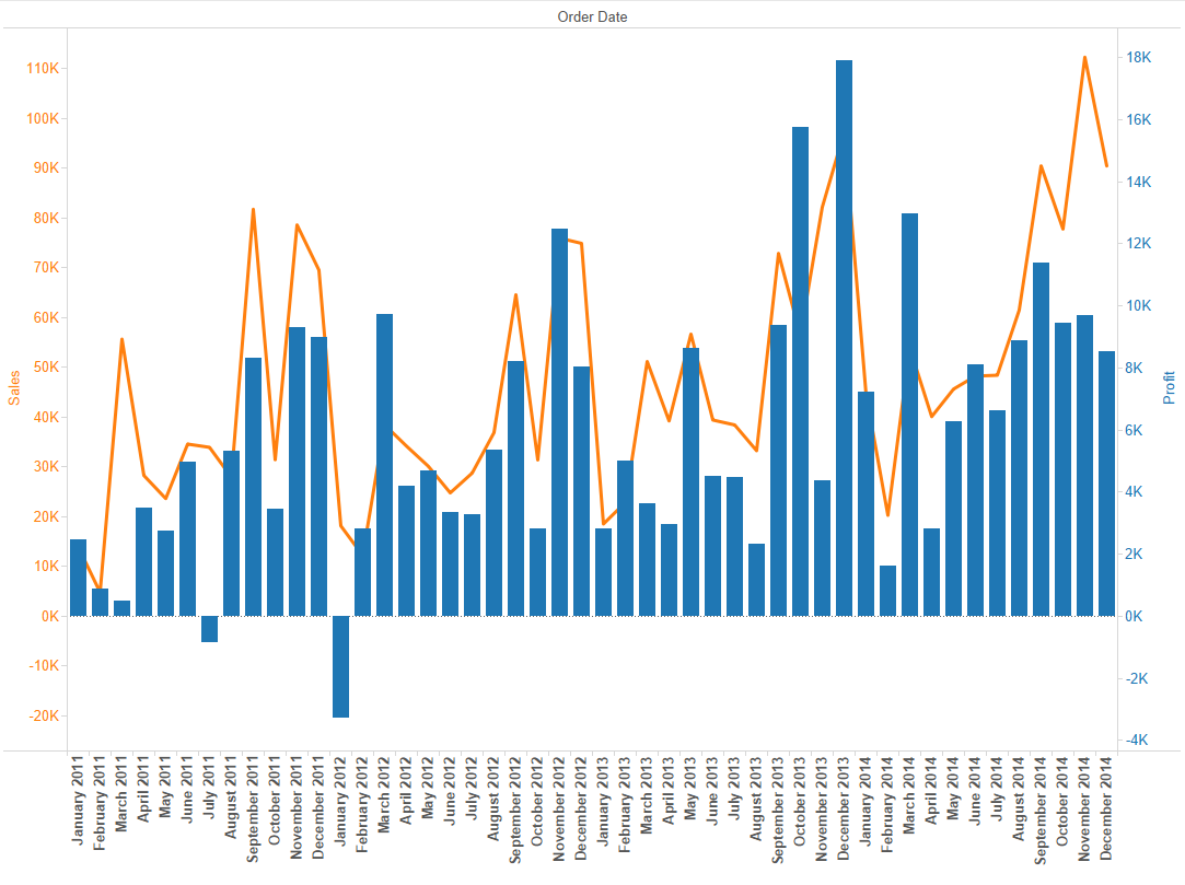
In this post in the Show Me How series we talk about dual combination charts. The name gives a good clue of what this graph type (or mark type as we call it in 'Tableau language') covers. 'Dual' means dual axis. Our earlier Show Me posts already discussed dual lines. 'Combination' charts are views that use multiple mark types (e.g. line and bar) in the same sheet. So a dual combination chart is one where there are two axes on the same pane and the measures are displayed in different mark types.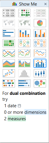 The ingredients to a dual combination chart are 1 date field, 0 or more dimensions and 2 or more measures. Let's try on the Superstore Sales dataset what Tableau Show Me produces if we CTRL + select Order Date, Profit and Sales.
 The date field is continuous (I already drilled-down to Quarter level from Year), the first measure by the alphabet forms the bars, the other the line. The bar width cannot be significantly increased in this default version by the Show Me panel but you can replace the continuous (green) date pill with a discrete (blue) one that allows the bars to have maximum available width.How can we enrich the information on the chart by adding a dimension? What if we are interested in our profit's regional split? One way for example is to create a new header by dragging the Region field onto Rows. If we filter for 2013-2014 and South and West regions only, the following chart is produced:
 If instead of comparing two regions' profit and sales figures we are curious of total national sales and only the profit split by regions, the Region dimension's place is on the Color button on Profit's Marks card. It is not the clearest visualisation but good enough to demonstrate an alternative route to involve a dimension in the dual combination chart.
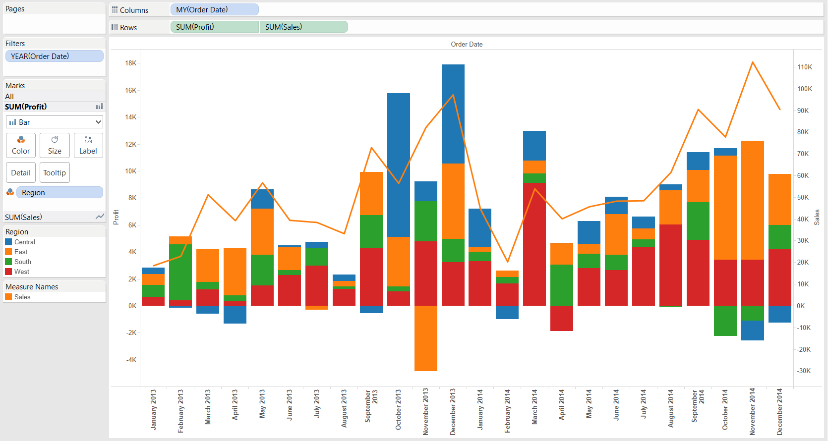
 There are two key steps from here. Moving the Profit pill into the pane of Sales by the 'Dual Axis' option in the context menu of the Profit pill...
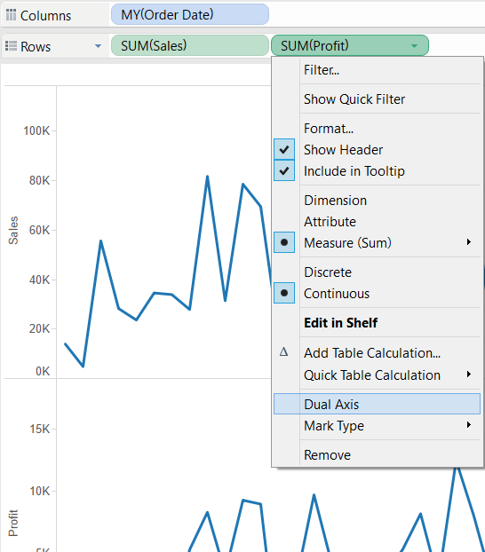
 .. and then changing Profit's mark type to 'Bar'.
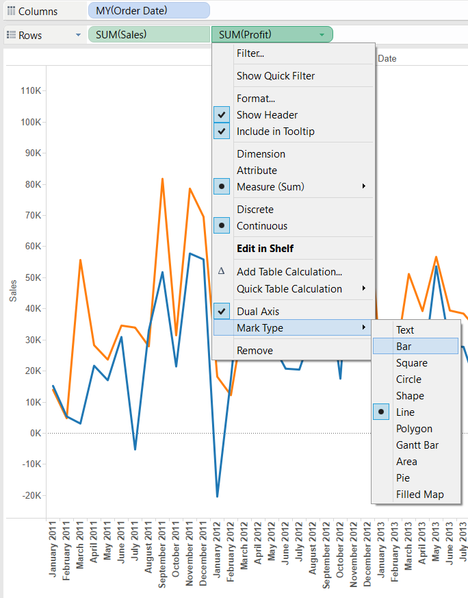
 There is another way to create a dual axis chart if we have our first measure (e.g. Sales) already in the view - just drag the second measure to the right side of the view and release it when Tableau indicates with a dashed vertical line on the right-hand side of the view that it will draw a secondary axis.
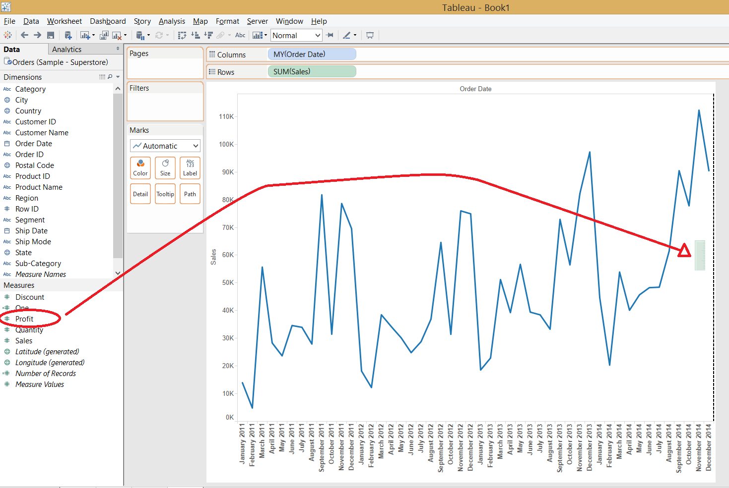
 The dual combination chart is a useful tool in our arsenal but have to be applied for the right job, in the right way.
Show Me dual combination charts
The common variant of the dual combination chart is line with bars, this is what Tableau offers in their Show Me panel.The ingredients to a dual combination chart are 1 date field, 0 or more dimensions and 2 or more measures. Let's try on the Superstore Sales dataset what Tableau Show Me produces if we CTRL + select Order Date, Profit and Sales.The date field is continuous (I already drilled-down to Quarter level from Year), the first measure by the alphabet forms the bars, the other the line. The bar width cannot be significantly increased in this default version by the Show Me panel but you can replace the continuous (green) date pill with a discrete (blue) one that allows the bars to have maximum available width.How can we enrich the information on the chart by adding a dimension? What if we are interested in our profit's regional split? One way for example is to create a new header by dragging the Region field onto Rows. If we filter for 2013-2014 and South and West regions only, the following chart is produced:If instead of comparing two regions' profit and sales figures we are curious of total national sales and only the profit split by regions, the Region dimension's place is on the Color button on Profit's Marks card. It is not the clearest visualisation but good enough to demonstrate an alternative route to involve a dimension in the dual combination chart.Creating a dual combination chart without the 'Show Me' panel
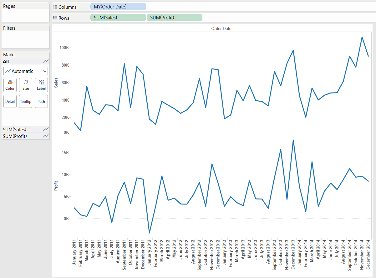
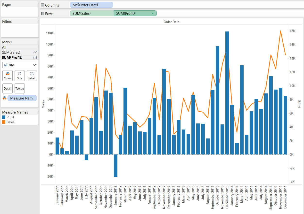
So far our starting point was the chart automatically drawn by Tableau's Show Me functionality. How can we compile a dual combination chart from scratch without Show Me? Let's bring two measures (Sales and Profit) and the discrete MY(Order Date) in the view first.There are two key steps from here. Moving the Profit pill into the pane of Sales by the 'Dual Axis' option in the context menu of the Profit pill... .. and then changing Profit's mark type to 'Bar'.There is another way to create a dual axis chart if we have our first measure (e.g. Sales) already in the view - just drag the second measure to the right side of the view and release it when Tableau indicates with a dashed vertical line on the right-hand side of the view that it will draw a secondary axis.Visual Best Practice Considerations
The 'Show Me' requirement of a dual combination chart is identical to the requirement for dual lines (1 date field, 0 or more dimensions, 2 measures). The visual best practice aspects also apply. An earlier blog post of The Information Lab explained the possible data visualisation pitfalls of dual axis charts. In short the conclusion was that they are working the best when can be (and are) synchronised or we use the dual axes to compare the two measures to a fixed point (and e.g. display the compound growth rate of them along time).The real question on the use of dual combination charts is why we would select different mark types for the measures. Bars along time express the evolution of the phenomenon and also indicate that the distinct values (e.g. monthly or quarterly figures) are rather independent from each other. A line hints that a value of e.g. 'June' is naturally evolving from (and at least partly dependent on) the preceding values (May, April, etc.). So if we wanted to display the number of customer complaints and sales along time, it is appropriate to express customer complaint as bars (the number of complaints next month can be assumed fairly independent from the number of complaints last month) whereas sales as a line stands for its natural development - sales stems from returning customers from previous months and new customers, too. A dual combination chart is also perfect to distinguish between measures with different units (e.g. simple count vs currency). Thus visualizing the number of employees (bars) and corporate profit (line) is a right task to solve with a dual combination chart.You may also finetune the formatting of a dual combination chart by coloring the axes to be clear on which measure is displayed along the primary (left) or the secondary (right).The dual combination chart is a useful tool in our arsenal but have to be applied for the right job, in the right way.