

18 June 2015
We have arrived to a special chart type in our Show Me How series. Box plots, also called box-and-whisker plots tell us about the distribution of measure's data values by indicating the important statistical values of the median (Q2), upper quartile (Q3), lower quartile (Q1), visually expressing the interquartile range (between Q3 and Q1) and the minimum and maximum values of the measure. The median is the data value that splits all the values to two parts in a way that half of them is smaller than the median and the other half is bigger. Three quarters of the data values are below the upper quartile (Q3) while one quarter of the data values is above it. Q1 is analogous, at the bottom end.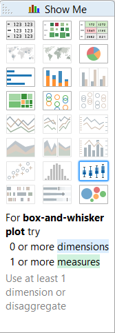 At least one measure is required and that measure will be split by a dimension or alternatively, if there is no dimension in the view, the data have to be disaggregated, meaning that Tableau displays the values at record level. Let's try this with the Superstore Sales dataset, analysing the Profit distribution by Customer ID.
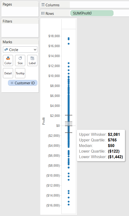 We can take a step further and take a look at the distribution of Profit within each Product Category.
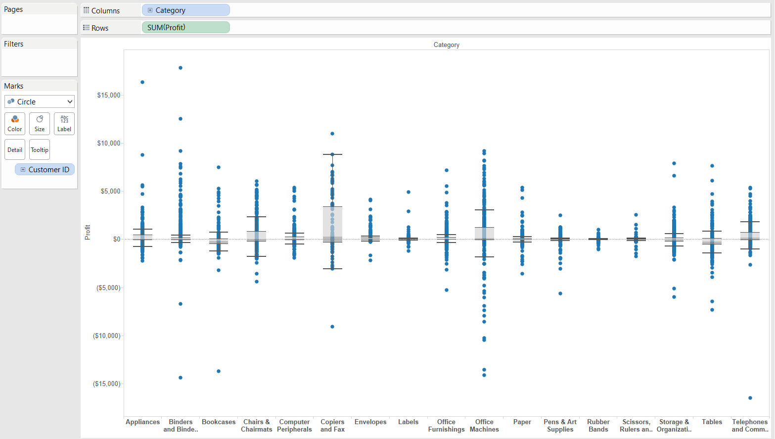 The categories are hardly readable so we should swap the columns and rows.
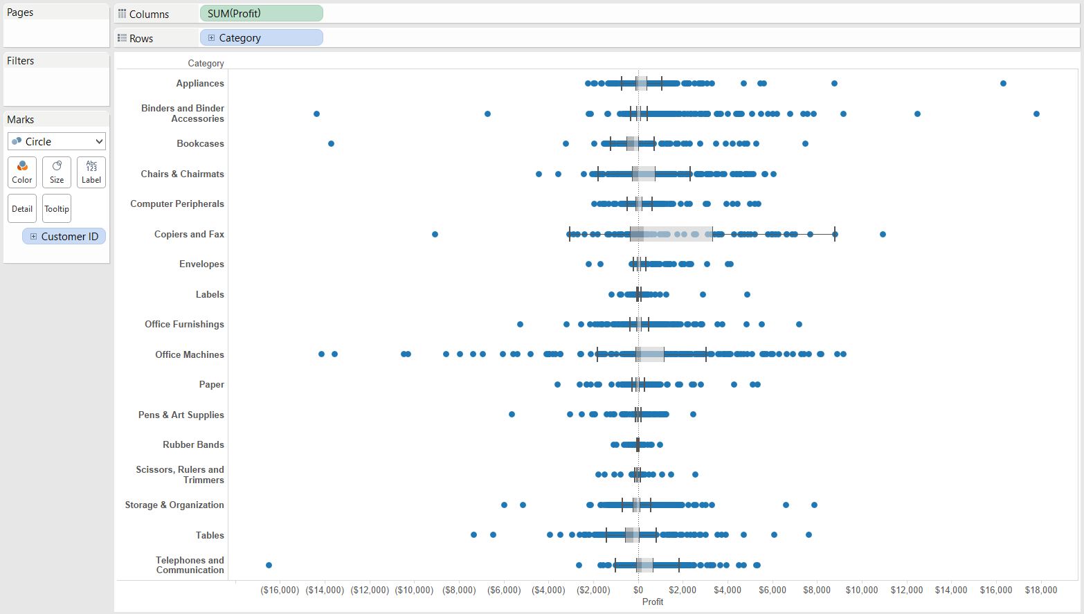 We are all aware of the fact that Tableau is not only a tool for dashboard building and reporting but also for data discovery, including rapid fire analytics. Enabling the Summary Card by selecting Worksheet / Show Summary reveals a list of descriptive statistics about the selected portion of the view.
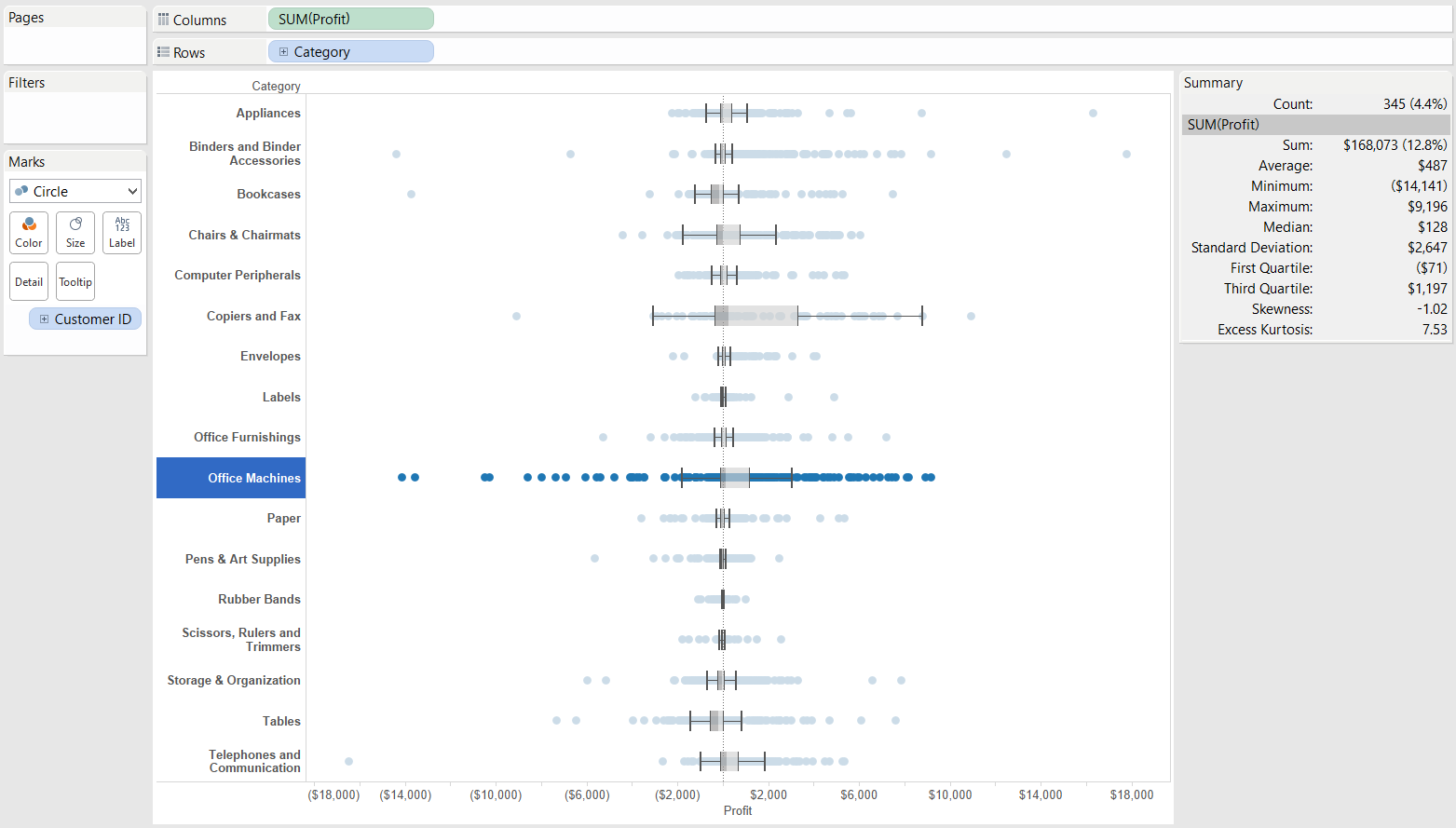 Skewness is asymmetry in a statistical distribution, when a curve appears to be distorted or skewed to the left or the right. In a perfect normal distribution the average and the mode (the most frequent value) are the same and the two tails of the distribution curve (parted by the mode) are symmetrical. If skewness is negative, the mean is less than the mode. Positive skewness stands for the opposite. Kurtosis describes the sharpness ('peakedness') of the curve of the frequency distribution.You may have noticed that Tableau plots several data values outside the whiskers though the whiskers are supposed to represent the minimum and the maximum of the values. By default the whiskers extend to 1.5 times the interquartile range (IQR) from the edge of the box. IQR = Q3 - Q1 so the range between the upper quartile and the lower quartile. So the upper whisker is by default at the Q3 + (Q3-Q1)*1.5 value while the lower whisker is automatically at the Q1 - (Q3-Q1)*1.5 data value. This can be simply changed to extend to the actual minimum / maximum by editing the reference lines along the axis.
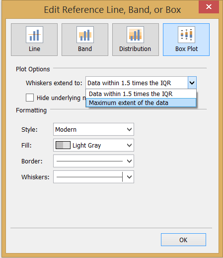 A box plot can be drawn without the help of Show Me, too. Just right click on the axis of the measure to add a reference line. In the pop-up window choose to add a box plot.
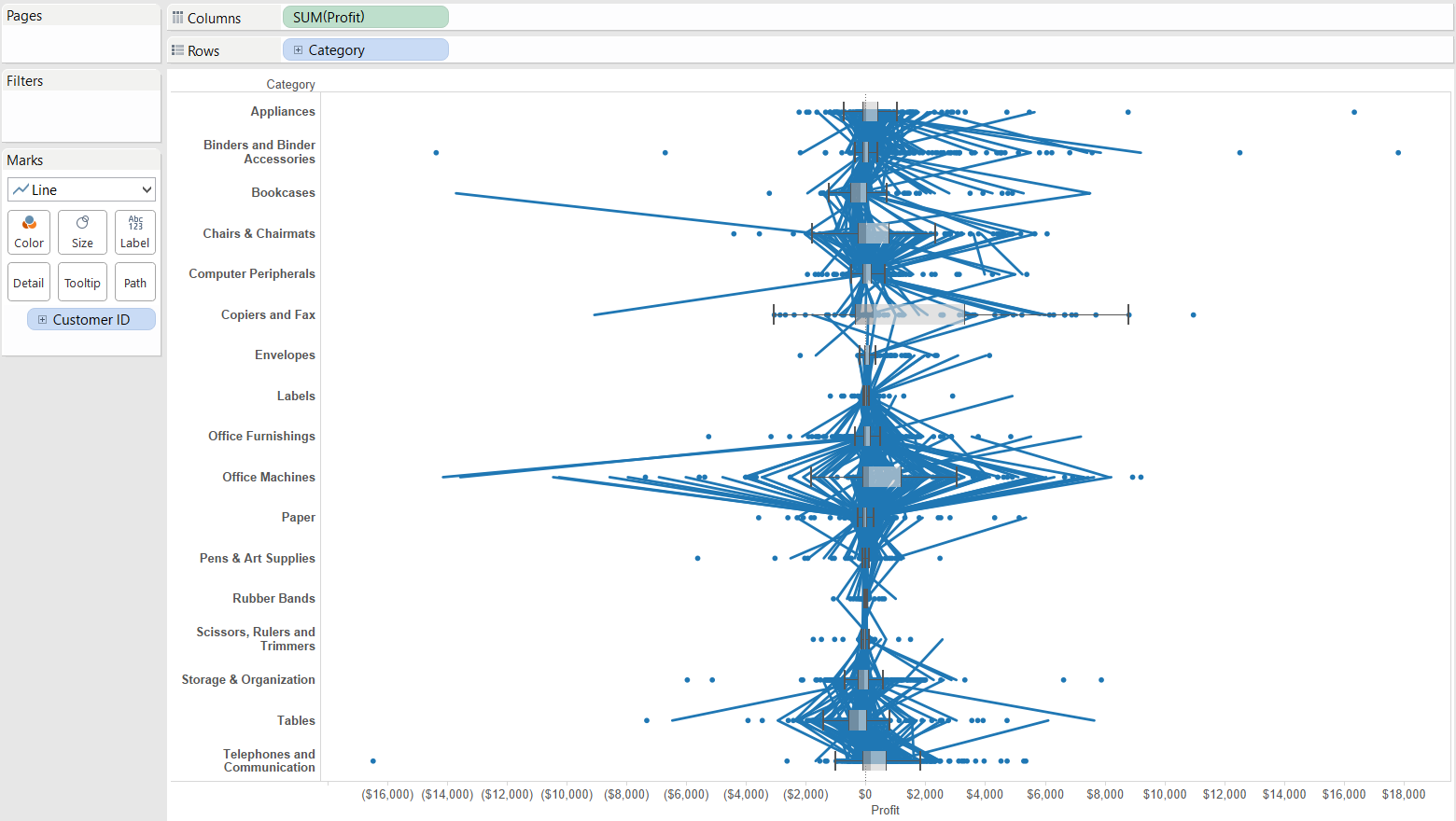 Then tell Tableau how to draw the lines by moving the dimension providing the level of detail (in our example this is Customer ID) onto the Path button on the Marks card.
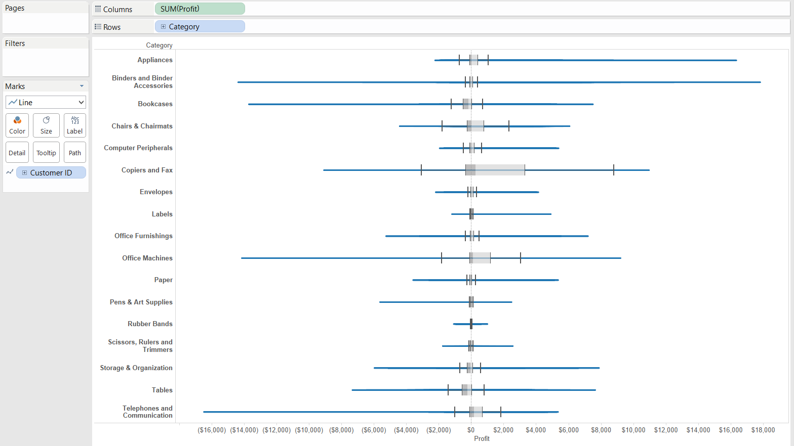 The resulting graph represents well the total range of values by simplifying the view. The compromise is that we lose sight of the individual data points thus we do not get an insight to the 'density' of the points in certain areas of the distribution. We only know that 50% of the data points are located within the box and 25-25% of the data values are below and above the box.Finally, let's string this knowledge all together. We can compile a box-and-whisker plot that clearly shows the range of the data values, the individual values and the also gives a hint on the different size of ranges. Assume we want to understand the profit by customer, visually grouped by the product container types. Maybe our factory director brought up the opportunity of renewing one of the production lines and we need to support the decision by analysing the profitability of our various containers we sell our products in. To have both a line chart (value span) and circles (individual values), we can prepare a dual axis chart - starting by duplicating the Profit measure in the view.
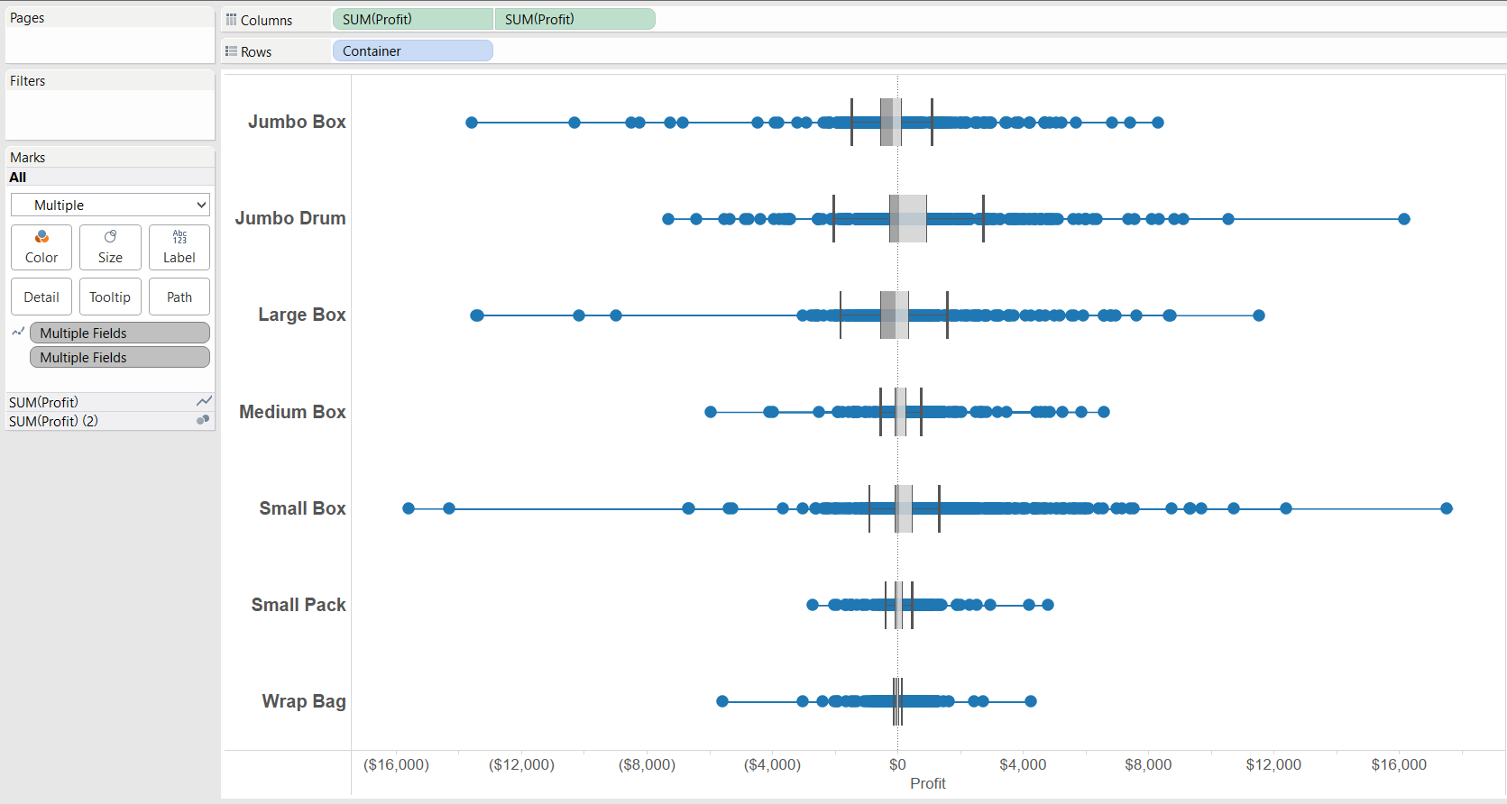 We do not stop here. Let's create a calculated field to find out the difference between the maximum and minimum profit figure by customer, at the level of Container types. Tableau's brand new, fantastic level-of-detail (LOD) calculations are right at our help to achieve this. The formula is:
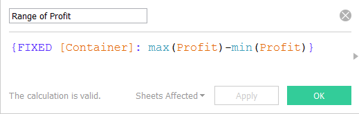 We just have to place this calculated field on the Color button on the Marks card and the resulting colors hint on the total range of profit values, very helpful considering that the ranges are misaligned (per container the minimum and maximum are at different profit values) and hard to compare.
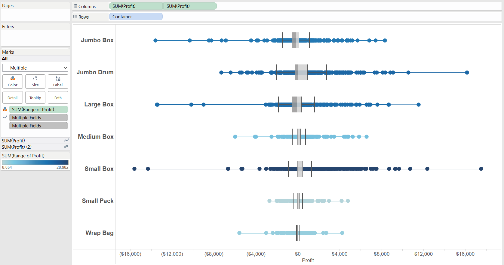 We can conclude that box-and-whisker plots are one of Tableau's handy features that facilitate rapid fire data analysis, painting the overview of a measure's distribution at the chosen level of detail.
Show Me box-and-whisker plots
How can we create this graph using Tableau's Show Me panel?At least one measure is required and that measure will be split by a dimension or alternatively, if there is no dimension in the view, the data have to be disaggregated, meaning that Tableau displays the values at record level. Let's try this with the Superstore Sales dataset, analysing the Profit distribution by Customer ID.We can take a step further and take a look at the distribution of Profit within each Product Category.The categories are hardly readable so we should swap the columns and rows.We are all aware of the fact that Tableau is not only a tool for dashboard building and reporting but also for data discovery, including rapid fire analytics. Enabling the Summary Card by selecting Worksheet / Show Summary reveals a list of descriptive statistics about the selected portion of the view.Skewness is asymmetry in a statistical distribution, when a curve appears to be distorted or skewed to the left or the right. In a perfect normal distribution the average and the mode (the most frequent value) are the same and the two tails of the distribution curve (parted by the mode) are symmetrical. If skewness is negative, the mean is less than the mode. Positive skewness stands for the opposite. Kurtosis describes the sharpness ('peakedness') of the curve of the frequency distribution.You may have noticed that Tableau plots several data values outside the whiskers though the whiskers are supposed to represent the minimum and the maximum of the values. By default the whiskers extend to 1.5 times the interquartile range (IQR) from the edge of the box. IQR = Q3 - Q1 so the range between the upper quartile and the lower quartile. So the upper whisker is by default at the Q3 + (Q3-Q1)*1.5 value while the lower whisker is automatically at the Q1 - (Q3-Q1)*1.5 data value. This can be simply changed to extend to the actual minimum / maximum by editing the reference lines along the axis.A box plot can be drawn without the help of Show Me, too. Just right click on the axis of the measure to add a reference line. In the pop-up window choose to add a box plot.Data visualisation considerations
A crucial requirement towards great visualisations is readability. A related tip for box plots is to have any dimension on the Rows shelf rather than on Columns if there are several members of the dimension, possibly also with long names. If you are not interested in the dispersion of individual values, you may express the span of values by line. Starting from our earlier box plot with circle mark type, in step 1 just change the mark type to line:Then tell Tableau how to draw the lines by moving the dimension providing the level of detail (in our example this is Customer ID) onto the Path button on the Marks card.The resulting graph represents well the total range of values by simplifying the view. The compromise is that we lose sight of the individual data points thus we do not get an insight to the 'density' of the points in certain areas of the distribution. We only know that 50% of the data points are located within the box and 25-25% of the data values are below and above the box.Finally, let's string this knowledge all together. We can compile a box-and-whisker plot that clearly shows the range of the data values, the individual values and the also gives a hint on the different size of ranges. Assume we want to understand the profit by customer, visually grouped by the product container types. Maybe our factory director brought up the opportunity of renewing one of the production lines and we need to support the decision by analysing the profitability of our various containers we sell our products in. To have both a line chart (value span) and circles (individual values), we can prepare a dual axis chart - starting by duplicating the Profit measure in the view.We do not stop here. Let's create a calculated field to find out the difference between the maximum and minimum profit figure by customer, at the level of Container types. Tableau's brand new, fantastic level-of-detail (LOD) calculations are right at our help to achieve this. The formula is:We just have to place this calculated field on the Color button on the Marks card and the resulting colors hint on the total range of profit values, very helpful considering that the ranges are misaligned (per container the minimum and maximum are at different profit values) and hard to compare.We can conclude that box-and-whisker plots are one of Tableau's handy features that facilitate rapid fire data analysis, painting the overview of a measure's distribution at the chosen level of detail.