

28 April 2015
This post in the Show Me How series is about discrete area charts. Recently we have talked about continuous area charts where we stressed the importance of pills being discrete vs continuous.How does the Show Me panel help us with discrete area chart? What 'ingredients' are required to create one?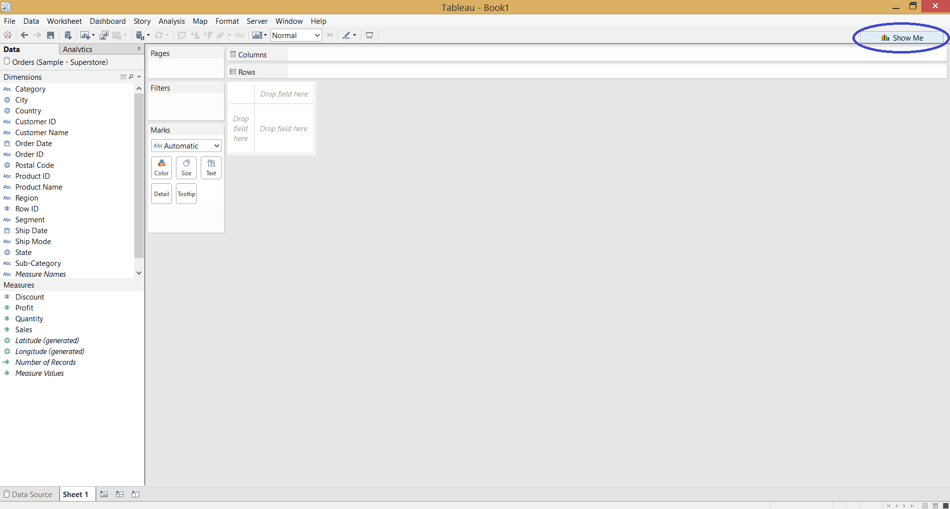
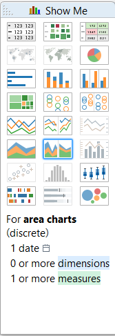 Let's see a basic discrete area chart with a discrete date field and a measure. All the examples are built on the Superstore Sales dataset that is shipped with Tableau.
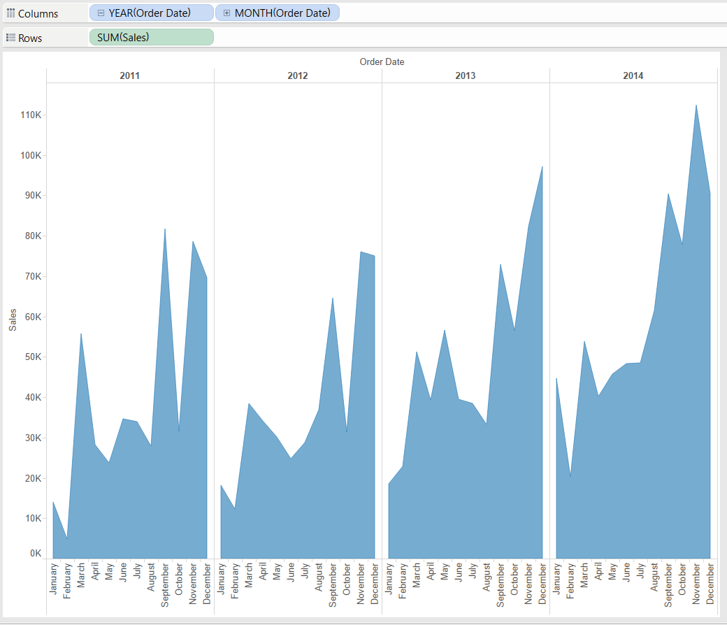 This is a good 'visual aid' to display the recurring seasonality in sales. The discrete date field creates a header in the view hence splits the area to annual blocks. In my opinion this stresses more the comparison of the in-year seasonal patterns than the overall trend. If I wanted to focus on the long-term, overall trend, I would have chosen the continuous area chart. E.g. here it is relatively easy to compare the winter months across years as they are close to the vertical column divider lines. Also, the discrete date field enables us to effortlessly navigate up and down in the date hierarchy.The logical next step is to include a dimension in the view. Adding 'Region' on the Color button on the Marks card will split the total sales by region, stacking the regional sales values on top of each other.
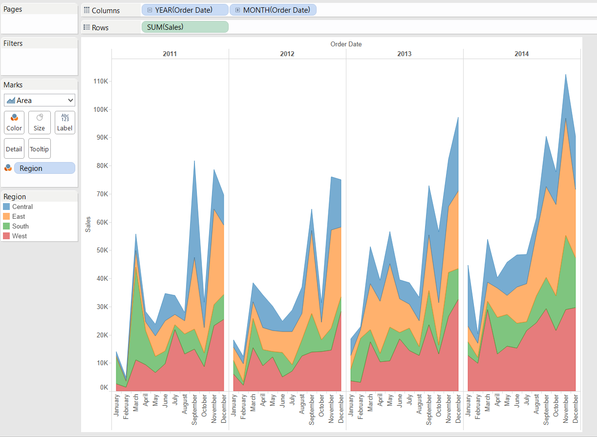 The Show Me panel indicates that we can have even more dimensions and measures to form together the discrete area chart. This depends on the data content / message we want to express with a single view. Enriching the visualisation with new splits (headers formed by dimensions) conveys more information but also creates more clutter.In terms of data visualisation best practises and use cases much of what we addressed at continuous area charts remains valid for discrete ones. The only difference stems from the discrete date field that creates a header instead of the axis drawn by a continuous date field. The discrete version's merits are the easy drill-down in the date hierarchy and comparison of seasonal patterns across years. The column divider lines in the panes provide visual references for this. The continuous chart is great at outlining the long-term trend and comparing seasonally 'unrelated' data values far from each other, like a May 2012 vs. November 2014.Area charts express well the 'volume' behind a data value and provide a nice way to brush up the look of your dashboard - in the proper use case.
Let's see a basic discrete area chart with a discrete date field and a measure. All the examples are built on the Superstore Sales dataset that is shipped with Tableau.This is a good 'visual aid' to display the recurring seasonality in sales. The discrete date field creates a header in the view hence splits the area to annual blocks. In my opinion this stresses more the comparison of the in-year seasonal patterns than the overall trend. If I wanted to focus on the long-term, overall trend, I would have chosen the continuous area chart. E.g. here it is relatively easy to compare the winter months across years as they are close to the vertical column divider lines. Also, the discrete date field enables us to effortlessly navigate up and down in the date hierarchy.The logical next step is to include a dimension in the view. Adding 'Region' on the Color button on the Marks card will split the total sales by region, stacking the regional sales values on top of each other.The Show Me panel indicates that we can have even more dimensions and measures to form together the discrete area chart. This depends on the data content / message we want to express with a single view. Enriching the visualisation with new splits (headers formed by dimensions) conveys more information but also creates more clutter.In terms of data visualisation best practises and use cases much of what we addressed at continuous area charts remains valid for discrete ones. The only difference stems from the discrete date field that creates a header instead of the axis drawn by a continuous date field. The discrete version's merits are the easy drill-down in the date hierarchy and comparison of seasonal patterns across years. The column divider lines in the panes provide visual references for this. The continuous chart is great at outlining the long-term trend and comparing seasonally 'unrelated' data values far from each other, like a May 2012 vs. November 2014.Area charts express well the 'volume' behind a data value and provide a nice way to brush up the look of your dashboard - in the proper use case.