21 April 2015
In this post in the Show Me How series we will discuss continuous area charts. We will try to find a good use case for them, see how they are created in Tableau with and without the Show Me panel and look at them from the angle of data visualisation best practices.Before we jump into the theory, I have to emphasise the importance of understanding what continuous and discrete means in Tableau. We have addressed this before, you will find good descriptions in our earlier blog post here or information about blue and green pills here.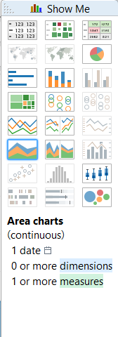 Using the Superstore Sales dataset that is shipped with Tableau, the basic continuous Area chart then looks like this:
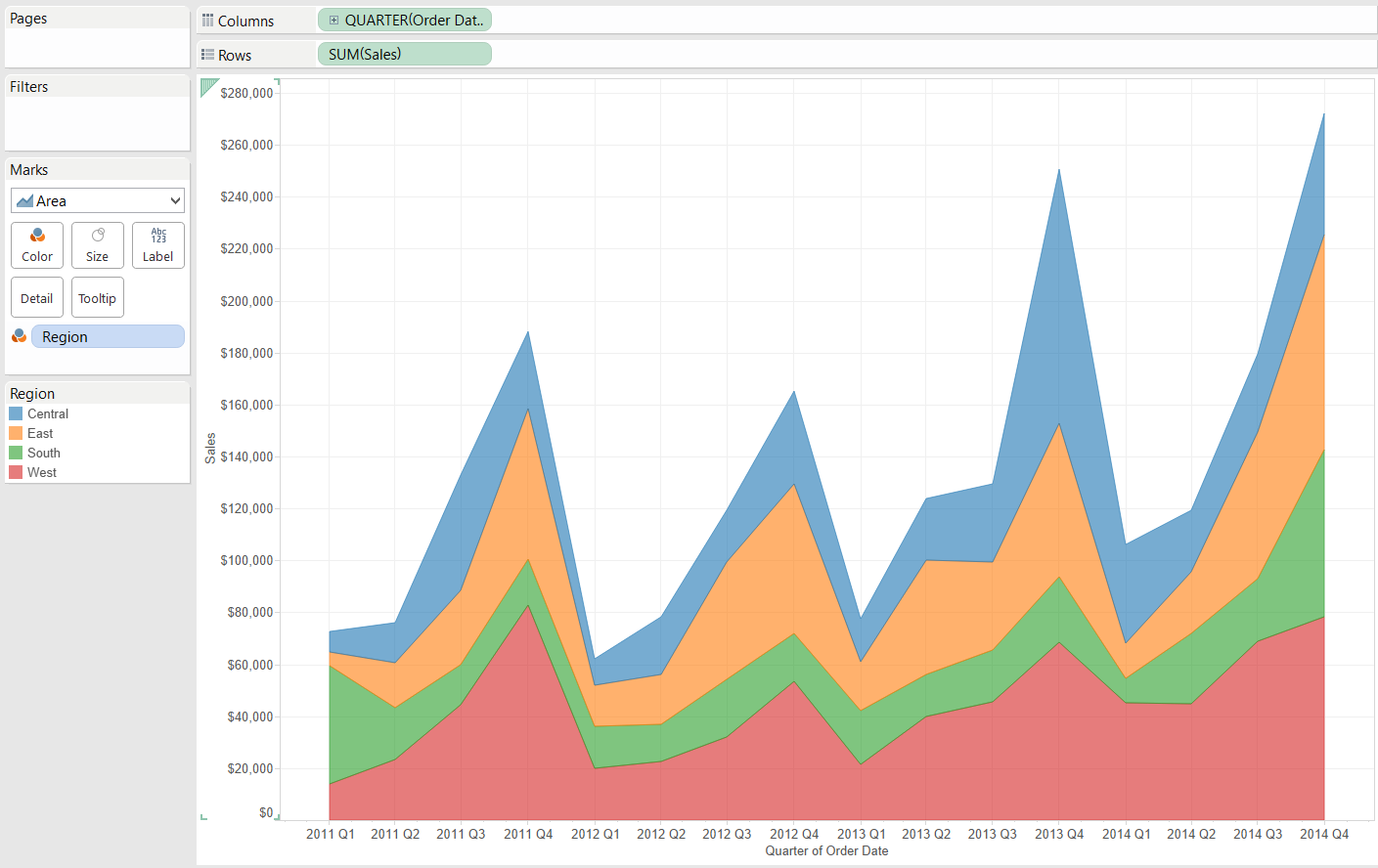
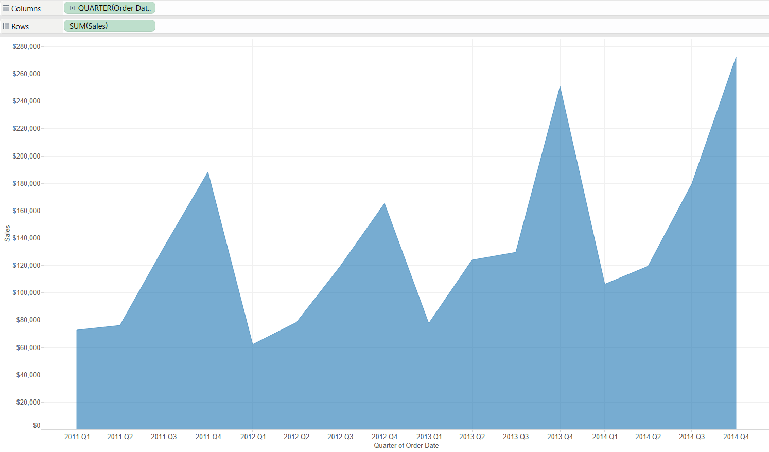 Notice that Tableau automatically displays all the gridlines, these do not add significantly to the view thus you may want to remove them. Adding e.g. 'Region' on the Color button on the Marks card will split the area by region, this is how we arrive to the classical area chart.
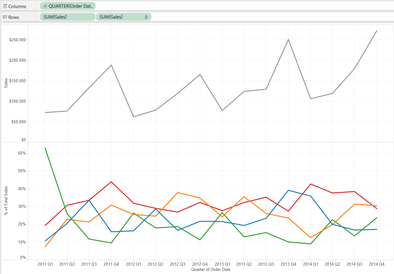
 To focus on the part-to-whole relationship and show percentages, it is easy to create the percentage of total sales by adding a table calculation to the pane at the bottom.
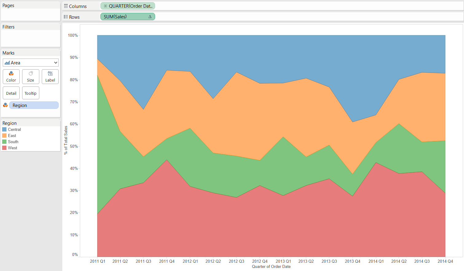
 The total value may also be incorporated in the same pane its (regional) parts in a dual-axis chart. That could though compress the regional values too much or create clutter in the chart so I do not go into the details of that choice.What are good use cases for an area chart? One is the demonstration of part-to-whole relationships with percent of total values. Then the whole chart area is utilized and both the axis at the bottom and the top of the chart provide reference to ease the comparison of values.
 Another great use case for the are chart is a 'funnel-type' analysis when the areas strictly follow an order, all are rooted at zero and there is a natural order in their sizes. Think of a capacity analysis of four types: potential capacity, actual available capacity, booked capacity and used capacity. Potential >= actual >= booked >= used, so this is a monotonic decrease. This means that nothing will be hidden by another area on the chart.
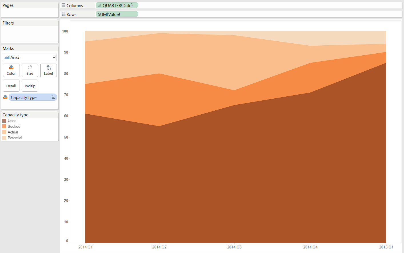 Please note that even though on this chart the potential capacity equals 100, this could be any positive value and it should not necessarily be stable over time. The 'Stack Marks' option has to be turned 'Off' within the Analysis menu to display correct figures.All in all, while continuous (stacked) area charts are not the most suitable for representing absolute values, in some cases they can flavour your dashboard with something beyond a traditional line chart.
Show Me continuous Area Charts
We find in Wikipedia that 'Area charts are used to represent cumulated totals using numbers or percentages (stacked area charts in this case) over time.' What does Tableau require to produce this chart type? Let's see the Show Me panel. Using the Superstore Sales dataset that is shipped with Tableau, the basic continuous Area chart then looks like this:
 Notice that Tableau automatically displays all the gridlines, these do not add significantly to the view thus you may want to remove them. Adding e.g. 'Region' on the Color button on the Marks card will split the area by region, this is how we arrive to the classical area chart.
Data visualisation best practices
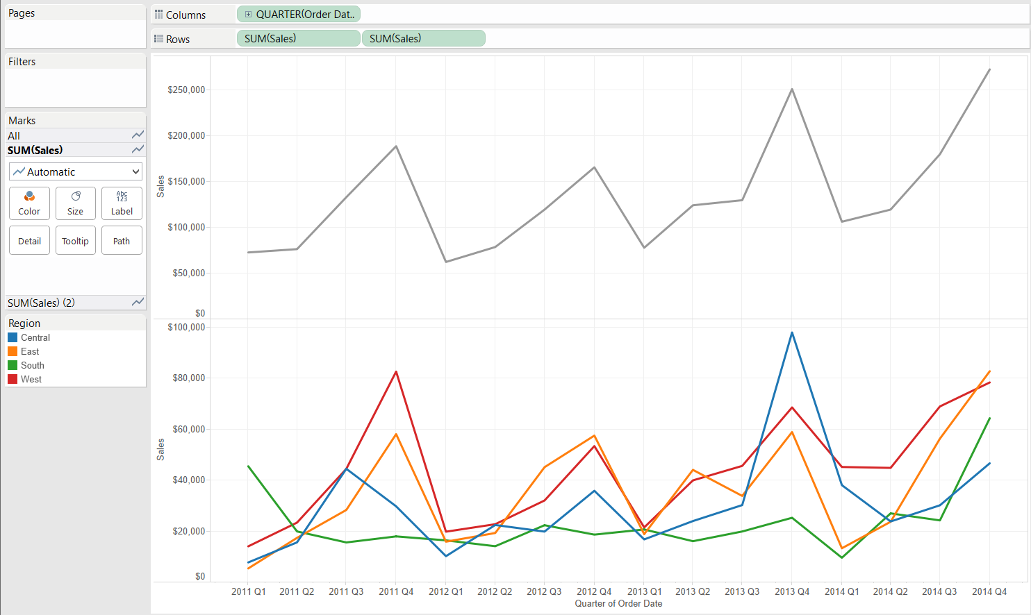
A continuous area chart should combine the abilities of showing trend (having a continuous date field in the view) and reflecting part-to-whole relationships (in the above example the total sales split by regions). Still, because of the stacked nature it is extremely hard to decipher the real trend of anything besides the dimension member at the bottom - Region West in our case. This is because other items have a varying 'base' they are stacked on so the top of their area does not correspond to the actual peak of the data value. The issue we encounter is remotely similar to why we require zero based bar charts. A varying base is not better in representing size than an axis along that only a part of the value is shown. If you do not believe me, try the exercise described on page 4 of Stephen Few's thoughts on this topic.If we wanted to display absolute figures, we can choose lines that eliminate the issue of stacked marks. Following through with the example in this post it looks as below: To focus on the part-to-whole relationship and show percentages, it is easy to create the percentage of total sales by adding a table calculation to the pane at the bottom.
 The total value may also be incorporated in the same pane its (regional) parts in a dual-axis chart. That could though compress the regional values too much or create clutter in the chart so I do not go into the details of that choice.What are good use cases for an area chart? One is the demonstration of part-to-whole relationships with percent of total values. Then the whole chart area is utilized and both the axis at the bottom and the top of the chart provide reference to ease the comparison of values.
 Another great use case for the are chart is a 'funnel-type' analysis when the areas strictly follow an order, all are rooted at zero and there is a natural order in their sizes. Think of a capacity analysis of four types: potential capacity, actual available capacity, booked capacity and used capacity. Potential >= actual >= booked >= used, so this is a monotonic decrease. This means that nothing will be hidden by another area on the chart.
 Please note that even though on this chart the potential capacity equals 100, this could be any positive value and it should not necessarily be stable over time. The 'Stack Marks' option has to be turned 'Off' within the Analysis menu to display correct figures.All in all, while continuous (stacked) area charts are not the most suitable for representing absolute values, in some cases they can flavour your dashboard with something beyond a traditional line chart.