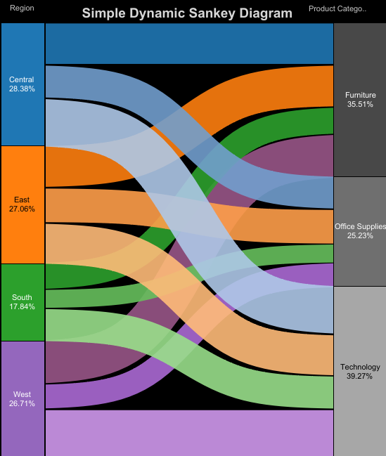
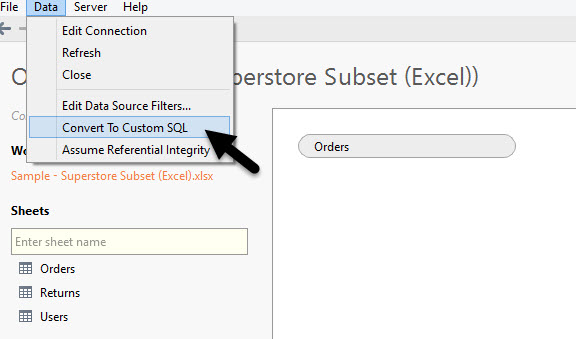
 Let's not get into best practice arguments; yes they can be hard to read so consider when to use them and what alternatives are available <blah> <blah>.Let's talk through how I've built this, we'll do a simple version and a nicer more complex version. My method extends on Jeffrey and Olivier's methods by requiring minimal data manipulation.Step 1: Duplicate the dataI need to duplicate my data and add a field to tell me which is the Real and data and which is the Dummy (duplicate) rows. There are many ways of doing this, Alteryx, Copy / Paste in Excel, but as I'm using an Excel data source I'm going to open the sheet with the the Legacy connector:
 and then convert my Orders table to Custom SQL:
 I'll then copy and paste the code and UNION it and create my extra field, highlighted in red below, everything else is just as Tableau provided it:
SELECT [Orders$].[City] AS [City],[Orders$].[Customer ID] AS [Customer ID],[Orders$].[Customer Name] AS [Customer Name],[Orders$].[Customer Segment] AS [Customer Segment],[Orders$].[Discount] AS [Discount],[Orders$].[Order Date] AS [Order Date],[Orders$].[Order ID] AS [Order ID],[Orders$].[Order Priority] AS [Order Priority],[Orders$].[Postal Code] AS [Postal Code],[Orders$].[Product Base Margin] AS [Product Base Margin],[Orders$].[Product Category] AS [Product Category],[Orders$].[Product Container] AS [Product Container],[Orders$].[Product Name] AS [Product Name],[Orders$].[Product Sub-Category] AS [Product Sub-Category],[Orders$].[Profit] AS [Profit],[Orders$].[Quantity ordered new] AS [Quantity ordered new],[Orders$].[Region] AS [Region],[Orders$].[Row ID] AS [Row ID],[Orders$].[Sales] AS [Sales],[Orders$].[Ship Date] AS [Ship Date],[Orders$].[Ship Mode] AS [Ship Mode],[Orders$].[Shipping Cost] AS [Shipping Cost],[Orders$].[State or Province] AS [State or Province],[Orders$].[Unit Price] AS [Unit Price],'Dummy' as RowTypeFROM [Orders$]
UNION
SELECT [Orders$].[City] AS [City],[Orders$].[Customer ID] AS [Customer ID],[Orders$].[Customer Name] AS [Customer Name],[Orders$].[Customer Segment] AS [Customer Segment],[Orders$].[Discount] AS [Discount],[Orders$].[Order Date] AS [Order Date],[Orders$].[Order ID] AS [Order ID],[Orders$].[Order Priority] AS [Order Priority],[Orders$].[Postal Code] AS [Postal Code],[Orders$].[Product Base Margin] AS [Product Base Margin],[Orders$].[Product Category] AS [Product Category],[Orders$].[Product Container] AS [Product Container],[Orders$].[Product Name] AS [Product Name],[Orders$].[Product Sub-Category] AS [Product Sub-Category],[Orders$].[Profit] AS [Profit],[Orders$].[Quantity ordered new] AS [Quantity ordered new],[Orders$].[Region] AS [Region],[Orders$].[Row ID] AS [Row ID],[Orders$].[Sales] AS [Sales],[Orders$].[Ship Date] AS [Ship Date],[Orders$].[Ship Mode] AS [Ship Mode],[Orders$].[Shipping Cost] AS [Shipping Cost],[Orders$].[State or Province] AS [State or Province],[Orders$].[Unit Price] AS [Unit Price],'Real' as RowTypeFROM [Orders$]
Step 2: Densification using BinsCreate a new Measure:[ToPad] = if [RowType]=='Real' then 1 else 49 endAnd now create a new Bin of Size 1 called [Padded]. To do this right click on [ToPad] and use the Create Bin option:
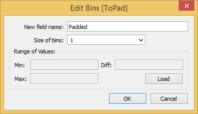 Because Bins are Range aware then they will effectively allow us to pad out our data for each row and create 49 rows of data for each row. Let's test it out by creating a third function [t]:
[t] = (index()-25)/4Now let's Viz, drop [t] onto columns and our [Padded] bin onto Detail, change the mark type to circle. Finally make sure the index in [t] is Computing over [Padded].
 Woah - we didn't have a value of 12 in or data, we had 1 and 49 - but that's densification in action! The index() will compute over the bins and build us values that weren't there, there are lots of uses for this technique but it's a true mind bender and Jedi technique.Step 3: Build our Ranking FunctionsWe now need to build functions that will show our data at the right points vertically when we build the Sankey, these are identical:
[Rank 1] = RUNNING_SUM(sum(Sales))/TOTAL(sum(Sales))
[Rank 2] = RUNNING_SUM(sum(Sales))/TOTAL(sum(Sales))They create a running total of Sales and divide by the overall Total, giving a cumulative percentage. Step 4: Build our Curve function(s):Let's start with a sigmoid function - the basis of the Viz (that gives the curve)
[Sigmoid] = 1/(1+EXP(1)^-[t])and add the Curve:
[Curve] = [Rank 1]+(([Rank 2] - [Rank 1])*[Sigmoid])
Step 5: Build the Viz
Let's get Vizzical, drag Two Dimensions onto the Detail Shelf, these will be our Left and Right parts of our Sankey Diagram - in my case I'm using dynamic dimensions controlled by a parameter but please yourself (if you read Olivier's post linked above he uses a set to create a Top N effect to control his dimensions).
Add the [Curve] to Rows and now let's talk Nested Table Calcs (an excellent primer here from Nelson Davis, I also recommend my primer on Table Calcs).
Our [Curve] calc has three parts to it, [Rank 1], [Rank 2] and [t] we need each of these to address over different dimensions. We want to Rank over both dimensions, but we want each Rank calc in a different order, we want Rank 1 to sort by the 'left' Dimension first, and Rank 2 to sort by the 'right' dimension. That way the 'groupings' of the flows will look right.
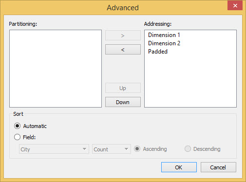
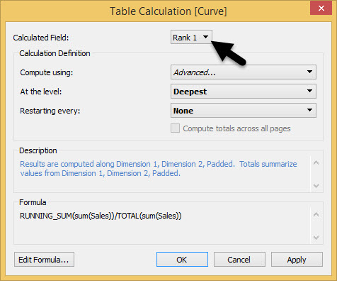
To do this Edit Table Calculation on the [Curve] pill on Rows. First we'll set [Rank 1], click on Advanced in the dropdown and choose the options below:
Now switch the nested calc to change the Compute context for [Rank 2] using the menu below:
We want [Rank 2] to compute over a different ordering, which we can control by using a different order in the addressing:
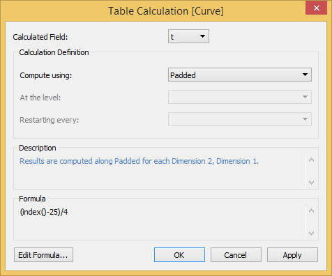
Finally switch to [t] that should compute over just our Padded dimension:
Step 7: Tidy Up
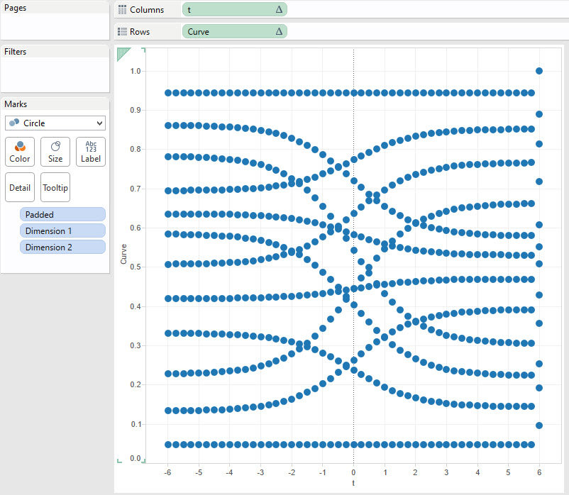
Now we need to remove grid and zero lines, hide our [Curve] axis add a bit of colour, etc, but the main thing to do is fix that axes that has a wonky dot over on the right (caused by the domain padding). I fix [t] axis at -5 and 5. I also fix [Curve] at 0 and 1 and reverse the Axis - more to come later on why. With those few tweaks here's what I have. To create line I changed to a Line mark type and added [Padded] to the Path:
Step 8: Add Size
We now need to vary the lines by size, based on their sales. Adding Sum([Sales]) to Size won't look good as the padded marks have no sales associated, so let's trick tableau by using a Table Calc that will act over those passed marks:
RUNNING_AVG(SUM([Sales]))
Now add that to Size and Compute using [Padded], now tweak the overall Size until you're happy:
Step 9: Add Left and Right Dimensions
Now build two single bar stacked chart sheets showing the breakdown of percentage Sales for each dimension (I shouldn't have to show you how to do this, this is an advanced blog - but download check out my Viz if you're not sure). Now combine into a dashboard, I use floating to minimise the spaces, and use Highlight Actions on Hover to improve readibility.
[tableau url='https://public.tableau.com/views/SimpleSankey/Sankey?:embed=y&:display_count=no&:showTabs=y' width='570px' height='715px'][/tableau]Getting More Complex
The above method has some downsides, namely the size needs to be configured manually to fit the Viz. Another option (aside from using Oliviers method above) is to draw one line per row of data. Yes it gets busy but that's what I've done in the Viz below, it's slower but neater. Have a look, it follows a very similar method to the above - I've just computed over RowID too. Hope you enjoyed this post as much as I enjoy researching and testing these methods.
