

27 November 2017

The Tableau community have recently been sharing some 'real' Tableau Dashboards on Twitter using the hashtag #realTableau. The idea is to share the work we do in Tableau behind close doors. This work will often have different constraints and requirements than Tableau Public / Makeover Monday type work and so it's important that it gets highlighted as much as the fun stuff many people do - of course the challenge is much of it is private. Thankfully many people have stepped forward to share, for example, Charlie Hutchinson has been blogging about his dashboards and you can see many more examples on the #realTableau thread.I thought I'd take a moment to share a very old dashboard I've used on a few projects to analyse data loads. Each data load is being automatically loaded into a database but each row (or column in the real dashboard) might have errors or warnings relating to whether the data could be loaded.If we need to build a a visualisation to show these loads then we're interested in a number of things: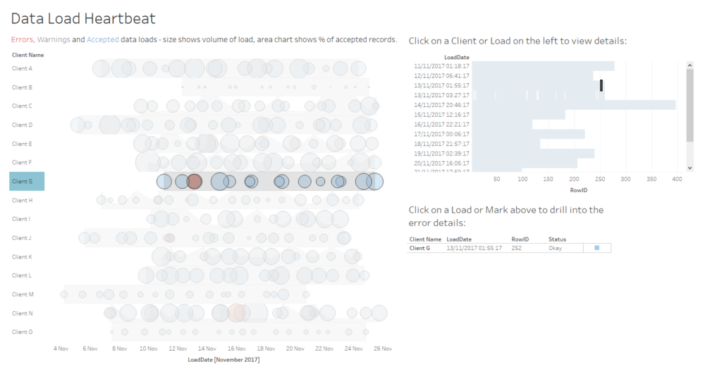
- how frequent are the loads per client?
- how big is each load? (we might want to spot outliers in size variation e.g. if a client regularly sends 1000 records and suddenly they send 10 records it might be an issue)
- how successful is each load?
- where in each data load are the errors occurring, is an error throughout the data or is it just on the top X rows, say?
- what specifically is the error for a given line to help us pinpoint the actual problem.