21 December 2014
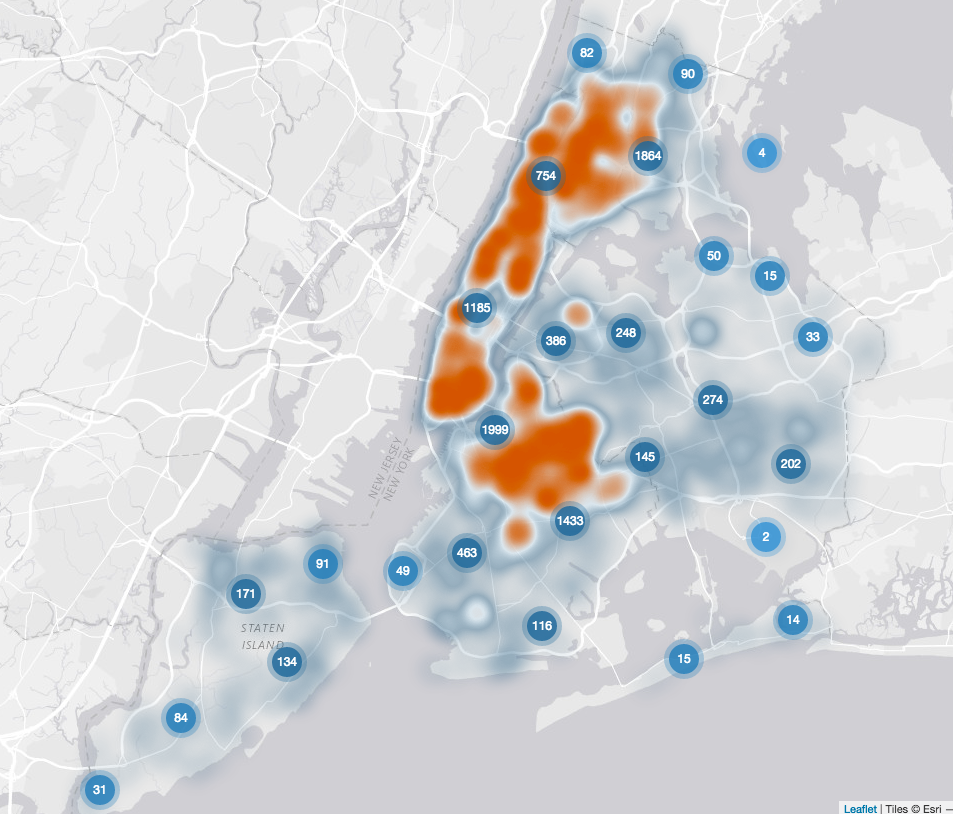
Recently Andy Kriebel shared this visualisation by Meredith Myers on his Data Viz Done Right site. Click on the Viz below to go to the webpage and see the interactive visualisation. I thought, given my recent post, I'd try to rebuild this visualisation in Tableau. See my attempt below (click to see the full visualisation):
 Things that are easy:
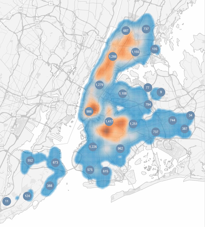
 I thought, given my recent post, I'd try to rebuild this visualisation in Tableau. See my attempt below (click to see the full visualisation):
 Things that are easy:
- Heat map - using Alteryx
- Points - used Alteryx clustering to group nearby points
- Click and zoom - need more time but I think I can replicate this using actions (needs more data and time that I have right now)
