

31 December 2015
A modern mapping stack needs to be quick and easy to create, integrate and update. Just as Tableau and Alteryx can plow through any and all data from parsing to visualising, with the addition of Mapbox taking on GIS is just as simple
A modern mapping stack needs to be quick and easy to create, integrate and update. Just as Tableau and Alteryx can plow through any and all data from parsing to visualising, with the addition of Mapbox taking on GIS is just as simple. Here's how I recently put it to use.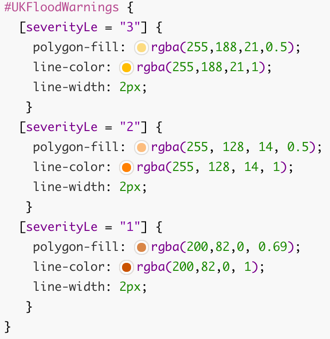 Notice how you can 'filter' your styles based on the data in the shapefile. In this case the severity level for each polygon determined which colour was used.Once uploaded and ingested by Mapbox it's ready to use in Tableau. It of course needs a basemap of land, rivers, roads, building, etc. and for that I took Mapbox's Emerald style and modified it by removing many of the filled areas to allow focus on the flooded areas.
 And so all the pieces were ready to put into Tableau and published to Tableau Public.
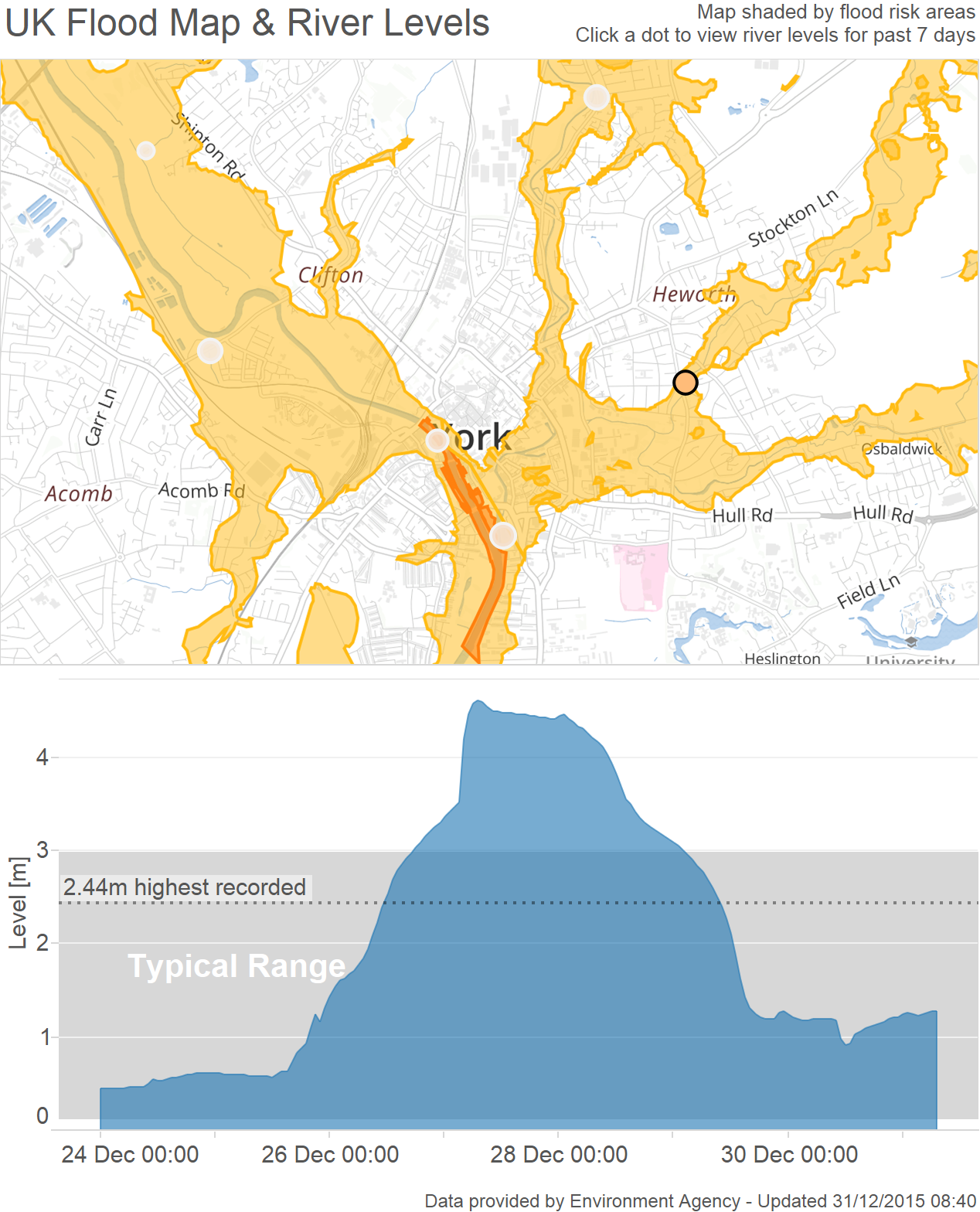 The first combines the background flood map from Mapbox with the river level data to show the trend of each river in the affected areas with reference to its typical range and previous highest recorded level.
 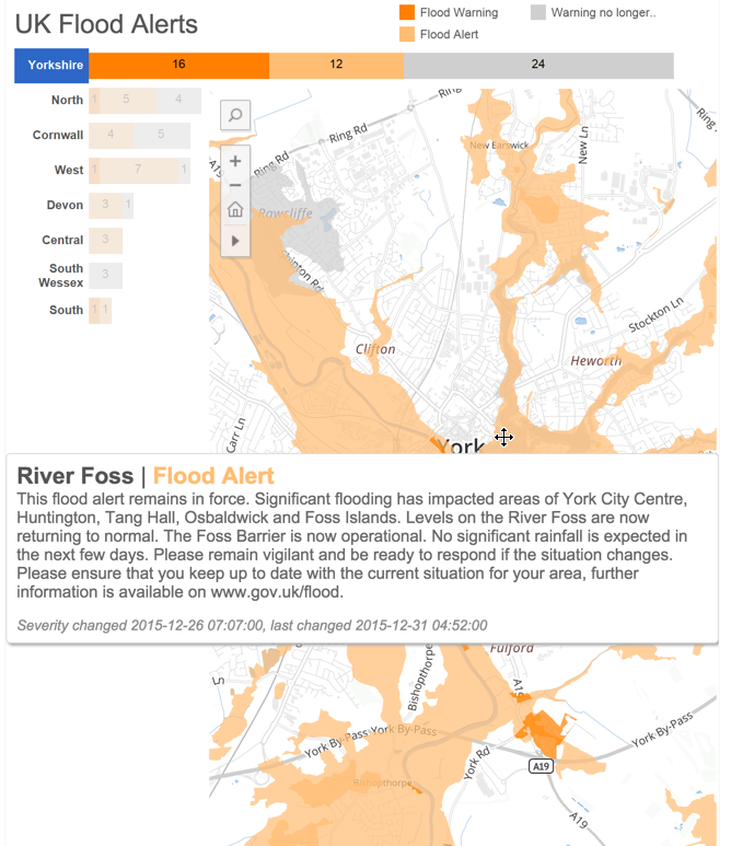 Next a polygon map of the flood alert areas combined with a bar chart allows for easy exploring of problem areas across the entire country, allowing the user to get each alert and description for the areas of interest using the tooltip.
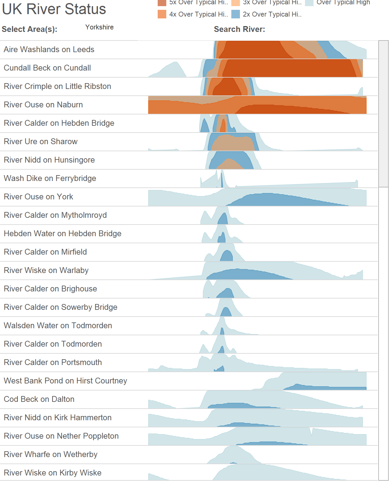 Finally I wanted to better understand the river level trend across an entire region of rivers (or across the whole country) to try and identify hotspots. For this I made use of a horizon chart which shows rivers 1-5 times over their typical high level.
The Story
For our readers outside of the UK we've had some rain recently, and yes I can already hear some of you asking 'but I thought it never stops raining in the UK?' Jokes aside we do get quite a bit of rain, and that's normal. 2015 and specifically December have not been normal, they've both been the wettest on record. I'm not going to forget this for a while, as having consumed my Christmas dinner & grumbled about how it was still raining, I went to sleep only to wake up to a lake outside my front door.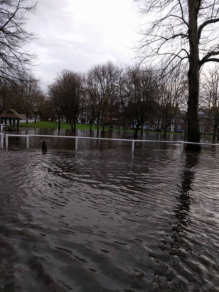
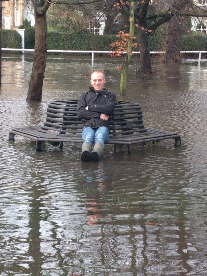
This, as it turns out, was a prelude of what was to come for my local town of York. While our issue was caused by a small pumping station being unable to cope with the volume of water, another more fundamental piece of equipment, the Foss Barrier, was about to fail on the other side of town. We were fortunate in that our small flood required only the use of waterproof boots, for many in York though the sudden end to their Christmas became clear as the ground floor of their homes and businesses were destroyed.
Emergency services navigate a flooded street in York, northern England, Dec 27 - Phil Noble pic.twitter.com/fx9D4EVtpT
— GoldenCouple (@TRH_WandC) December 28, 2015More Refined Information
While through pure luck our house was spared, we feared the worst, and I found myself constantly monitoring the Environment Agency's website looking at flood warning areas and river levels, trying to figure out if we too should evacuate. The trouble is, like many data-driven government websites, I found it difficult to navigate, needing to jump back and forth between pages, and has information spread not only across its site, but in multiple formats and styles.The Power of Alteryx, Mapbox & Tableau
Alteryx the Engine
Thankfully the Environment Agency provides all the data they collect via APIs which can be accessed by anybody without the need for pesky authentication. Using Alteryx to connect to these APIs I was able to do two things. First download all areas classed as flood alert, flood warning and severe flood warning (i.e. your house is about to be flooded). Then I expanded these areas by a mile and spatially matched the result with a list of river level recording stations again provided by the Environment Agency. Finally with a list of applicable river stations I downloaded 7 days worth of readings giving me two datasets, river levels and flood areas.Feel free to download the workflow.Mapbox the Canvas
The visualisation I had in mind combined the river level data with the context of which areas of the country were most in danger, something I hadn't seen from the Environment Agency. For a custom background map the only answer is Mapbox (and if you've got Tableau 9.2 it's super easy to integrate thanks to its addition to the 'Map Services' menu).Using Mapbox Studio Classic the data is easy to upload as a zipped shapefile. Once there all you need to do is write some CartoCSS styling information against it. For my flood area layer this came out as:Notice how you can 'filter' your styles based on the data in the shapefile. In this case the severity level for each polygon determined which colour was used.Once uploaded and ingested by Mapbox it's ready to use in Tableau. It of course needs a basemap of land, rivers, roads, building, etc. and for that I took Mapbox's Emerald style and modified it by removing many of the filled areas to allow focus on the flooded areas.Tableau the Publisher
The first combines the background flood map from Mapbox with the river level data to show the trend of each river in the affected areas with reference to its typical range and previous highest recorded level. Next a polygon map of the flood alert areas combined with a bar chart allows for easy exploring of problem areas across the entire country, allowing the user to get each alert and description for the areas of interest using the tooltip.Finally I wanted to better understand the river level trend across an entire region of rivers (or across the whole country) to try and identify hotspots. For this I made use of a horizon chart which shows rivers 1-5 times over their typical high level.