

5 August 2013
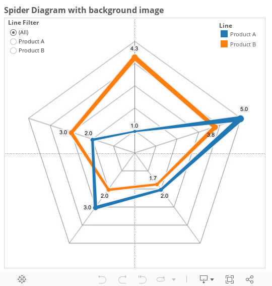
Tableau is a very powerful tool, but there are some things that it either doesn't do, or is very difficult to do. Sometimes, the skill is knowing the difference - is something just plain hard, or is it impossible?Personally, I like a challenge. So when a client asked me if it was possible to create a Spider Diagrams (one of the many alternative names for a Radar Chart) in Tableau, responding with 'no' just didn't sit right with me. Not natively, perhaps, but it must be possible.. For the data, I just created some basic fake information in an excel file. 5 lines of data to create 5 points.
 The X and Y coordinates took a little bit of math, after first finding the X-Y coordinates of the end points on the background image, assuming the centre is (0,0).
 Put the Relative X field on Columns, the Relative Y field on Rows, use Line type with the ID of the point as the Path, colour it by the name of the line and there we go.
 Almost.As it's a cyclic plot, the first and last points are supposed to join up. This works with a polygon, but not with a line chart. Back to the excel, add another data point, same as the first, back to Tableau, refresh and there we go - it works.
 To finish off the view, I first added a no-change 'Lookup' table calculation, to allow just showing one of the two lines, without changing the max number, and so the positions.
 Next thing to do was to add the label. This was made more complicated by the fact that the Tableau v8 layout engine doesn't overlay labels for two points if they are the same value. This means the start/end point looks a bit odd so we need to use a calculated field to only include the value if it is not the last point on the lineIF LAST()<>0 THEN SUM(Value) END
The aim
What is a Radar Chart? A radar chart shows data in a cyclic manner, overlaid on a spoke-and-web design (hence the 'Spider')
The method
My first approach was to use a background image. If you haven't created a chart with a custom background image before, they are fairly simple - you just need to know the bounds on an X-Y scatter plot that the image should be within. As I was styling mine on excel, I did a screengrab of an empty excel version, and so had my background.For the data, I just created some basic fake information in an excel file. 5 lines of data to create 5 points. The X and Y coordinates took a little bit of math, after first finding the X-Y coordinates of the end points on the background image, assuming the centre is (0,0).
 Put the Relative X field on Columns, the Relative Y field on Rows, use Line type with the ID of the point as the Path, colour it by the name of the line and there we go.
 Almost.As it's a cyclic plot, the first and last points are supposed to join up. This works with a polygon, but not with a line chart. Back to the excel, add another data point, same as the first, back to Tableau, refresh and there we go - it works.
 To finish off the view, I first added a no-change 'Lookup' table calculation, to allow just showing one of the two lines, without changing the max number, and so the positions.
 Next thing to do was to add the label. This was made more complicated by the fact that the Tableau v8 layout engine doesn't overlay labels for two points if they are the same value. This means the start/end point looks a bit odd so we need to use a calculated field to only include the value if it is not the last point on the lineIF LAST()<>0 THEN SUM(Value) END
Put SUM(Result) onto size if you want, but there we have it. A radar chart in Tableau.
Next Time
We may have now done something in Tableau that would have a good number of people recoiling in horror, but I'm not convinced we should stop here. I will be adding a second post on this topic, where we will try to go that little bit further.For now though, I will leave you with the workbook so far.