

29 January 2015
Before we begin, please be aware that this is a workaround that will hopefully help out in most situations but may not always be suitable.Parameters are a great function in Tableau and they can be used to show more than one measure in a view. For example, using Superstore Subset, I have created a parameter which allows me to switch between sales value, % of total sales and average days between order and ship dates.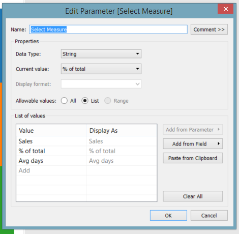 I created two new calculations, one for % of Total Sales,
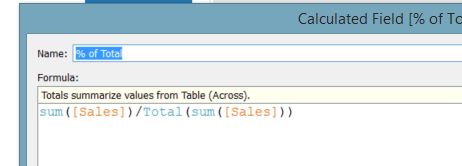 And one for average days between order and ship dates,
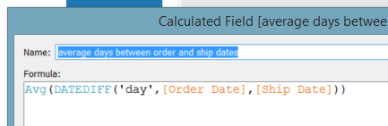 I have then created a calculation which switches between measures depending on your parameter selection, named Value to Show.
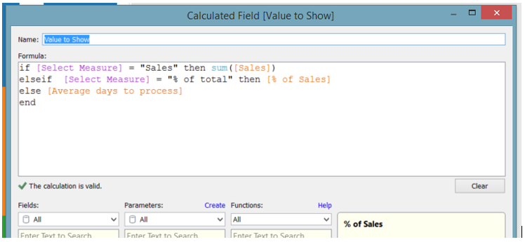 I have then created a bar chart view using Product Category split by Order Priority.
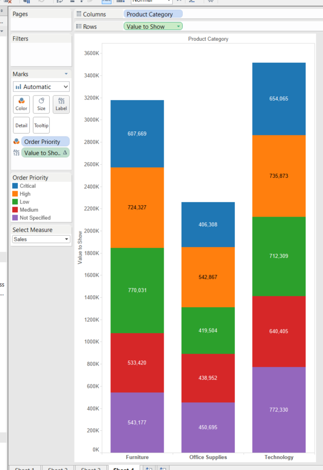 You can then use the parameter selection to choose which view you want to see, all good so far. Apart from the fact that the three measures we have to choose from all have very different formats, Sales – currency, % of total – percentage, Avg days – decimal. Because we are using the Value to Show calculation as the Measure, Tableau recognises this as one single field, so we can only set the formatting to one type. So our labels and axis become pointless.A way around this is to use measure values and some new calculations. Firstly right click on Sales and select Create Calculated Field. As we are using these as labels I have named these new fields exactly the same as the existing fields with label on the end. Create the calculation below, this will result in when you select Sales in your parameter you will see your Sales values, but when anything else is selected you will see null (nothing).
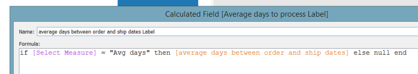
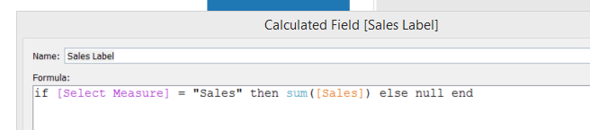 Do the same for the other two fields, % of Total Sales and average days between order and ship dates,
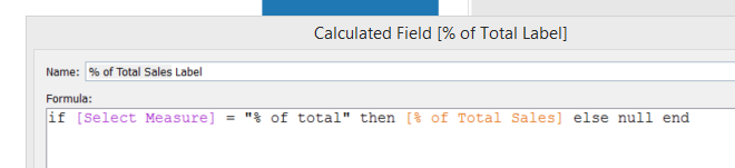
 Now when you create your bar chart, instead of using the original calculated field “Value to Show” use Measures Values and select the three label fields to show. Also place Measure Values on the labels icon. You can now set the formats for each measure individually by right clicking on the pill and selecting format, or right clicking on the field in the measures list and changing the default formatting.
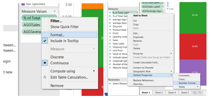 Your labels should now be formatted correctly. One issue you may notice is the formatting of the axis is still an issue, as you will get a decimal value instead of a %, this may not be ideal, however if you have labels there may be an argument that you don’t need to show the axis. You can however, get a dynamic title on the axis by using the parameter field, and placing it on the rows shelf before the Measure Values pill. You can then remove the title from the original axis by right clicking on the axis, selecting Edit Axis and deleting the title, and then right click on the parameter title and select Rotate Label, and right click on Select Measure and select Hide Field Labels for Rows. Now when you select a different value in the parameter your axis heading should change.
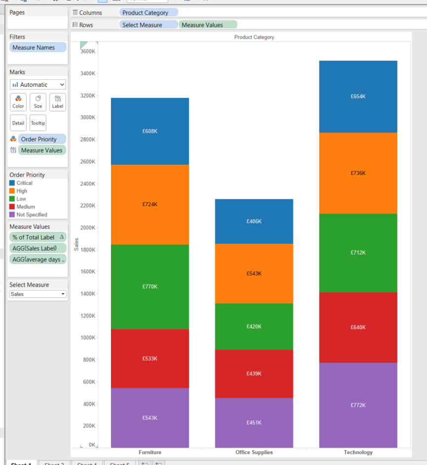 This method can also be used in a table view.
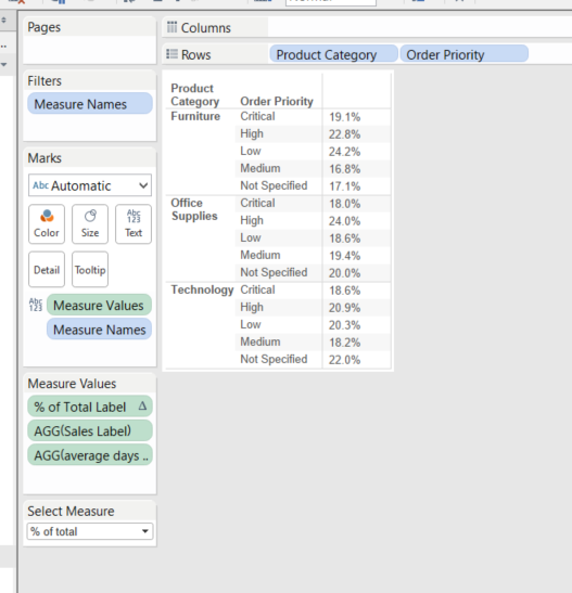
I created two new calculations, one for % of Total Sales,And one for average days between order and ship dates,I have then created a calculation which switches between measures depending on your parameter selection, named Value to Show.I have then created a bar chart view using Product Category split by Order Priority.You can then use the parameter selection to choose which view you want to see, all good so far. Apart from the fact that the three measures we have to choose from all have very different formats, Sales – currency, % of total – percentage, Avg days – decimal. Because we are using the Value to Show calculation as the Measure, Tableau recognises this as one single field, so we can only set the formatting to one type. So our labels and axis become pointless.A way around this is to use measure values and some new calculations. Firstly right click on Sales and select Create Calculated Field. As we are using these as labels I have named these new fields exactly the same as the existing fields with label on the end. Create the calculation below, this will result in when you select Sales in your parameter you will see your Sales values, but when anything else is selected you will see null (nothing).Do the same for the other two fields, % of Total Sales and average days between order and ship dates,Now when you create your bar chart, instead of using the original calculated field “Value to Show” use Measures Values and select the three label fields to show. Also place Measure Values on the labels icon. You can now set the formats for each measure individually by right clicking on the pill and selecting format, or right clicking on the field in the measures list and changing the default formatting.Your labels should now be formatted correctly. One issue you may notice is the formatting of the axis is still an issue, as you will get a decimal value instead of a %, this may not be ideal, however if you have labels there may be an argument that you don’t need to show the axis. You can however, get a dynamic title on the axis by using the parameter field, and placing it on the rows shelf before the Measure Values pill. You can then remove the title from the original axis by right clicking on the axis, selecting Edit Axis and deleting the title, and then right click on the parameter title and select Rotate Label, and right click on Select Measure and select Hide Field Labels for Rows. Now when you select a different value in the parameter your axis heading should change.This method can also be used in a table view.