

'A Pareto chart, named after Vilfredo Pareto, is a type of chart that contains both bars and a line graph, where individual values are represented in descending order by bars, and the cumulative total is represented by the line.' ---- from WikipediaRecently I had to create one of these and found that I had to look in a lot of places to get what I was looking for so I hope this will help you if you need to create one.
To start off with you need to create a % of Total Sales field
I will use the default superstore data in Tableau so that you can try this yourself.Double click on SalesDouble click on Customer NameThen Sort the Customer name on the Columns shelf by SUM([Sales])Make the Chart fit the width of your screen and you should have something like this.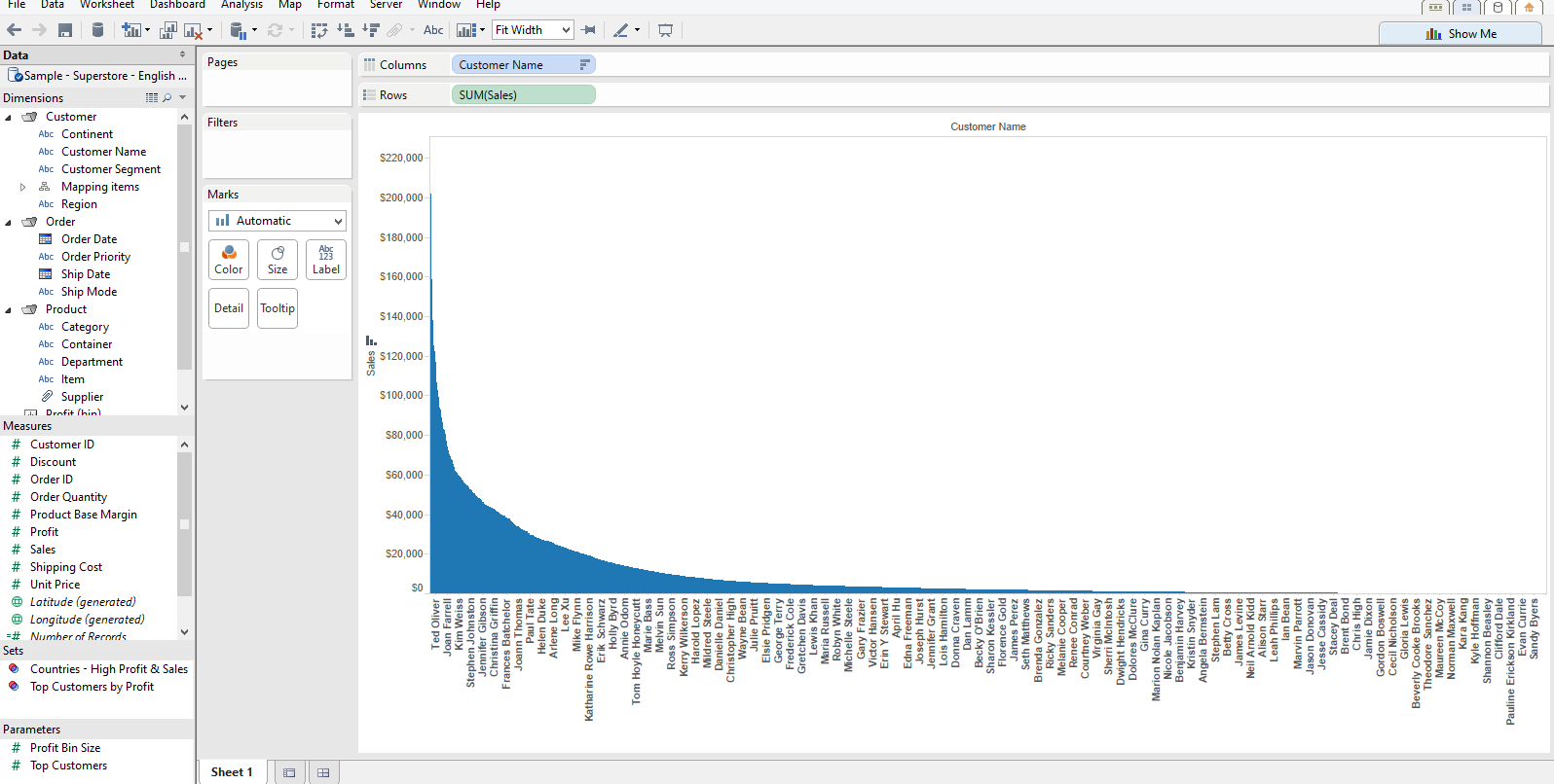 Thats easy enough to get the first view of the bars but now we need to add in another line to show the cumulative total.Whilst holding down the CTRL key left click on the SUM([Sales]) on the Rows shelf and drag it the side so that you have two measures.
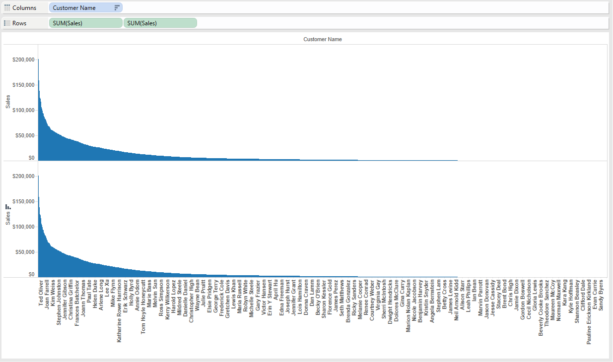 On the first Sales pill Right click and pick a Quick Table Calculation and Running TotalRight click on the same pill again and click on Edit Table CalculationTick the box to Perform a Secondary CalculationSelect Percent of Total
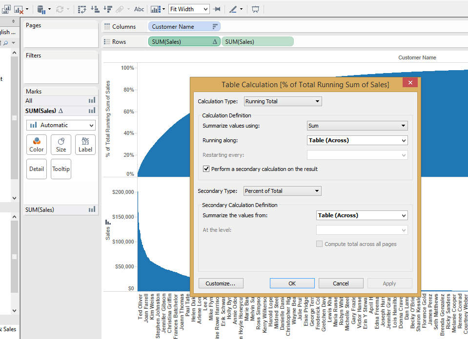 Now click on the Customize button on the bottom left of the window, This will show what calculation is being done and you can also save this as a new Field.Give it a name like % of Total Sales and click OKYou will come back to a smaller window with the table calculation for '% of Total Sales'Click OK and you will see your first pill is not the SUM([Sales]) any more.
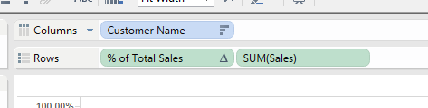
Next we need to turn the Customer Name field from Text into a Calculation
Right click on the Customer Name pill and select Measure and then Count (Distinct)This will change your view to show just one point on each measureRight click on CNTD(Customer Name) and pick a Quick Table Calculation and Running TotalRight click on the same pill again and click on Edit Table CalculationTick the box to Perform a Secondary Calculation and select Percent of TotalClick on the Customize button and save the calculation as a new field '% of Customers'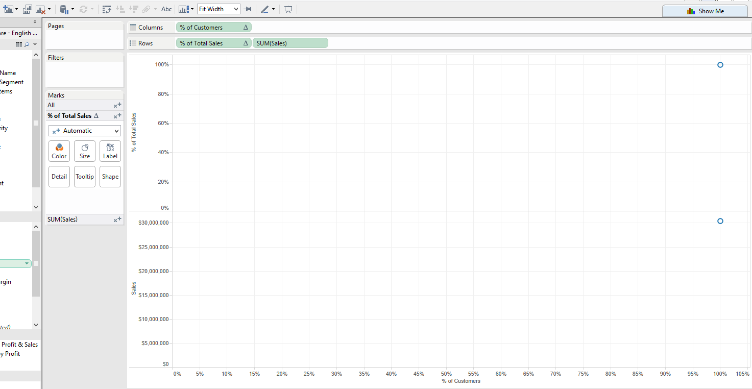 Optional - You may wish to change the default number format for both % of Customers and % of Total Sales to be Zero decimal places but this is just a cosmetic point.
Bringing it together
Drag from the Dimensions shelf a new Customer Name field and drop it onto the Level of details on the All Marks CardRight Click and Sort this field by the Sum of SalesNow Right click on the % of Customers and click on Edit Table Calculations and pick the Customer Name in the Compute using drop down and click Apply and OKYou should have something like this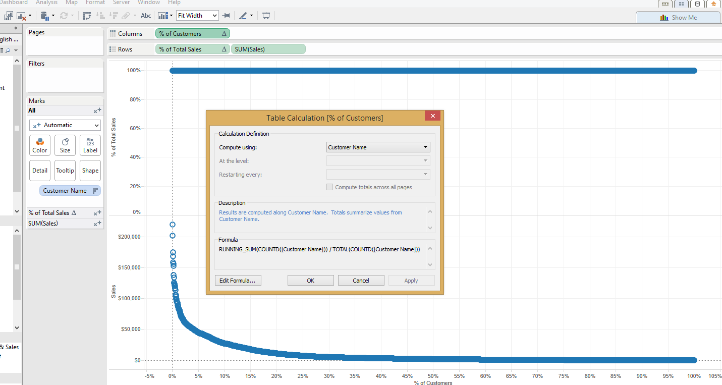 Next Right click on the % of Total Sales pill and do the same
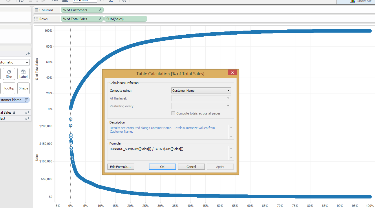 Make the Chart into a Dual Axis by either Right clicking on the Sum of Sales axis and selecting Dual axis or Drag and drop the axis to the right hand side of the % of Total Sales sectionOn the Marks card I like to set the % of Total Sales to a line and the Sum of Sales to an area so that you have something like this
 And there you go a basic Pareto Chart.
You want more?
Ok I do like to play with my Parameters :) and they do make this more interactive.Right click on the % of Total Sales axis and add a Reference lineCreate a new Parameter called 'Target % of Sales' with a current value of 0.8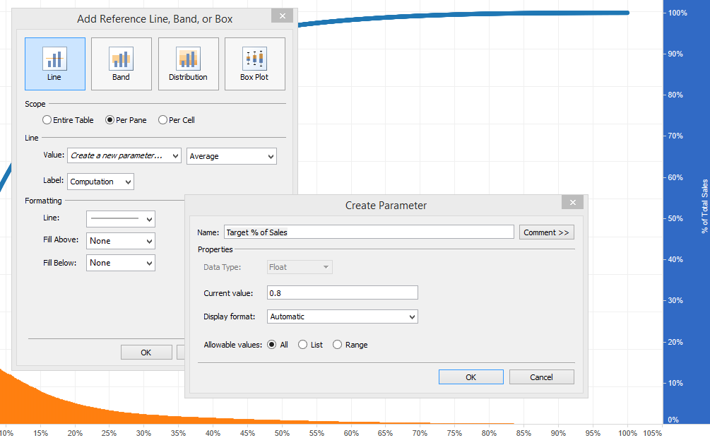 Now to see where this crosses the % of Customers we need to create a calculated fieldRight click on the % of Total Sales in the Measures shelf and select create a calculated fieldName the field Target Cross Point and use the following formulaIf [% of Total Sales]<[Target % of Sales] Then [% of Customers] Else NULL ENDChange the default number format to be a %Then drag it onto the details marks cardRight Click on the % of Customers axis and add a reference line using the Target Cross PointSet the Aggregation to be Maximum and the Label to ValueYou will now have a second reference line that crosses at the point where the the target line meets the % of Total Sales curve
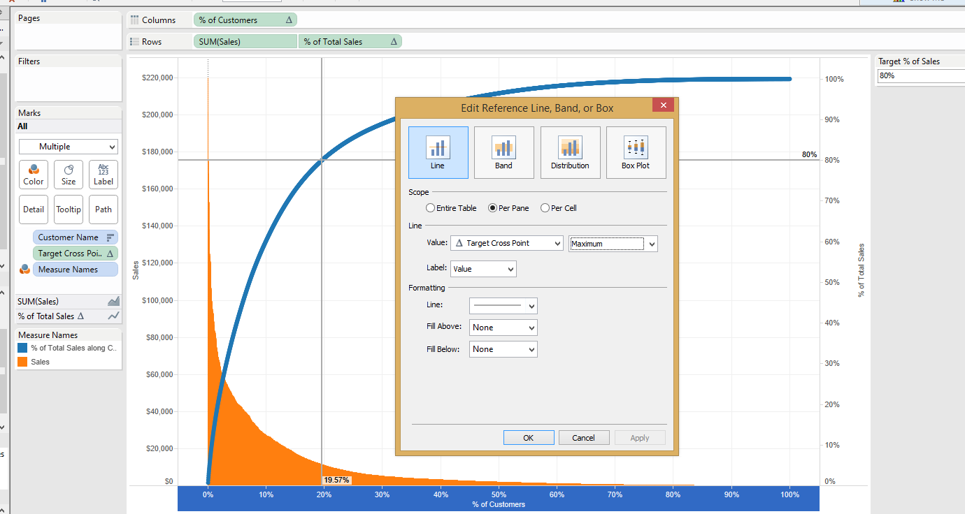 By changing the Target you will change the crossing point
You want even more???
OK, only because I have the same question as you how to use this nice looking vizTo start with you need to duplicate the sheet you have just made (it just saves some time but you can do it manually)Using the Show Me function select a Text TableDrag the Target Cross Point measure field into the filter shelfClick on the Special tab and select Non-null valuesThis will show you everyone that makes up the Target % of salesIf you set it to Null values then it will show you everyone after the Target % of SalesI'll set mine to 10% so you can see the values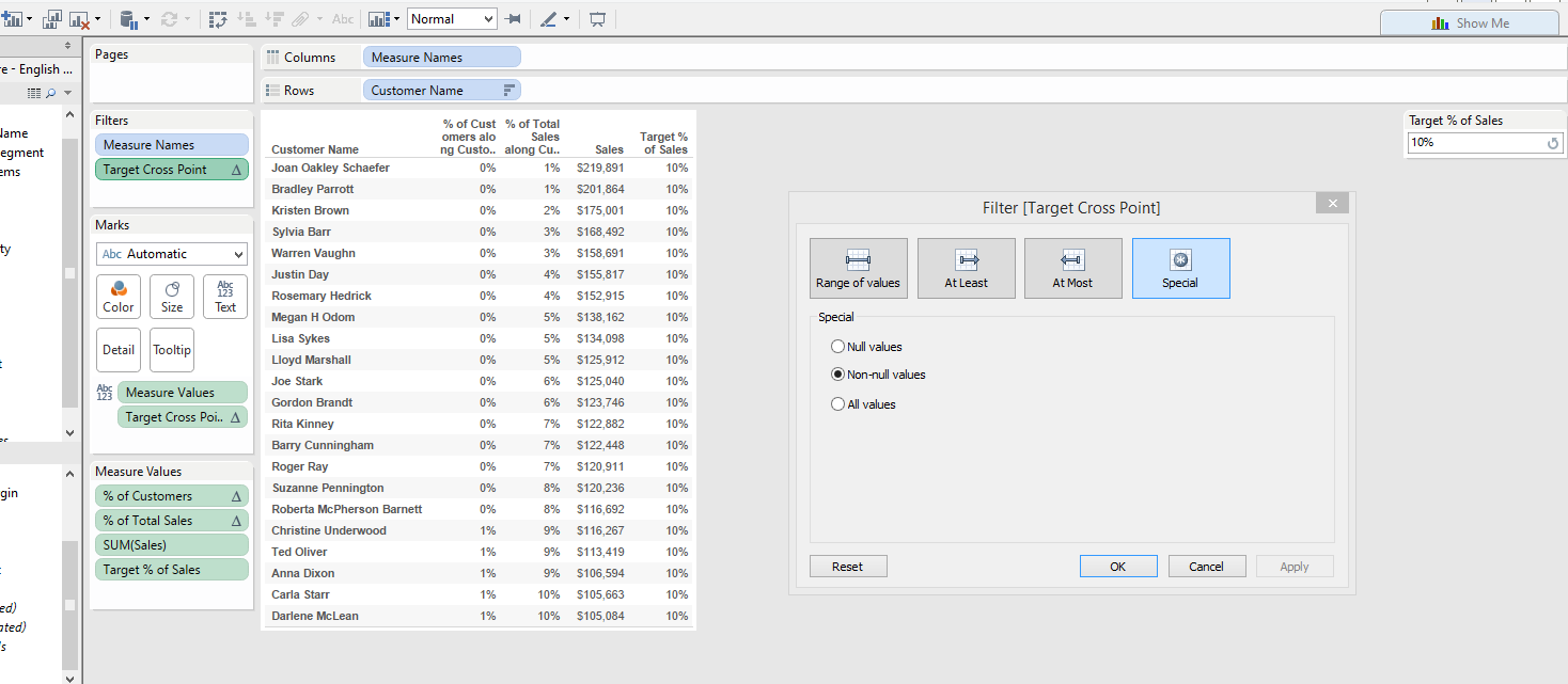 Join these together in a dashboard and you should have something like this