3 December 2012
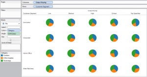
When creating a view in Tableau, fields are placed on the rows and columns. If the field is blue (discrete), a Header is created. If the field is green (continuous), Tableau creates an axis. (For more on blue/green, see Tom’s earlier post - http://www.theinformationlab.co.uk/2011/09/23/blue-things-and-green-things/)Headers exist on the left and top of a view, and axes exist on the left and bottom.However, what happens if you want a header to be on the bottom, masquerading as an axis? Can this be done? Can Tableau be persuaded to abandon best practice for the sake of getting the view you (or more likely, your boss) wants?Yes. Yes it can. And here’s how:The first thing to mention is that, as with all workarounds, there are a specific set of conditions under which this trick will work, but we’ll come to those later. For now, let’s get creating!I’ll be using the standard superstore sales dataset for this example, and will be working through 2 examples of this together; one text and the other, pie charts.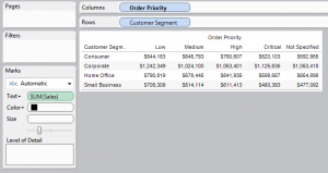
 Whilst this Table Option may often be used to make all headers appear at the top, we are going to use it to push the header to the bottom. The key is that this only occurs when there is a vertical axis on the view.
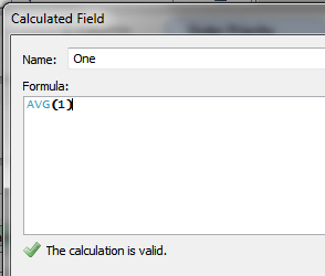 Step 2) Add this new field to the view, as a vertical axis
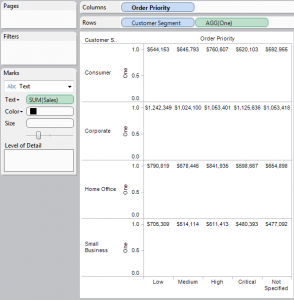
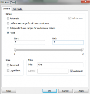
 Step 3) Edit the axis to have a fixed range between 0 and 2
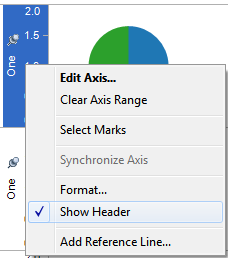
 Step 4) Hide (Un-show) the axis Header
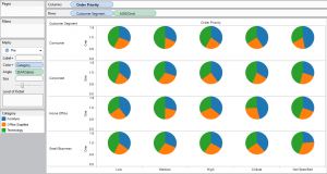
 Step 5) Enjoy your Header chart
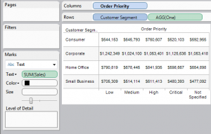
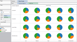
The setup
Create a view with headers on both rows and columns. I’ve used Order Priority as, whilst the values are discrete, with nothing to link one text string to the next, we know that there is an inherent order to them. Give people a check box with low, medium or high, and invariably you will get someone who tries to put it in between two choices.

The Trick (In Theory)
At this point, we can not move the headers down to the bottom. There is no option to do so within Tableau. And so we move on to the pivotal point of the trick, as quoted from the Tableau manual: Whilst this Table Option may often be used to make all headers appear at the top, we are going to use it to push the header to the bottom. The key is that this only occurs when there is a vertical axis on the view.
The Trick (In Practice)
Step 1) First off, we need to use a suitable continuous field. We don’t want it to ultimately affect the view, which means it needs to be the same for every header. For this we can use a calculated field “One”, with a value of AVG(1) Step 2) Add this new field to the view, as a vertical axis
 Step 3) Edit the axis to have a fixed range between 0 and 2
 Step 4) Hide (Un-show) the axis Header
 Step 5) Enjoy your Header chart

The Conditions
As I mentioned earlier, there are limitations to this trick:- Only the last discrete field on the column shelf is moved to the bottom. Any other fields stay on top
- This does not work if there is a horizontal axis
