

28 May 2014
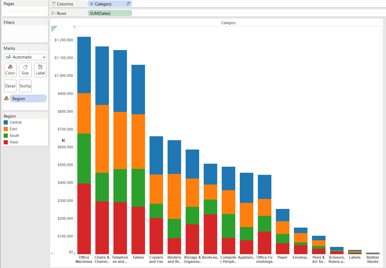
Sets could be described as a “Wow! That’s a nice one! I might use that in the future!” kind of Tableau feature. However, then a few months pass by and you might find yourself saying something like, “Wow, a few months passed by and I have not used that feature yet… ”Well, if this is you, then you are in the right place. Let’s re-discover Sets.I’ll use the Sample Superstore Subset for this demonstration. If you want to follow along with this post.Imagine that your Sales Manager wants to show Sales displayed by categories BUT doesn’t want to show the categories situated bellow a given Sales threshold. To make it more interesting, let’s say that the Sales Manager wants to have control over the threshold, so we can make this a little bit more interesting.Let’s do it! With the usual magic that Tableau provides, we can accomplished the image above very quickly by dragging the Category field to Columns and Sales to Rows and then Region to the Color mark. Next sort Categories by right clicking on Categories and then selecting sort by sum of sales and voila! We have a beautiful stacked bar chart.But this doesn’t fully answer the question right?Glad you asked! The controllable threshold required by the sales manager also can be created with just a few clicks.But how do I make it controllable?Pretty soon you will discover that the answer to many “How do I make” questions in Tableau is usually the same answer: Parameters!First, right click on Parameters and click on create a new parameter. Make sure to fill out the table as shown in the picture. We will type 100,000 as our current value, but you choose whatever number you want wherever you want since this will be a customer threshold.
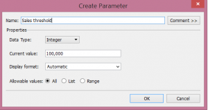 Next, right click on the Y axis and select Add reference line.
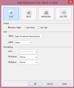 Under Scope, select Entire Table and under Line, fill in the Value for the parameter you just created, Sales threshold. Then, click ok and you will be able to see the threshold on your graph like as shown here:
 In order to see the windows that control the Threshold, it’s very easy. Just go to the parameters window and yes—you guessed it!—you just right click again on the parameter Sales threshold and select Show Parameter and there you go! Play around with it and see how you can control the threshold line by changing the numbers on the parameter control.Ok, but wait, the sales manager also required me not to show the categories that are under the threshold.How do I do that?You might lower your voice and, hesitating a bit, ask… Parameters?The answer is yes, but not quite.What?Yes, we will use the Parameter, but we will use it in a filter (You were not expecting that, were you?)Well don’t freak out, is easy too and literarily just two steps1) Drag the Category field (by pressing control) to the filters and the drop it there and will display a table dialog.
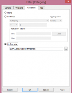 2) Go to the Condition tab and filter by formula typing “Sum(Sales)>[Sales threshold]” click ok and –Yes! You are filtering out the categories under the threshold.So, this seems like we are covering all the requests from the sales manager, right?It seems like is the end of the request.But, as you might know, this might be just the beginning, and there can be more questions or different ways of visualizing this, such as:What if I actually want to have a reference of the categories that are under the threshold, what if I want to highlight the ones that are under the threshold?Well the answer for this is using Sets.Sets?Yes, Sets in a calculated field.What?I know, it sounds complicated but it’s not.We are going to use the same filter but this time as a Set, because we can use Sets in a calculated field and do all sort wonderful and magical things.First, create a Set by right clicking on the category field we have under filters and create A SET. We will call this set “Categories above threshold”
 Notice how Tableau keeps the condition filter that we created previously for the filter. Then, we will use this Set to create a conditional calculated field to highlight the categories that are under the threshold.But first, it is important to create an extract of the database so you can use a set within a calculated field. To do this just right click on the database connection and select create an extract. Really simple, right?After you’ve created an extract you just need to right click on the set we created and select create a calculated field. After that, fill out the dialogue table like this:
 On the calculated field, we are conditioning whether or not to show regions (Central, East, Etc...), depending on whether or not if the category is below the line.This will lead us to the end of our post. We now just remove the categories filter and then replace the region field from the color mark with our new calculated field and yes, FINALLY! Finished!
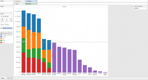 You can play with the Threshold and see how the categories below are highlighted as requested.We are done, at least as far as this post is concerned, but trust me, you will do more, and more questions and requests will come!Posted by Diegodiego.alarcon@theinformationlab.co.uk
 With the usual magic that Tableau provides, we can accomplished the image above very quickly by dragging the Category field to Columns and Sales to Rows and then Region to the Color mark. Next sort Categories by right clicking on Categories and then selecting sort by sum of sales and voila! We have a beautiful stacked bar chart.But this doesn’t fully answer the question right?Glad you asked! The controllable threshold required by the sales manager also can be created with just a few clicks.But how do I make it controllable?Pretty soon you will discover that the answer to many “How do I make” questions in Tableau is usually the same answer: Parameters!First, right click on Parameters and click on create a new parameter. Make sure to fill out the table as shown in the picture. We will type 100,000 as our current value, but you choose whatever number you want wherever you want since this will be a customer threshold.
 Next, right click on the Y axis and select Add reference line.
 Under Scope, select Entire Table and under Line, fill in the Value for the parameter you just created, Sales threshold. Then, click ok and you will be able to see the threshold on your graph like as shown here:
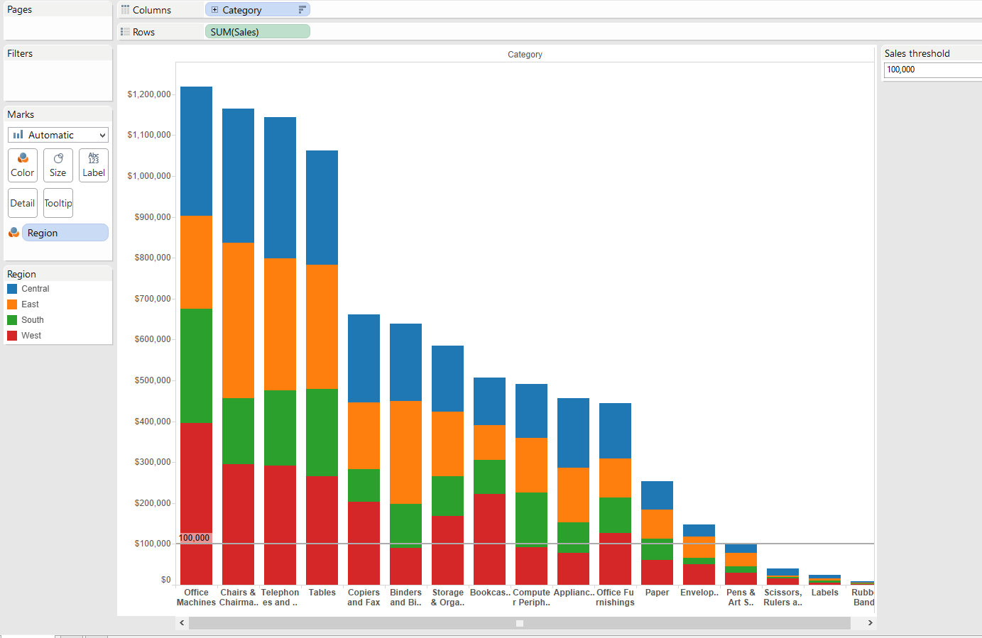 In order to see the windows that control the Threshold, it’s very easy. Just go to the parameters window and yes—you guessed it!—you just right click again on the parameter Sales threshold and select Show Parameter and there you go! Play around with it and see how you can control the threshold line by changing the numbers on the parameter control.Ok, but wait, the sales manager also required me not to show the categories that are under the threshold.How do I do that?You might lower your voice and, hesitating a bit, ask… Parameters?The answer is yes, but not quite.What?Yes, we will use the Parameter, but we will use it in a filter (You were not expecting that, were you?)Well don’t freak out, is easy too and literarily just two steps1) Drag the Category field (by pressing control) to the filters and the drop it there and will display a table dialog.
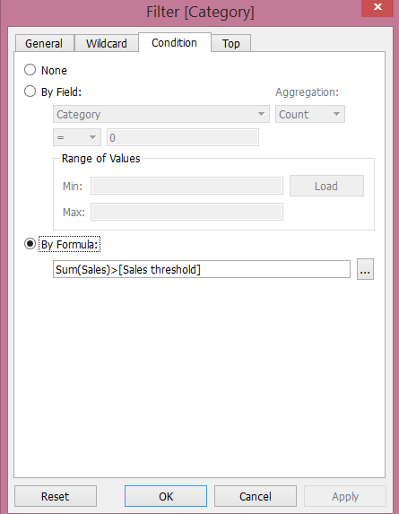 2) Go to the Condition tab and filter by formula typing “Sum(Sales)>[Sales threshold]” click ok and –Yes! You are filtering out the categories under the threshold.So, this seems like we are covering all the requests from the sales manager, right?It seems like is the end of the request.But, as you might know, this might be just the beginning, and there can be more questions or different ways of visualizing this, such as:What if I actually want to have a reference of the categories that are under the threshold, what if I want to highlight the ones that are under the threshold?Well the answer for this is using Sets.Sets?Yes, Sets in a calculated field.What?I know, it sounds complicated but it’s not.We are going to use the same filter but this time as a Set, because we can use Sets in a calculated field and do all sort wonderful and magical things.First, create a Set by right clicking on the category field we have under filters and create A SET. We will call this set “Categories above threshold”
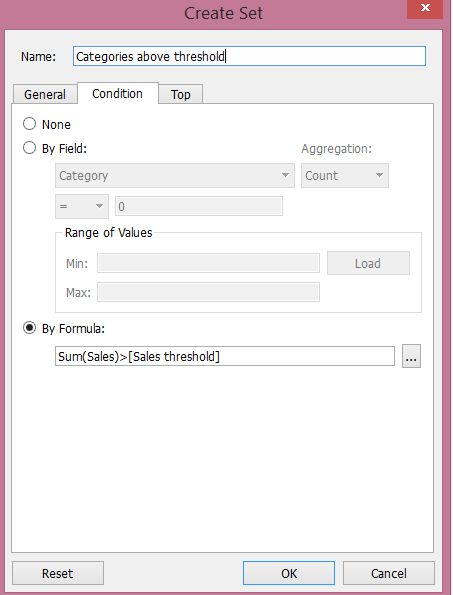 Notice how Tableau keeps the condition filter that we created previously for the filter. Then, we will use this Set to create a conditional calculated field to highlight the categories that are under the threshold.But first, it is important to create an extract of the database so you can use a set within a calculated field. To do this just right click on the database connection and select create an extract. Really simple, right?After you’ve created an extract you just need to right click on the set we created and select create a calculated field. After that, fill out the dialogue table like this:
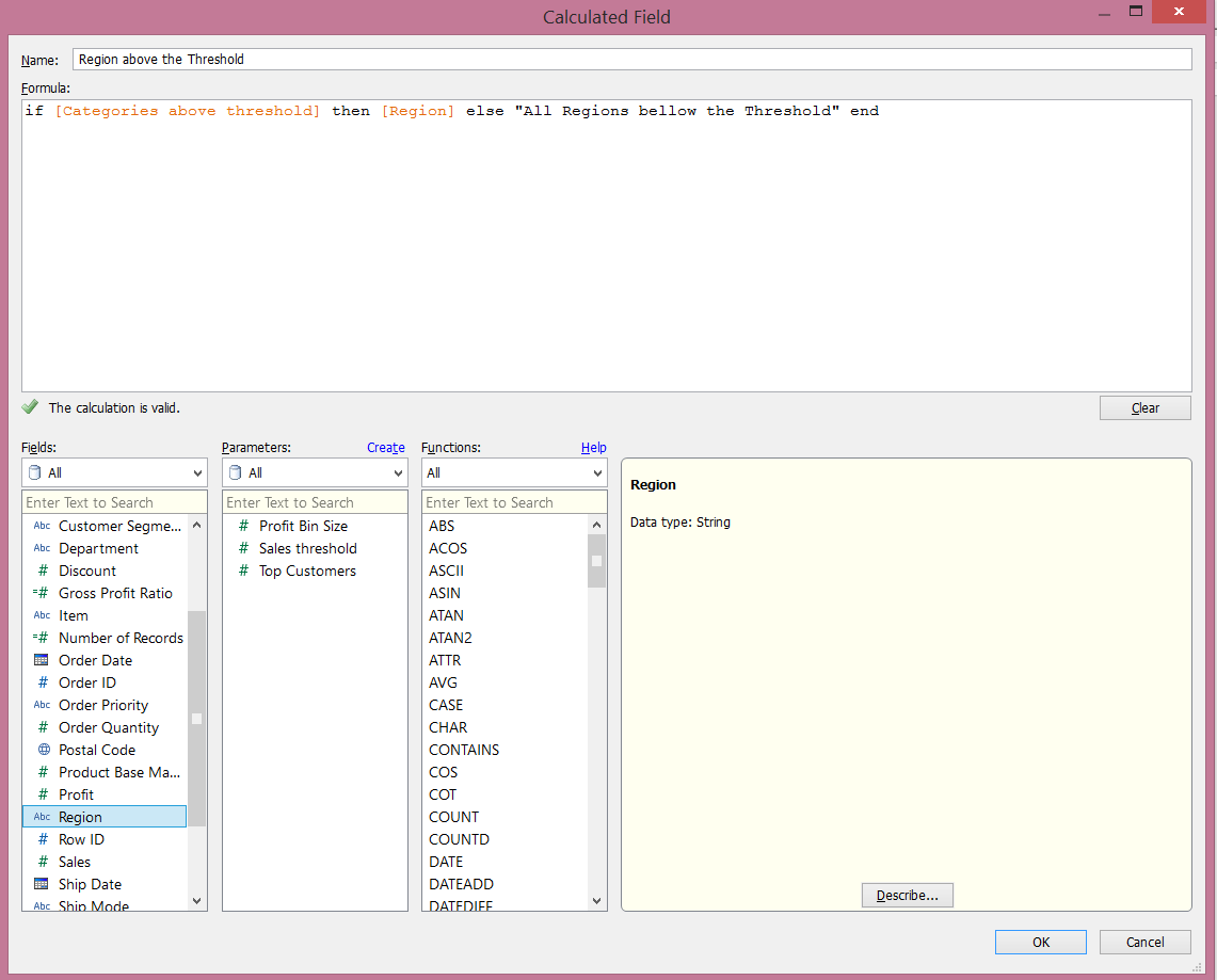 On the calculated field, we are conditioning whether or not to show regions (Central, East, Etc...), depending on whether or not if the category is below the line.This will lead us to the end of our post. We now just remove the categories filter and then replace the region field from the color mark with our new calculated field and yes, FINALLY! Finished!
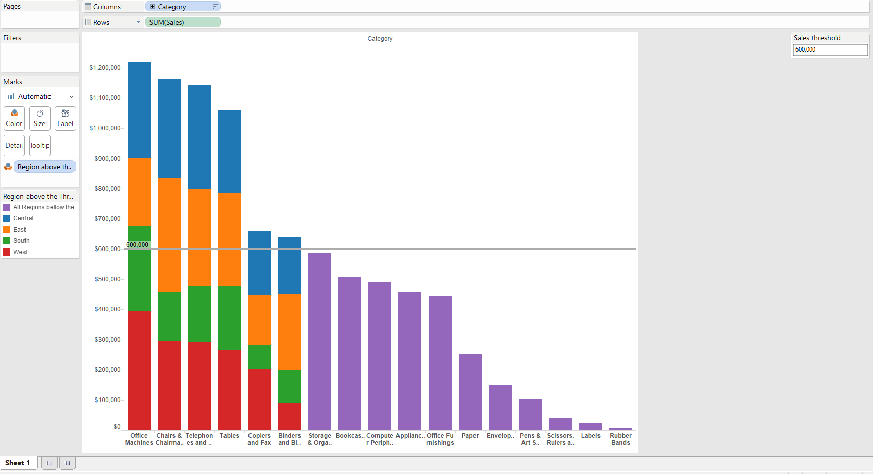 You can play with the Threshold and see how the categories below are highlighted as requested.We are done, at least as far as this post is concerned, but trust me, you will do more, and more questions and requests will come!Posted by Diegodiego.alarcon@theinformationlab.co.uk