

4 August 2016
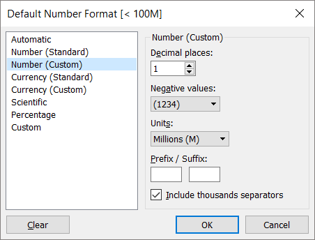
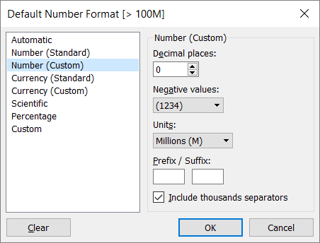
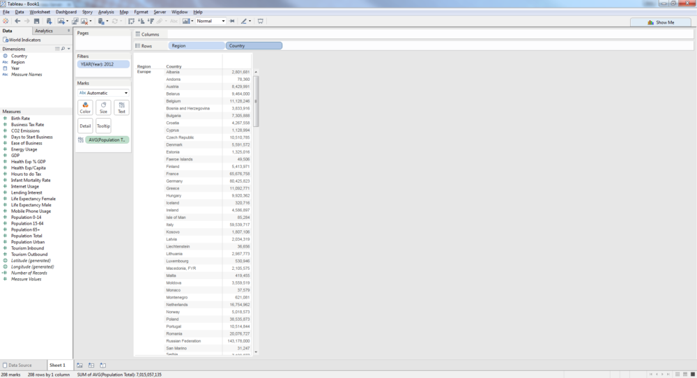
Quite often when you're working with #BigData you'll find yourself working with extremely large and extremely small values, especially with financial data. It can be difficult to label such values, whether in the view or via the tooltip; your audience may struggle to tell the difference between a whole host of 0.1M and 0.2M values and you may equally confuse them if they're staring at a page of 26,901K and 32,301K values that they need to process. But, in typical Tableau-style, there's a fairly easy workaround to negate this issue and to help you create more insightful and user friendly vizzes.In this quick example, I'm going to use the Sample World Indicators dataset that comes packaged with Tableau. When you look at the total population data, you'll see that there are several countries with a population of more than 100m people, many smaller countries with a population of less than 1m people and a huge number in between. When working with such a varied dataset, you want to allow your audience to be able to compare each country easily and using an appropriate level of accuracy.[caption id='attachment_8693' align='alignnone' width='500']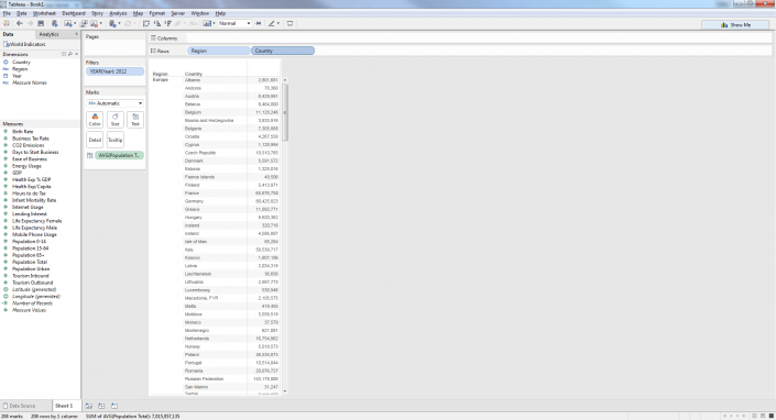 Click to enlarge the image[/caption]In this case, showing the smaller countries in round thousands would be appropriate, as you can see easily the variation between them without the need for extra precision. The highly populated countries can be easily identified in round millions - after all, what's an extra 0.4m going to tell you when looking at China or India in this instance! The remaining countries show a large amount of variation, however, so perhaps here it would make sense to show them in millions rounded to 1 decimal point to aid clarity when comparing.Fellow Information Lab consultant Phil Lowe showed me this great tip which simply requires a few new calculations and you're away! We want Tableau to recognise when a value reaches a certain threshold or else return a null value, which can then be replicated as many times as required. Once the calculations are in place, you simply change the default format of each new calculation to the required format and place them in the view.To start, we create our calculation to recognise numbers less than a million, remembering to capture both positive and negative values (though clearly not an issue in this example):
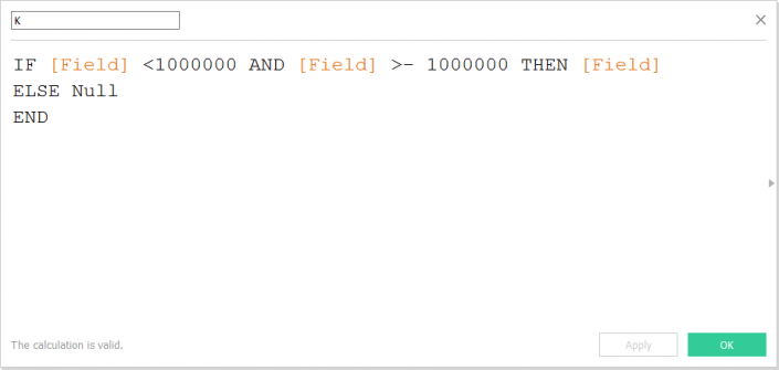 Next, we want to capture all values between 1M and 100M:
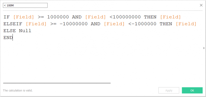 Finally, we capture all values above 100M:
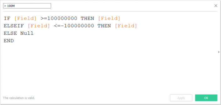 Once this is done, it's a simple case of going through each new calculated field and amending the default number format to the desired format:
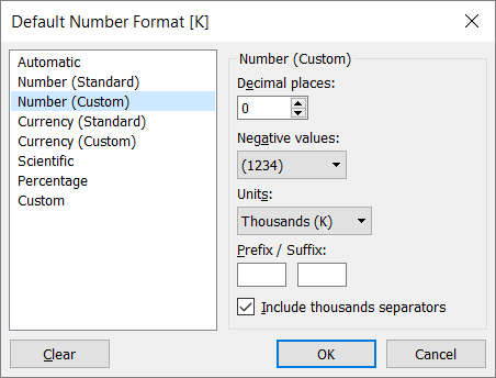
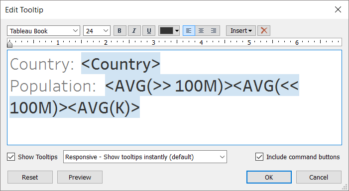
 Once you have formatted your new fields appropriately, we need to add them to the view. Because we crafted them so that they return a null value when the specified threshold is not met, we simply add all three to the label (or tooltip) side-by-side and only the relevant value will be returned.
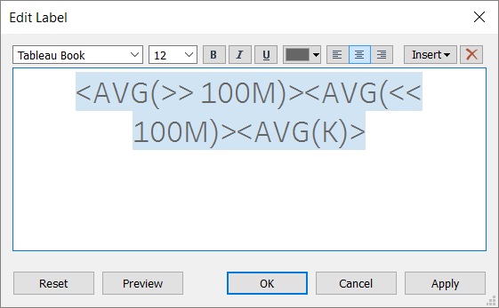
 And here's the end result. As you can see, when you scroll through the view, each row contains one value in the label/tooltip and this varies depending on size.[iframe src='https://public.tableau.com/views/ExampleofVariableLabelling/Dashboard?:embed=true&:display_count=yes&:showVizHome=no&:toolbar=no' width='600x' height='800px' scrolling='no']This simple tip works really well when you're dealing with the same type of values but it doesn't work so well if you need to switch between a variety of number types, such as percentages, currencies and absolute values. If you're struggling with this problem then check out Andrew Pick's helpful blog on the subject here.Thanks for reading, please get in touch if you have any comments or feedback. Follow me on Twitter @robsuddaby.
 Click to enlarge the image[/caption]In this case, showing the smaller countries in round thousands would be appropriate, as you can see easily the variation between them without the need for extra precision. The highly populated countries can be easily identified in round millions - after all, what's an extra 0.4m going to tell you when looking at China or India in this instance! The remaining countries show a large amount of variation, however, so perhaps here it would make sense to show them in millions rounded to 1 decimal point to aid clarity when comparing.Fellow Information Lab consultant Phil Lowe showed me this great tip which simply requires a few new calculations and you're away! We want Tableau to recognise when a value reaches a certain threshold or else return a null value, which can then be replicated as many times as required. Once the calculations are in place, you simply change the default format of each new calculation to the required format and place them in the view.To start, we create our calculation to recognise numbers less than a million, remembering to capture both positive and negative values (though clearly not an issue in this example):Next, we want to capture all values between 1M and 100M:Finally, we capture all values above 100M:Once this is done, it's a simple case of going through each new calculated field and amending the default number format to the desired format:Once you have formatted your new fields appropriately, we need to add them to the view. Because we crafted them so that they return a null value when the specified threshold is not met, we simply add all three to the label (or tooltip) side-by-side and only the relevant value will be returned.And here's the end result. As you can see, when you scroll through the view, each row contains one value in the label/tooltip and this varies depending on size.[iframe src='https://public.tableau.com/views/ExampleofVariableLabelling/Dashboard?:embed=true&:display_count=yes&:showVizHome=no&:toolbar=no' width='600x' height='800px' scrolling='no']This simple tip works really well when you're dealing with the same type of values but it doesn't work so well if you need to switch between a variety of number types, such as percentages, currencies and absolute values. If you're struggling with this problem then check out Andrew Pick's helpful blog on the subject here.Thanks for reading, please get in touch if you have any comments or feedback. Follow me on Twitter @robsuddaby.