

Alteryx Designer makes supervised and unsupervised learning tasks pretty easy through two tool palettes, Predictive and Predictive Grouping. However, the results from the Predictive Grouping tools can be difficult to interpret – arrays of numbers with no particular relation to the data that you put in. In this blog series we’ll clarify how Alteryx reaches those numbers, and what they mean for your analysis. K- Centroids Diagnostics Tool The K-Centroids Diagnostics tool is like an early draft of clustering, to find out how many potential clusters are in the data. This “early drafting” is done by taking multiple samples of the data and applying clustering techniques, to see if the results are valid across randomly chosen samples – this is known as bootstrapping.
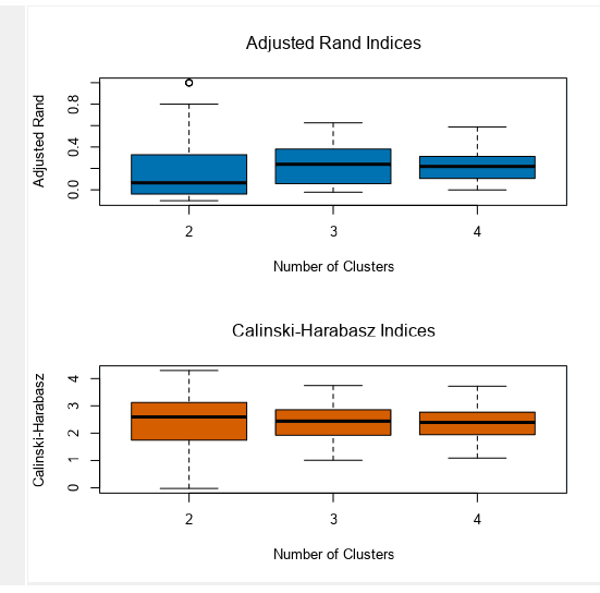
A comparison might be thought of when looking at an office, or class room, if you were trying to assemble people into different groups and the sort of variables you had were personal features; perhaps height, the colour of their shoes, or their hair colour. By random chance, A sample of 10 people out of 50 might inadvertently pick 8 blonde people, or the next sample would only pick people over 1.8m tall (which might also skew other characteristics) – over multiple samples however, these skewed samples will become less relevant in the face of more balanced (but still random) samples. The outcome of the K-Centroids Diagnostics Tool produces an output which looks like this (in this case generated with some rugby statistics data);
Adjusted Rand Index The ARI measures similarity between clusters by comparing the clusters produced with an expected similarity against a random model – the “adjustment” here comes from a slight change in the maths to account for chance (which is an unavoidable part of clustering). ARI produces a score between -1, meaning clusters are identical, 0, which means clusters are independent, and 1, which means clusters are completely different. That means the ARI is a score we should try to maximise, and keep above 0. Calinski – Harabasz Index The CH Index is a ratio of between-cluster variance and within-cluster variance. The differences between these can confuse people, so let’s go back to our office – imagine there’s a party going on!
Looking over the office, we can identify different conversational groups. Some people are standing very close to each other, swapping gossip, while some people are standing a bit further away from each other when they speak – as clusters, the gossip group is dense, and have lower “within cluster variance”.
Between cluster variance meanwhile, is how close those groups are to each other. This can be affected by the parameters of the problem we are analysing (in the same way our party groups can be affected by the size of the room they are in), which is why the CH Index is a ratio. The higher the value of the CH Index, the more distinct the clusters are – by distinct, we mean dense (within-cluster variance) and separate from each other (between cluster variance).
OK, makes sense; but then we see these:

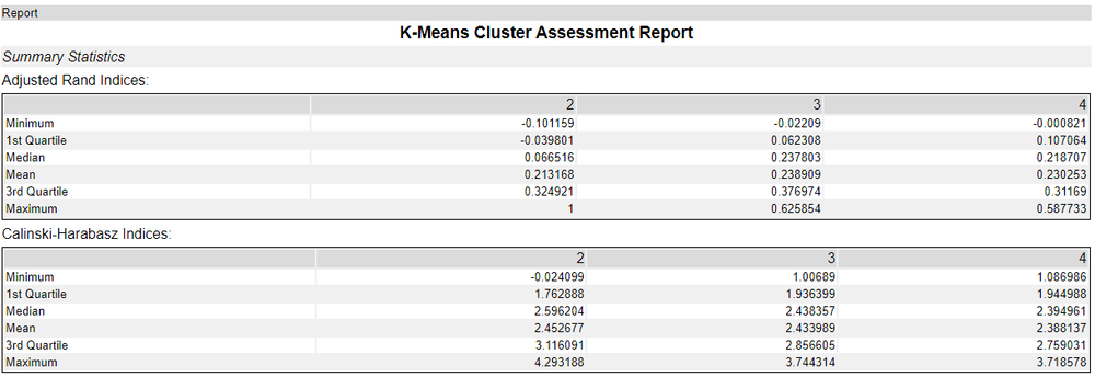
Why are these split into quartiles, minimum and maximum? The ARI and CHI are scores, so showing them as scales as Alteryx does can be confusing – surely we should only have one score? Recall that we were generating clusters from different samples of the data for each speculative cluster grouping. Essentially, this is showing the scores for each set of samples – all the samples that were generating two clusters, three clusters, and four clusters, in this case. So, which should we pick? Generally, I tend to take the mean of median score for that set of samples. A maximum value sounds like the one we want, but that has more potential to be a fluke sample. Looking back at our table with our new found knowledge, how should we interpret our scores? This is data taken from the 2023 Rugby World Cup Group Stages, looking at the performance stats of different teams (in this case about attack). Interestingly, World Rugby organises competitors into two “tiers”; Tier 1 nations like New Zealand and France, who have sophisticated league set ups and well financed national teams, vs Tier 2 nations, like Portugal or Chile, who don’t have the same level of maturity in their national games. There is considerable debate in world rugby as to whether or not this is useful as a way of ensuring teams are well matched, or an attempt to maintain a kind of class system which privileges older (and richer) teams, particularly when Pacific nations like Fiji, Samoa or Tonga – where rugby is the national sport – are considered Tier 2.
At 2, 3, and 4 clusters, the Mean ARI of the samples suggests that all clusters are independent of each other with scores around 0.21 – 0.23. This is fine, but not clearly suggesting a winner. However, the median ARI of the clusters is distinctly lower for 2 clusters as opposed to 3 and 4, which suggests 2 clusters isn’t as good as 3 or 4.
For the CH index scoring, they are also quite close together (both for the mean and median scores) – but trending downwards as we add more clusters. This would suggest that 2 might well be better than 3 or 4, and perhaps support World Rugby’s tier system.
However, between both systems, there isn’t much in it – it could be that the teams at the world cup are similar enough in attack statistics for their first three games that we cannot yet clearly distinguish them.