

You’ve built a dashboard, it is looking very smart and has all the analysis that was required, but your end user isn’t familiar with Tableau. How can you make it more user friendly?
- Make the interactions with your dashboard clear
Add a subtitle to your chart title, and if there isn’t any, add a text box above or next to it. Rewrite the filter(s) title(s) so that they are a call to action. Use italics so it is clear that it is an action:
Hover over the bars for more information
Click on a country to filter the dashboard
Start by choosing a year and selecting a category
2. Use built-in navigation buttons to navigate from one dashboard to the other
Don’t forget that you can use custom images to make the action more intuitive, like back and forward arrows or a home.

3. Use buttons as filters
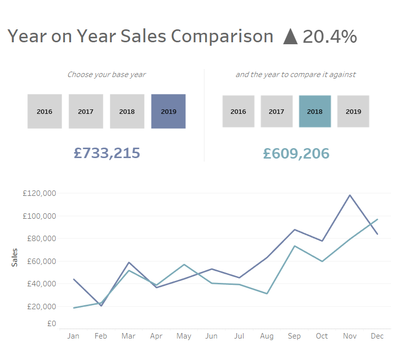
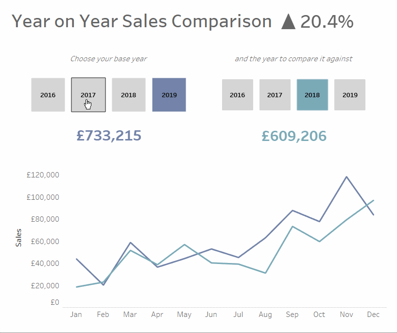
Reduce the number of clicks needed by having buttons instead of filters. One of the pieces of work I was doing recently involved comparing figures between two different years and I have recreated the logic using Superstore data. In this dashboard, there is no filter in sight, yet it is fully interactive:
How? By using parameters actions. Let’s go through the main steps:
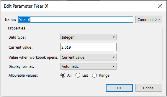
First of all, we need to create 2 parameters, one for both of the years we wish to visualize.
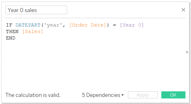
Then we need to create the calculations to make the line for each year. Dual axis these calculations along a discrete Date field (don’t forget to synchronise the axes!).
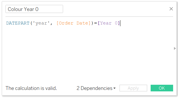
Next we need to create our year “filters”. Each Year 'filter' is a different sheet, where Year of Order Date is the label, and the chart type is a Shape.
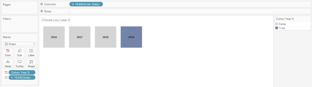
I have also used colour to indicate which line the year refers to, and which button has been clicked, using this simple calculation:
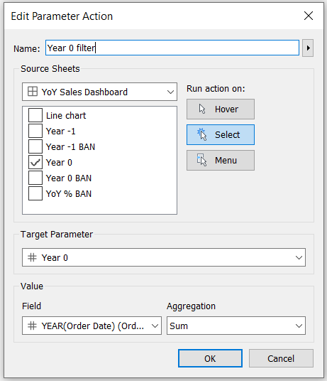
Once you have put both of your year “filters” and your line chart onto your dashboard, set the parameters actions for both years.
This creates a user friendly, intuitive dashboard for users that might not be familiar with Tableau and want to quickly see what is important to them.
To make your dashboards user-friendly, try and look at your work with fresh eyes, and ask yourself the question: are the built-in interactions obvious and easy to use? If not, text formatting, colour, images and buttons are there to help.
Icon from Dave Gandy at Flaticon. Main image from Anna Shvets at Pexel.