

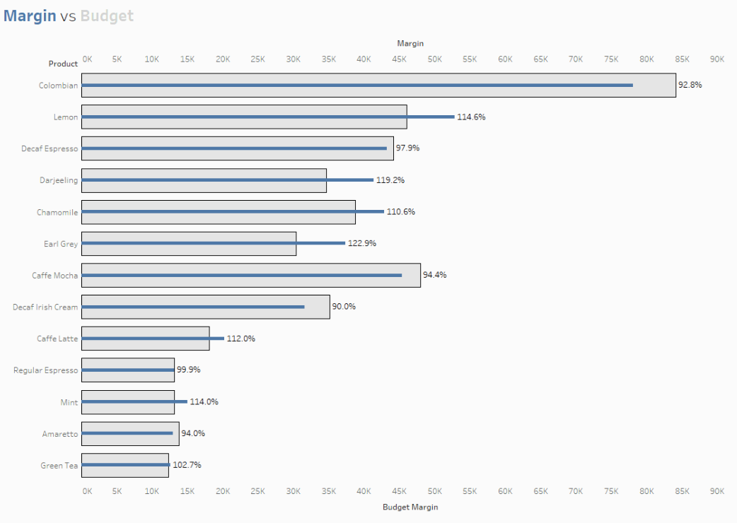
I was teaching dual-axis charts to a class recently, and someone asked me, 'How can I label the longer bar?'. I wasn't too sure initially, but knew it would be possible, as most things in Tableau are. When I had a free minute I went away and thought about it and came up with this solution. And now I'll share it with you!The IssueHere I have a nice bar-in-bar chart.When I try and label the bars though, I get this:As you can see, the labels overlap the bars and sometimes get covered up. It's just not very neat. So how can we fix this? It's easy. I'm going to make two calculations; one for when margin is higher than budget margin (the thin blue bar), and one for when the budget margin is higher than the margin (the wide grey bar). These will be dragged to the relevant bar, et voila, perfect labels!Here are the calculations you'll need: Drag the [Margin Label] field to the labels mark card on for the Margin pill. And then the [Budget Margin Label] to the labels on the Budget Margin pill, see the clip below: