

Reference lines can be a powerful feature in aiding understanding and adding context (or reference!) to a visualisation. Adding horizontal or vertical reference lines in Tableau is a standard built-in feature but creating a diagonal reference line requires some extra user created calculations.
This blog will be a part of a series; this article will show how to include multiple diagonal reference lines in a scatterplot, the second will show a growth reference line from a target in a time series graph and the third will show doubling rate reference lines in a logarithmic scale.
Motivation
Makeover Monday Week 39 (2020) was a dataset from UNICEF on Child Marriage rates where I wanted to create a scatterplot showing how different countries have varying proportions of child marriage between genders.
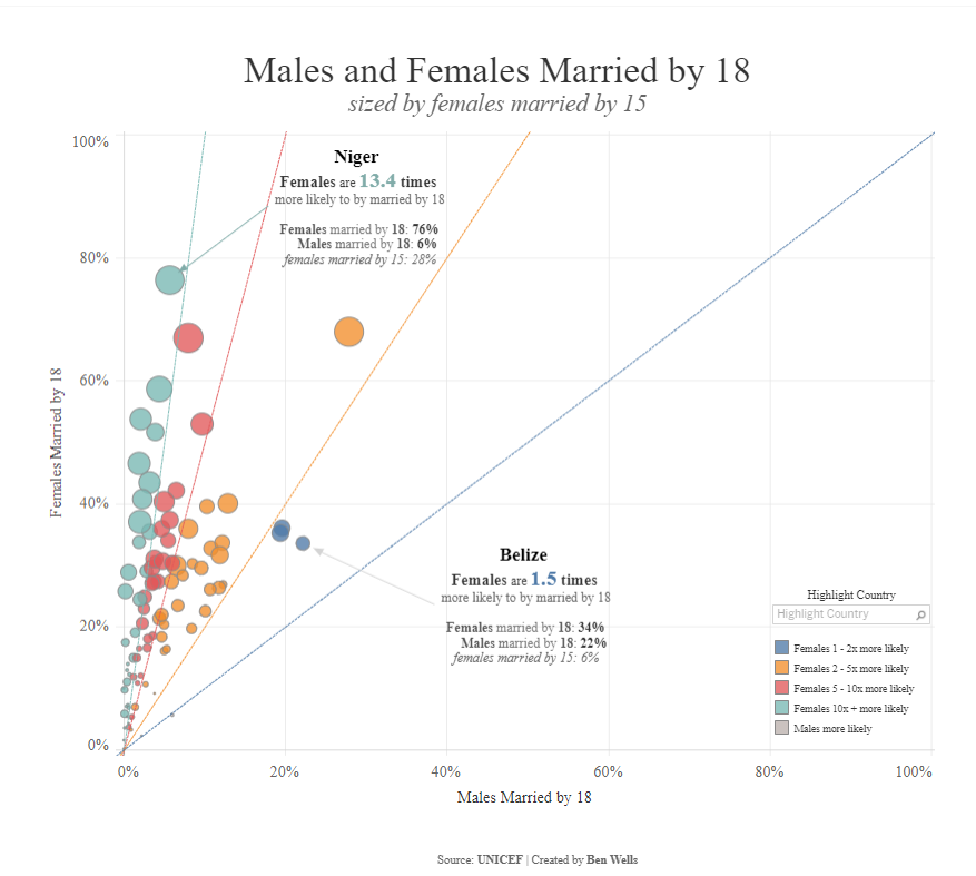
Including a 45° diagonal reference line would be useful to help distinguish countries which had higher proportion of females married by 18 than males. This was a great start for my analysis and found the original technique from a video by Andy Kriebel here. I then wanted to add more diagonal reference lines which would add further context - like which countries are you five or ten times more likely to married by 18 as a female compared to a male? Secondly, I wanted to have a user driven fan capturing group (we will call this the bonus view) which creates two reference lines fanning out and capturing countries in this fan.
Below were the two final views I created which can be seen on Tableau Public here (N.B this blog will not show how to get to the final formatted output as the blog could be too long! But it will show how to get the reference lines in the views which you can then format according to your design).
Multiple Diagonal Reference Lines
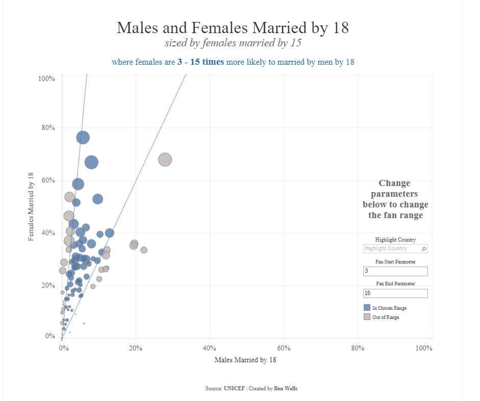
Bonus: User Driven Reference Lines
Multiple Diagonal Reference Lines
Method
Data source: Makeover Monday week 39 (2020) - Child Marriage. Can be found here.
Workbook to follow along with the methodology below can be found here.
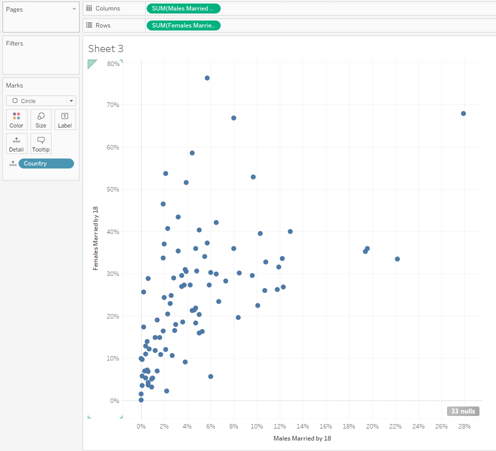
1) Create a scatterplot with [Males Married by 18] on columns against [Females Married by 18] on rows, with [Country] on detail and change the mark type to circle.
2) Create the calculated fields which will determine the angle of the reference line. For this example, the angle of the reference line will determine how much more likely females are to be married by 18 compared to males.
Intuition: Creating a dual axis against the same measure on the opposing axis will act to plot a line on a graph according to the equation y = mx + c.
y = the calculated field we are creating
x = [Females Married by 18]
m = gradient of the line (∆y / ∆x) i.e. for each x along how many y up
c = is the y-axis intercept (this is zero in this use case)
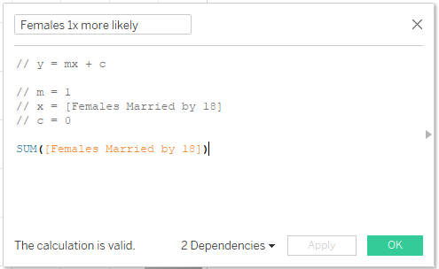
The equation simplifies to y = m * [Females Married by 18]
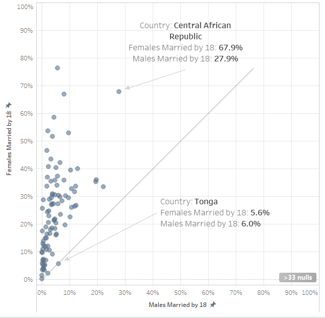
(i) Creating a perfect 45° line is the same as thinking females and males are as likely to each other to be married by 18 (one x% along is the same as one y% up), so the gradient (m) = 1. This can also be thought that above this reference line females are more likely than males to be married by 18 and the opposite below the line. We can see this in the example below where Central African Republic has a higher percentage of females married by 18 than men and is above the 45° line and the opposite for Tonga.
As my analysis is focusing on how much more likely females are to marry than men, I will call the calculated field [Females 1x more likely].
(ii) Continue to make the other reference lines for 2, 5 and 10 times more likely. This is done by determining the gradient (m). A female to be twice as likely to marry by 18 than a man, the gradient would be ½.
The calculated fields to create are:
[Females 1x more likely] = SUM([Females Married by 18])
[Females 2x more likely] = (1/2) * SUM([Females Married by 18])
[Females 5x more likely] = (1/5) * SUM([Females Married by 18])
[Females 10x more likely] = (1/10) * SUM([Females Married by 18])
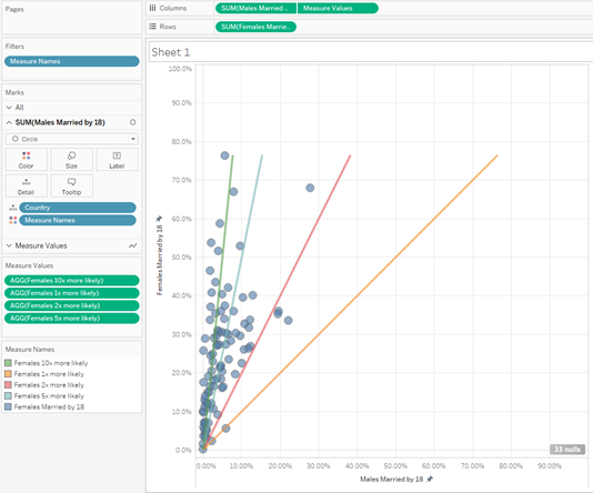
3) Bring the measures on to the view.
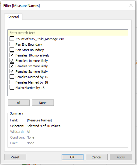
(i) Drag [Measure Names] onto Filters and only select the 4 calculations you have created:
(ii) Drag [Measure Values] on to Columns, right click the [Measure Values] pill and select Dual Axis and be sure to right click on the x-axis and select Synchronise Axis. I also like to uncheck Show Header, to only have the bottom x-axis in the view.
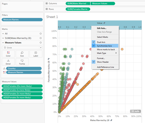
(iii) Change the [Measure Values] from Circle to Line and make sure [Measure Names] is above [Country] in the order of the shelf (otherwise your line will go funky!).
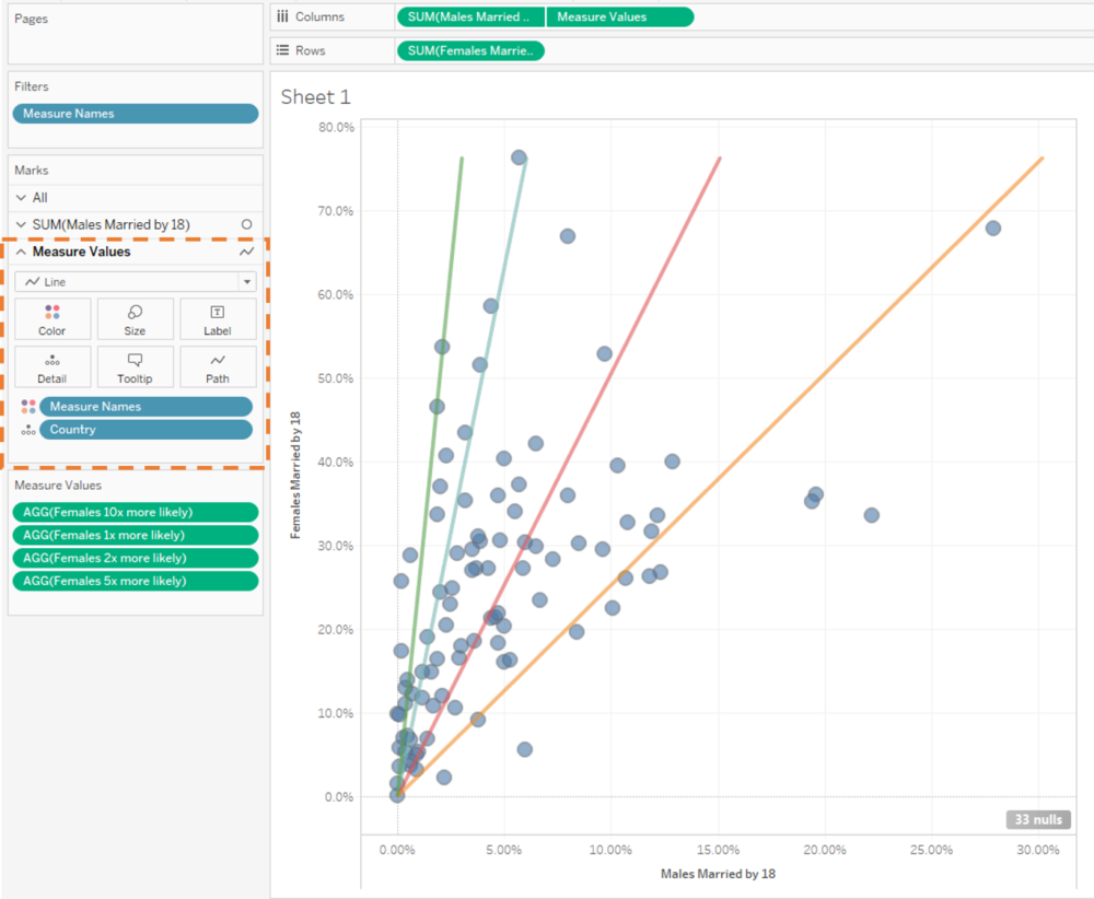
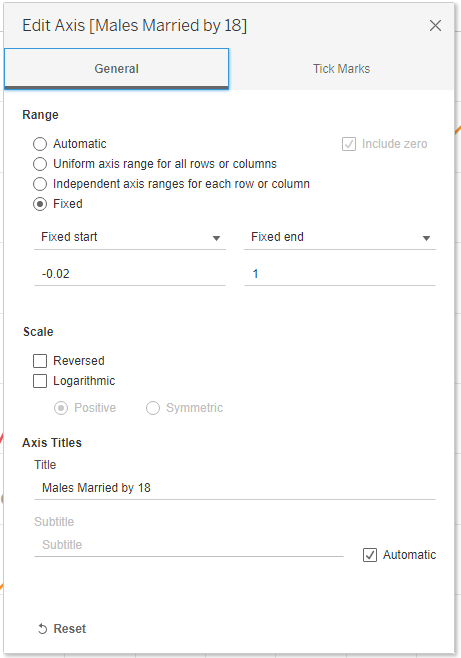
(iv) Right click the x-axis and select Edit Axis… and fix the start to -0.02 and end to 1. Repeat this process for the y-axis. This will make the axis range the same scale and show the full range of the data.
4) Extend the reference lines as currently the reference lines are showing at the angles we wish, they do not go all the way to the end of the plot:
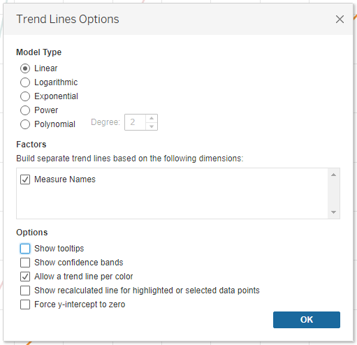
We can fix this by right clicking on the graph > Trend Lines > Show Trend Lines > Measure Values.
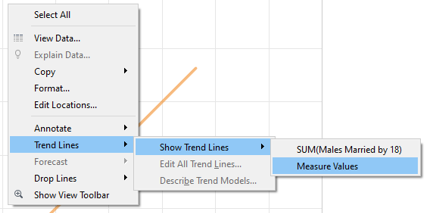
This will add a dashed line across to the end of the plot. We can then change the opacity of the [Measure Values] to zero and change the formatting of the reference lines to a solid line if you wish.
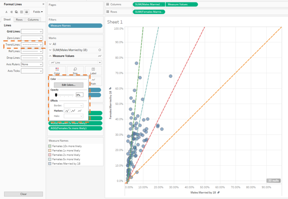
Right click on the trend line and select Edit All Trend Lines… and uncheck Show tooltips and Show recalculated line for highlight or selected data points. So the trendlines do not change as you click on countries and tooltips are hidden (Only 'Allow a trend line per color' should be selected from the options).
5) Finally, we want to be able to colour code the countries according to the bracket the fall in. This can be done by the following calculated field:
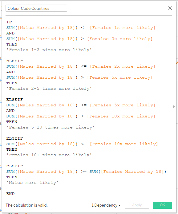
[Colour Code Countries] =
IF
SUM([Males Married by 18]) <= [Females 1x more likely]
AND
SUM([Males Married by 18]) > [Females 2x more likely]
THEN
'Females 1-2 times more likely'
ELSEIF
SUM([Males Married by 18]) <= [Females 2x more likely]
AND
SUM([Males Married by 18]) > [Females 5x more likely]
THEN
'Females 2-5 times more likely'
ELSEIF
SUM([Males Married by 18]) <= [Females 5x more likely]
AND
SUM([Males Married by 18]) > [Females 10x more likely]
THEN
'Females 5-10 times more likely'
ELSEIF
SUM([Males Married by 18]) <= [Females 10x more likely]
THEN
'Females 10+ times more likely'
ELSEIF
SUM([Males Married by 18]) >= SUM([Females Married by 18])
THEN
'Males more likely'
END
6) Drag the [Colour Coded Countries] calculated field onto Color on the Males Married by 18 shelf and you should have the finished outcome!
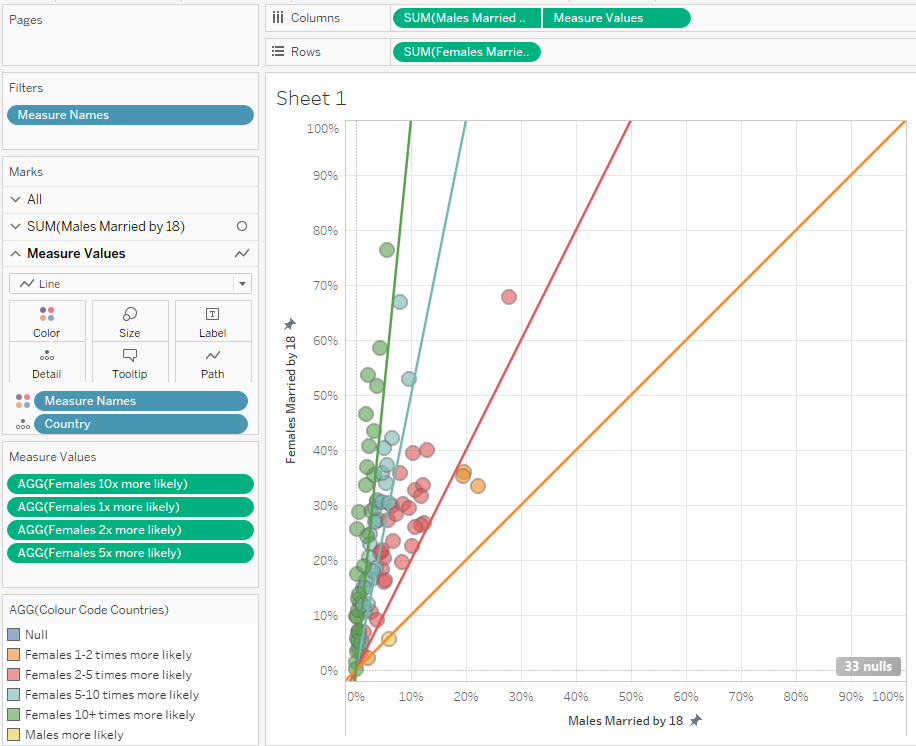
You should be able to create a scatterplot incorporating multiple reference lines into your view. From here you can add other measures onto size, add annotations, change formatting and tooltips until you reach your desired finished outcome!
Bonus: User Driven Reference Lines
Method
The same data source and workbook as before.
1) Create a scatterplot with [Males Married by 18] on columns against [Females Married by 18] on rows, with [Country] on detail.
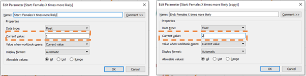
2) Create two parameters: [Start: Females X times more likely] and [End: Females X times more likely] with the current value to 1 for [Start: Females X times more likely] and 2 for [End: Females X times more likely]
3) Create the calculated fields, following the same logic as before we will create two calculated fields for two reference lines which will act as the boundary of the fan.
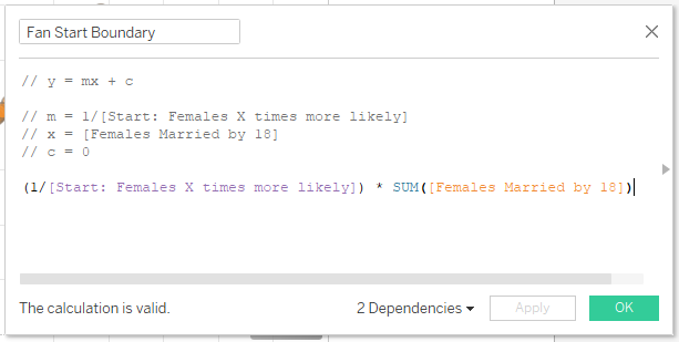
[Fan Start Boundary] = (1/[Start: Females X times more likely]) * SUM([Females Married by 18])
[Fan End Boundary] = (1/[End: Females X times more likely]) * SUM([Females Married by 18])
4) Follow Steps 3-4 from Multiple Diagonal Reference Lines (section above) using [Fan Start Boundary] and [Fan End Boundary] measures instead of [Females 1x more likely], [Females 2x more likely], [Females 5x more likely] and [Females 10x more likely].
5) Colour code country if in fan interval by creating [In/Out Chosen Range] calculated field:
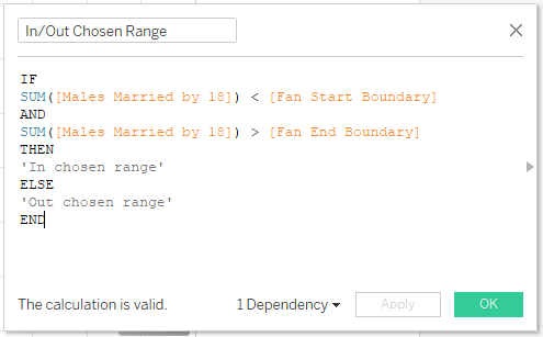
[In/Out Chosen Range] =
IF
SUM([Males Married by 18]) < [Fan Start Boundary]
AND
SUM([Males Married by 18]) > [Fan End Boundary]
THEN
'In chosen range'
ELSE
'Out chosen range'
END
5) Drag [In/Out Chosen Range] to Color on [Males Married by 18] shelf and the countries will be colour coded according if the fall between the reference line fan you have determined.
6) Final Output should look like this
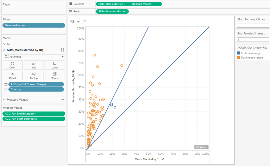
You can determine the range of the fan of the reference lines by changing the [Start: Females X times more likely] and [End: Females X times more likely] parameter values in the top right of the sheet. Again, you can further format the view to get to your final desired outcome!