

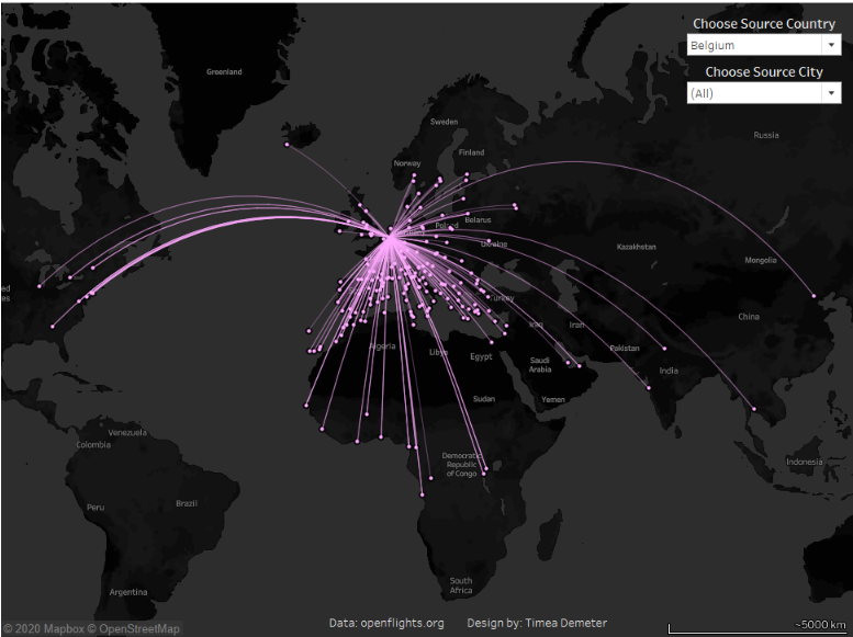
I have always admired these fancy maps with the lines connecting the locations.
But every time I tried to create one, I got a bit confused with what comes onto path and how to connect the origin and destination points. And once I did manage to connect those points it only created straight lines by default so I had to use a different technique to make them curvy.
Check out some really great posts from Gauthier Bonnot and Konstantin Greger on how to create paths using the above mentioned method.
But then I stumbled across this blog that describes a different method available only after Tableau 2019.2 was released, when Tableau introduced the makeline and makepoint functions which would draw the lines for us.
Super exciting, I thought to myself,this is exactly what I’m going to do.
The data
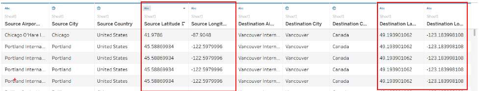
I went straight onto openflights.org, downloaded the data on airports and routes and prepared it in Alteryx. I am not going to go into details on how I brought the datasets together because this post is centered around how you would create an origin destination chart once you have the Longitude and Latitude for the source and destination locations.
So these two are the main fields that I will be using, everything else is there so I can slice the data and maybe filter based on specific preferences.
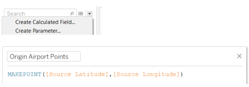
Step 1 - Create the location points for the Origin and the Destination
I will start with creating the points for the origin airports in a new calculated field.
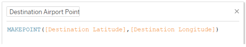
And then do the same for the destination airport.
As a quick note, the Longitudes and Latitudes have to be Numeric (decimal) data types otherwise the formula will give you an error.
Step 2 - Create the routes as lines on the map
You might ask, why would I want to complete step 1 if Tableau can show these points on the map just by dragging the Longitudes and Latitudes onto the shelves?
Well, the answer to that is strongly connected with our ultimate goal. Which is (not world domination, although that would be cool as well, but...) to create the lines for the routes. And in order to create the lines we need these points to be used in the below formula ;)
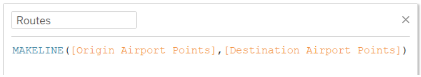
Step 3 - Showing the lines on the map
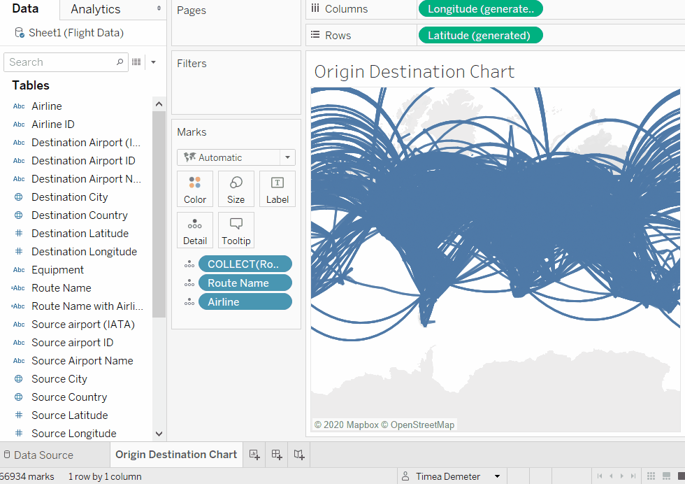
Now we grab this calculation and bring it onto the map.
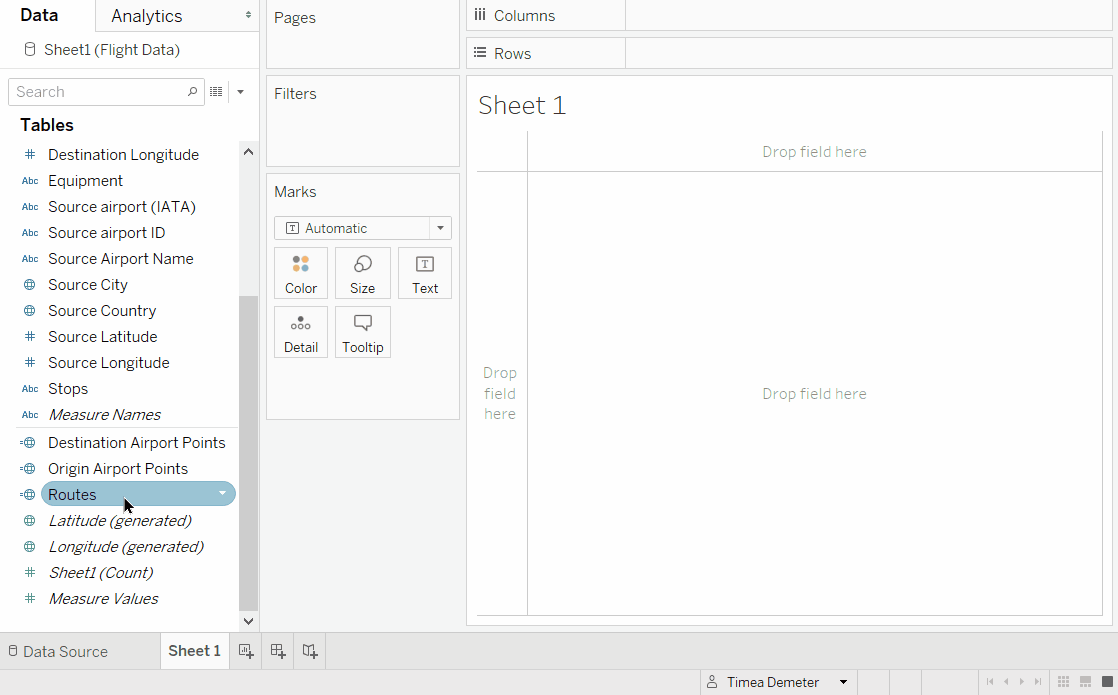
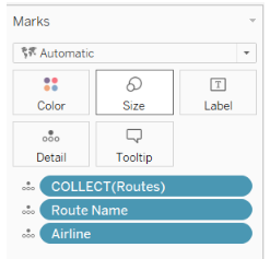
But as you can see above all routes are displayed as one object, so we will need to bring something onto detail to break up the view by the individual routes.
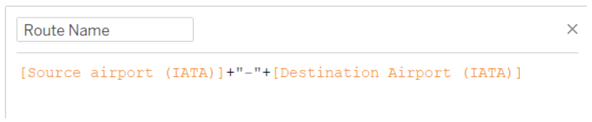
At the moment we don't have a field to identify the routes so will create one that is the combination of the Source Airport and the Destination Airport's IATA code.
But then every route might be served by multiple airlines, so if we want to make sure that this is reflected in the chart, we need to Bring Airline onto detail as well.
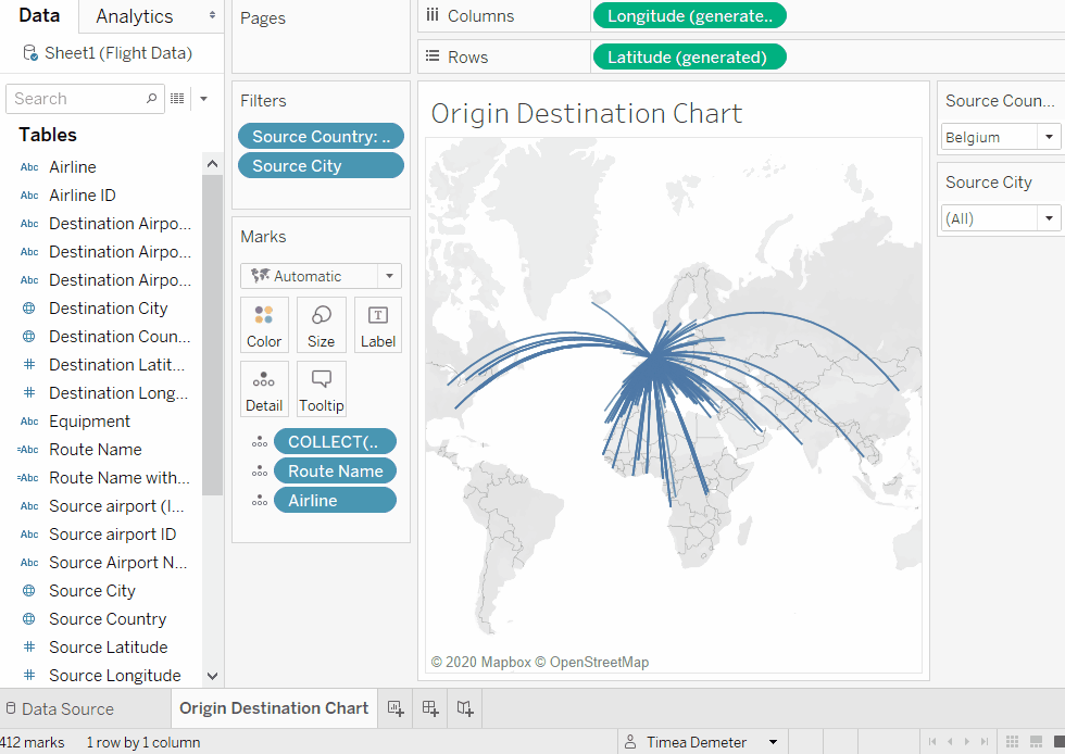
Step 4 - Formatting the chart and the map
We can do a bit of formatting by making the lines a bit thinner and lighter and I would also want to make sure to distinguish them better so I will bring the origin airport or origin country onto filter and always have just one selected.
Now, if I want to make this even better I can add dots onto the destination by creating a dual axis. Then removing Everything from the second marks card, and bring Destination Airport Points and Destination Airport Name onto detail. We can also change the marks to circle and make them slightly bigger.
If I want to format it even further and make it look like the one from the beginning of this post, all I need to do is change the background to something darker and use bright colors for the lines.
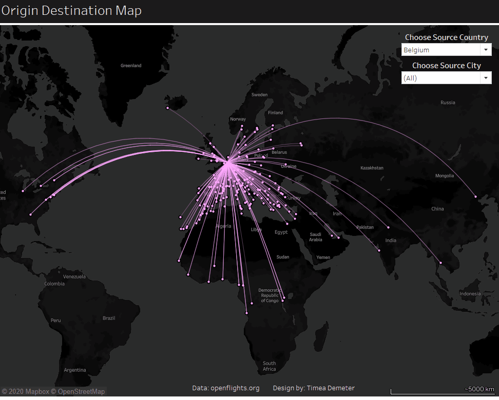
And Voila, the origin and destination map is ready!
You can explore and download the finished workbook here.