
The example in this blog is based on data provided by The World Bank and is also available on makeovermonday.co.uk/data under 2020 -> Week 11.
Step 1. Build a scatter plot and add reference lines to both axes.
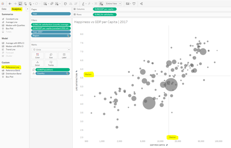
Step 2. Create a calculated field to colour the circles falling under the 4 parts of the quadrant differently. Place the new field on the Colour shelf.
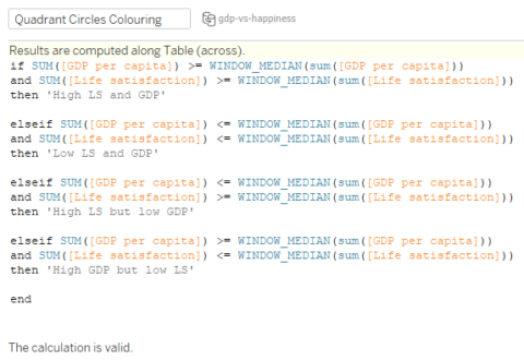
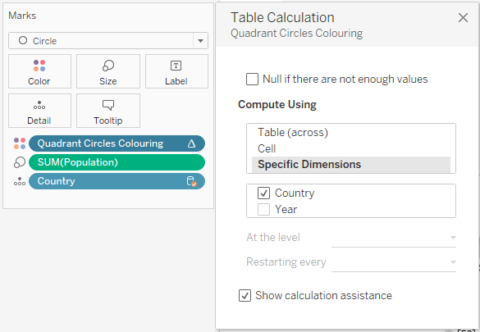
Configure the table calculation as below:
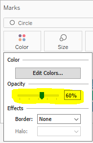
Click on the Colour shelf and choose colours you like. You may want to reduce the opacity to something like 60% if your circles are overlapping.
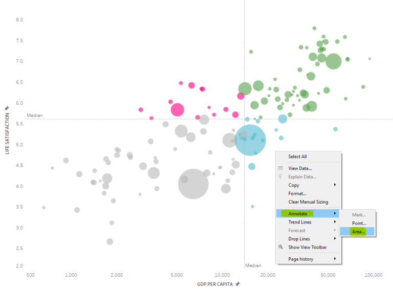
Step 3. Add 4 annotations to each side of the quadrant. Right click on the scatter plot -> ‘Annotate’ -> ‘Area’.
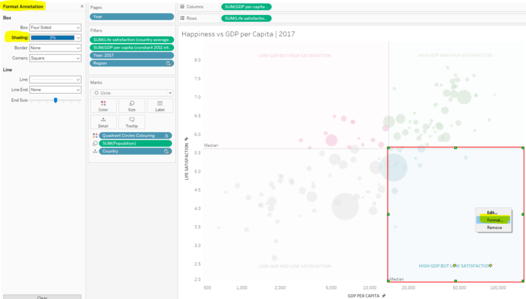
Add a label to your newly created annotation and expand the area to each side of the reference lines. Then right click on it -> ‘Format’ and choose appropriate color under ‘Shading’. Use low opacity or very subtle colors, so that your points on the scatter plot stand out.
Repeat the last step for each side of the quadrant.
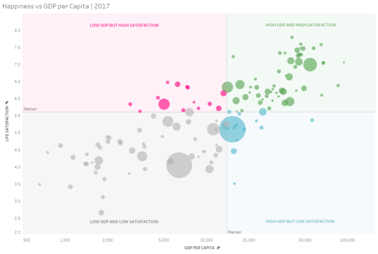
And there you have it – a nice and simple 4-colour quadrant in Tableau!
Advantages of this technique:
- It is very easy to create.
- Your quadrant can be forced to remain in the same shape even if your axes change when more data comes in or when filters are applied. For example, if GDP per Capita reaches 150,000 on the x-axis above in the following year, you can force the annotation to reach to 150,000 via adjusting the axis, and this will preserve its shape.
Disadvantage of this technique:
- It can only be used if your reference lines on both axes remain static.
If you have any questions about this blog, or would like to chat about Tableau in general, do not hesitate to get in touch on Twitter @nataliatamiteva.
