

11 August 2014
Data blending is a really powerful feature of Tableau, allowing you to bring together information from two completely different places, such as a centrally managed database and an excel file on your desktop. It also allows that data to be brought together at different levels of aggregation, such as if one is daily values and the other is monthly targets.However, sometimes the blend just doesn’t seem to work, and trying to identify what is going wrong can be tricky if you can’t see what’s happening. This post is going to focus on one of those times. And yes, as those amongst you may have guessed, the title is inspired by a similarly named TV show.
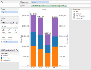 This view is one way of adding a total for a bar.
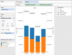 Oh. That’s not right.What could be wrong? Well, we are blending, so maybe we need to check the links are correct.First step, Data -> Edit Relationships. Confirm that there is a relationship between the two datasources on Department
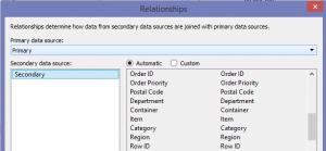 There it is.Next, check if the field is being used as a linking field in this view
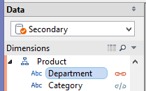 Hmm. It is.Try deselecting it? No change.Select it again? Still no change.This is frustrating!What was that? A tea break? Well, if you insist!Ok, so now I’ve had some tea, let’s discuss what is happening, and what we can do to fix it.
This means that if only one axis uses a field, it is impossible to tell Tableau to use that field as part of the blend for both axes.So what can we do at this point? Another tea break? As an Englishman I do believe that the answer to most situations, but in this case the solution is close enough that I think we can hold off.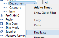 2) Use this duplicate field in the view instead of the original
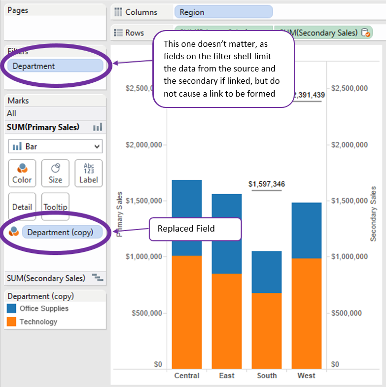 3) Select the now grey link next to the original field in the secondary data source
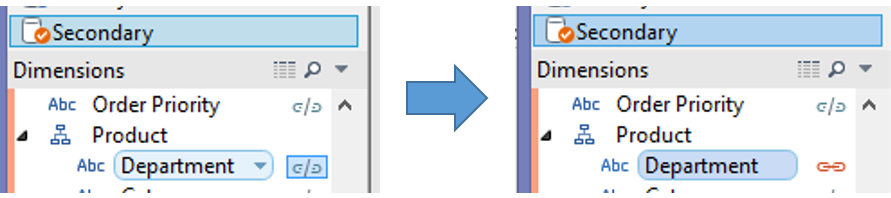 Once you’ve made those changes, you get the view we were aiming at – success!
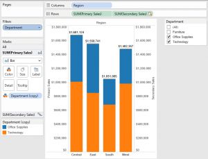 Now, we can stop here, and I hope this helps a little in furthering your Tableau journey.Or we can continue, right to the very edge of Tableau mystery.
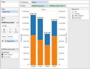 Use this method with caution, as it can be tricky to see what is happening, but there you go – a little bit of Tableau magic.
The situation
Let’s start by demonstrating the problem with the good old superstore dataset. Actually, I like the dataset so much, I’m going to use it twice! The connections are identical apart from a couple of things:- I called one Primary and the other Secondary
- I changed the “Sales” fields to be “Primary Sales” and “Secondary Sales” to make the example easier to follow!
| Columns | Region |
| Rows | SUM(Primary Sales)Dual axis withSUM(Secondary Sales) |
| Filters | Department – All selected and quick filter shown |
| Marks Cards | SUM(Primary Sales) – Bar, Department on ColourSUM(Secondary Sales) – Gantt, SUM(Secondary Sales) on Label |
| Other | Sync the axes |
 This view is one way of adding a total for a bar.
The Scenario
We’ve got a stacked bar showing the sum of Sales broken down by Department. We have a total for all the departments added above the bar.Now we realise that we want to only show Office Supplies and Technology. So we untick Furniture in the Quick Filter, and Hey Presto! Oh. That’s not right.What could be wrong? Well, we are blending, so maybe we need to check the links are correct.First step, Data -> Edit Relationships. Confirm that there is a relationship between the two datasources on Department
 There it is.Next, check if the field is being used as a linking field in this viewHmm. It is.Try deselecting it? No change.Select it again? Still no change.This is frustrating!What was that? A tea break? Well, if you insist!Ok, so now I’ve had some tea, let’s discuss what is happening, and what we can do to fix it.
The Understanding
The clue to this one is in the title of this blog post (yes, it wasn’t just a reference to a TV show). The orange/grey I’m referring to is the status of the link between two data sources.Orange link = field is being used as part of the blendGrey link = field is NOT being used as part of the blendFor a field to be used as part of the blend, we either need to include that field in the view, or select the link manually.Ok so far? Here’s the fun bit!When you have multiple axes on a chart, either side-by-side (Combo chart) or opposite each other (Dual Axis), you get multiple marks cards. Each marks card can have a different configuration of fields and end up in each generating a different query to get data. This means that each axis has its own blend. You see where this is going?If neither axis uses a field, the link icon will be grey. Selecting it turns it orange, and both axes use that field in the blend.If both axes use a field, the link icon will be orange, and the field is in the blend. Selecting the link icon turns it grey and neither axis uses it in the blend.If one axis uses a field (as in our case), the link icon turns orange, but only that axis uses the field in the blend. Selecting the link icon turns it grey, and neither axis uses it in the blend. Selecting it again turns it orange, and the link is reset to the default behaviour (only one axis).| Number of axes using field | Default behaviour | Manual selection of link | Select the link again? | ||
| Link icon | Number of axes with blend | Link icon | Number of axes with blend | ||
| 0 | Grey | 0 | Orange | 2 | Reset to default |
| 1 | Orange | 1 | Grey | 0 | Reset to default |
| 2 | Orange | 2 | Grey | 0 | Reset to default |
The solution
Complex as the problem may be, the solution is comfortingly simple.1) Duplicate the field in primary datasource2) Use this duplicate field in the view instead of the original3) Select the now grey link next to the original field in the secondary data sourceOnce you’ve made those changes, you get the view we were aiming at – success!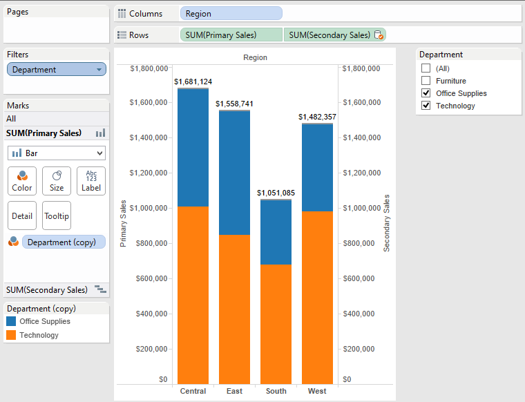 Now, we can stop here, and I hope this helps a little in furthering your Tableau journey.Or we can continue, right to the very edge of Tableau mystery.
Can we do this without the duplicate field?
I know I said it was impossible, but that was all of five minutes ago!If you get the order of operations right, you can do awesome things in Tableau, and this is one of them.1) Create the view as before, but don’t put blending field (Department in our case) on either marks card2) The link icon next to the field in the secondary source should be grey. Select it so it is orange. This activates blending on both axes.3) Add the field onto one of the marks cards. Before, this would have created the single-axis link, but since we overrode the default behaviour in step 2, both axes use the field as part of their blends. Use this method with caution, as it can be tricky to see what is happening, but there you go – a little bit of Tableau magic.