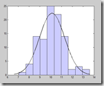
 We were recently asked to help a customer use Tableau to draw a best-fit Gaussian curve from his data of suppliers and their scores. Whilst Tableau doesn’t have this sort of statistical analysis built-in, once you get your head round the normal distribution formula, it’s just a matter of configuring a few calculated fields.
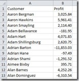
First of all, let’s look at our data in it’s raw format. We’re using a simple example here of customers and profit figures. There is 1 row per customer, along with their total profit for all transactions. If your data has more than 1 row per customer (perhaps 1 row per order) then you may want to do some pre-aggregation before bringing the data into Tableau.
1. Histogram
Connect to your data and verify all the rows are present. The first step is to create a histogram from the data. This is one built-in feature in Tableau that can be extremely easy to do – simply click Profit from the data window, then select the Histogram option from the Show Me tab – boom! BUT, we want to be a bit more flexible and also be able to reference the bins in later calculations so we are going to set the histogram up manually.
Rather than using Tableau’s automatic binning feature, create your own calculated field bins by writing a formula to round the profit amount down to the nearest one thousand
INT ( [Profit] / 1000 ) * 1000
We can also introduce a Parameter here to allow a user to easily change the bin size. If you wish, create a Parameter called “Profit Bin Size” and then change the formula to…
INT ( [Profit] / [Profit Bin Size] ) * [Profit Bin Size]
WARNING: If your data contains negatives this next point is really important!
Because the INT formula rounds down towards zero, any negatives are actually rounded up along the number line (still rounded down in terms of absolute magnitude). This creates the situation where your zero bin, which should represent 0 to +1000 or whatever your bin size parameter is set to, actually represents –1,000 to +1,000. We need to correct that and can do it by shifting the negatives down. Change the formula to…
INT ( [Profit] / [Profit Bin Size] ) * [Profit Bin Size] + IF [Profit] < 0 THEN -[Profit Bin Size] ELSE 0 END
OK now we have our bin calculated field – it has probably appeared in the Measures section of the data window so go ahead and throw it up into the Dimensions section before adding it to Columns in the view and then adding Number of Records to Rows.
2. Calculating the mean and standard deviation
The normal distribution / Gaussian formula requires the mean and standard deviation of profit of our entire customer population.
We can create a formula to work out the mean by writing…
AVG ( [Profit] )
But this formula, when added to the histogram view, will be partitioned by our binning dimension – i.e. we will get the mean for the bin 0 to 1,000, the mean for the bin 1,000 to 2,000 etc. We want the mean for the entire data set so we have to use a table calculation…
TOTAL ( AVG ( [Profit] ) )
…to get the right result. Similarly, for standard deviation, the formula will make use of the TOTAL table calculation
TOTAL ( STDEV ( [Profit] ) )
3. Create the curve formula
The formula for the normal distribution probability density function is as follows (reference: Wikipedia)
Where sigma (s) is the standard deviation, mu (m) is the mean and x is the profit bin as calculated above. Translating this into Tableau, we get a calculated field as follows
(1 / ([St Dev] * SQRT(2*PI()))) * EXP(-((ATTR([Profit Bin]) - [Mean])^2 / (2*[St Dev]^2)))
If you add this new calculated field to your view you should see a nice bell curve shape appear – we’re getting close but to fit the curve to our histogram, there are a couple of steps left.
First of all, we need to scale the function according to our bin width (smaller bins will have fewer number of records) and we do that by multiplying the whole formula by 1,000 (or your bin size parameter)
Secondly we want to convert the density function into a frequency function so that the numbers match up to our histogram – this is done by multiplying by the total number of records.
The final formula then is
(1 / ([St Dev] * SQRT(2*PI()))) * EXP(-((ATTR([Profit Bin]) - [Mean])^2 / (2*[St Dev]^2))) * [Profit Bin Size] * TOTAL (SUM([Number of Records]))
Add this to your view as a dual axis, synchronize and change the mark type to a line and you should end up with the below
